Olympics 2012 Equestrian Venue

2004 - New York, NY, USA

Olympics 2012 Equestrian Venue

New York, NY, USA

CLIENT NYC 2012 / SIZE 800 acres / STATUS Design completed 2004 / DESIGN TEAM Balmori Associates / Joel Sanders Architect

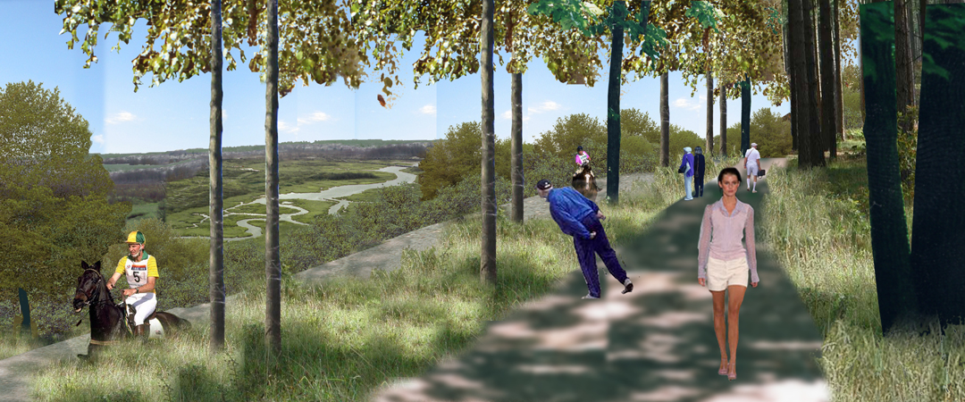
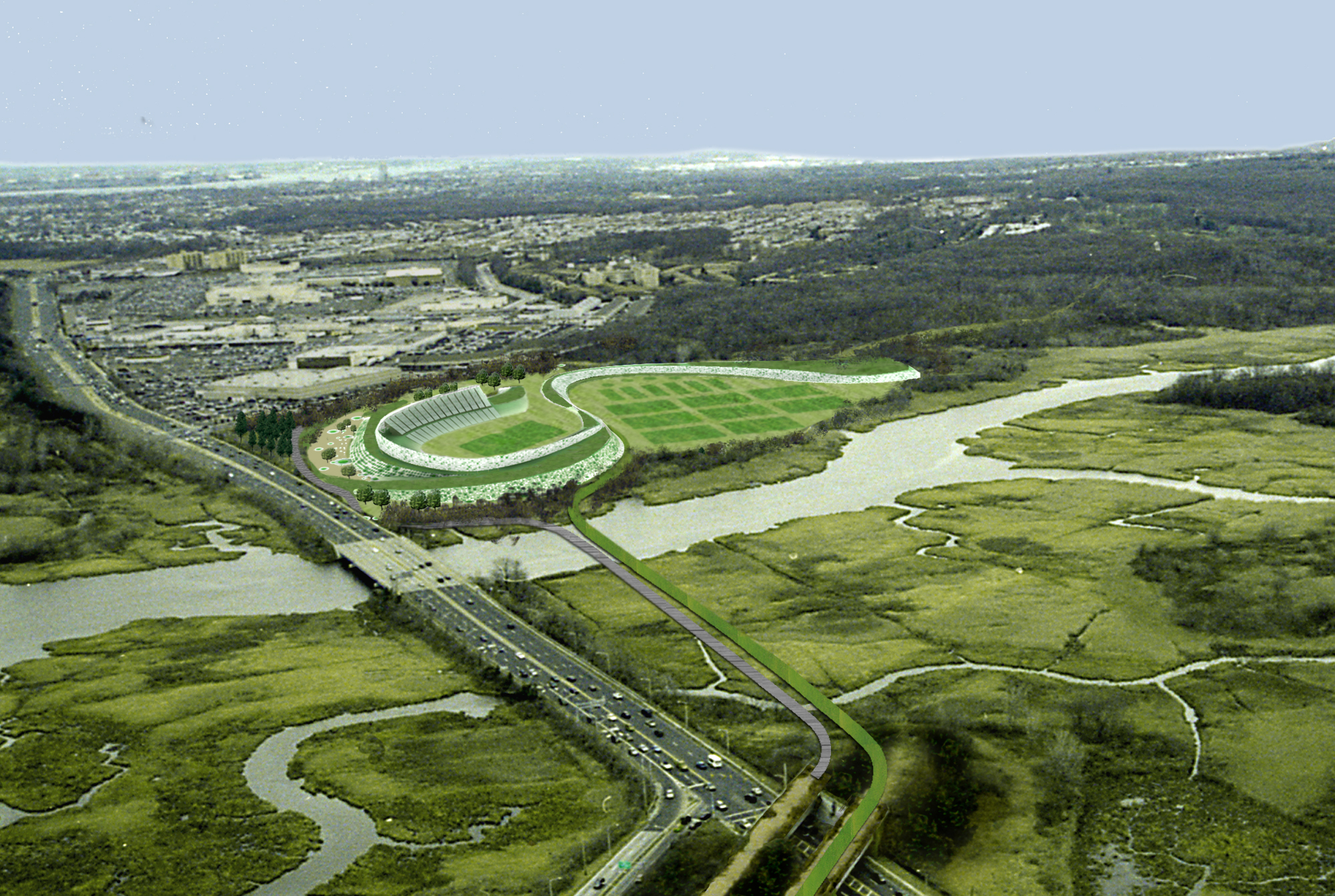
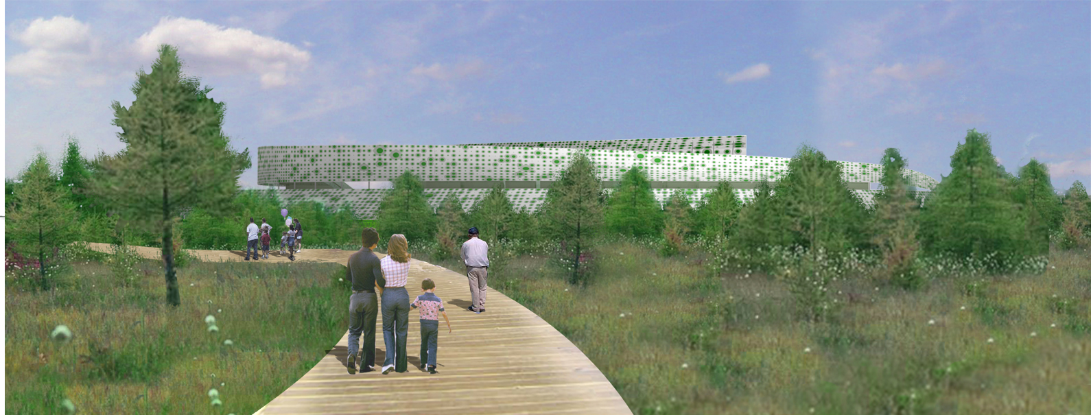
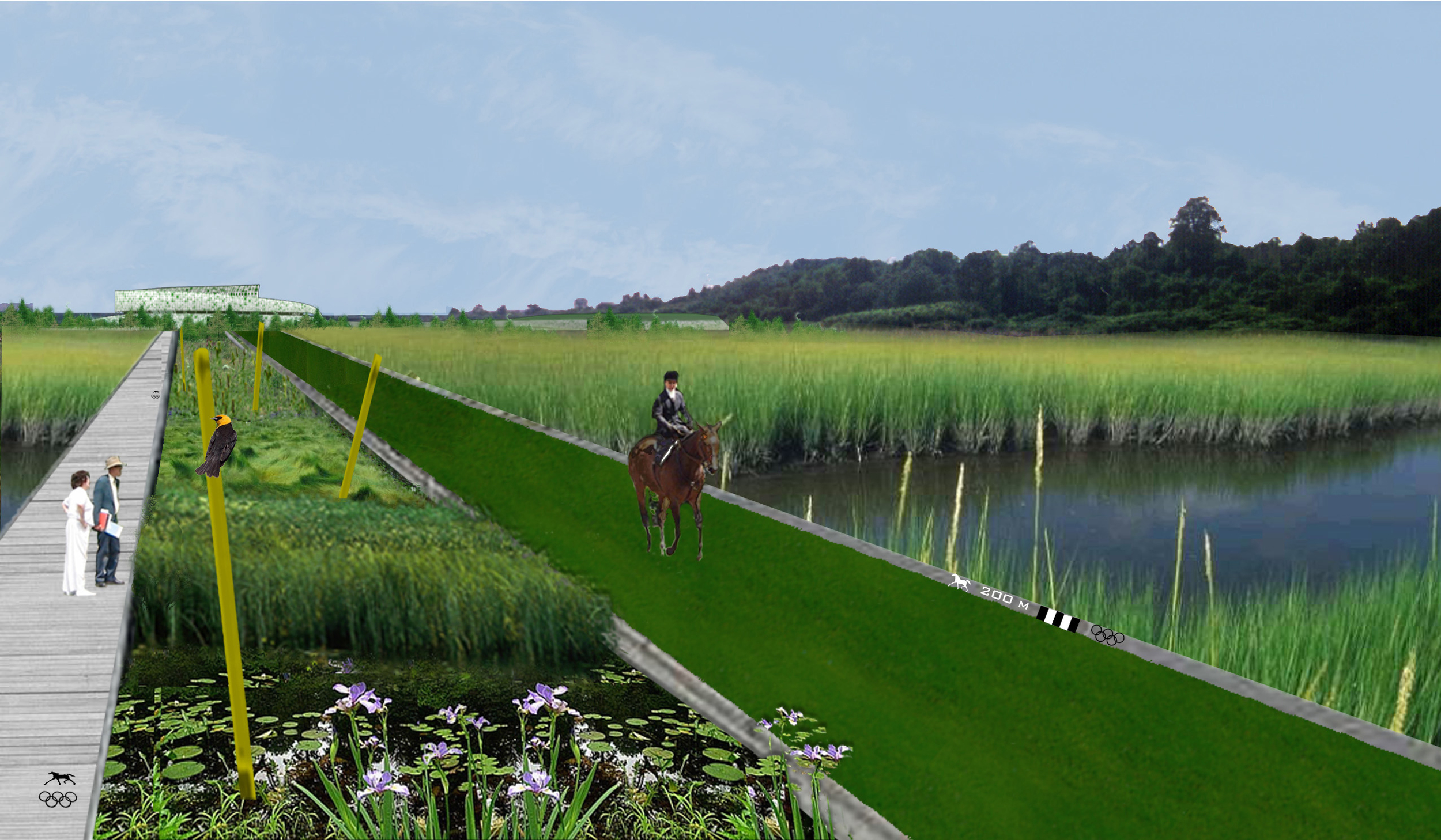
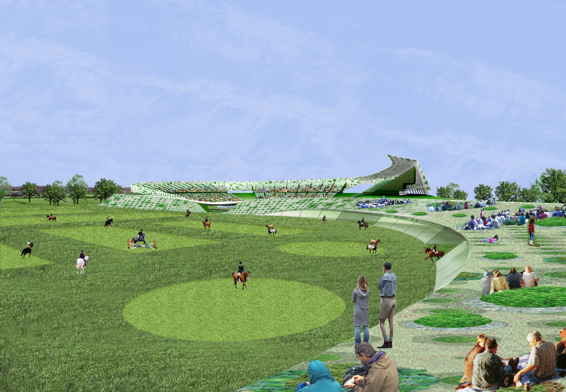
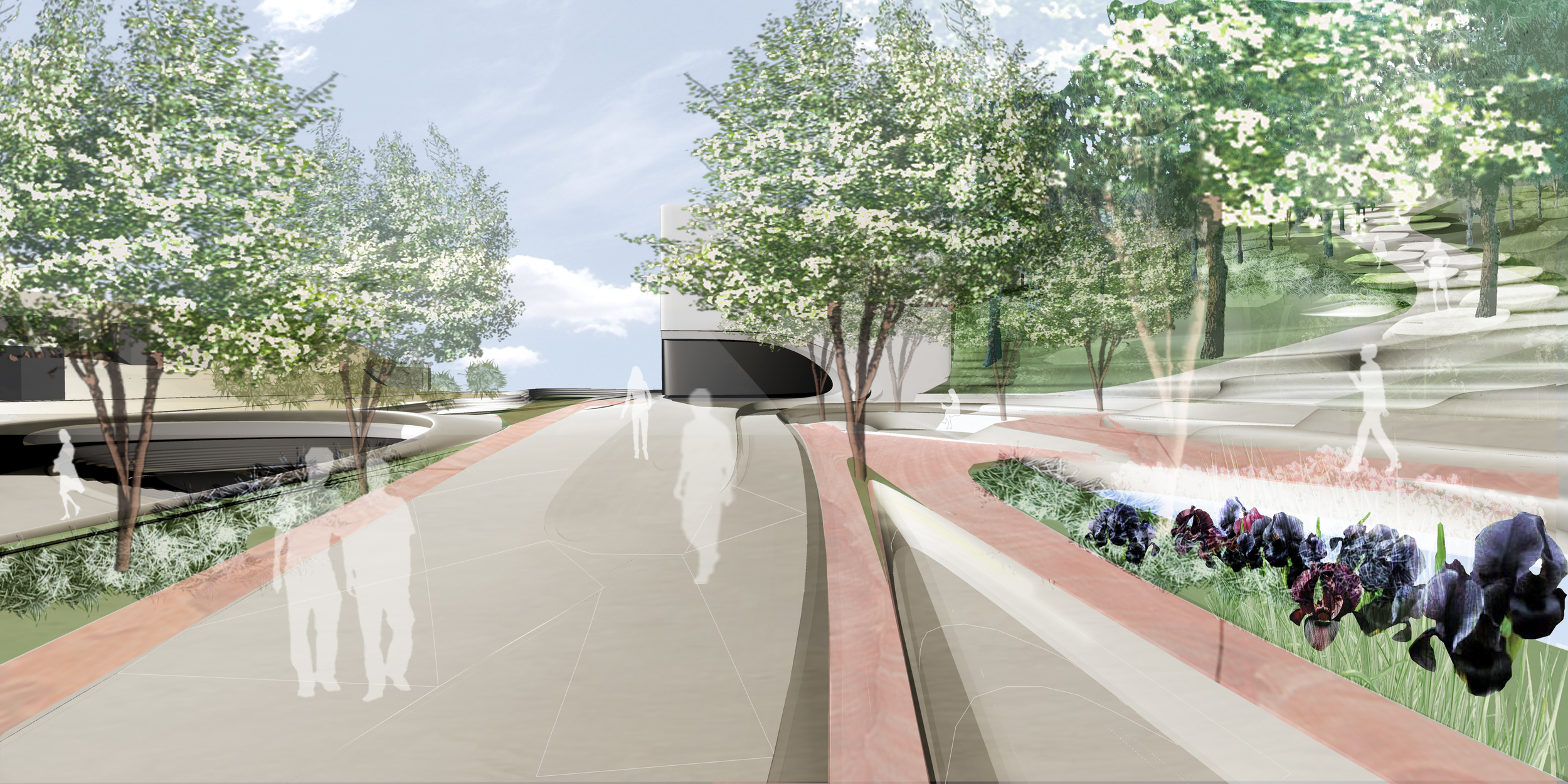
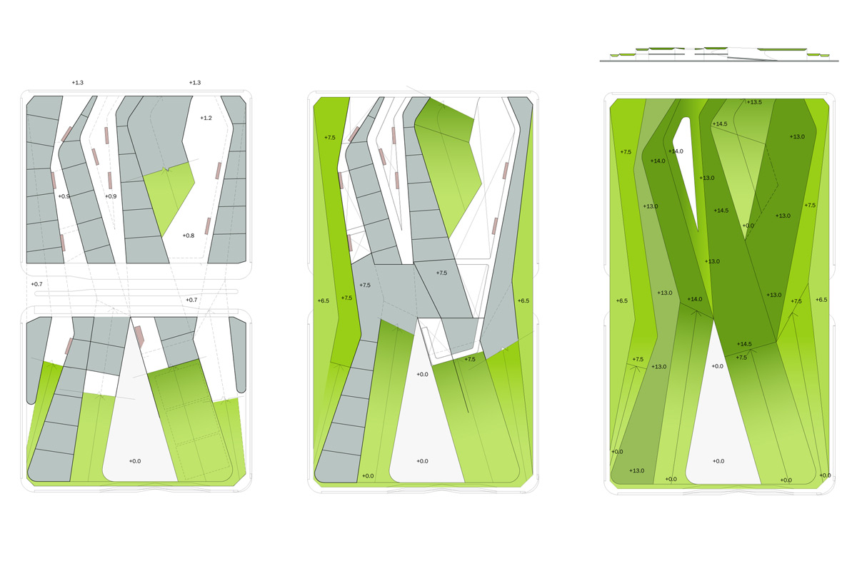
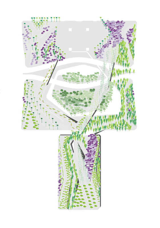
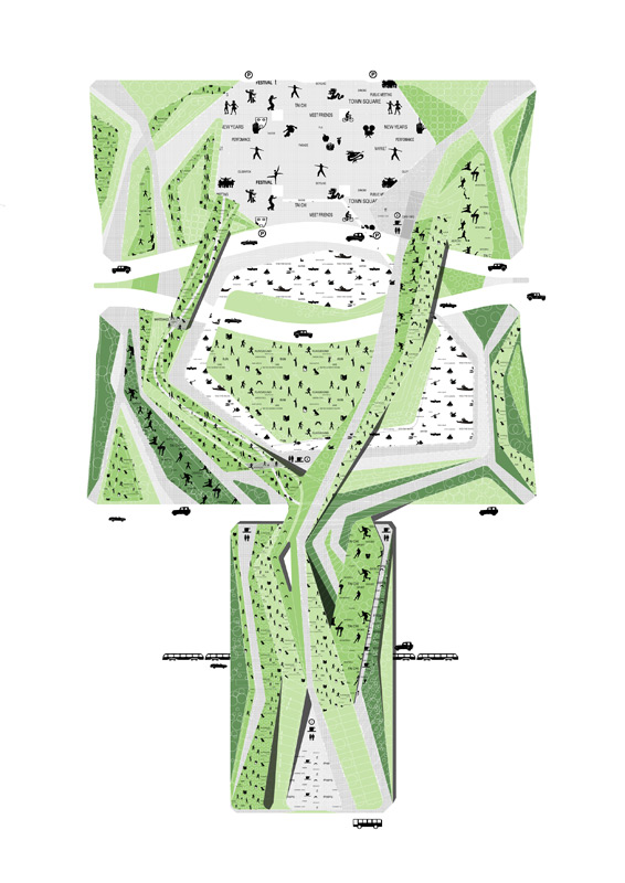
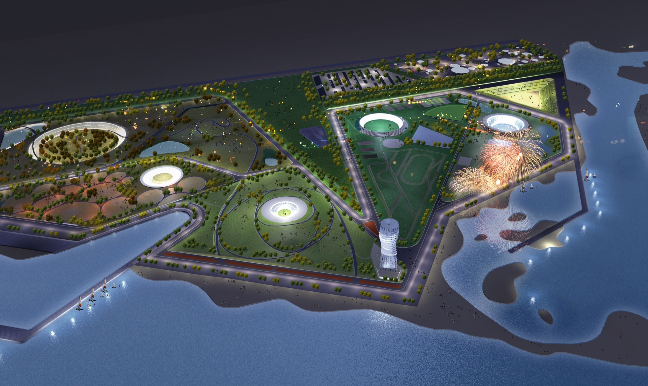
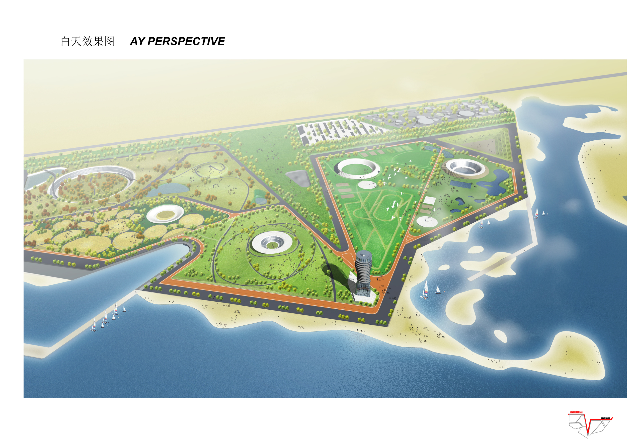
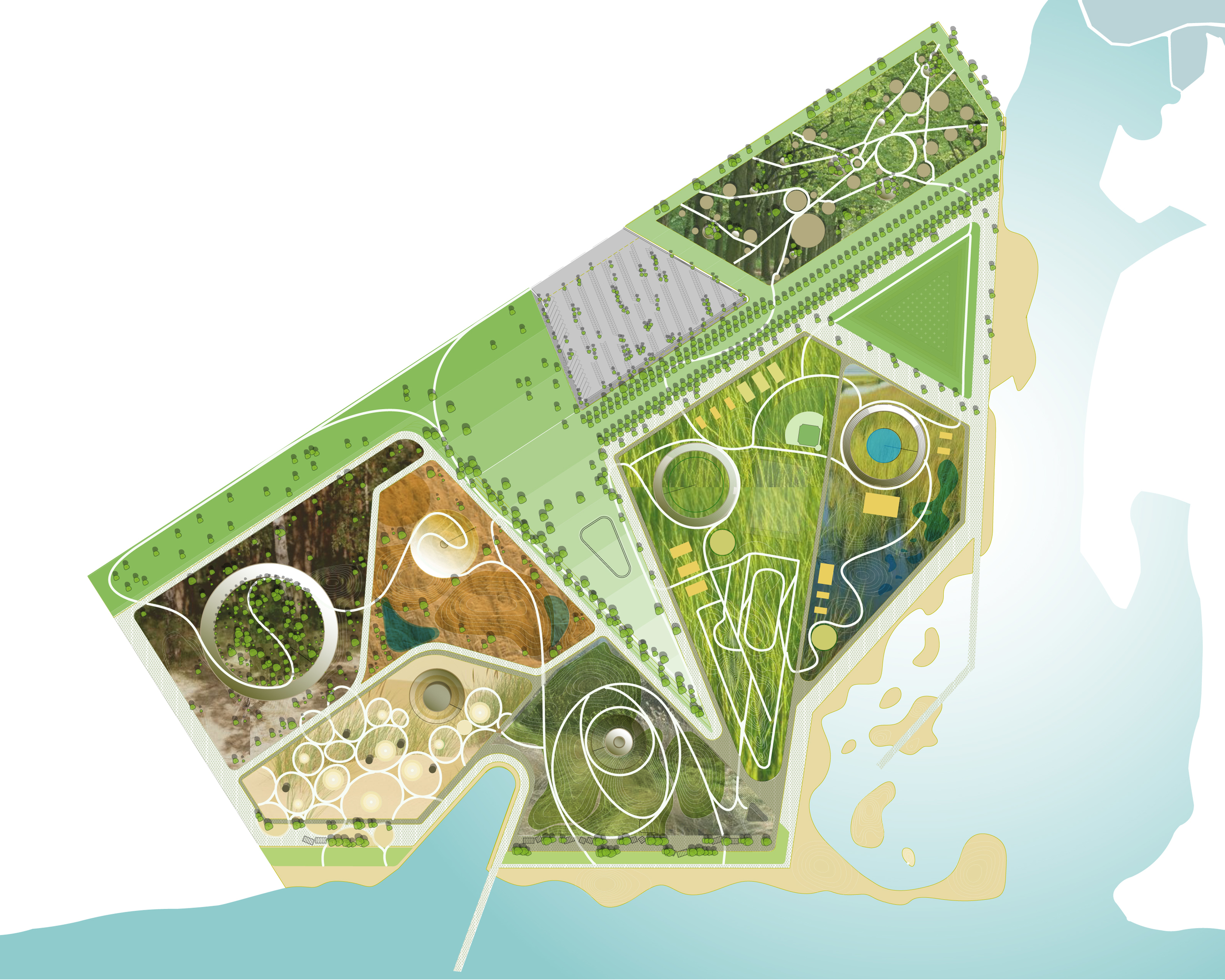
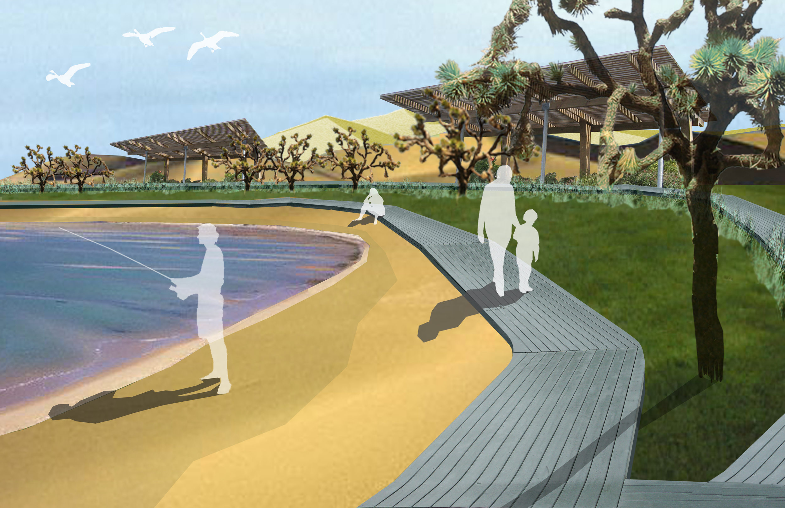
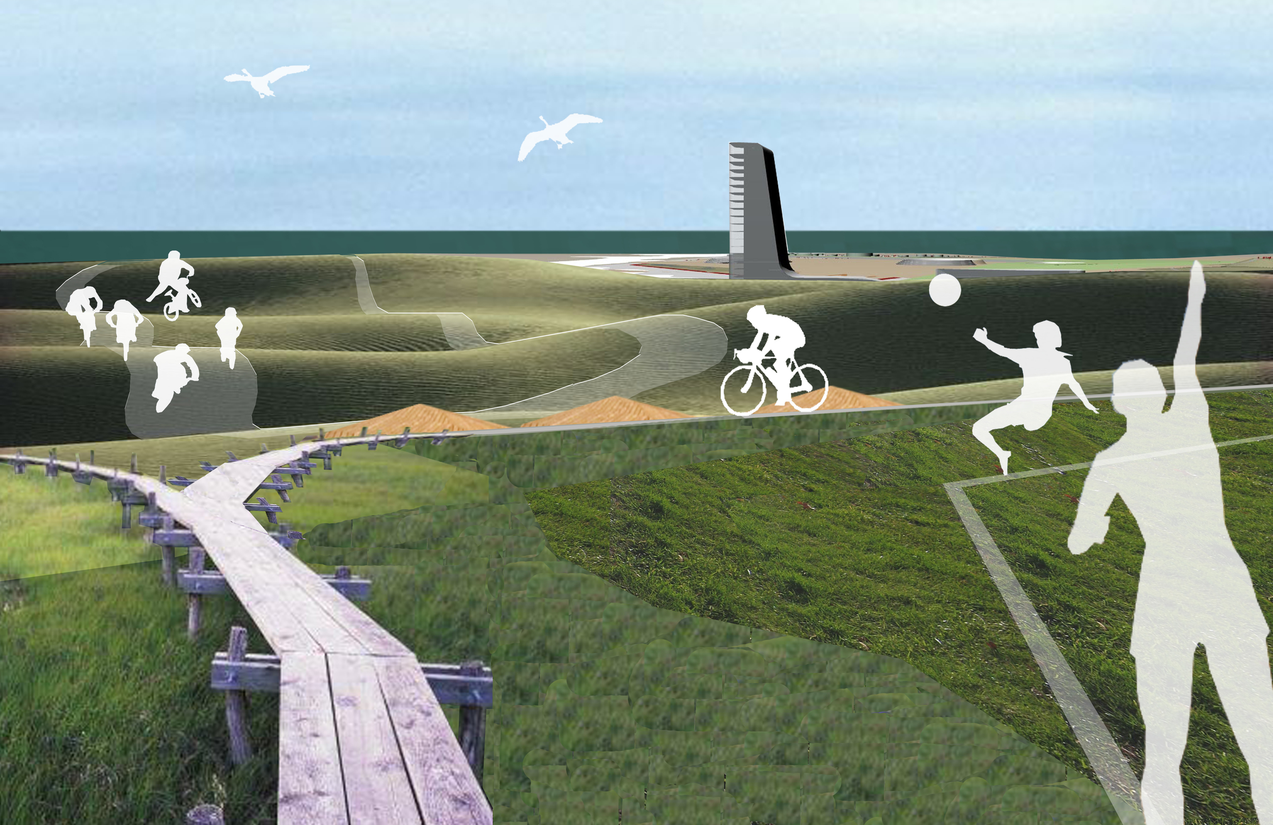
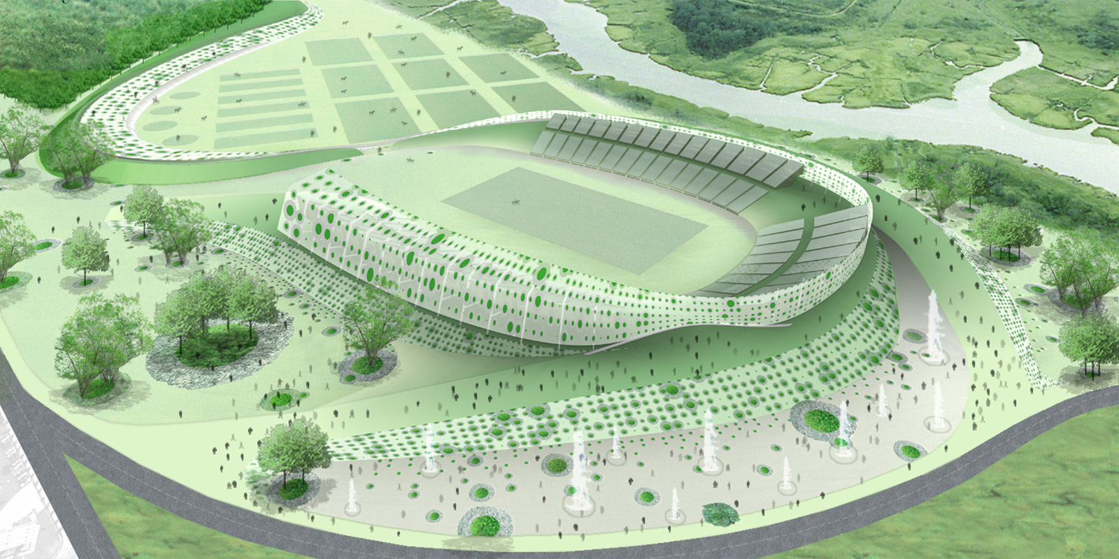
Equestrian trails and pedestrian paths are laid across the Greenbelt Park of Staten Island, the proposed site for the 2012 Olympics equestrian venue. These paths connect to existing paths in the park, establishing a wide network that further links it to the various adjacent neighborhoods.

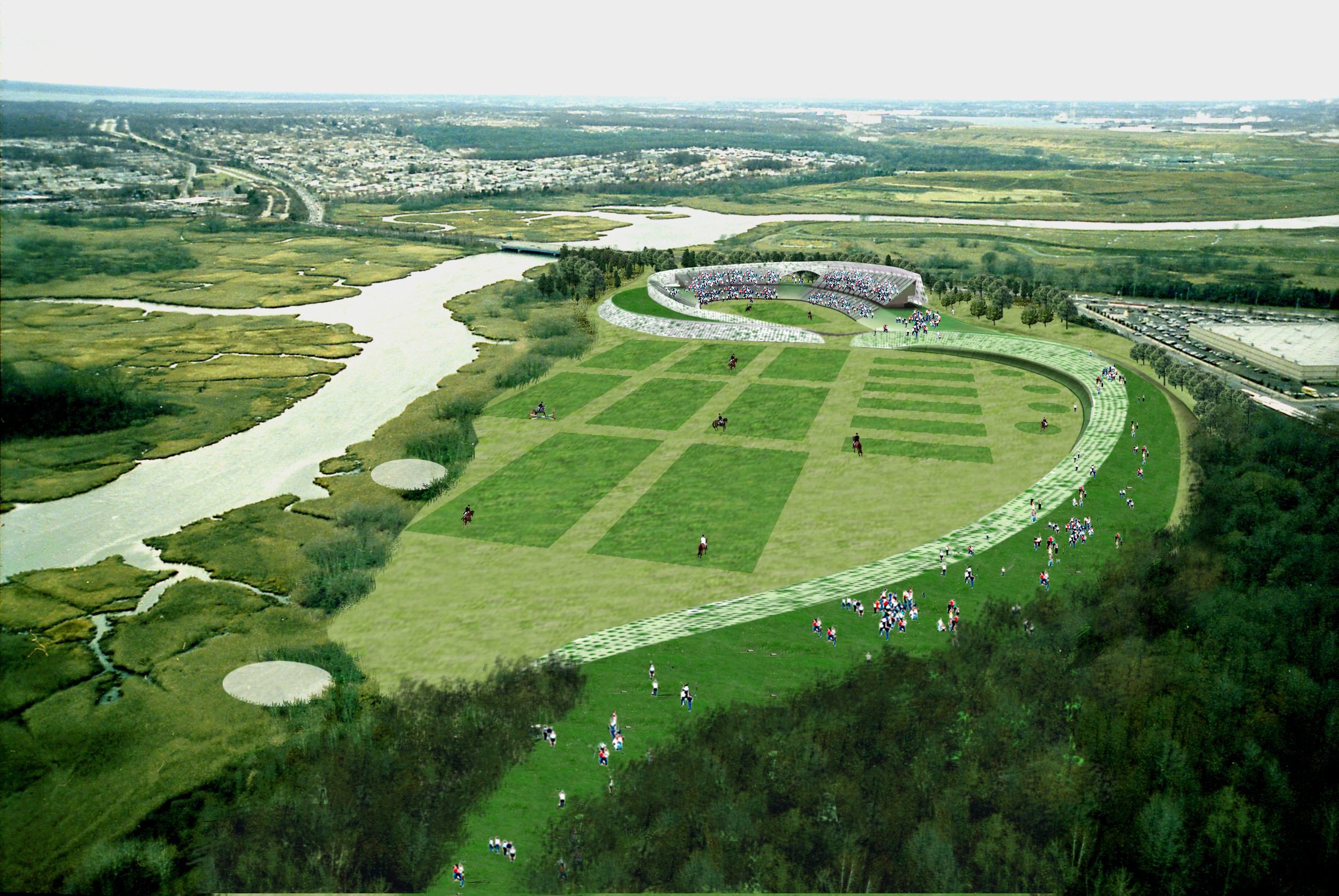
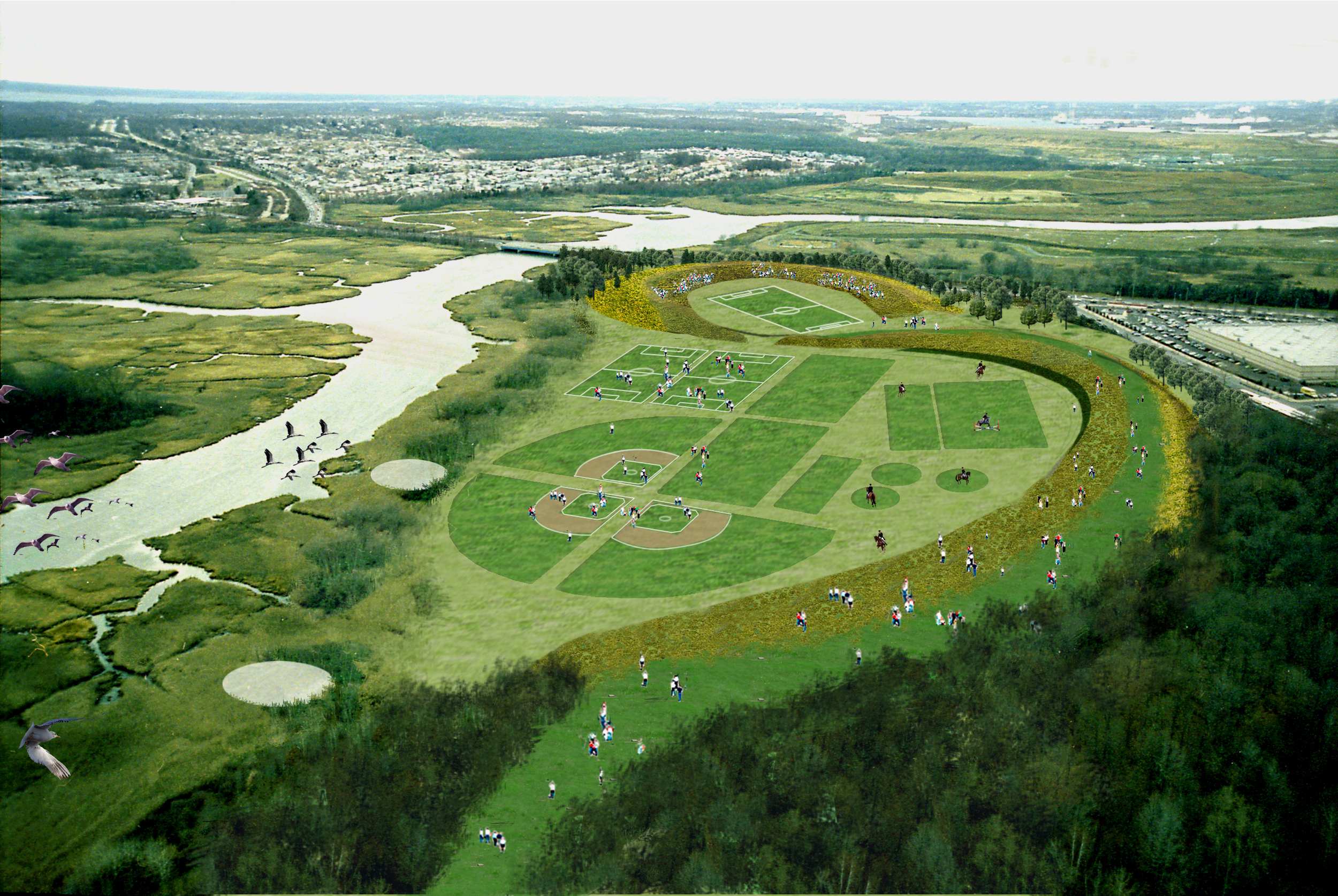
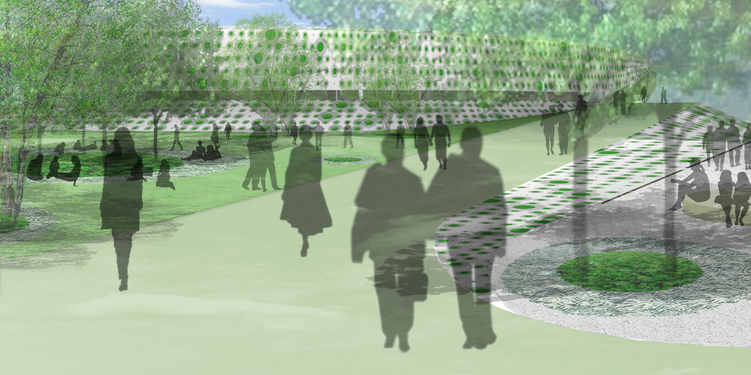
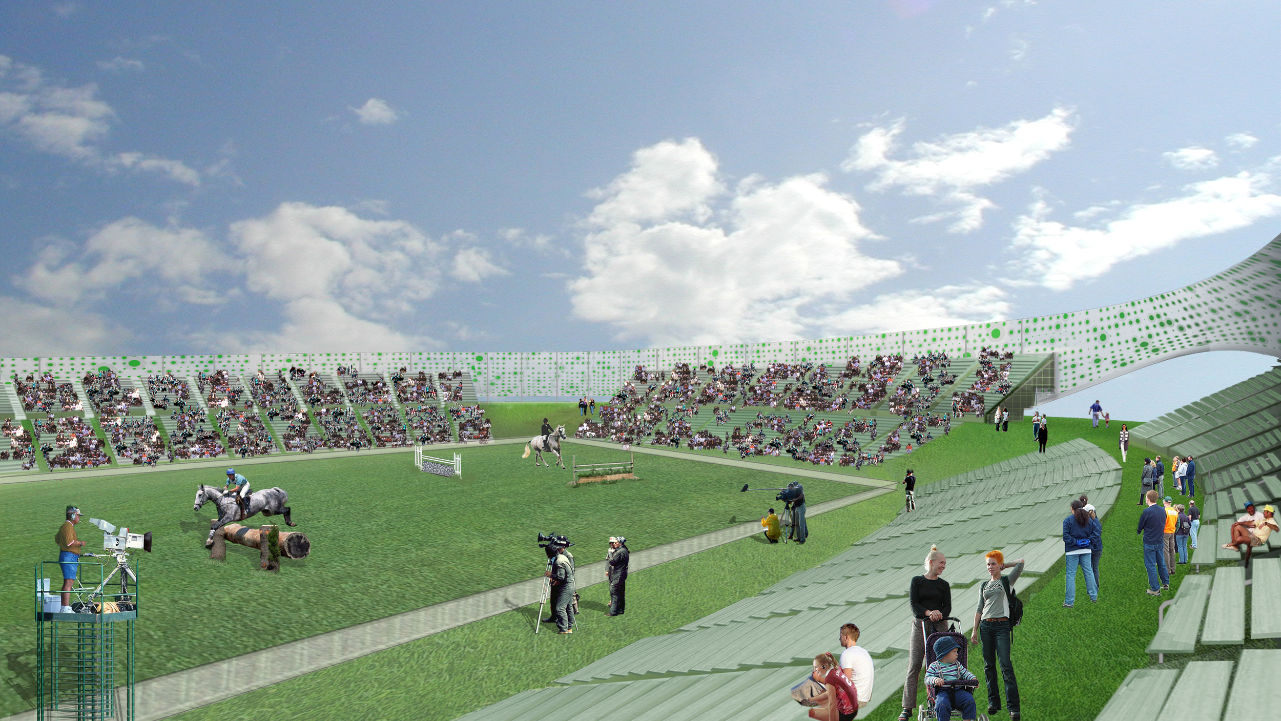
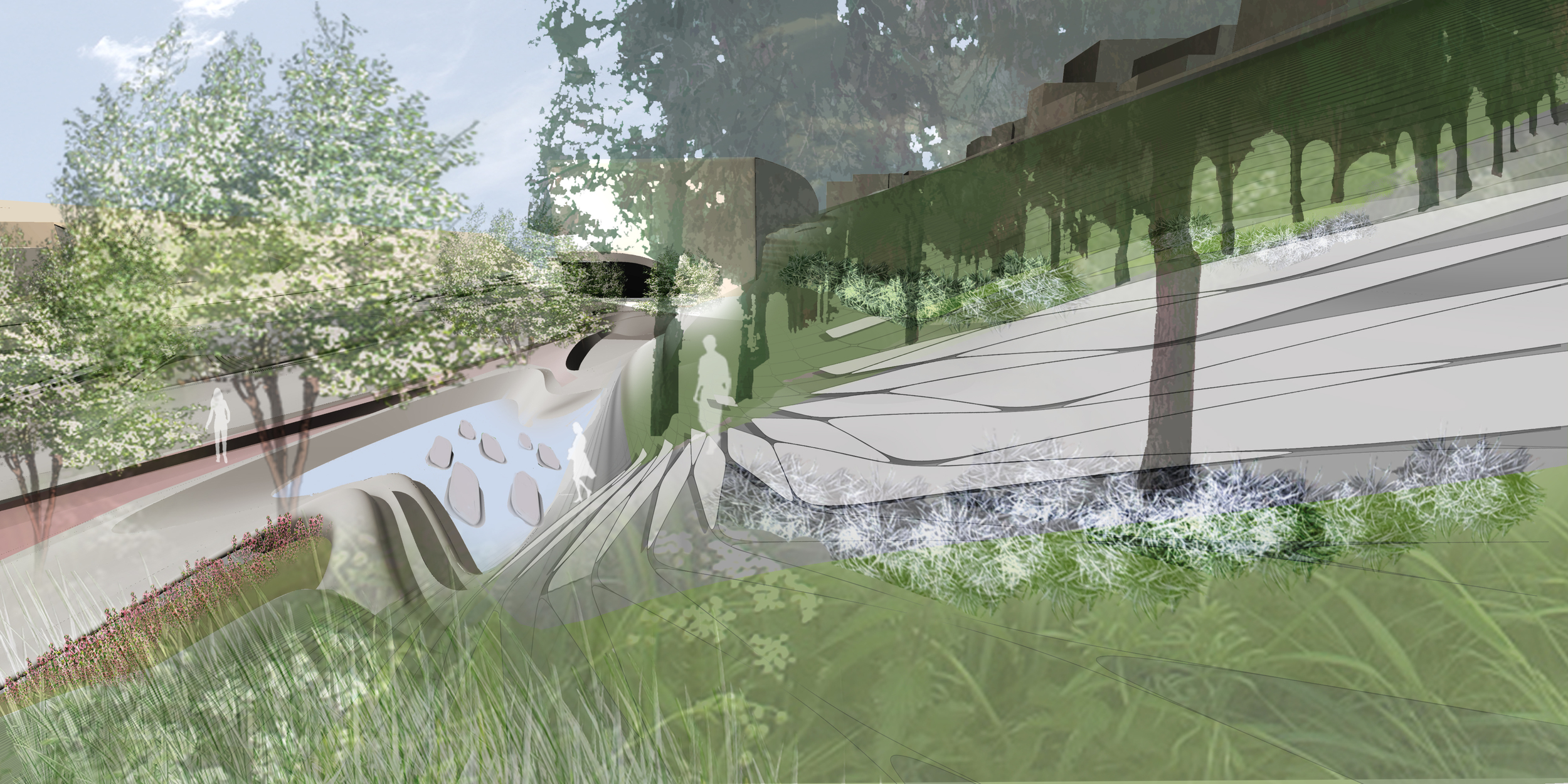
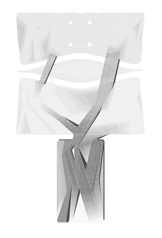
A sculptural earth mound provides an elevated pathway from which various events can be seen, and it organizes the layout of the venue grounds. It encloses the arena, creating a shelter from wind and flood, its slopes providing comfortable seating for spectators. In addition, it sets up the relationship between the ‘front of house’, the area that is accessible to spectators, and ‘the back of house’ area that is restricted to equestrian-related activities.

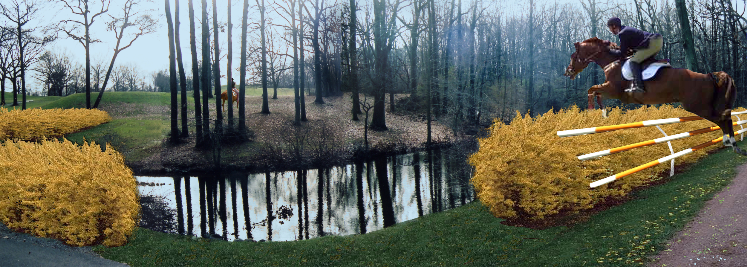
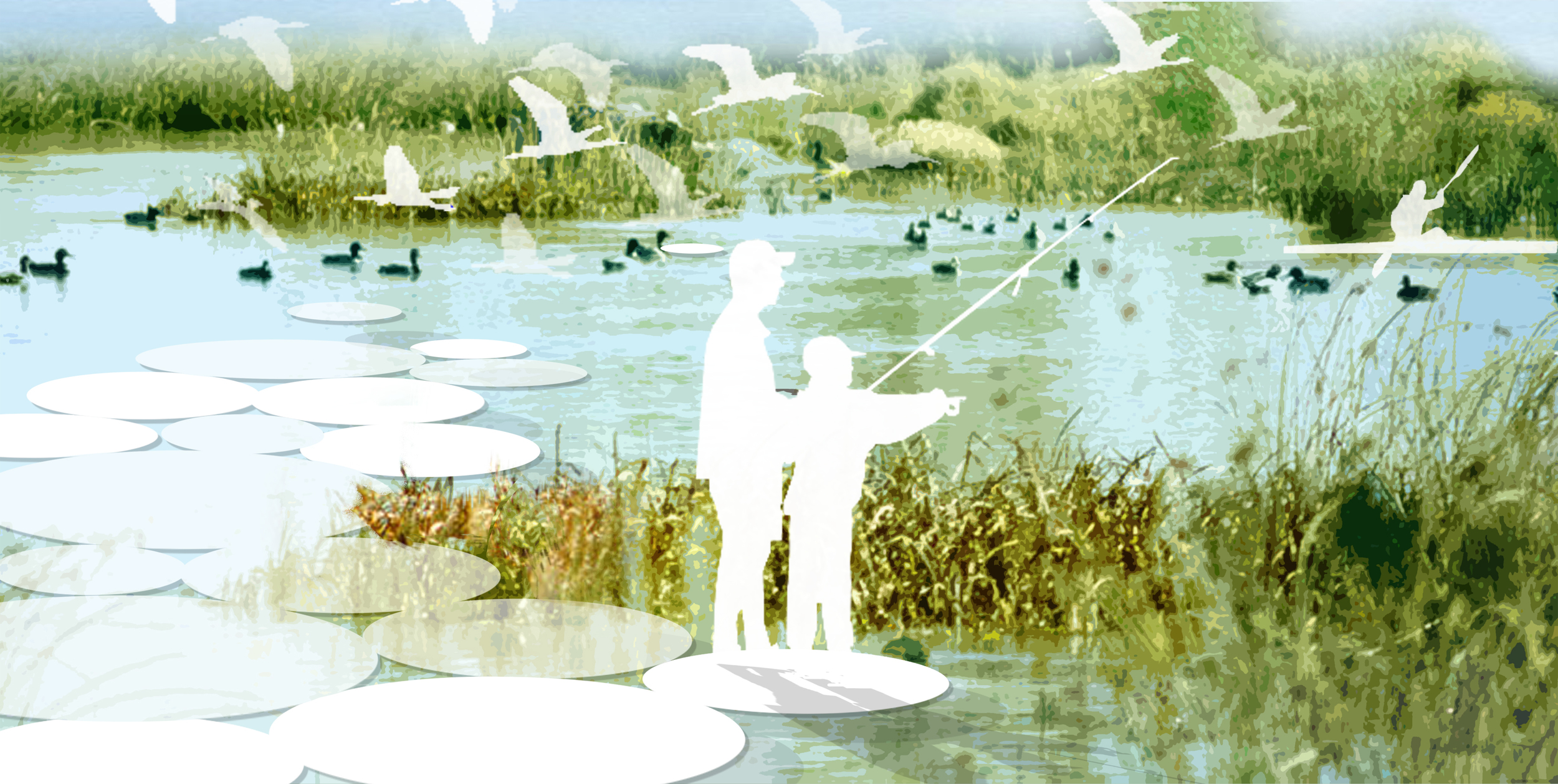
Past Olympic grounds have dictated strict separation of the two areas; this proposal, however, rethinks that philosophy. Functional separation is maintained through an elevated mound and a water channel that simultaneously allows perceptual integration with unobstructed views into these restricted areas.

After the Olympic Games, facilities such as the grand arena and stables would remain on the site and be incorporated into the Park as permanent elements to support further equestrian activity. Other facilities would be removed or re-programmed to fit the community’s needs. 


Chubu Cultural Center and Museum

2000 - Kurayoshi, Japan

Chubu Cultural Center and Museum

Kurayoshi, Japan

CLIENT Prefecture of Tottori / STATUS Completed 2000 / SIZE 20,000 square meters 210,000 square feet / DESIGN TEAM Balmori Associates

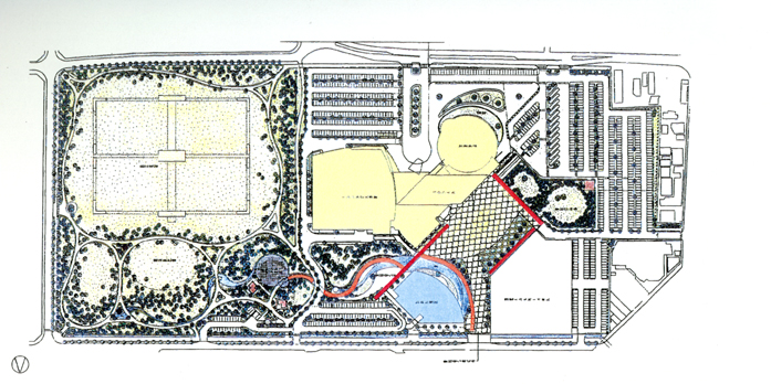
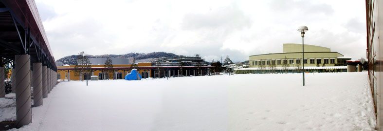
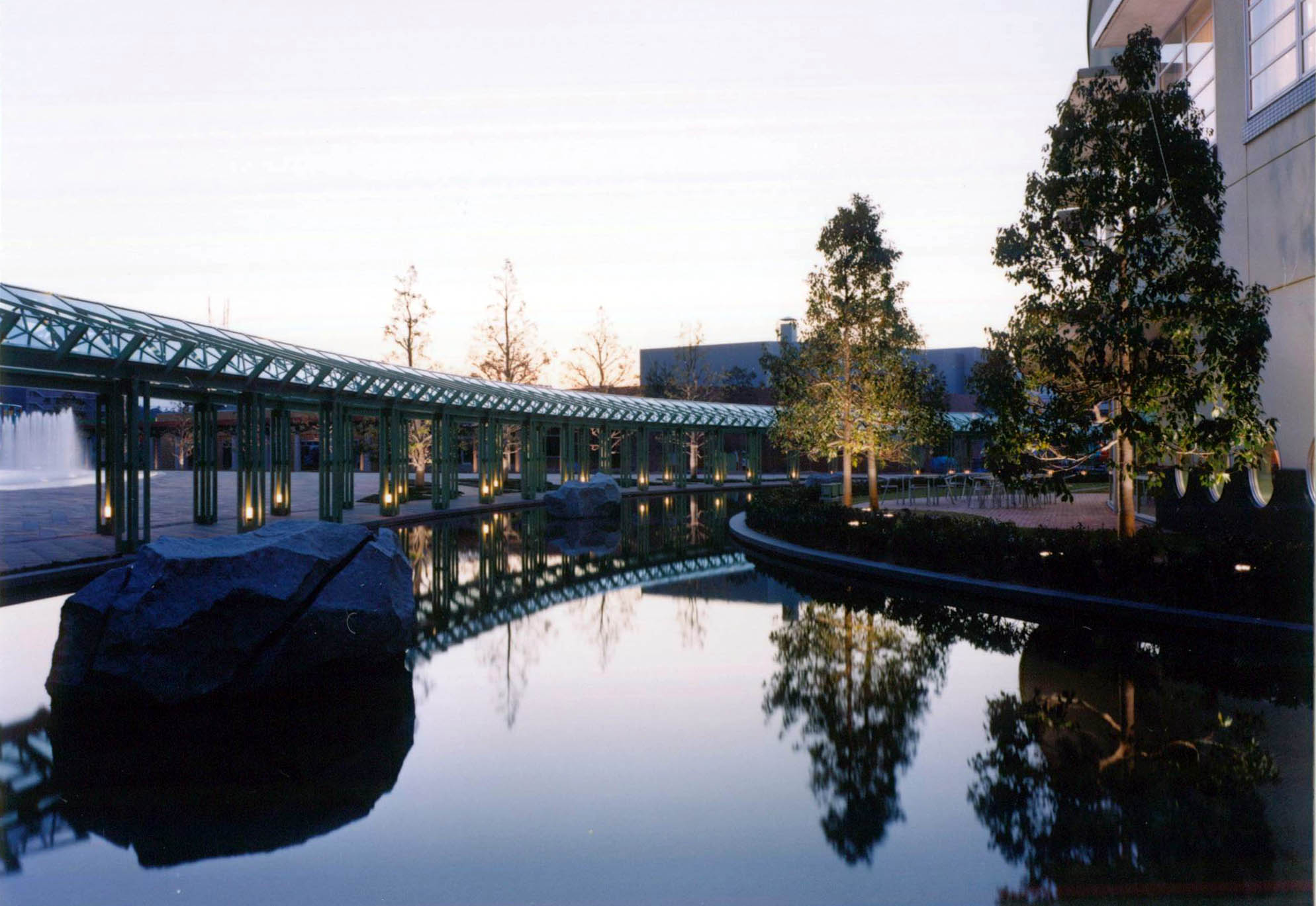
A mixed-use complex in the heart of Tottori Prefecture, the Chubu Cultural Center and Museum is intended to reinvigorate the city center and region.  The master plan for the project was designed by Cesar Pelli & Associates in collaboration with Balmori Associates.

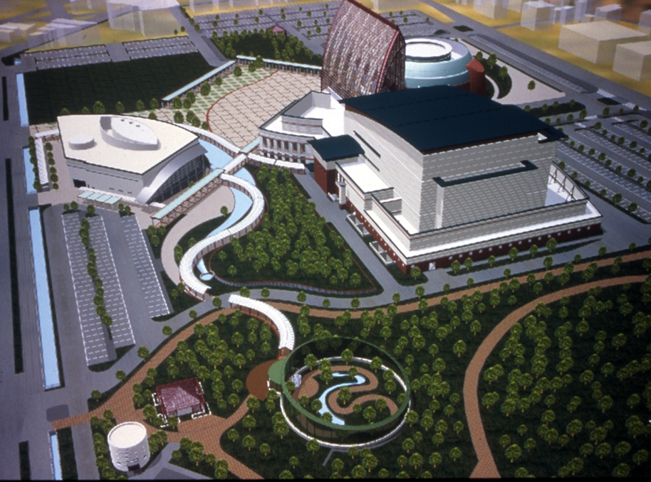
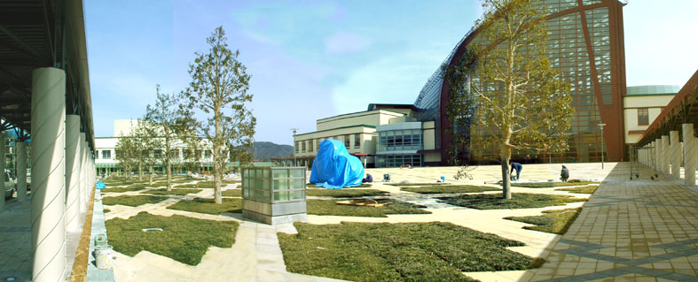
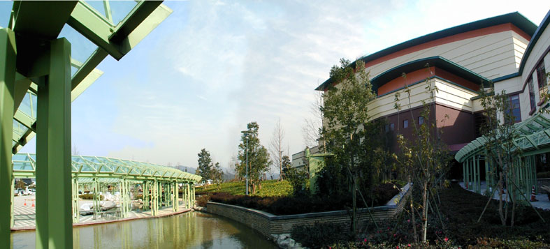
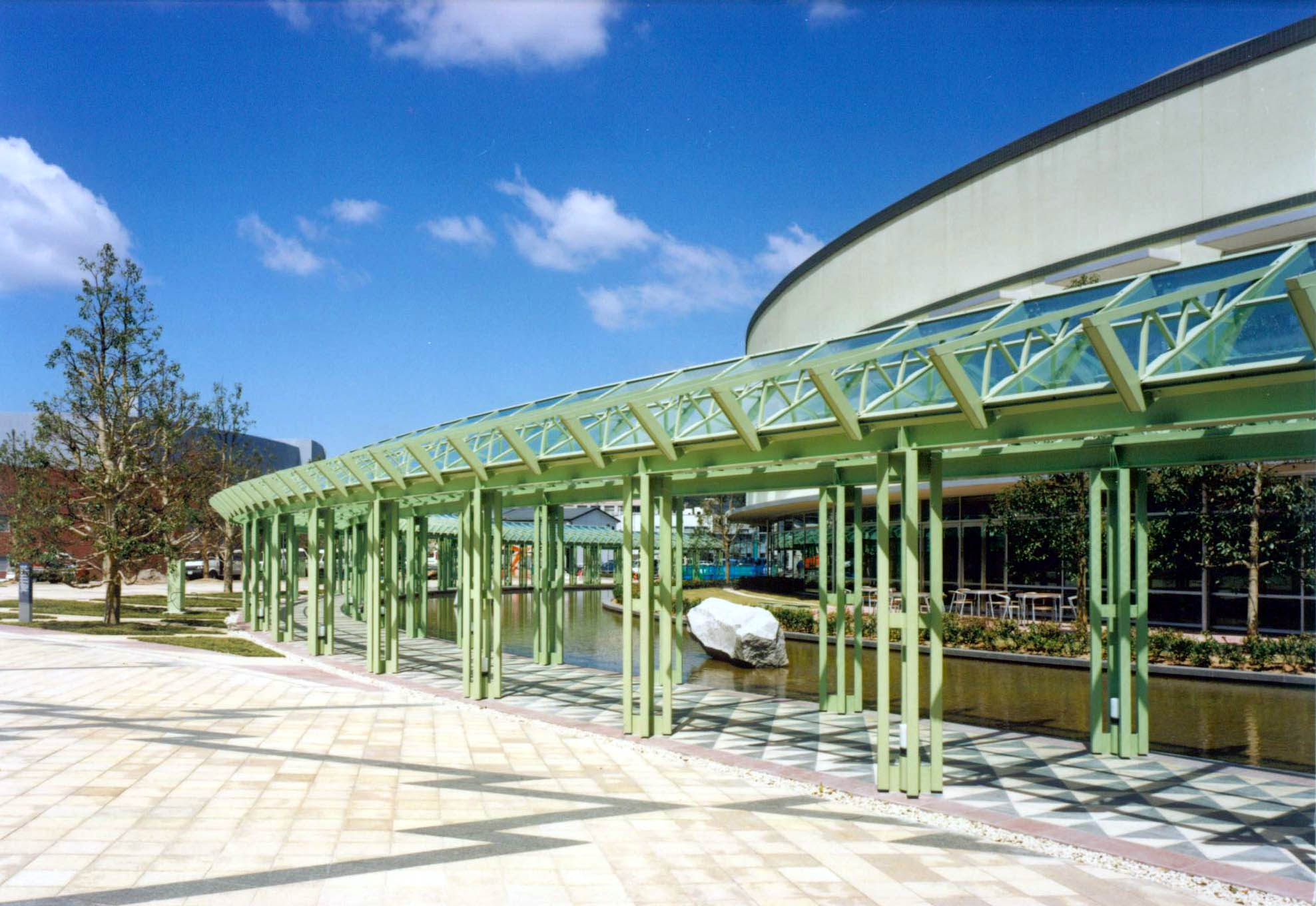
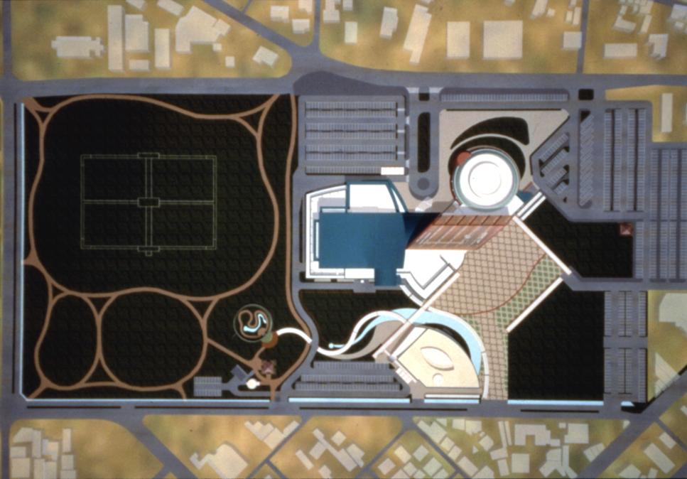
The complex comprises a Performing Arts Center, Women’s Center, Museum and two major open spaces, the Kurayoshi Commons and an Outdoor Plaza, which are connected along the property line between the City and the Prefecture.  The Kurayoshi Library, also designed by Cesar Pelli & Associates, lies north of the landscaped Plaza, adjacent to the Cultural Center.

The Performing Arts Center accommodates a 1500-seat symphony hall, a 300-seat multi-purpose theater, a large rehearsal room and support spaces.  The Women’s Center includes a communications salon, children’s center, library and a wide array of seminar rooms.

The new Museum is a showcase for Tottori’s famous “20th Century Pear”, with a seriesof exhibits dedicated to the history and cultivation of this distinctive fruit.  The facility will also support a virtual reality theater.

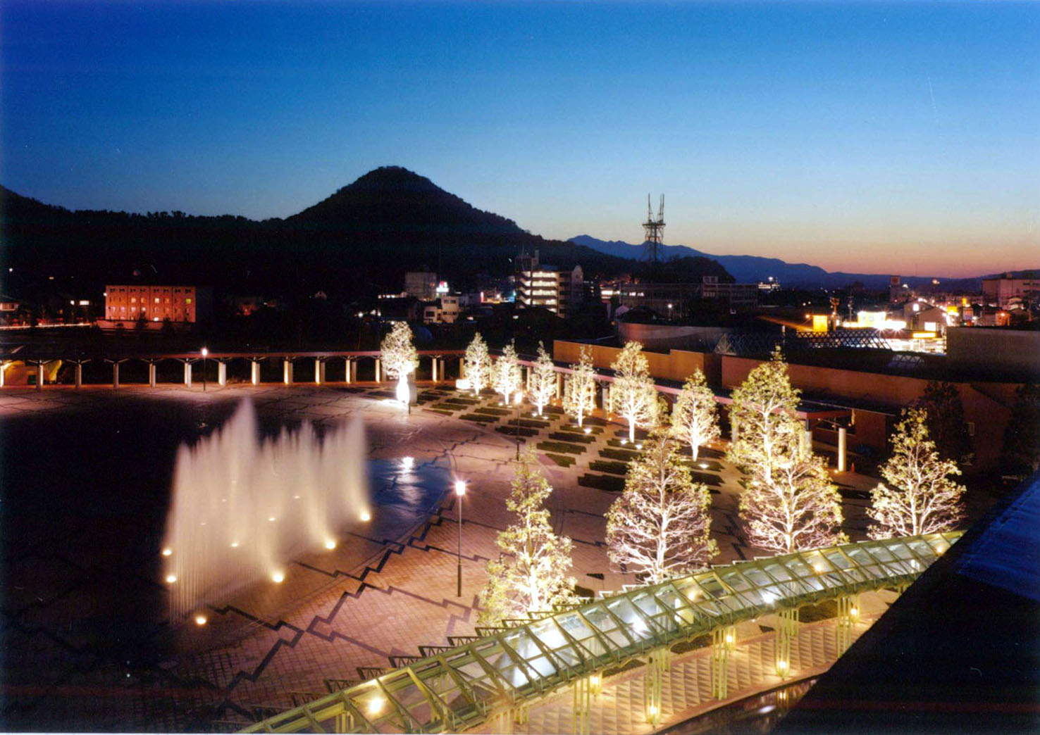
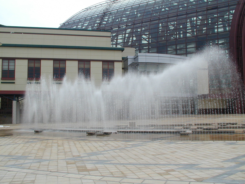
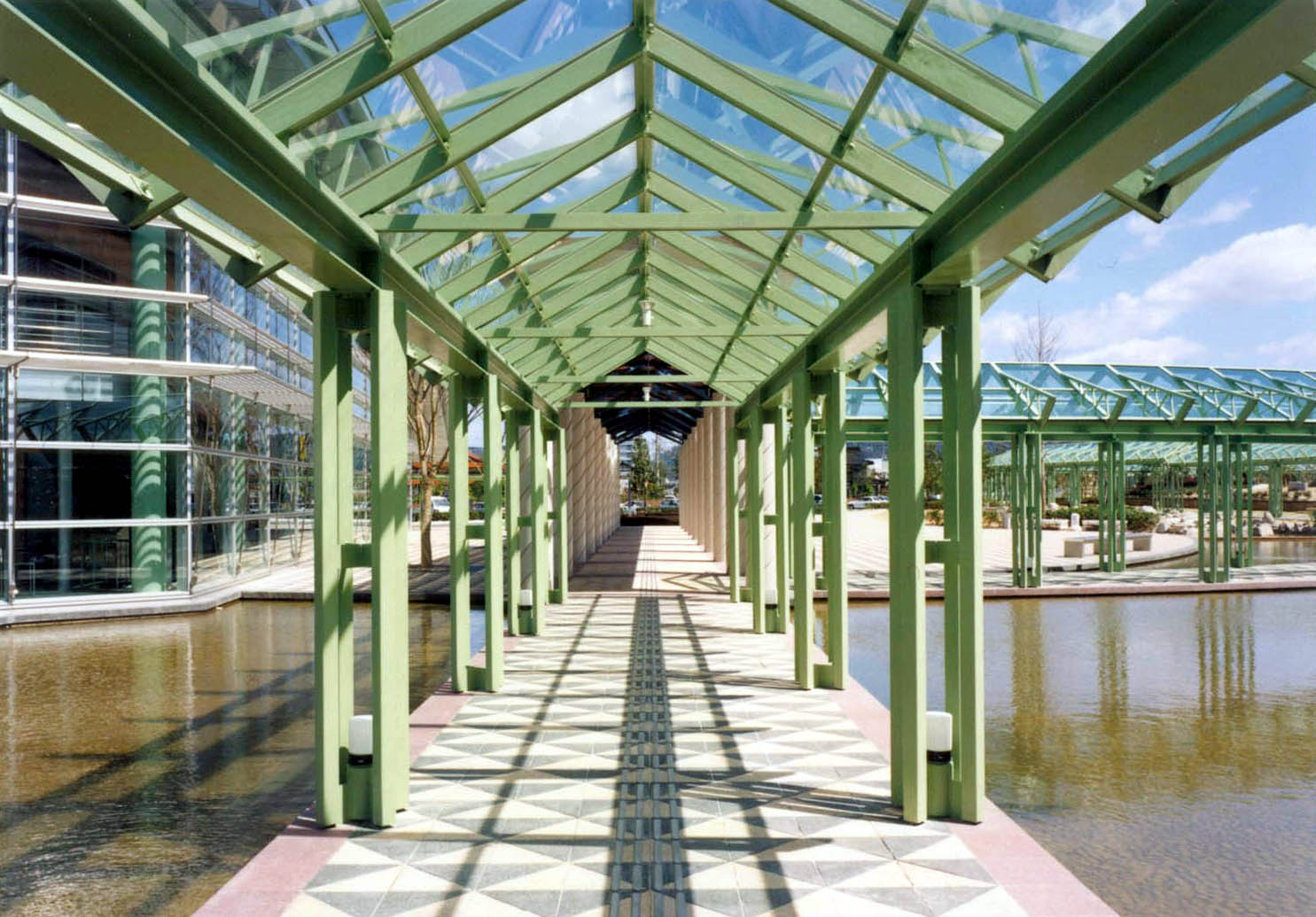
The Kurayoshi Commons, a glazed public room 42 meters in height, is the central element around which all other components of the complex are organized.  It serves as a lobby for the performing arts facilities, as additional exhibition space, and as a forecourt for the women’s center, restaurant and shops.  Its design is expressive of both the City of Kurayoshi and the Tottori region. 

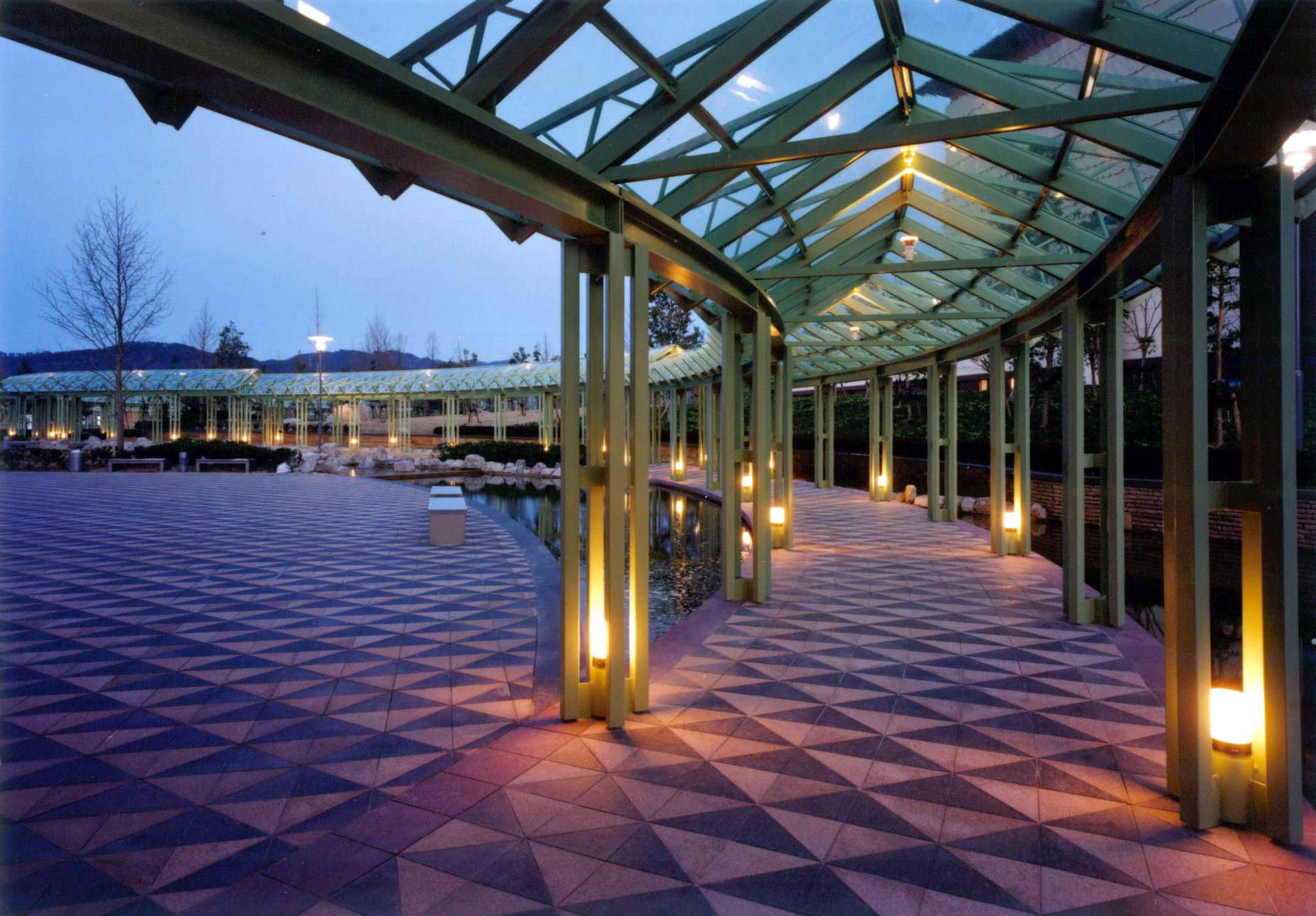
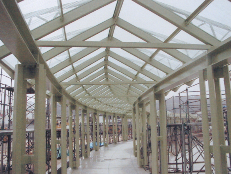
The Commons and the adjacent Outdoor Plaza offer ideal venues for public gatherings, concerts, fairs and festivals.  The diagonal plan geometry reflects the various city grids which cross the site.  The large wooden trusses that support the extensive glazing relate to indigenous construction techniques.  The paving designs  were based upon the traditional local kasuri fabrics that represented pine bark and fish scales. Nature translated into fabric that was in turn translated into granite paving.

Mobisle

2006 - New York, NY, USA

Mobisle

New York, NY, USA

CLIENT City of the Future 2016 /  STATUS Competition Finalist 2006 / DESIGN TEAM Balmori Associates, Joel Sanders Architect, Consulmar 

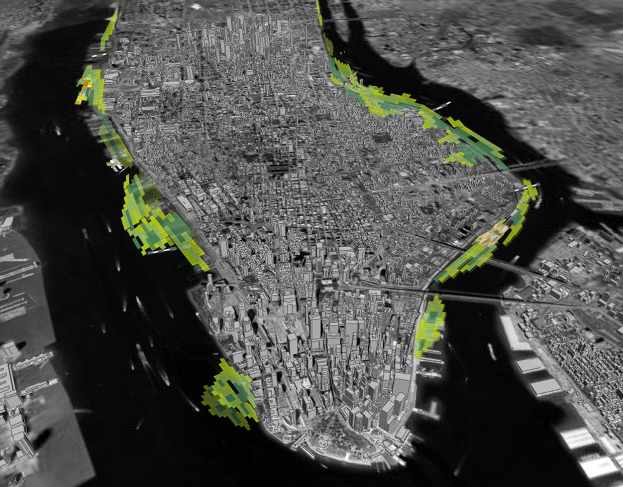
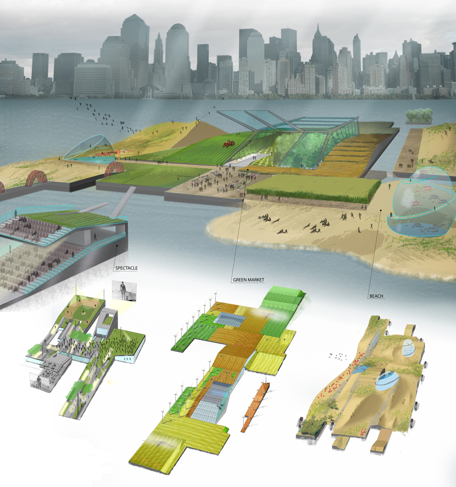
Manhattan, by means of an elastic coastline, could become the most flexible and changing of cities over the next hundred years. Climate Change, with its raised level of waters in the Hudson and East Rivers, will bring about loss of shoreline. MOBIsLEs, a fleet of self-propelled islands that circulate around the periphery of Manhattan, can accommodate incremental change over the short and the long term. Our engineering proposal consists of a kit-of-parts built in a factory and literally shipped to the waterfront, composed of modular strips 50 ft. wide and eight ft. deep for open space and 150 ft. wide and sixteen ft. deep for built space. Through the use of water turbines with generators some of these islands can be self -propelled, others can harness the energy of the water to power their programs. Inspired by the logic of dominoes these modular strips come in 20 profiles that can be reassembled to achieve a variety of topographies. MOBIsles can overlap the coastline where the shore permits or they can link with an urban fabric by means of bridge-like extensions of existing street located at major east-west thoroughfares along the length of Manhattan. These access docks would function as recharging stations both for vehicles and for islands themselves.

Miami Performing Arts Center

2007 - Miami, FL, USA

Miami Performing Arts Center

Miami, FL, USA

CLIENT Performing Arts Center Foundation /  SIZE 5.8 acres / STATUS Completed 2007 / DESIGN TEAM Balmori Associates, Pelli Clarke Pelli

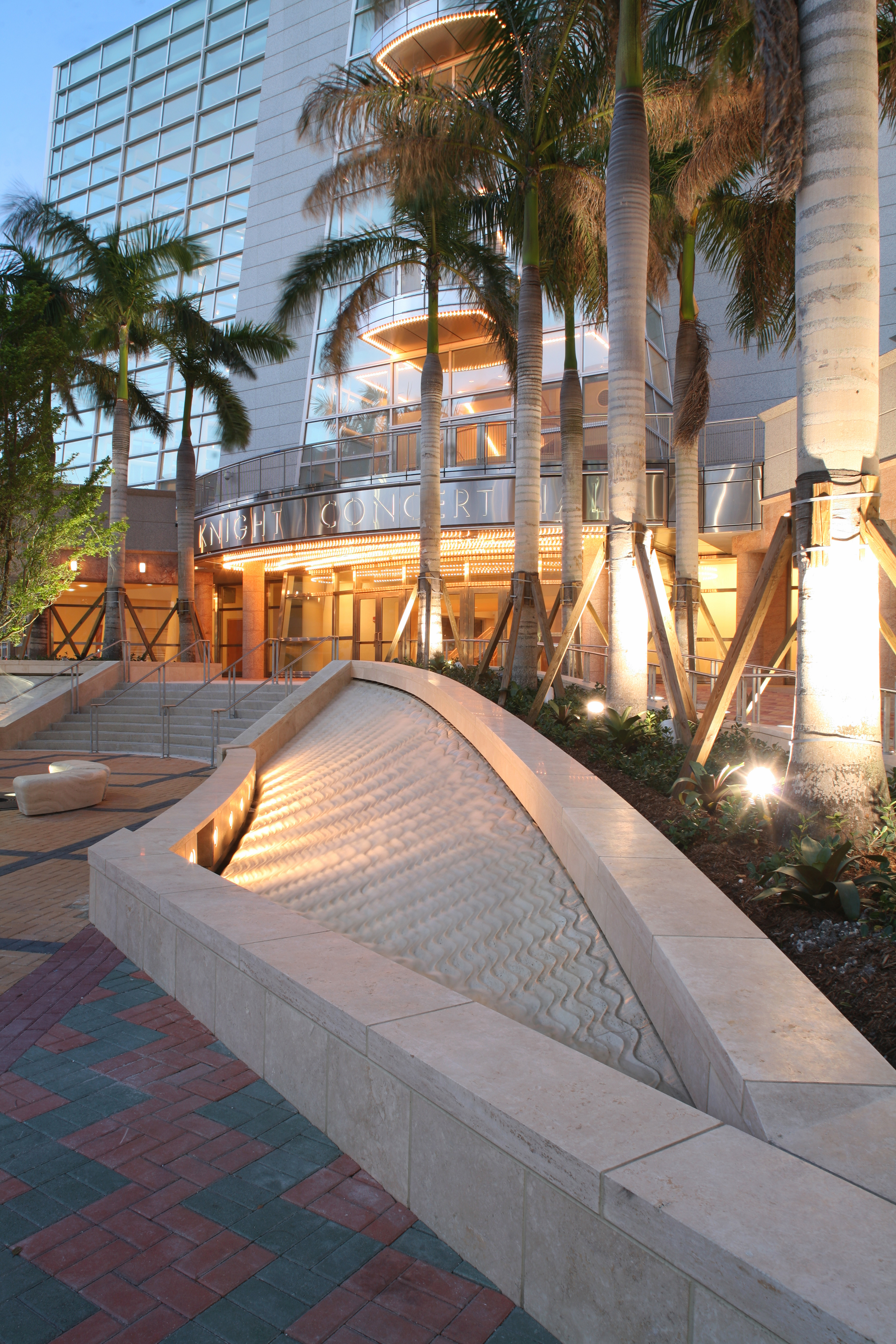
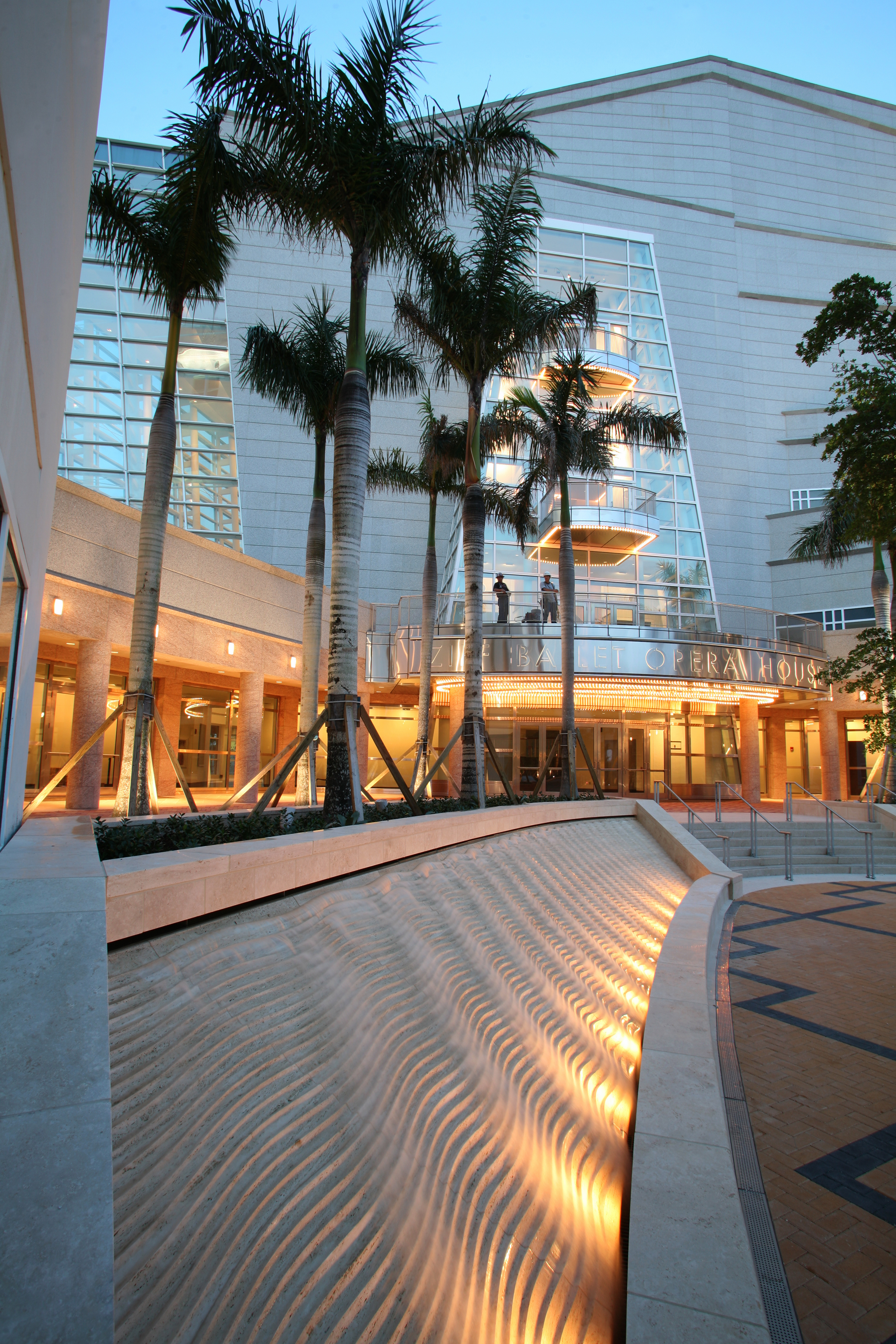
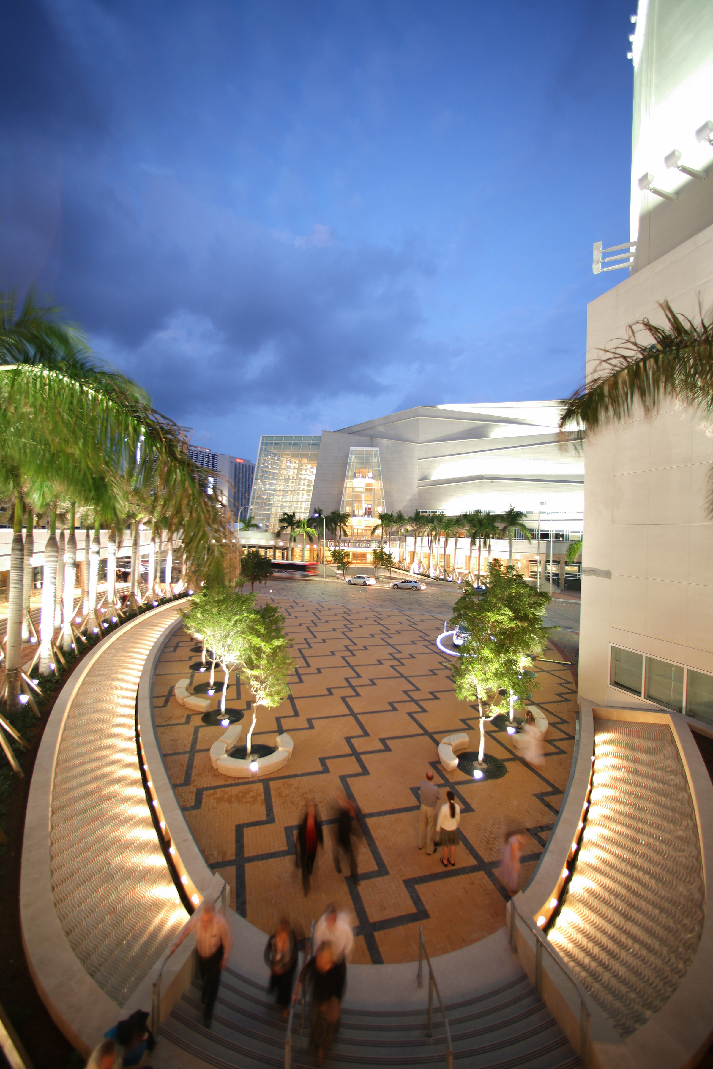
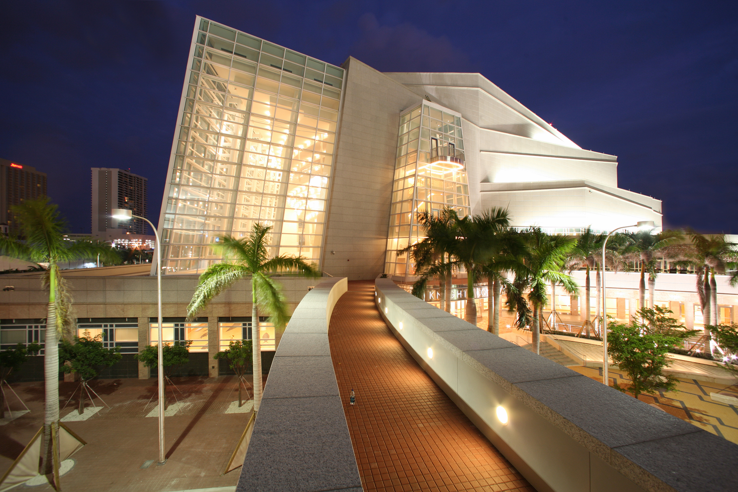
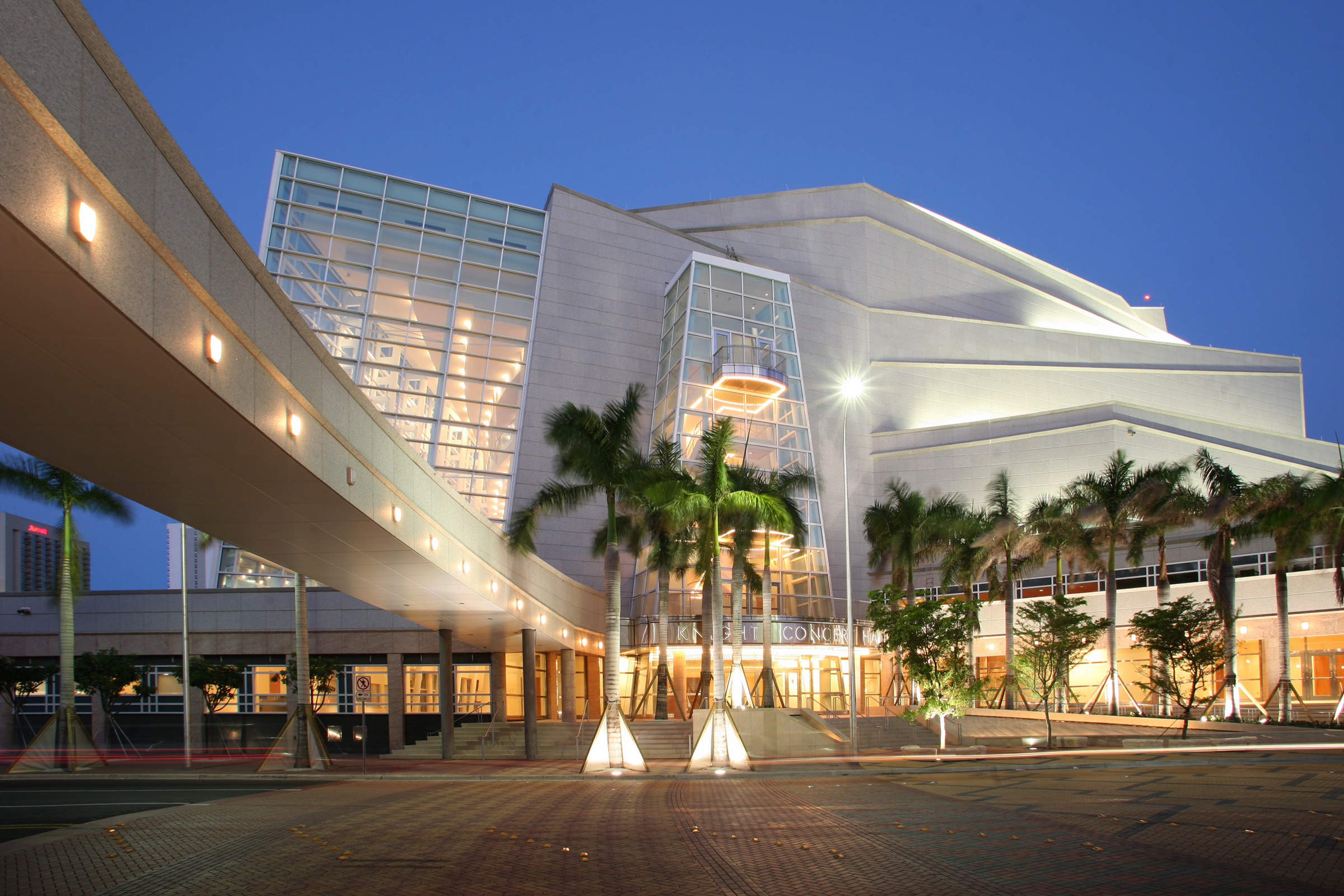
The Performing Arts Center, a catalyst for a large urban revitalization project, is located within the Miami-Dade Empowerment Zone and houses a planned arts, media and entertainment district for Miami’s Omni-Venetia area. The Central Plaza for the Arts, designed by Balmori Associates, links the opera house, symphony hall, theatre, and Art Deco tower that sit on either side of the Biscayne Boulevard.  This urban plaza bisects Biscayne Boulevard, thereby creating connectivity between the built forms.  A wide variety of social and cultural public life is supported by the Plaza. 

Furthermore, it can transform from two courts bisected by vehicular traffic into a continuous outdoor plaza for outdoor events when the street is closed.  Landscape elements mitigate the changes in elevation, distinguishing elements from each other while creating transitions between others. Rings of plants and fountains at the plaza’s edge provide a transition between the street and buildings, which are elevated for purposes of flood protection. The fountain, designed by artist Anna Murch, draws upon wave paths to create a space that is animated even in the absence of water.

Metis Garden Festival

2011 - Grand-Métis, Quebec, Canada

Metis Garden Festival

Grand-Métis, Quebec, Canada

CLIENT Metis International Garden Festival, Reford Gardens / SIZE 150 m2 / STATUS Completed, 2011 / DESIGN TEAM Balmori Associates / Consulmar S.R.L / Denis Pelli, Professor of Psychology and Neural Science, New York University

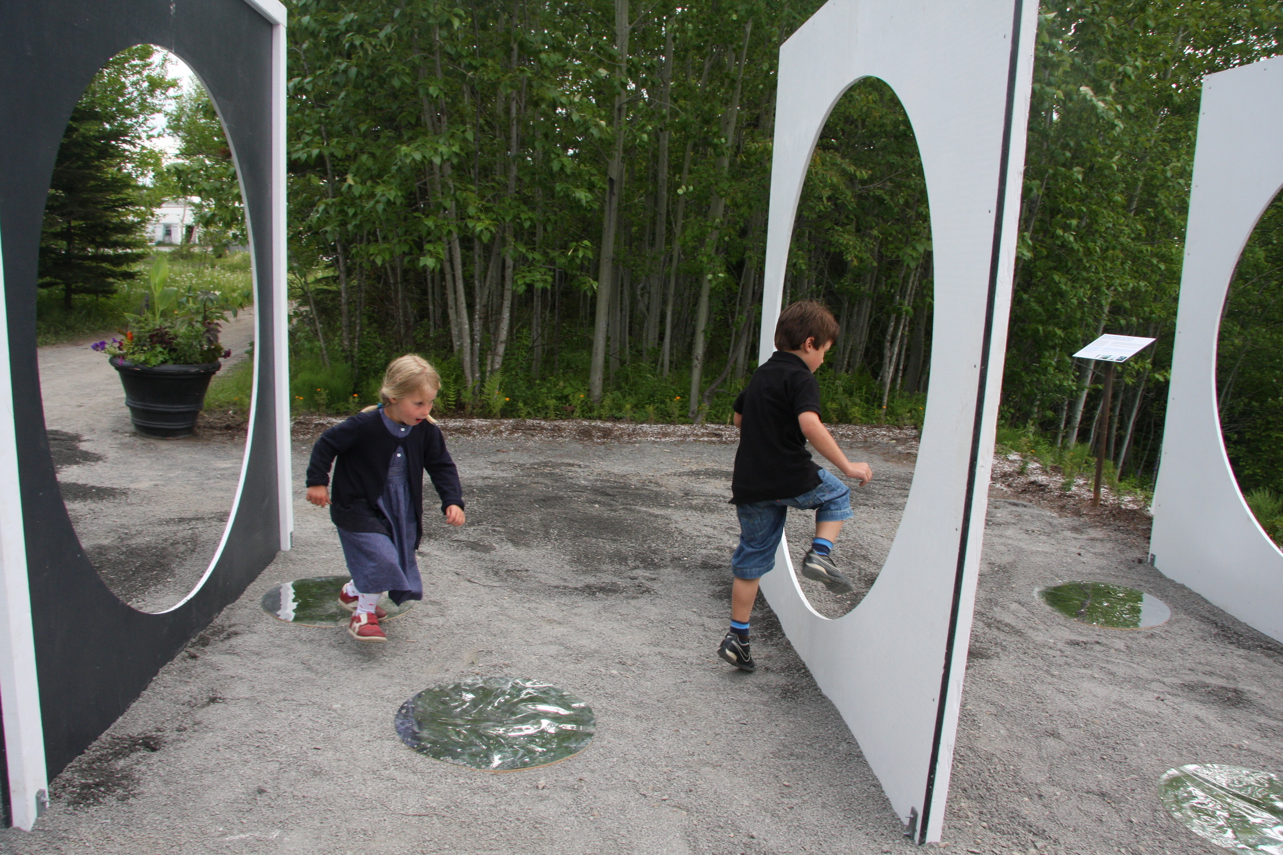
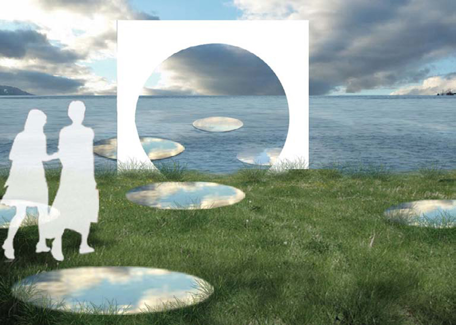
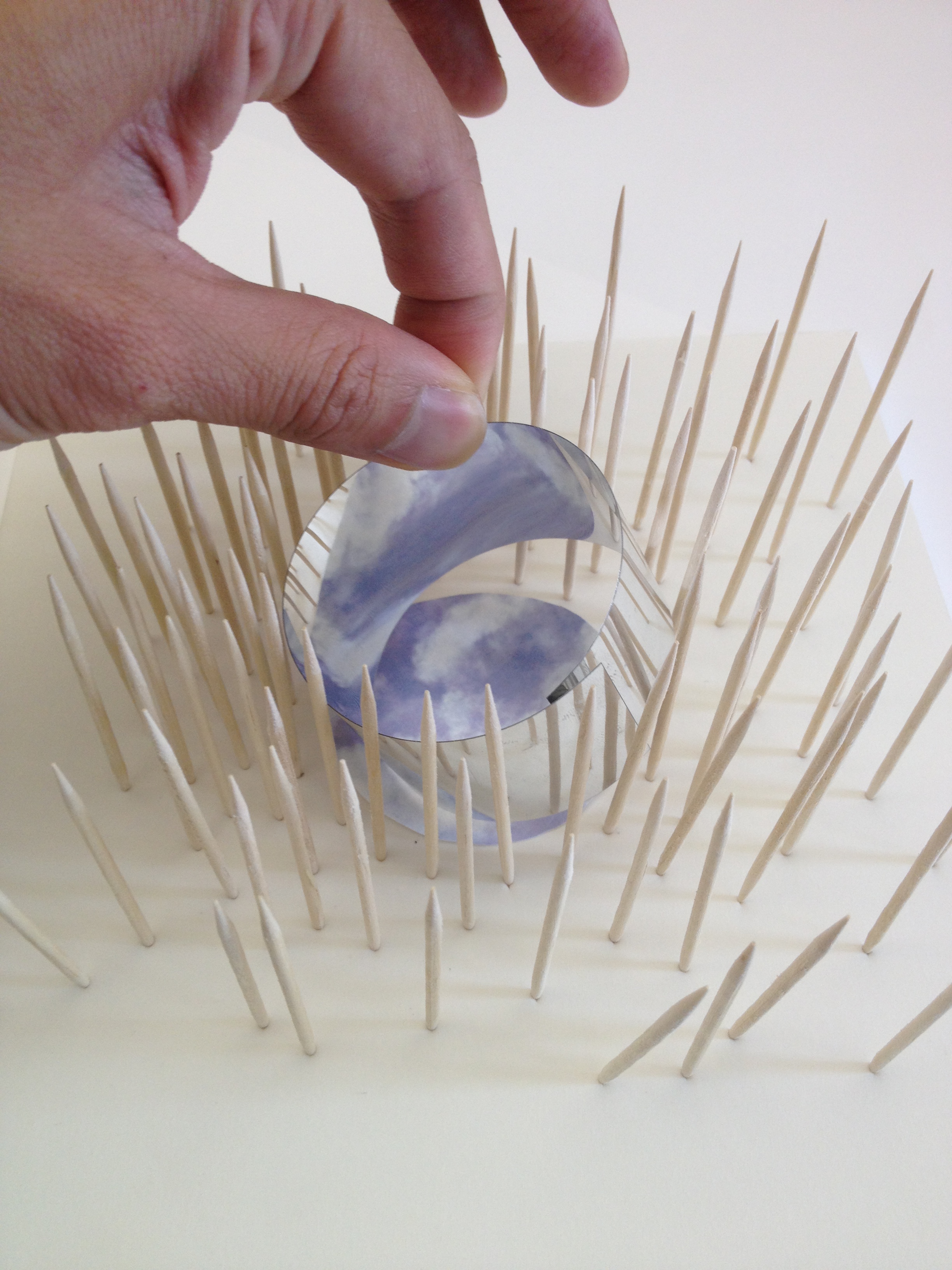
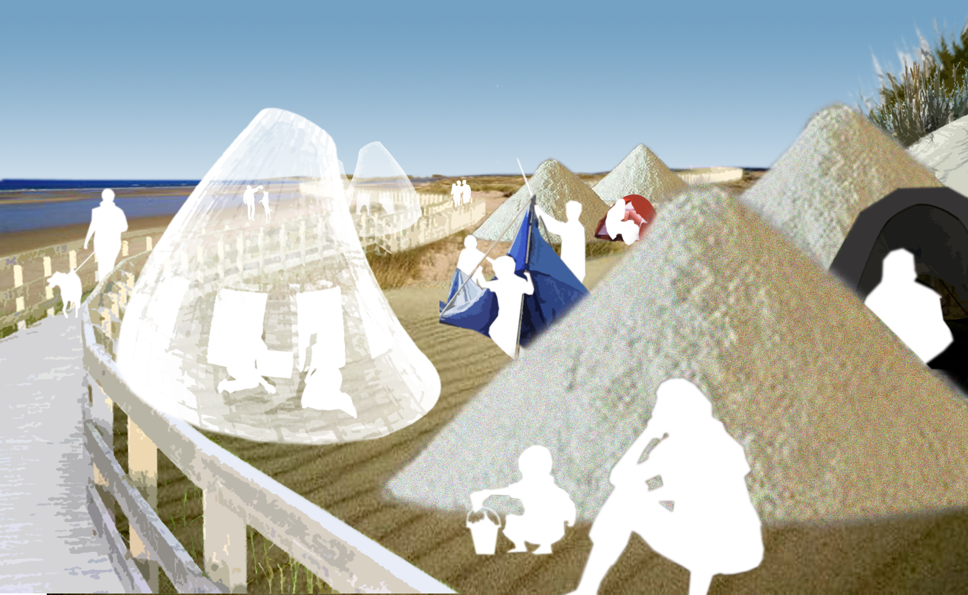
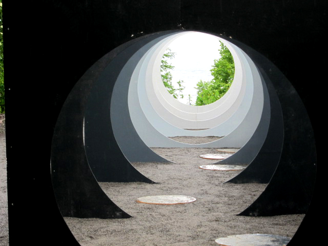
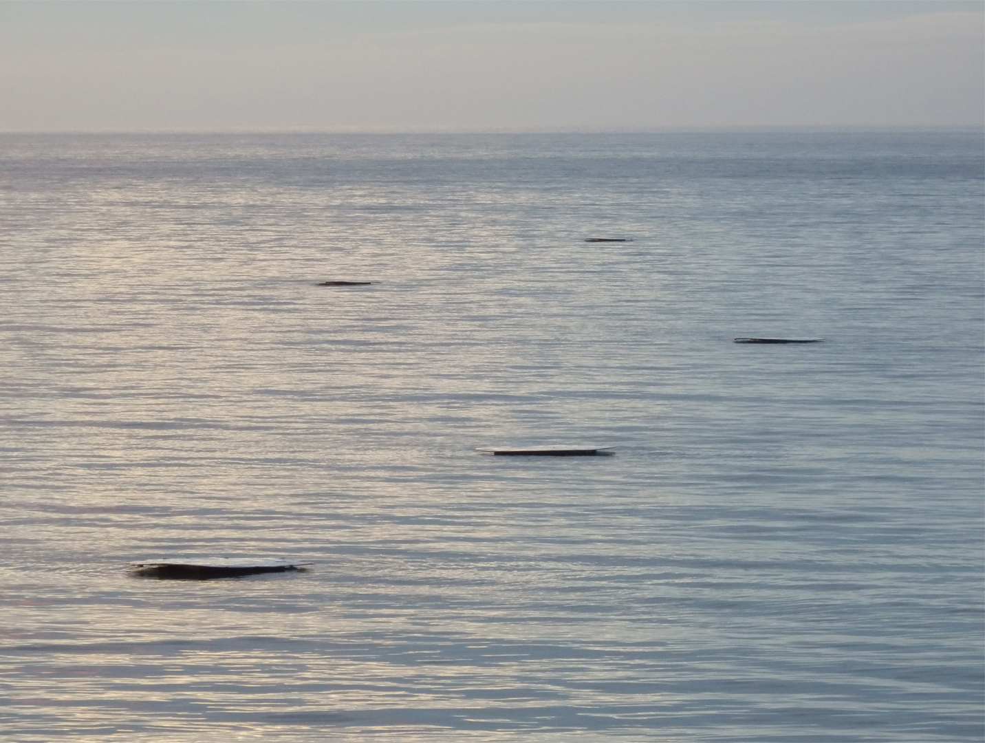
Water introduces a powerful horizontal allowing the eye to extend far over its flat surface and wide along the horizon, producing a particularly pleasurable experience which becomes an inseparable part of the landscape experience. We researched devices that manipulate the way one apprehends space and make the viewer more conscious of the act of seeing. The viewing device chosen for this demonstration is a tube or truncated cone (with both ends cut off). The cone restricting the visual field is implemented as a series of planes with a circular opening, the void gradually rising from the ground. When progressing through the frames towards the water focusing on the floating element the field of view opens itself, the horizon gets wider and infinite space offers itself to the viewer.

Magok Water (Works)

2007 - Seoul, Korea

Magok Water (Works)

Seoul, Korea

CLIENT The City of Seoul / SIZE 30 Acres / STATUS Competition Entry, 2007 / DESIGN TEAM Balmori Associates

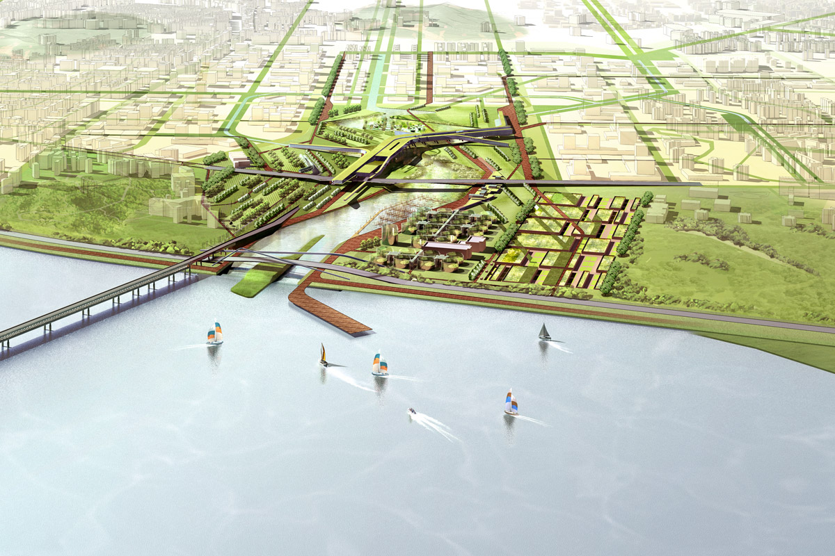
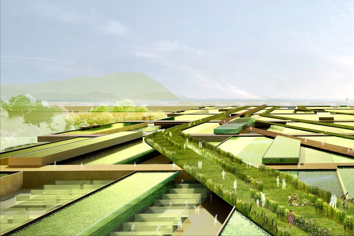
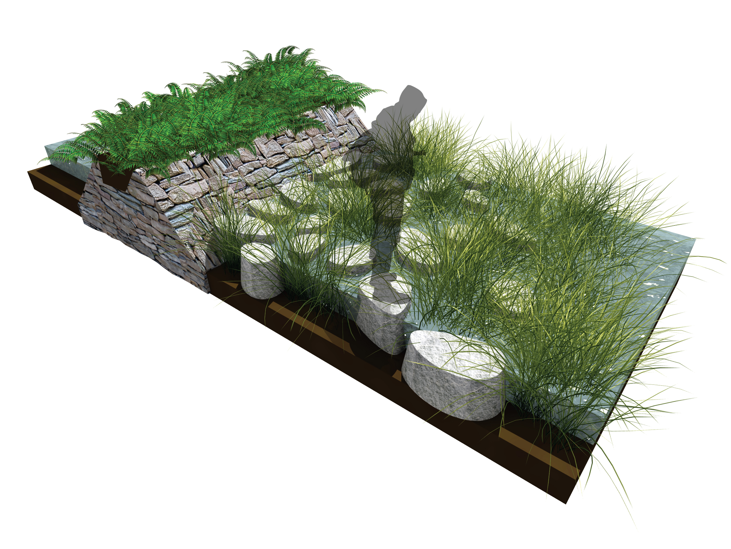
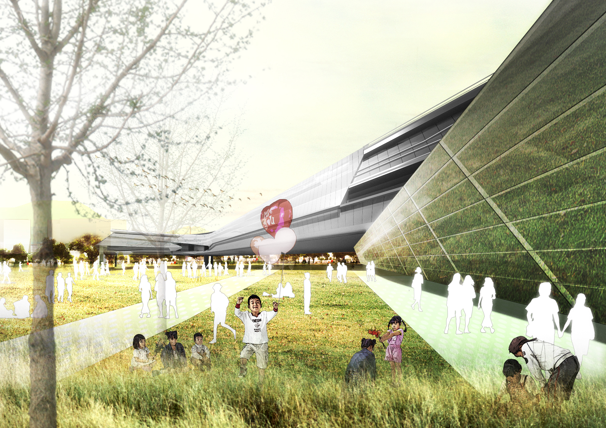
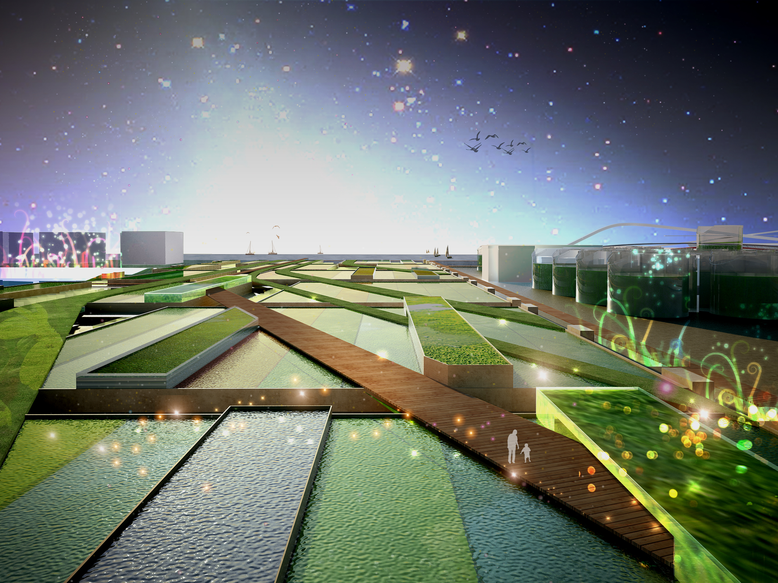
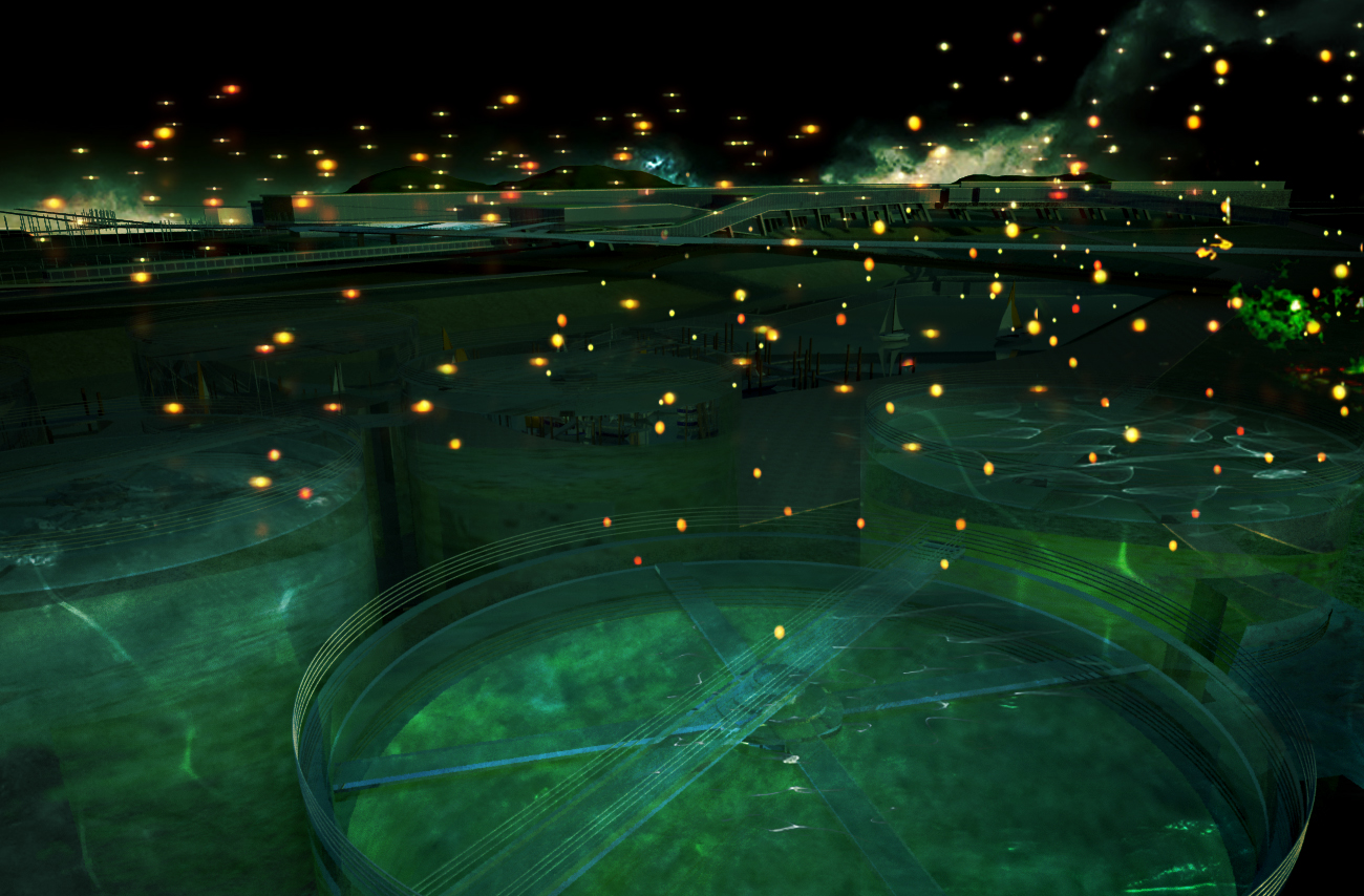
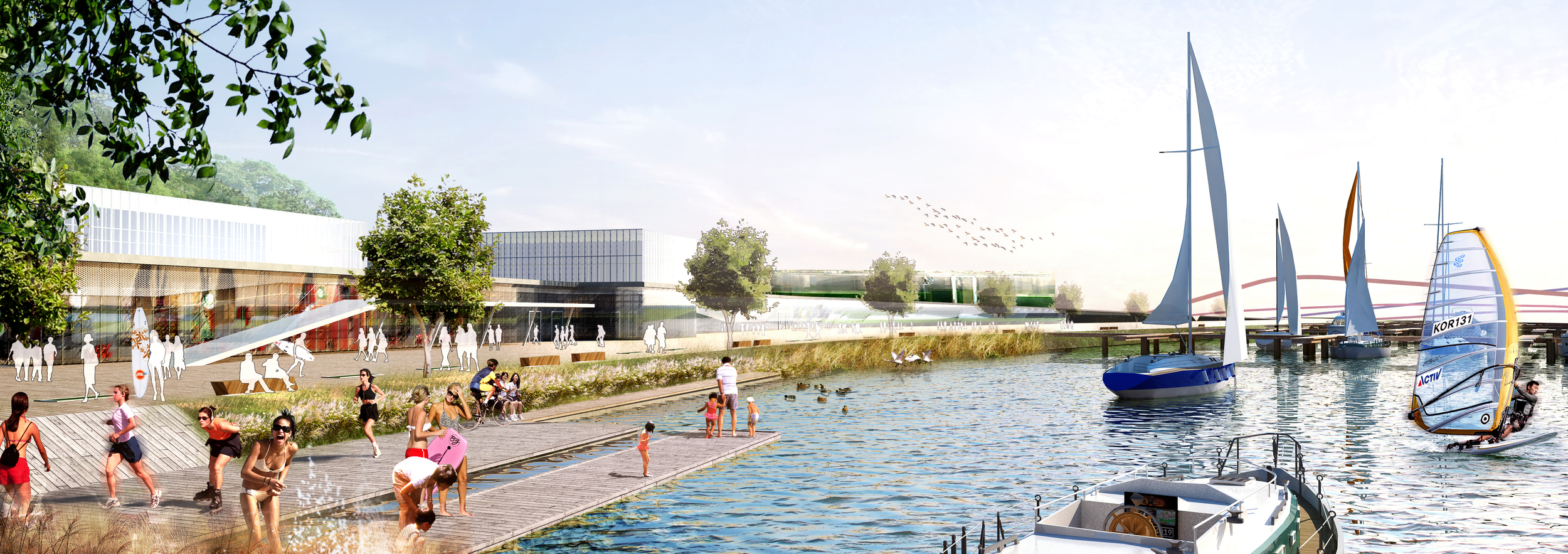
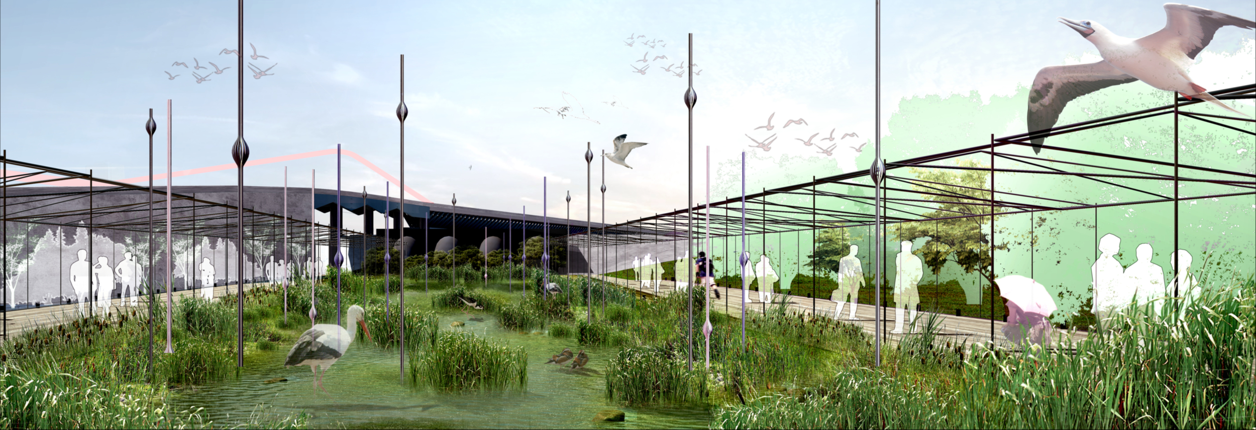
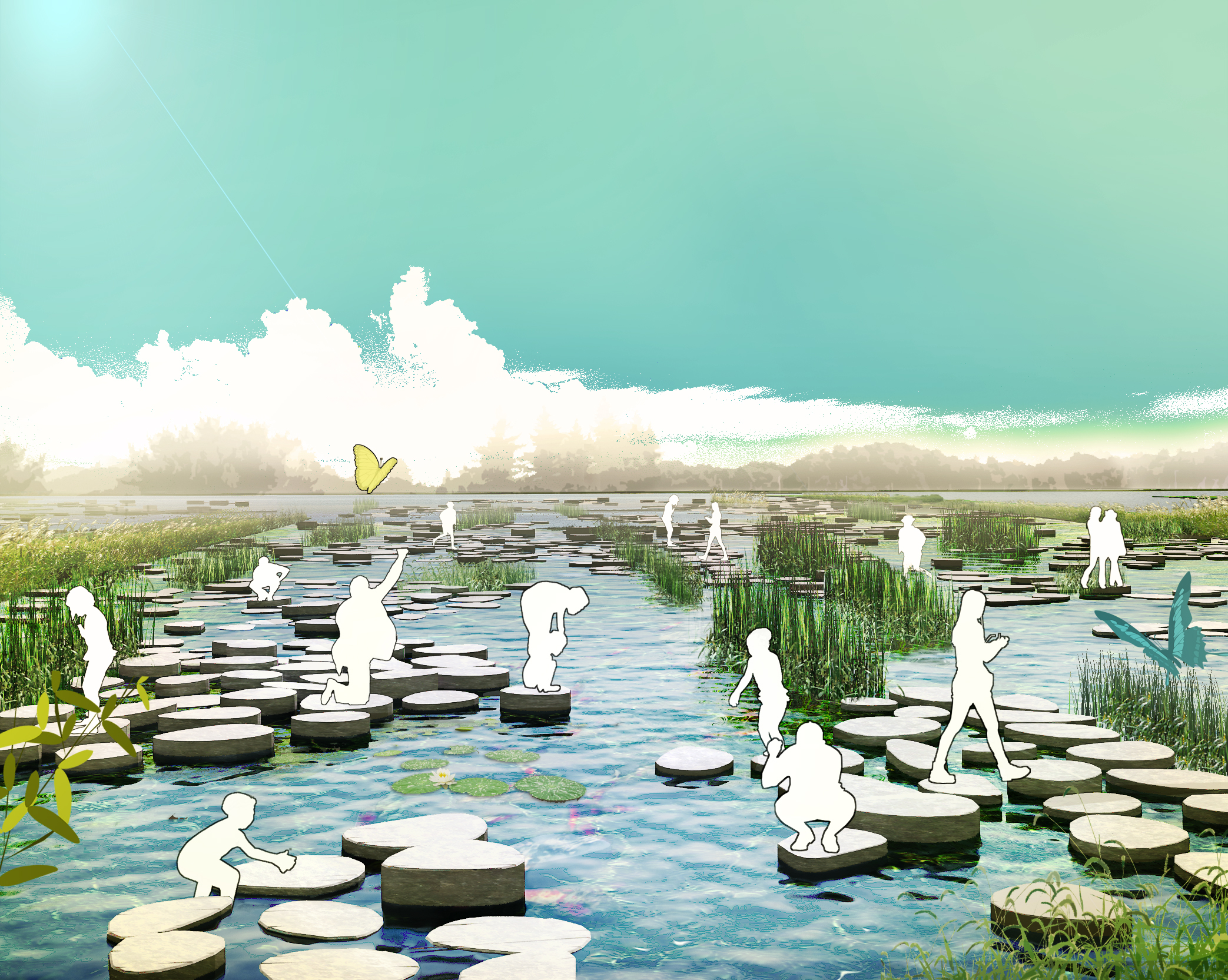
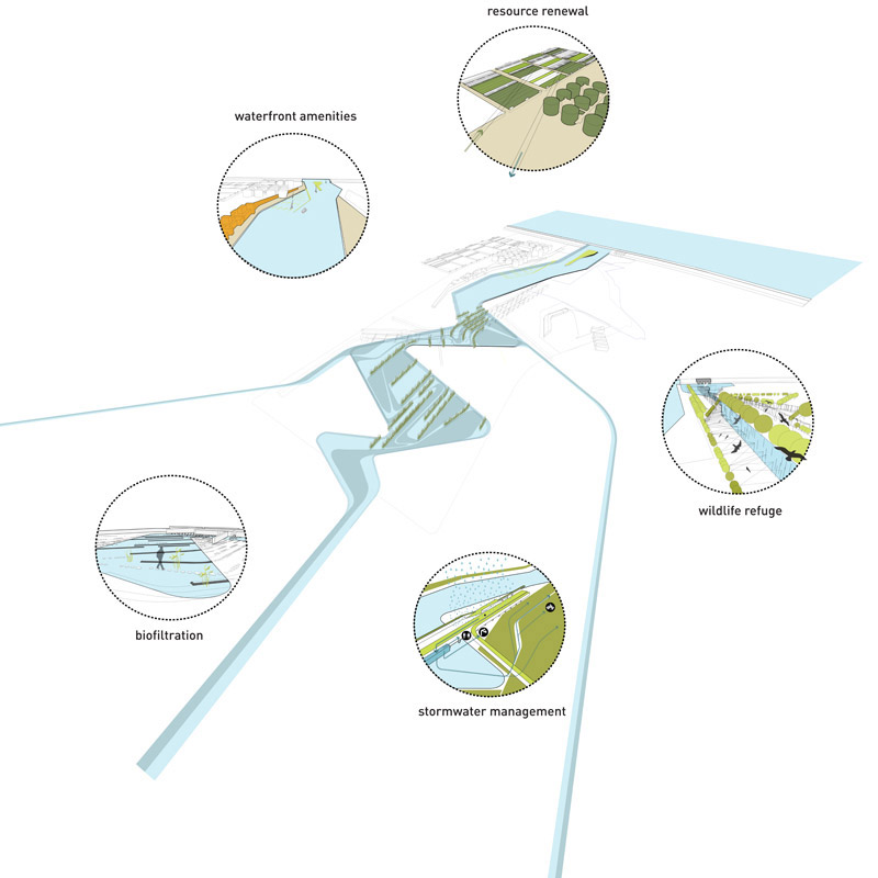
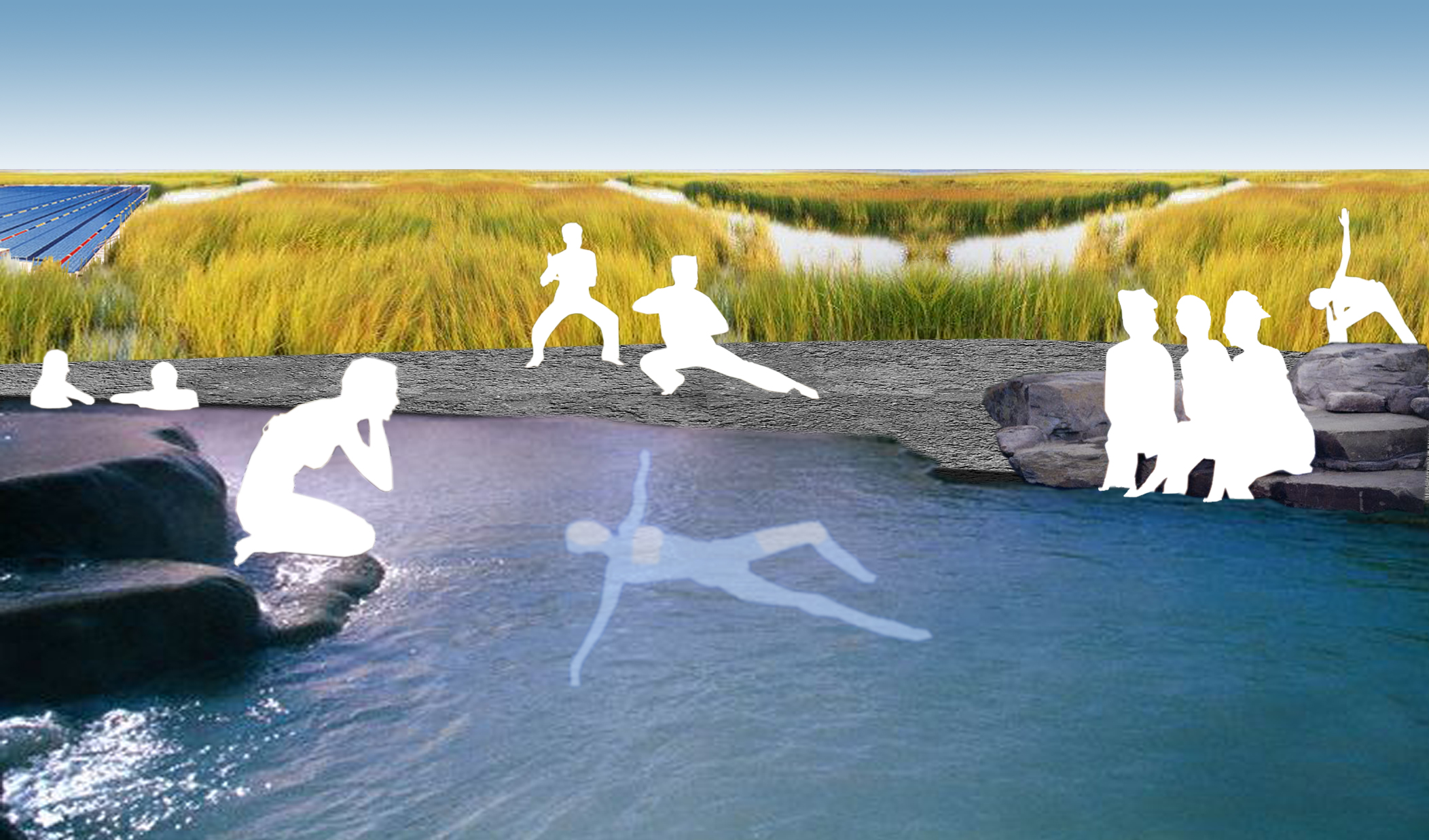
Water (Works) is a public park and an ecological infrastructure that is formally shaped by the flow of water. The park is a sophisticated network of ecological processes that weaves linear public space with natural and experimental technologies. Water (Works) is a working model of the park as an urban regenerator and prototype for future development. It is the green heart of the new R&D zone, an immersive environment of water remediation and a regional playground. Water (Works) is an ‘enhanced’ natural air and water cleaning infrastructure. Wetlands, phytoremediation, blackwater treatment and air cleaning trees form the basis of the layout and plantings. The living machine provides clean air, water and soil. Park paths and strips of program move alongside working wetlands, squash fields are framed by algae tanks and the convention center and marina are interlaced with the water system. The Marina engages the Han River, bringing it into the park as a lively recreational port. The Marina doubles as both social mixing zone and the final cleansing reservoir in the Water (Works). It is protected from summer flooding be a levee and gate system that serves as an outlook over the park and river. The nature of R&D is innovative and often unexpected. The sublime nature of the park posits the traditional park programs can coexist and thrive alongside cleansing and energy producing landscapes. Water (Works) is an educational park for children as well as an experimental think tank and laboratory for ecology and green technology.


Loring Park

1995 - Minneapolis, MN, USA

Loring Park

Minneapolis, MN, USA

CLIENT Minneapolis Park and Recreation Board / SIZE 25 acres / STATUS Completed 1995 / DESIGN TEAM Balmori Associates, Brauer & Associates

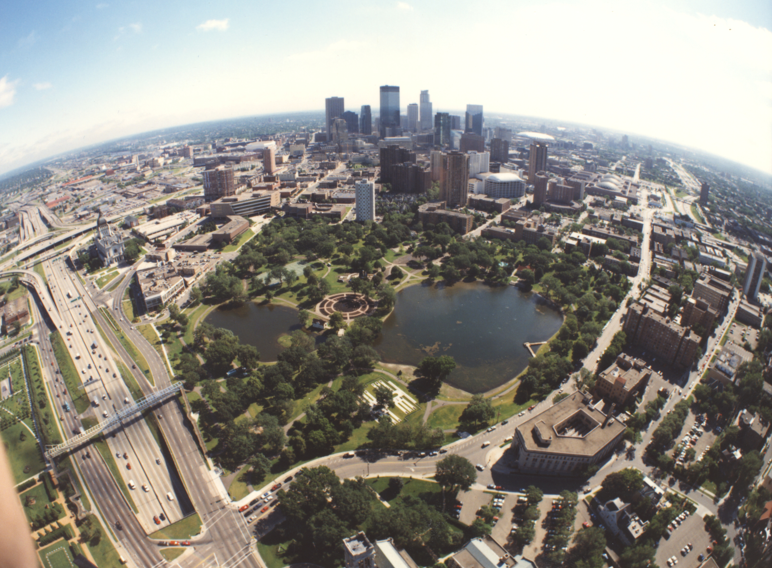
In 2005, analysis of this centrally located historic park designed in 1896 by Horace Cleveland revealed that the urban and infrastructure growth of the past century had damaged its historic fabric. The changing character of the park's context required a new type of urban design.

By connecting the park back to the city, the subsequent redesign funded by the Minneapolis Parks Department became a catalyst for redevelopment of downtown businesses, residential areas, and civic institutions.

Athletic and recreational facilities added to the park over the years are now incorporated as treed areas. Pathways open the edges with new entrances reaching across the highway to a pedestrian bridge designed by Siah Armajani. The park's historical character is carefully restored while new modern amenities, such as a theatre performance area and a redesigned horseshoe court are inserted and treated as gardens. The park is re-centered on a Garden for Four Seasons on the site where the park's large greenhouses once sat, serving as the park's axis.

A major highway built along the edge of the park presented a challenge during design because of the noise it created. We proposed treatment of this section of highway with a material used for paving airport landing strips, which diminishes the level of noise by a significant percentage. In addition, the construction of an earthen berm significantly reduced highway noise.

Long Island Green City

2005 - Long Island City, NY, USA

Long Island Green City

Long Island City, NY, USA

CLIENT Silvercup Studios / SIZE 35,000 SF / STATUS Long Island Green City 2002-2003 (ongoing), Silvercup Studios completed 2005 / DESIGN TEAM Balmori Associates 

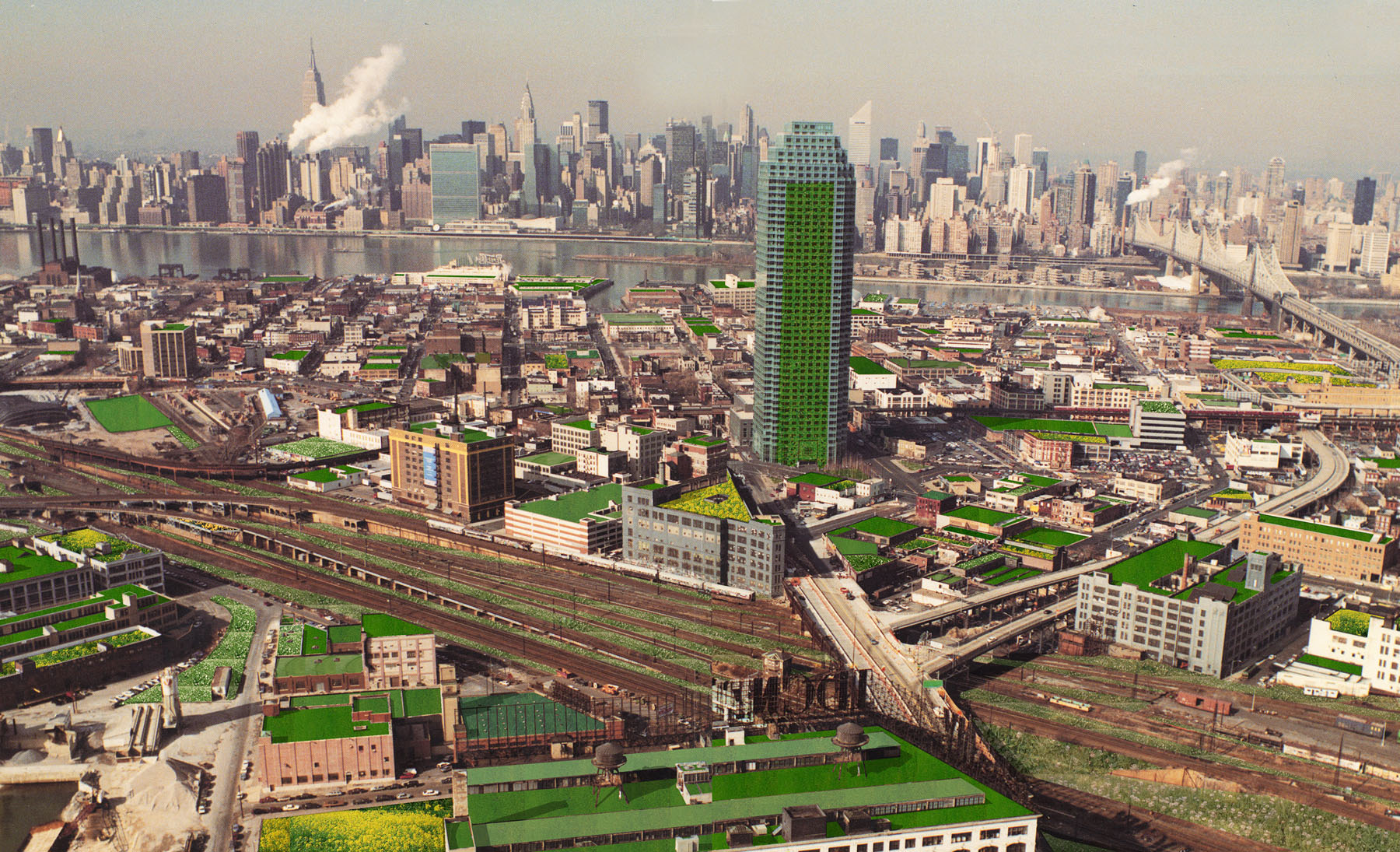
This proposal developed as a result of a presentation given by Diana Balmori in June of 2002 at a conference entitled Case Studies of Greens in New York City. The network of elevated trains and roadways overhead provides a panoramic view of the 11.7 million square feet of rooftops (belonging mainly to one-story industrial buildings).

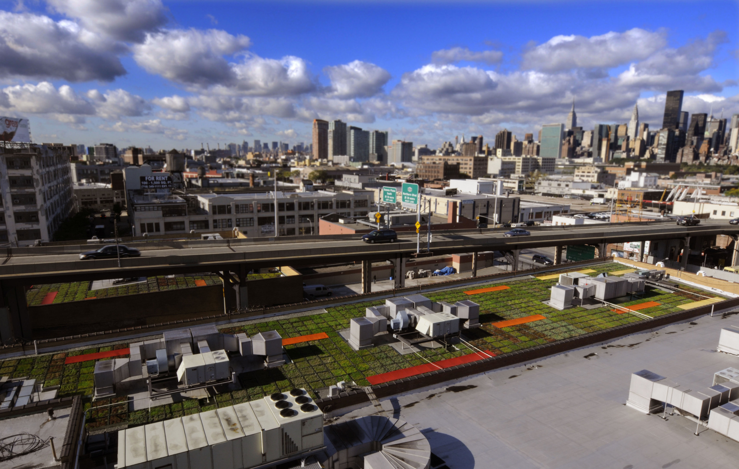
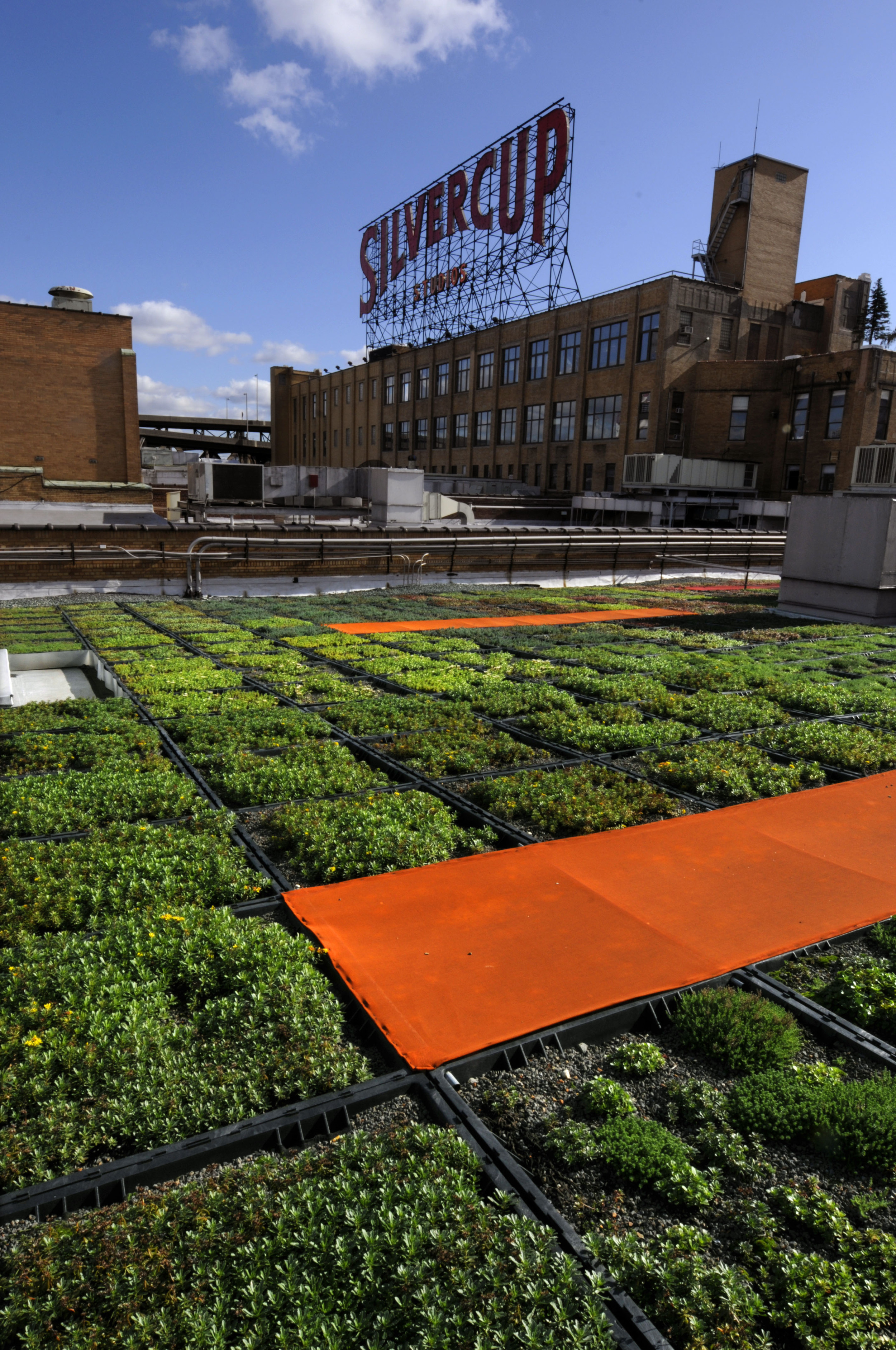
The study examines an increased urban population's effect on the natural environment. As cities expand and become increasingly populated, paved impervious surfaces multiply, leading to higher temperatures (heat-island effect) and increased storm water runoff, taxing the city's existing infrastructure. What resulted was the largest green roof ever installed in New York City and the first to monitor scientific data, the Silvercup green roof has been designed by Balmori Associates as the first of a series of green roofs planned for Long Island City over the next decade.  Balmori Associates conceived of and is implementing this plan for the neighborhood, dubbed “Long Island (Green) City.”

Expected benefits from the Silvercup green roof—which is equal parts roof garden, insulation system, and sponge—include absorption of air pollutants and carbon dioxide; improved outdoor air quality; increased energy efficiency and storm water run-off reduction (a particular burden to the sewer infrastructure of Long Island City); and, for the first time in New York, the gathering of data to quantify benefits. EarthPledge, a non-profit organization devoted to identifying and promoting technologies for sustainability, has installed the Silvercup roof research station. 

Bartscherer Garden

New York, NY, USA

Bartscherer Garden

New York, NY, USA

STATUS Under Design / DESIGN TEAM Balmori Associates

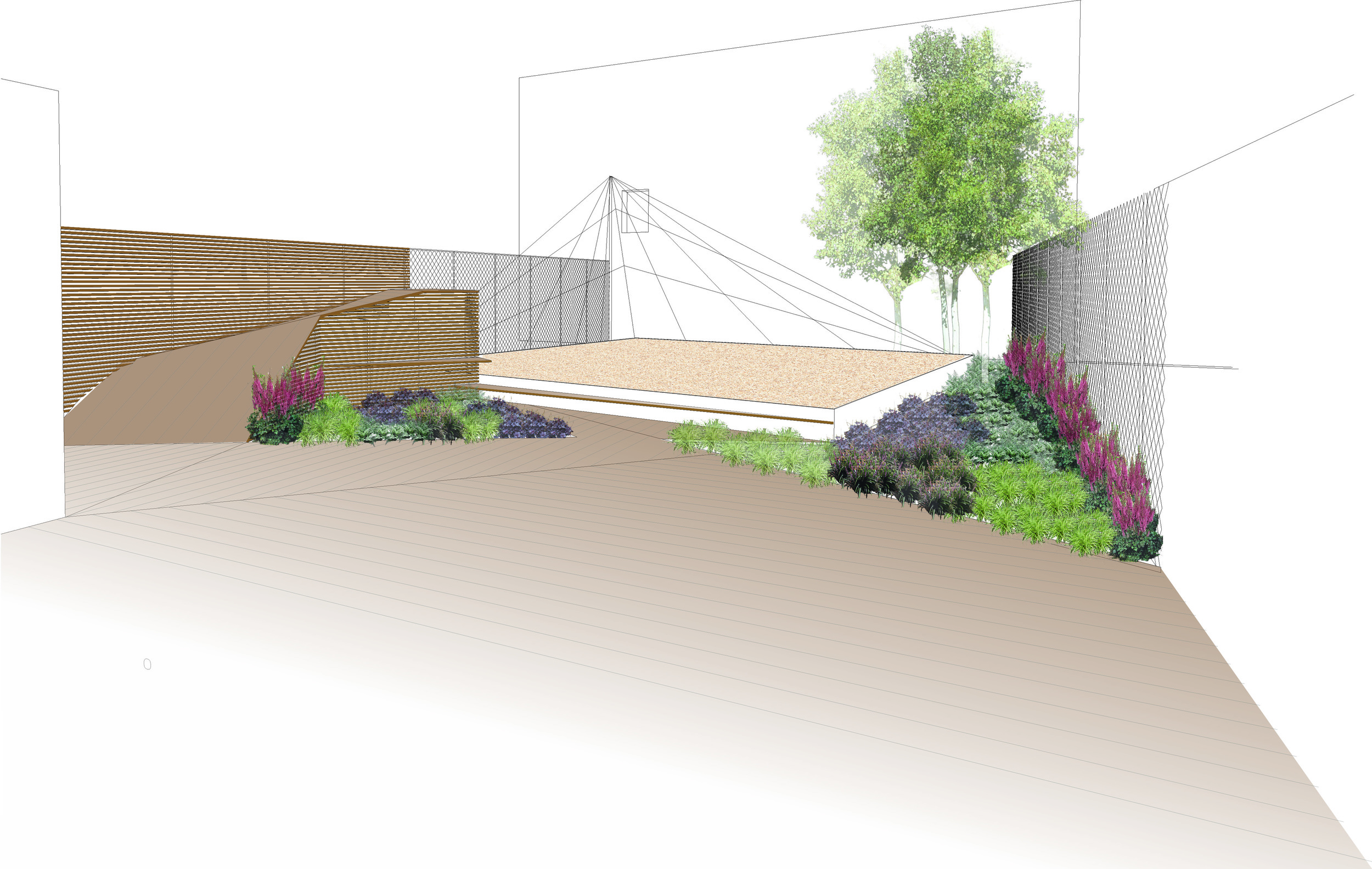
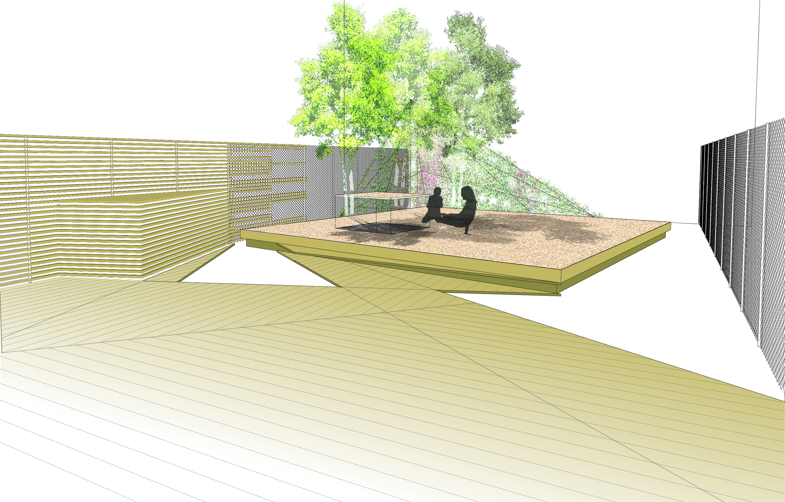
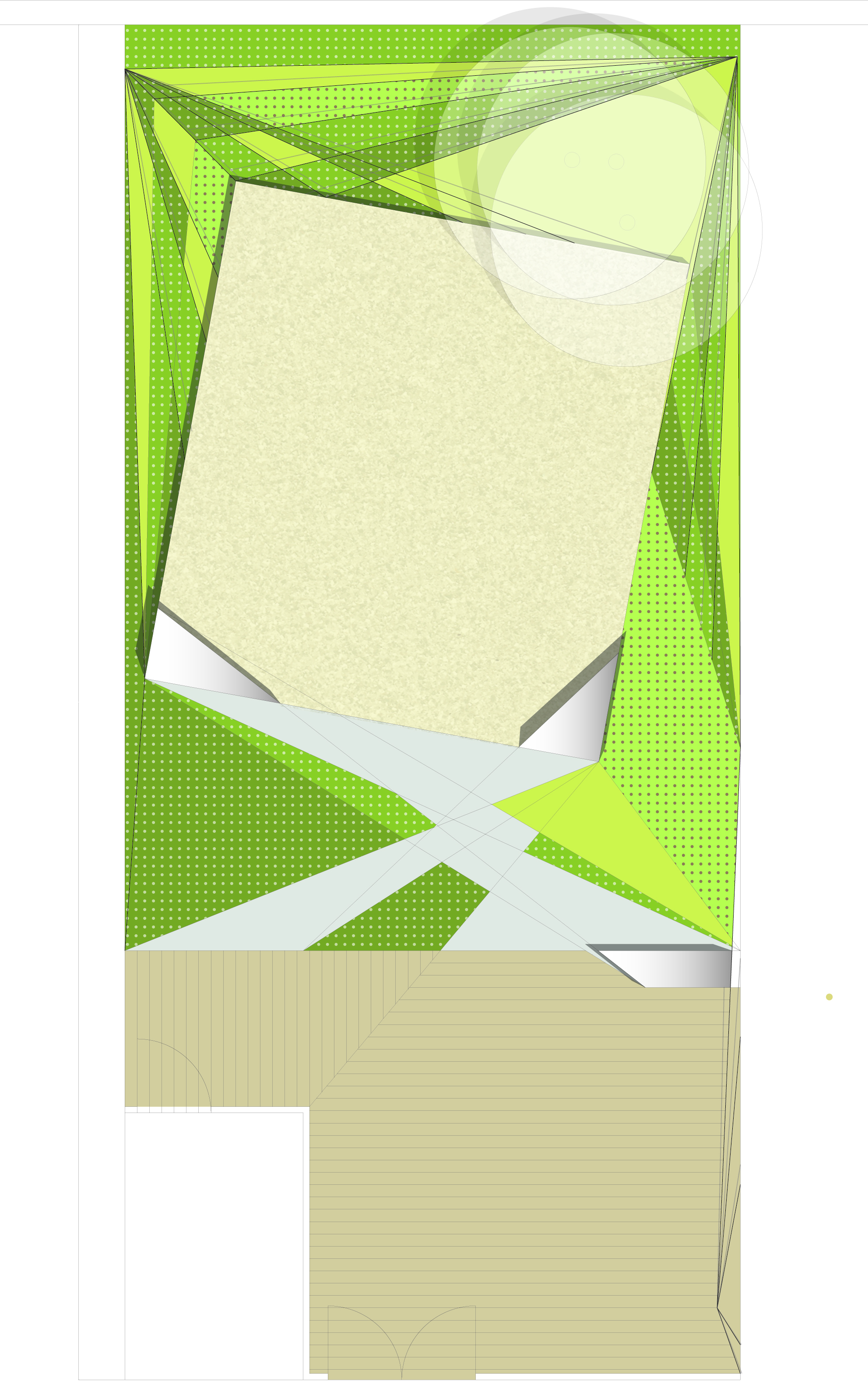
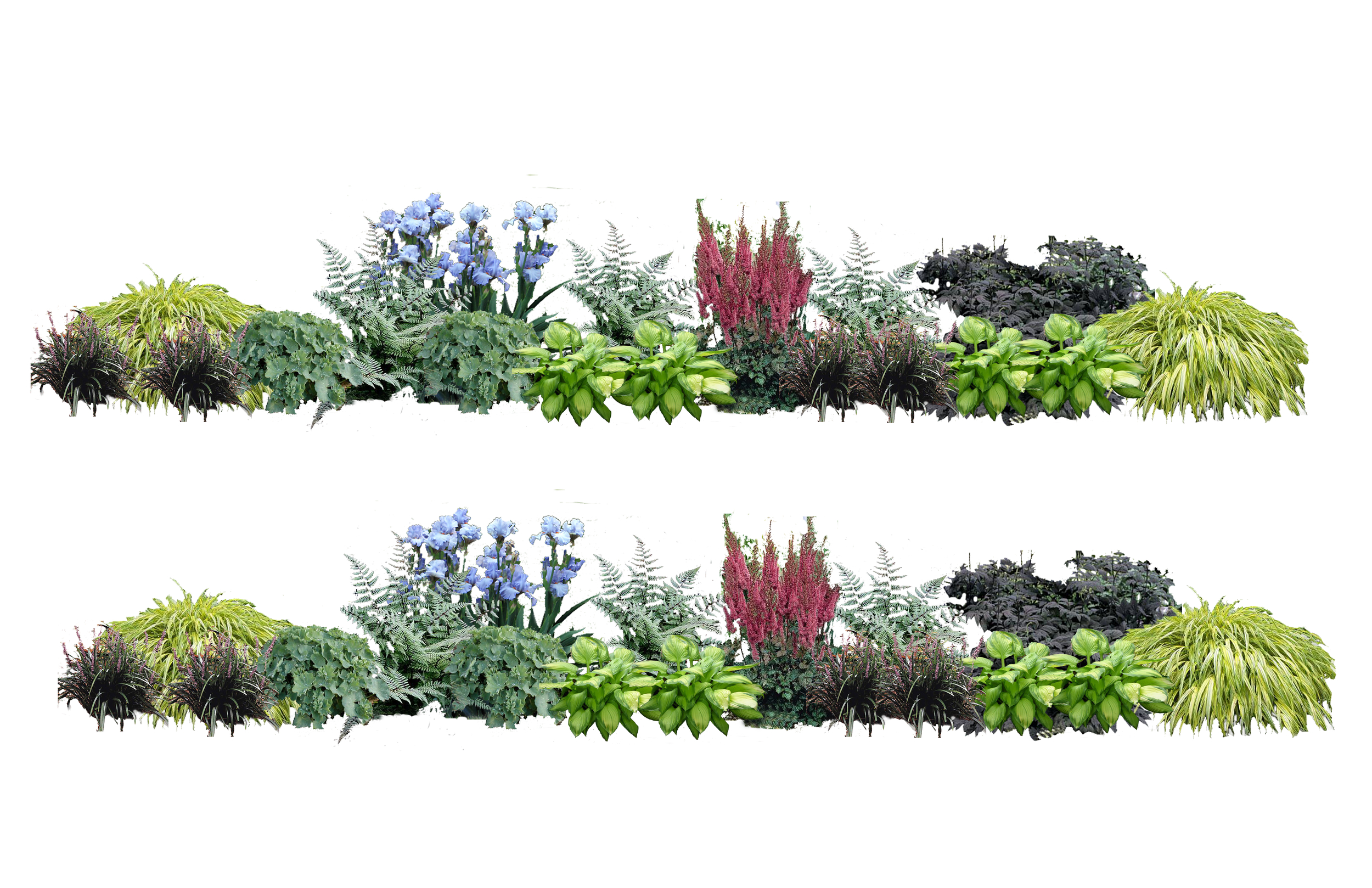
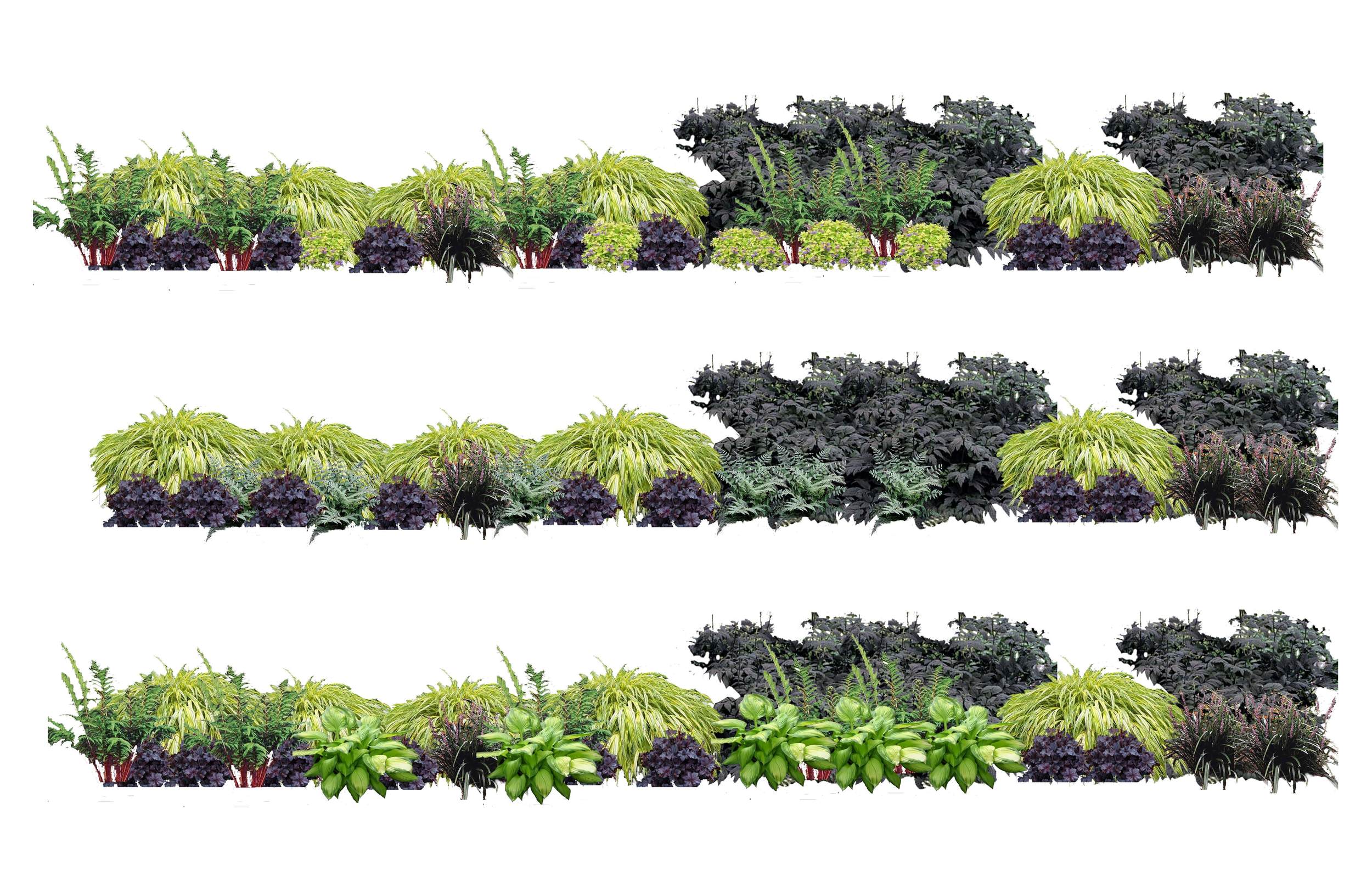
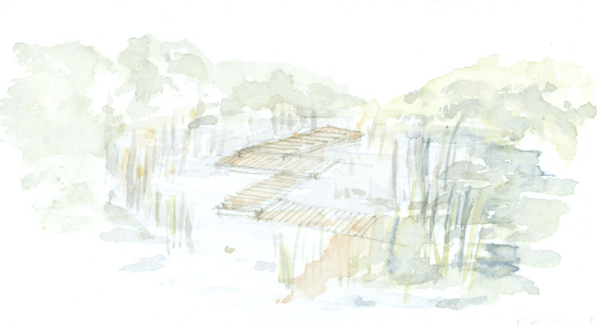
The townhouse garden extends the living and dining space of the kitchen into the landscape.  An elegant gravel platform floats in the center of the small garden.  Shifting the platform geometry maximizes the planting and gives movement to the garden.  A steel cabled trellis system anchors the garden, providing privacy and sculptural edges.  Vines climb the trellis, while tall perennials pierce through the openings to create an unexpected seasonal variation of color in several dimensions. 

The plantings follow a gradient of color, choreographed through all the seasons.  One may dine on the deck, entertain on the platform or sit alone amongst the plants in the back corner of the garden, experiencing the garden in various ways.  Pockets of plantings emerge from the garden screens for herbs and seasonal flowers.

Wuhan Garden Expo

2015 - Wuhan, China

Making Horizon 地平線 - 水平線

Wuhan, China 

Creative Garden Design Scheme for the 10th China (Hubei) International Garden Expo

The horizon line is one crucial reference when experiencing landscape.  It is the apparent line that separates earth and sky.  An ocean introduces a powerful horizontal allowing the eye to extend far over its flat surface and wide along the horizon, producing a particularly pleasurable experience which becomes an inseparable part of the landscape experience. Sometime the “true horizon” is obstructed by objects such as trees, buildings, mountains – this would be called the “visible horizon”. In cities with multiple, stacked, and constricted horizons, the search for the sense of an open horizon gets partly satisfied in the opening a park provides. Perhaps then, real pleasure from being in a park depends not only on the presence of vegetation, but on the release from the city’s constriction of the horizon line. One of the tasks of landscape may then be to create the sense of a wide horizon.

Since 2006 Balmori Associates, Landscape and Urban Design has been divided in two parts.  The first is a landscape practice that investigates landscape as a constructed space. The second part, BAL/LAB, is a collection of research and experiments. One BAL/LAB deals with the challenges of representing landscape. Diana Balmori wrote in Drawing and Reinventing Landscape (Wiley, 2014) that “Landscape architecture is an art of peripheral vision. Peripheral vision is essential for understanding and appreciating landscape; central vision alone cannot capture it.” To explore this, vision scientist Denis Pelli and Balmori Associates’ staff set up an experiment to measure how restricting the observer’s field of view affects the observer’s experience of the beauty of a landscape. The viewing devices chosen for this demonstration are a tube and truncated cone (with both ends cut off).  The results show that restricting the observer peripheral vision reduced the viewing pleasure.

In 2011 for a Garden Festival in Metis, Canada, Balmori Associates implemented the viewing cone described above as a series of planes with a circular opening, the void gradually rising from the ground. When progressing through the frames towards the St Lawrence River, focusing on the floating islands, the field of view opens, the horizon gets wider and infinite space offers itself to the viewer.

The Meditation Room BAL/LAB launched in 2014 emerges from the exploration of the ideas of horizon and peripheral vision. The research aims at creating the sense of an expansive horizon in the smallest of spaces. In May 2015 Balmori Associates built an installation presented by The Drawing Center during the New Museum’s Ideas City Festival in New York City. “Meditation Room: Horizon” is formed by a continuous wall of paper where the overlapping of two dot matrix systems come together to create a visible horizon. Visitors were invited inside to meditate for ten minutes. The design of Making Horizon地平線 - 水平線 for the 10th China (Wuhan) International Garden Expo is the result of our research and investigation of landscape representation and peripheral vision.

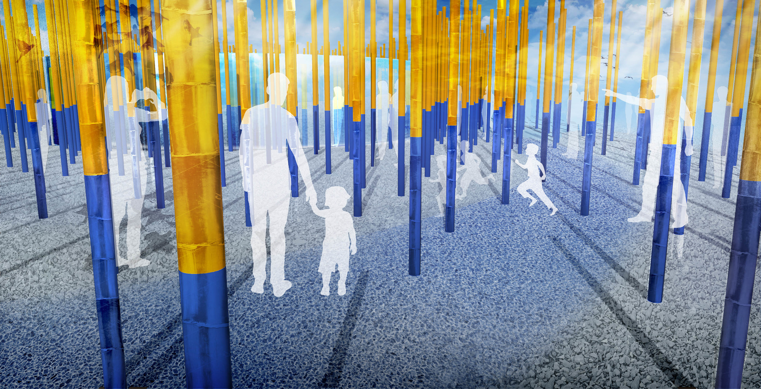
The project name 地平線 - 水平線 was inspired by two very distinctive spatial environments created in the garden.  The first being the constricted and constantly shifting horizon of the bamboo forest, with the very bold horizon line painted across the bamboo canes.  This we would refer to as 地平線 a general term to describe the boundary between earth and sky.

Once in the interior space, you are greeted by an illusion of an open and infinite horizon, created with the use of curved mirrored walls that reflect the sky, and the pool of water on the ground. This we would refer to as 水平線, a term used to describe the more specific horizon line made by the meeting of sky and water.

Making Horizons (地平線 - 水平線) creates a powerful twofold experience that challenges the perception of space.

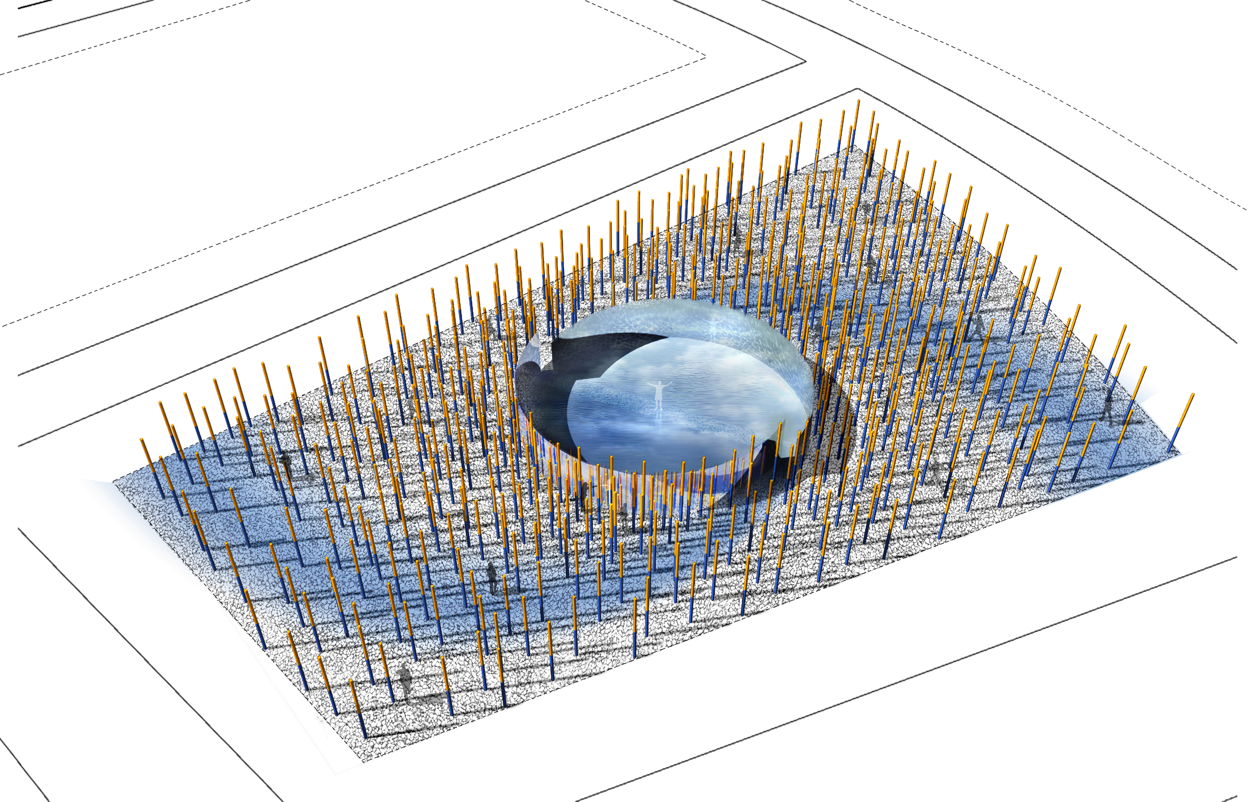
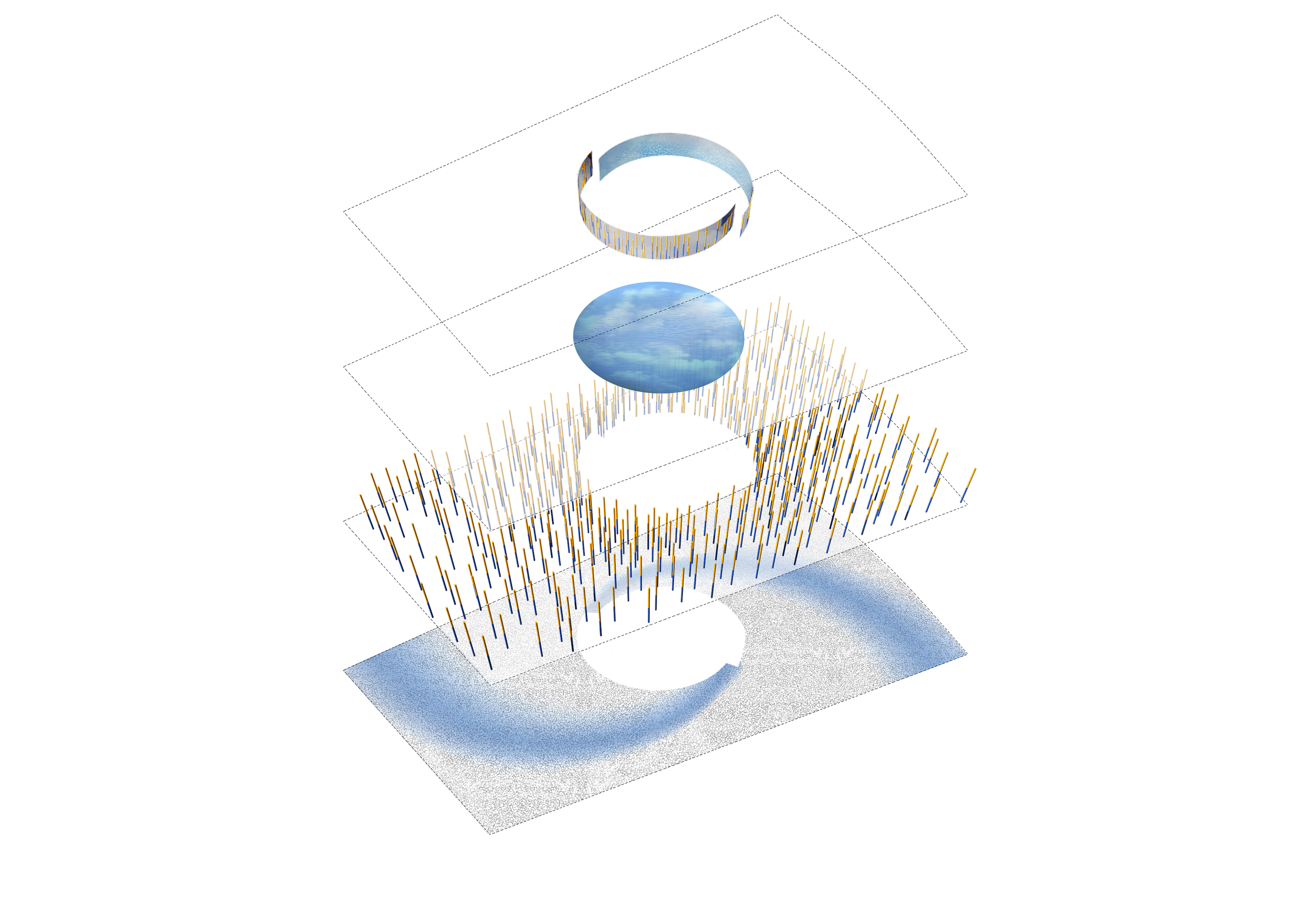
 The visitor is initially drawn into the garden by following a spiraling path of blue pebbles, these pebbles have glow-in-the-dark properties. During the day the pebbles absorb sunlight, and in the evening light is given off by them. This soft blue light illuminates the path, creating a mysterious glowing path which guides the visitor through the bamboo forest.

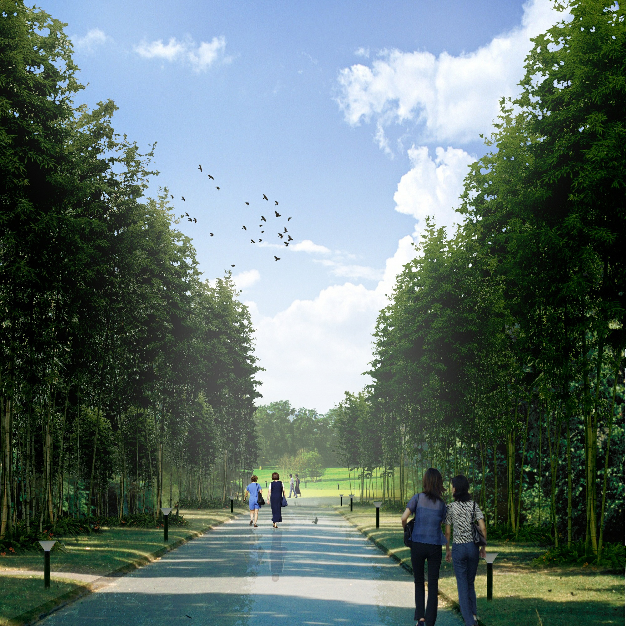
In this space, the visible horizon line - where the earth’s surface and the sky appear to meet - shifts to a constructed horizon line, defined by the meeting point of two colors, blue and yellow, which is painted on the vertical bamboo stalks. Yellow at the top and blue at the base. This line creates a very distinctive and powerful visual horizon, which is in contrast to the verticality of the bamboo itself. The forest of bamboo creates an intense and constricted space, and chops up sightlines creating a maze-like experience.

As visitors follow the blue pebble path they circle towards the center of the garden, the bamboo forest progressively intensifies as the stalks become closer together and as the pebble path narrows. The sense of compression becomes magnified towards the center of the garden revealing a previously invisible space. A continuous circular mirrored room reflects and extends outside the dense vertical space of the surrounding bamboo. But from the inside it shifts to an open horizontal plane, with continuous mirrors on each side and a thin and still layer of water on the ground. The water reflects the sky above, extending the open space to infinity; it is a space of meditation at the core of the garden.

The visitor will be able to enter this room and walk out into the center; a narrow gravel path of gravel submerged just under the skin of the water will give the illusion of walking on water whilst creating a continuous water plane.  The illusion of the endless reflection of water introduces a powerful horizontal allowing the eye to extend far over its flat surface, producing a pleasurable landscape experience.

Where the surrounding bamboo forest creates a constricted   environment, the center creates an ephemeral one, where the visual clarity of the horizon line will stand in contrast to the changing mood of the sky. 
King Abdullah House of Culture & Arts

2009 - Amman, Jordan

King Abdullah House of Culture & Arts

Amman, Jordan

CLIENT Darat King Abdullah II / SIZE 12,000 m2 / STATUS Competition Wnner 2009 / DESIGN TEAM Balmori Associates / Zaha Hadid Architects

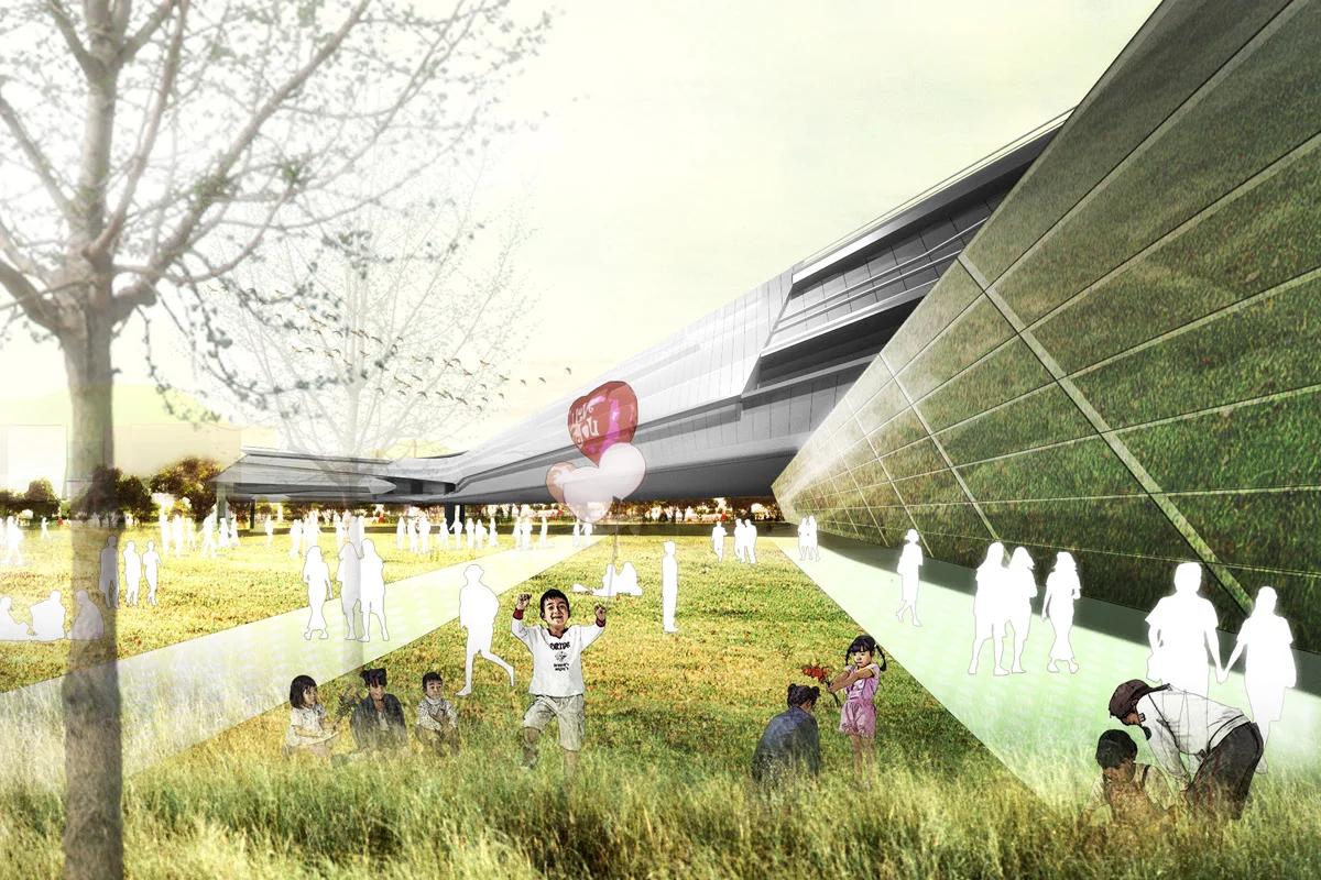
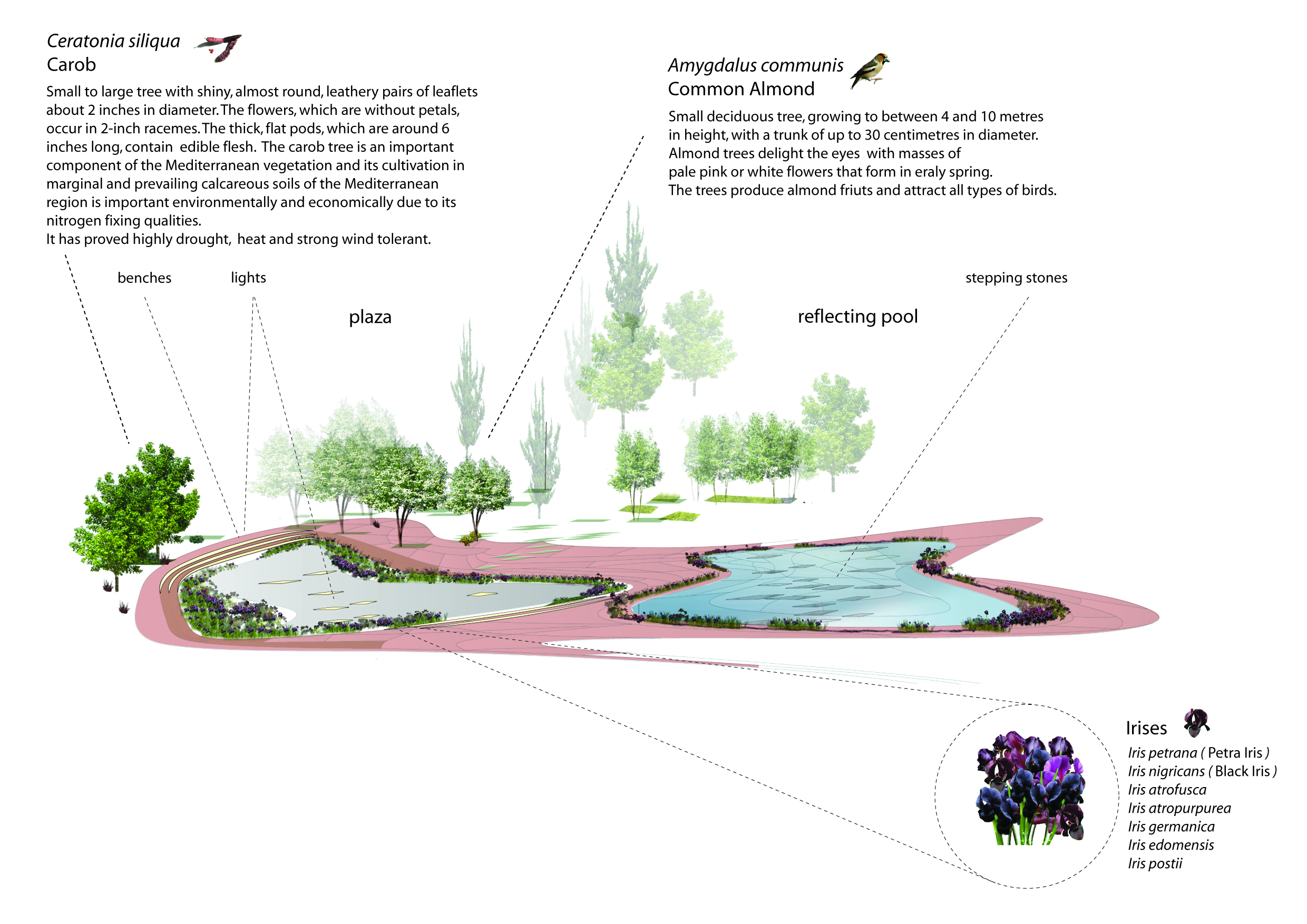
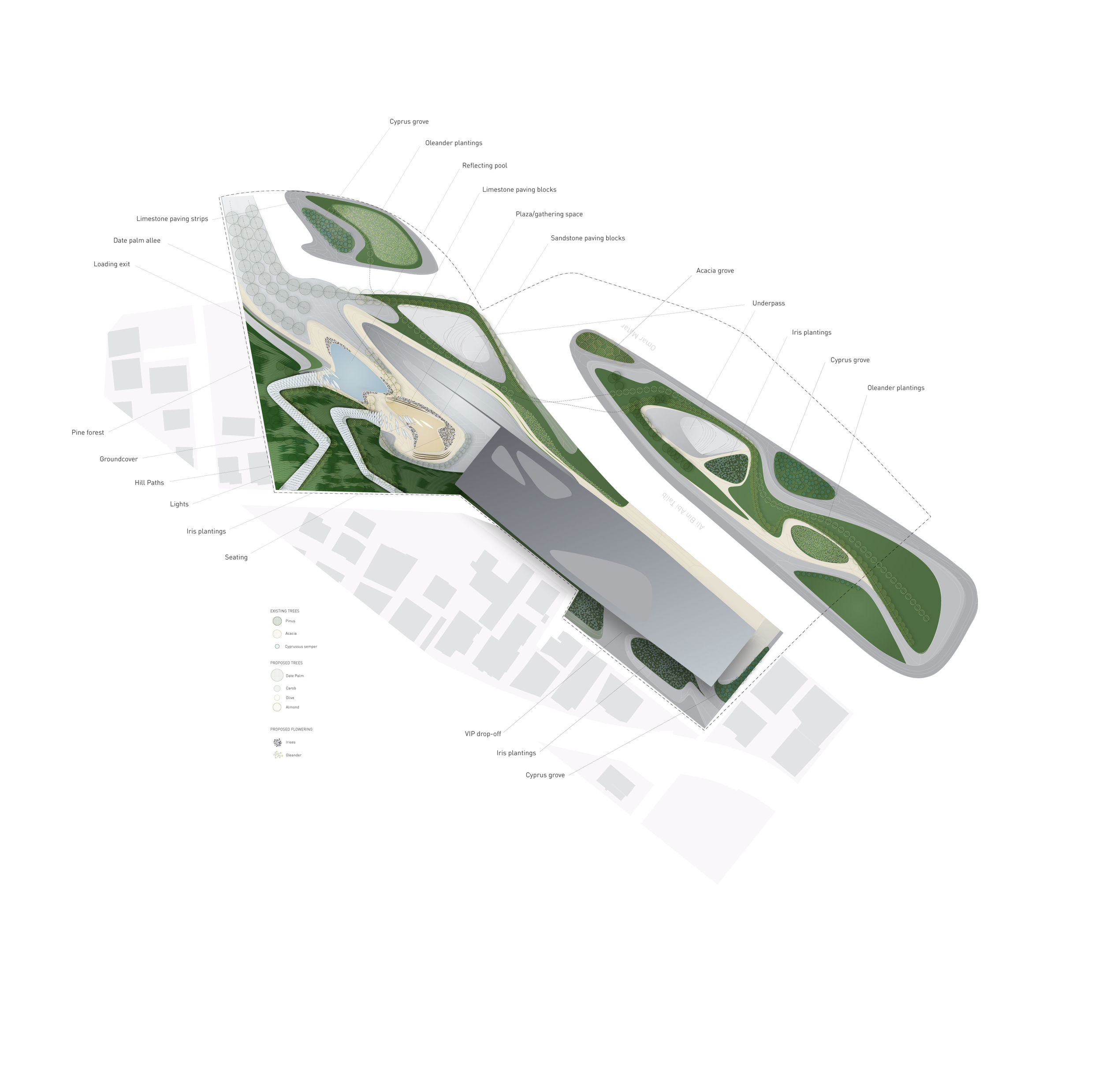
Located in the heart of the Jordanian capital of Amman, this new venue for the performing arts was an initiative of King Abdullah II to create a place to house all performing arts. Conceived as a complex to become the mayor venue for theater, music, and dance performance in Amman and Jordan, Balmori Associates teamed up with Zaha Hadid Architects to create a vital element of cultural life in the area, and a catalyst of education.

The Performing Arts Centre, the fifth element of the Cultural district, will house a music hall, concert hall, opera house, drama theatre, and an academy of performimg arts designed to foster local and international talent. Designed by British-Iraqi architect Zaha Hadid, the center will be 62 meters high. Zaha Hadid described the design of the Performing Arts Centre as “a sculptural form that emerges from a linear intersection of pedestrian paths within the cultural district, gradually developing into a growing organism that sprouts a network of successive branches. As it winds through the site, the architecture increases in complexity, building up height and depth and achieving multiple summits in the bodies housing the performance spaces, which spring from the structure like fruits on a vine and face westward, toward the water.”


Kent Falls Trail

2006 - Kent, CT, USA

Kent Falls Trail

Kent, CT, USA

CLIENT CT Dept of Environmental Protection, CT Dept. of Public Works  / SIZE 1/4 mile trail / STATUS Completed 2006 / DESIGN TEAM Balmori Associates, Vollmer Associates LLP

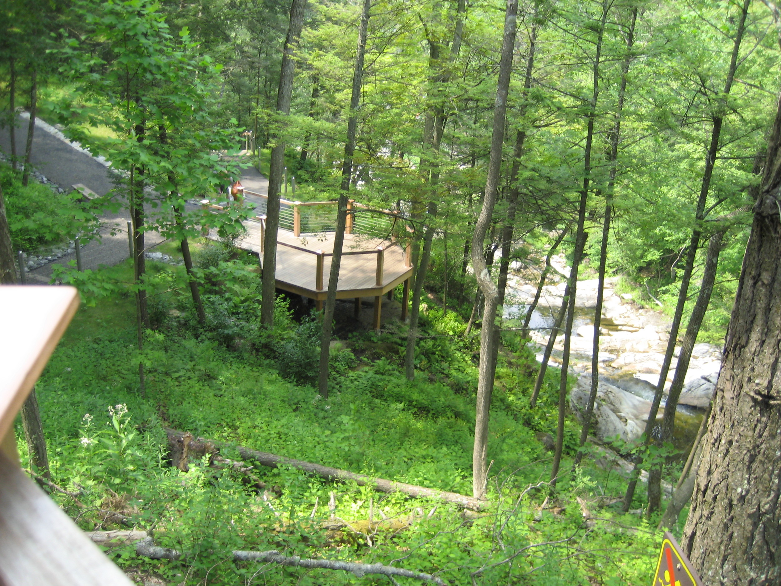
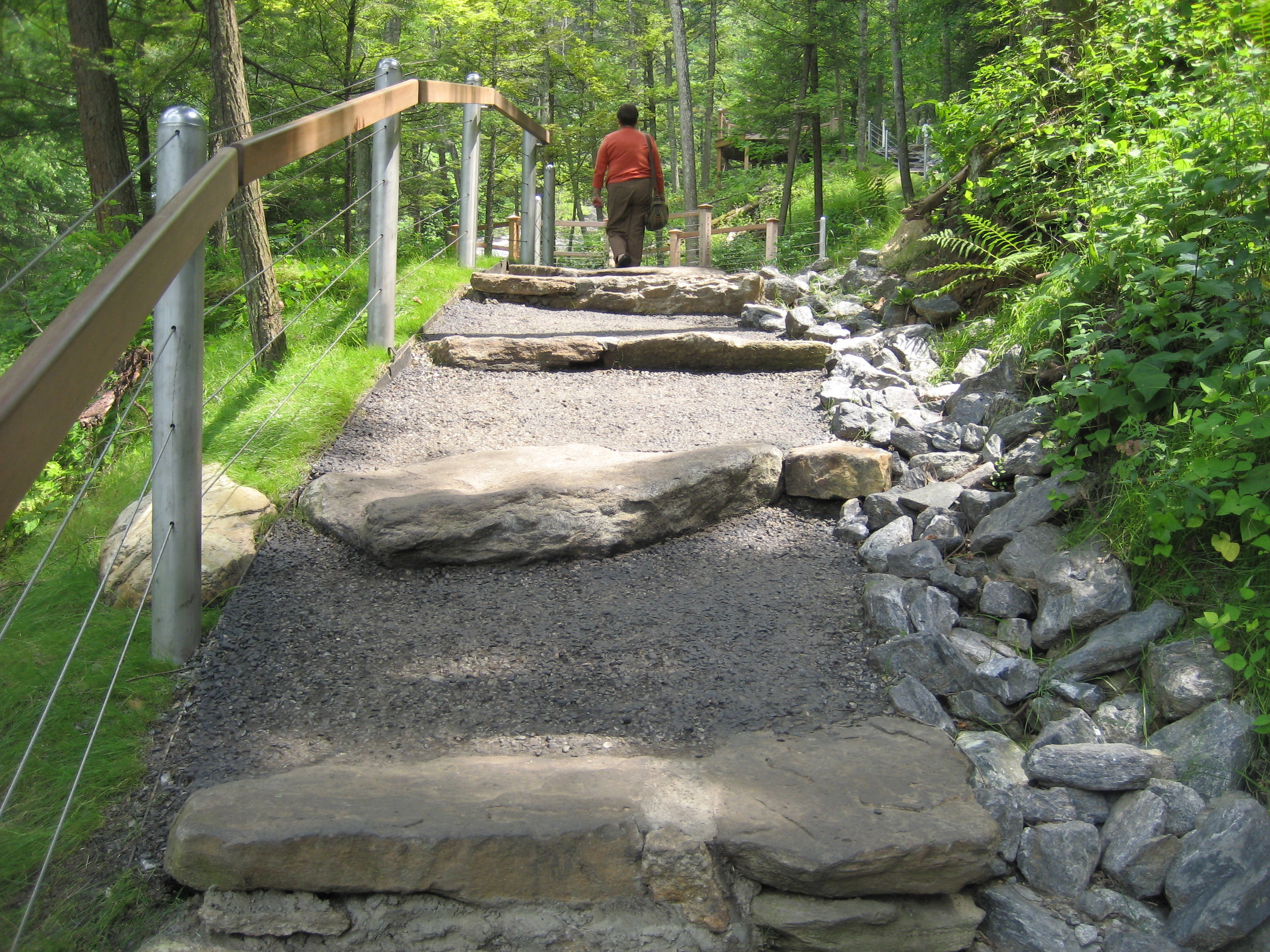
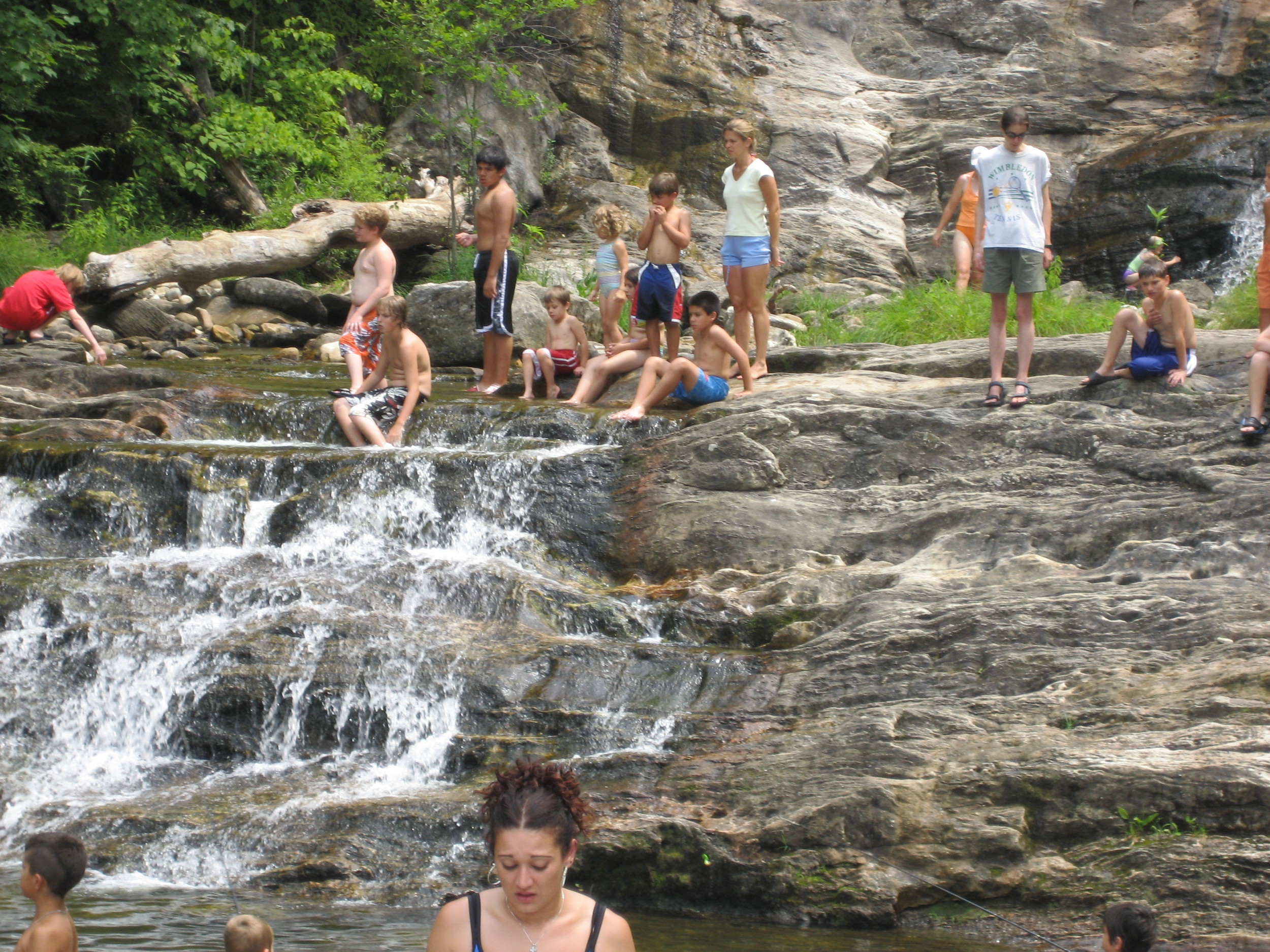
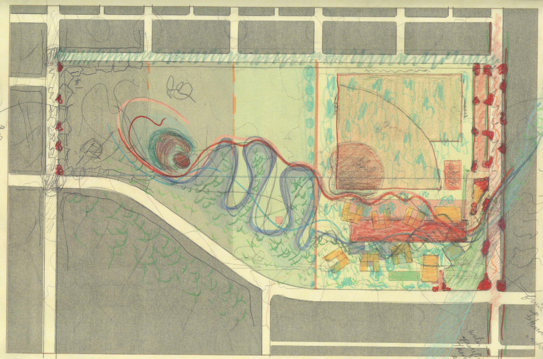
A green corridor badly eroded through overuse, poor design, and incompetent earlier construction, is not only restored but re-conceptualized through differing levels of intervention. Views along the quarter mile long route are enhanced and smaller spaces for respite and contemplation are created along the way.
The scheme creates new nodes that serve as optional trail branches at times, special lookouts at others, fulfilling functions that the original trail never had. It also proposes a loop rather than a climb and descent through the same trail, as a way of thinking through the ongoing reconstruction process and responding to the need to deflect the public's attention from areas under construction. 
A very short bridge proposed by a sculptor is to cross the stream above the last waterfall, presenting the opportunity of an artistic intervention and adding interest to the trail path. Excessive traffic is reduced by a return trail on the opposite side of the stream. This bridge is to be financed by the local community. Special attention was given to the construction details and materiality of benches, signage, guardrails, stairs, and walls in order to preserve the park's rural character. Lookouts and small intimate spaces were specifically designed to address the site and frame key views. Atypical and sometimes unexpected moments along the trail were given similar attention to detail in order to heighten the scenic experience
Shenzhen Cultural Park

2003 - Shenzhen, China

Shenzen Cultural Park

Shenzhen, China

CLIENT Shenzhen Municipal Planning & LandInformation Center / STATUS Competition Finalist 2003 / SIZE 136.38 acres / DESIGN TEAM Balmori Associates, MAD Architects Office

Shenzhen Cultural Park reflects an understanding of the forces at work in modern cities and no longer interprets the park as an isolated and passive precinct of the city. It features the park as an active shaper of the city; a conveyor of pedestrians, bikers and skaters; a fluid connector of green system with arms that extend to unite as many living pockets in the city as possible, enhancing the sustainability of all. It is conceived as an active set of strands weaving through the city and enlarging at times into modes of intensified activity and overlapping cultural functions.

Another idea governing the design of this park is that its forms derive from the intersection of landscape and architecture. The landscape is treated as a continuous surface which sculpts the land three-dimensionally according to the city’s particular dynamic and results in layers crossing and weaving; surfaces changing into volumes. Forms result from the intersection of landscape with the roads, buildings, and programs at work in this new city. This intersection of landscape with architecture gives rise to a new entity we call Parkitecture.

June Callwood Park

2009 - Toronto, Canada

June Callwood Park

Toronto, Canada

CLIENT City of Toronto Toronto Parks, Forestry & Recreation / SIZE 0.4 hectare / STATUS Competition, Finalist 2009 / DESIGN TEAM Balmori Associates / DTAH

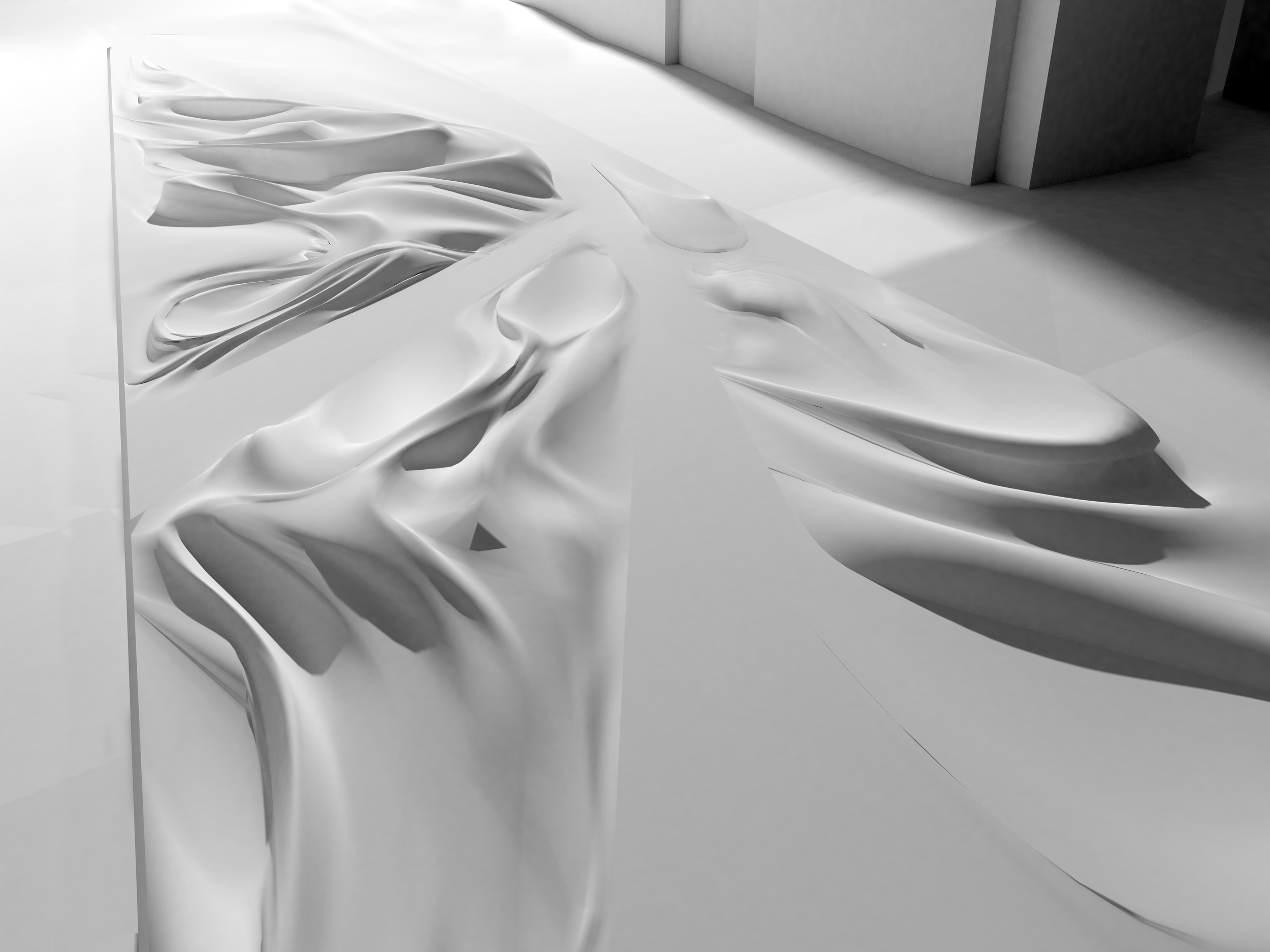
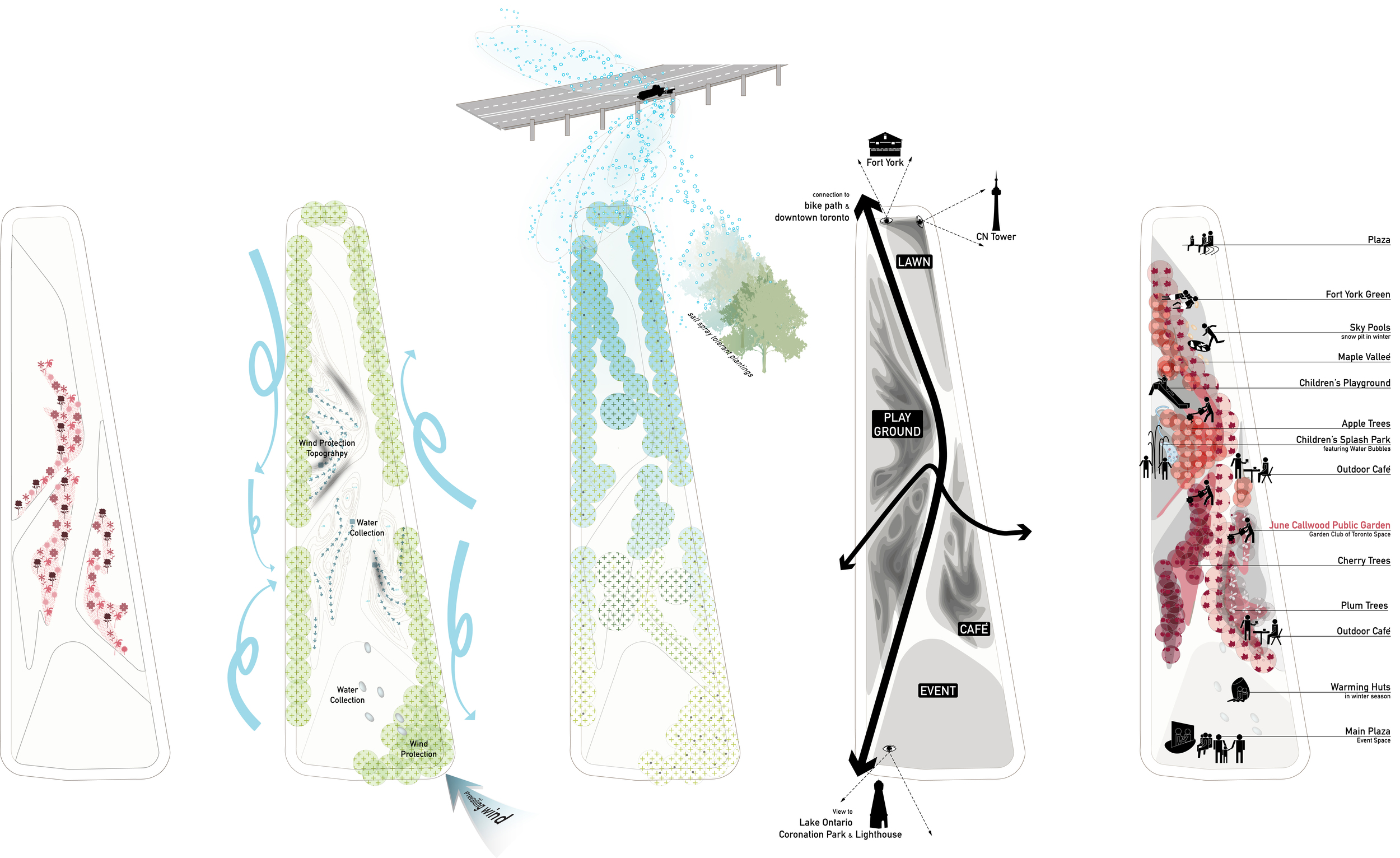
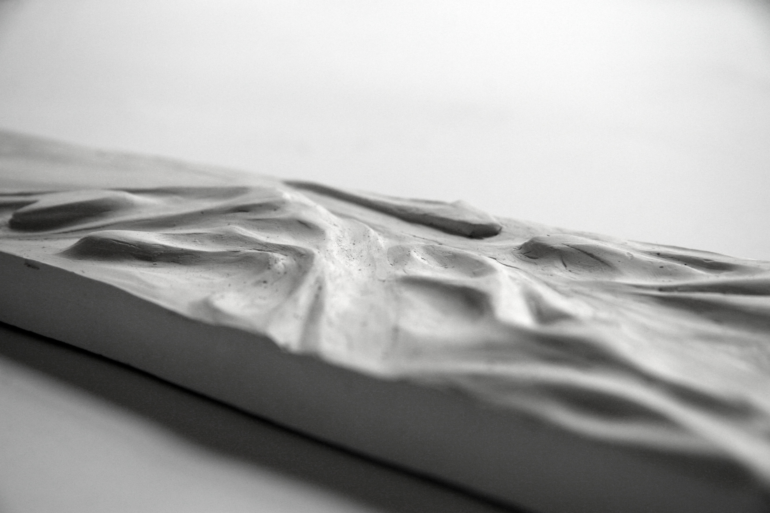
Balmori Associates and DTAH’s competition entry for June Callwood Park on the historic edge of Lake Ontario creates intimate neighborhood pockets along a main path that opens up to Fort York, Coronation Park and the lake. Sculptural forms generated by sun and wind patterns in the park define spaces for recreation and respite allowing for new ways of urban inhabitation and programmatic facility. Slides meander down the slopes and children play in the mist of rubber balloons in an interactive splash park. Rubber surfaces allow for unstructured play and the Fort York Green provides passive play space adjacent to the playground.

The park is shaped to maximize the sun exposure with maximum wind protection. The concave surfaces facilitate stormwater management in an artful manner (once collected in underground cisterns, water can then be used to irrigate the park) and at night they glow with the moonlight.

13 Acres // East Clayton Public Park & School

2000 - East Clayton, Canada

13 Acres // East Clayton Public Park & School

East Clayton, Canada

CLIENT East Clayton / STATUS Competition 2000 / SIZE 13 acres / DESIGN TEAM Balmori Associates

The 13 acre site is surrounded by a New Urbanist style, Sustainable Community Master Plan developed between 1997-2000. Based on principles of sustainability and complete communities, the plan includes the application of innovative servicing, stormwater management, road standard, and neighborhood planning ideas.

The Livable Region Strategic Plan, the Greater Vancouver Regional District’s vision of land use and transportation sets out four broad strategies for achieving urban growth in the Lower Mainland region.  These include protecting the green zone, building complete communities, achieving a compact metropolitan region, and increasing transportation choice. The Clayton area was identified as a “suburban”, and East Clayton as a new “urban” neighborhood.

At the same time, complete communities also protect the quality and integrity of ecosystems by maintaining environmentally sensitive areas (i.e., natural flow-receiving watercourses), and by managing the quantity and quality of storm-water runoff.

Rosario Civic Center

2001 - Rosario, Argentina

Rosario Civic Center

Rosario, Argentina

CLIENT Municipalidad de Rosario / STATUS Constructed 2001 / DESIGN TEAM Balmori Associates, Pelli Clarke Pelli

South Garden        

Option A: a space defined by an hedge of flowering shrubs and grass in the center with a largetree as focal point. A water element (a small cast iron fountain ) and benches around the space will be included to animate it. The possibility of using this space for the wedding ceremonies or for the reception after the wedding was accepted and Arq. Vidal encouraged usto continue exploring it.

Option B: a central space planted with flowering trees in an elliptical shape, surrounded by grass and shrubs. In this case the benches are under the gallery.

Civic Plaza

Conceived as a hard plaza with a paving pattern that emphasizes the axis and the inclusion of benches and a water element if the possibility of closing the plaza by night exists. We discussed the issue of the security by night and although we believed that the Café and the Health Center would generate activity, Arq. Vidal advised us to consider the inclusion of a gate. He also commented about the need to contemplate some outdoor furniture for the bar. We also talked about the importance of the “ totem’s” location in the Plaza as the symbolic element ofthe Civic Center.

North Garden

A space for basketball practice and a space for sitting under a large tree with stepping stones and a drinking fountain. The surrounding walls will be treated with a kind of brick (nido de abeja) which allows the light to go through. Vines are proposed on the top. Arq. Vidal suggested to treat the space as an outdoor waiting room for the Health Center instead of a playfield.

Streetscape                           

Option A: large trees spaced 9 to 10 m in between them.

Option B: For the streets with parking places we proposed large trees combined with small trees in between them. For the other two streets, we proposedlarge trees spaced 10 m in between them . The species used are Jacaranda and Tipa. The access of public to the Civic Center would be primarily by bus, secondarily place by walk and bike and in the latter by car. Arq. Vidal express the need of provide bike racks (aprox. 20 units). He also suggested including a drop off for the Registro Civil. Anotherissue that was considered is the possibility of proposing a roof garden in some of the buildings as an improvement in the mechanical systems of heating and cooling.

Maral Explanada

2015 - Mar del Plata, Argentina

Maral Explanada

Mar del Plata, Argentina

CLIENT Maral SIZE 264,000 ft2 / 25,000 m2 / STATUS Completed 2015 DESIGN TEAM
Balmori Associates / Pelli Clarke Pelli Architects

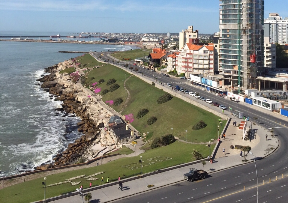
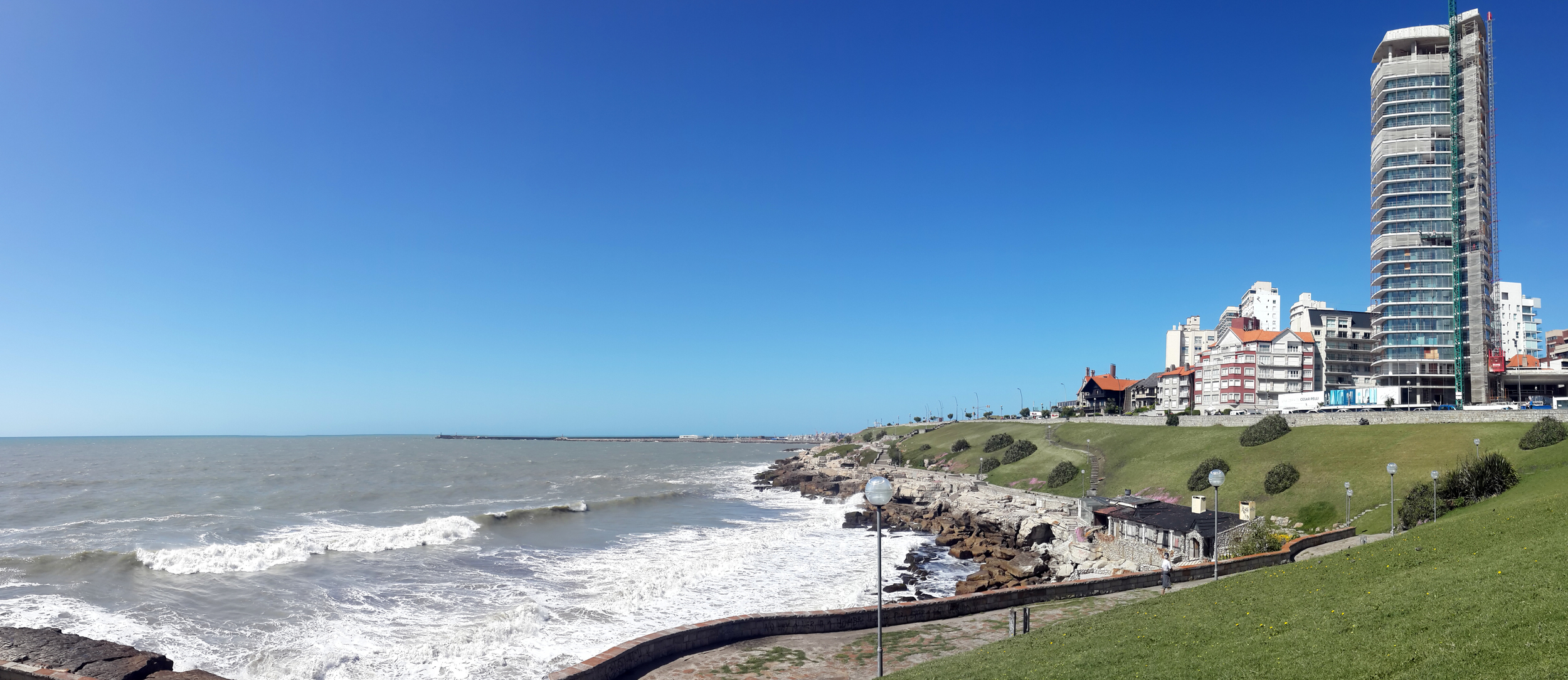
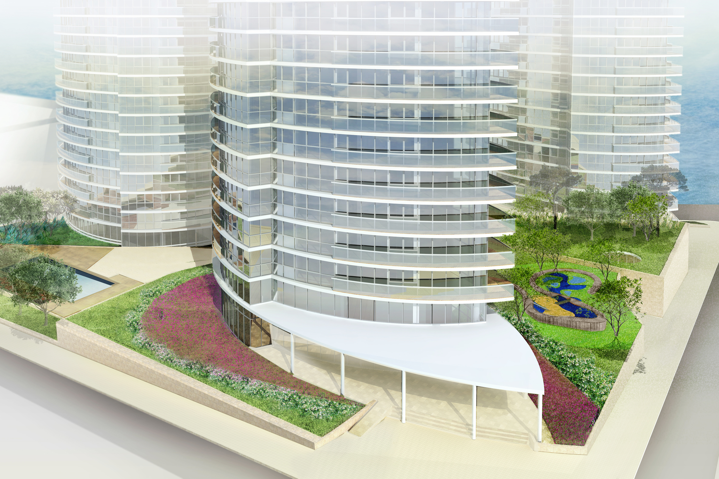
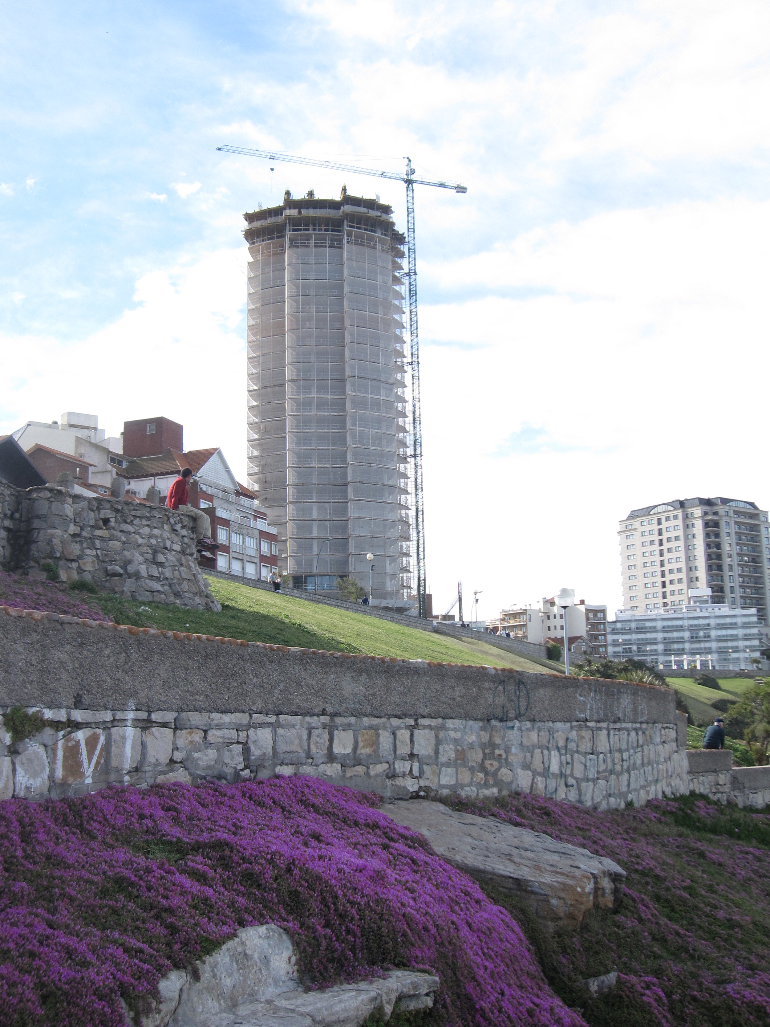
Located by the sea in Argentina’s largest beach resort city, Maral Explanada consists of a sloped landscaped terrain connecting three residential towers. The site sits above the rocky Atlantic shoreline at Playa Chica, one of Mar del Plata’s well-known beaches.

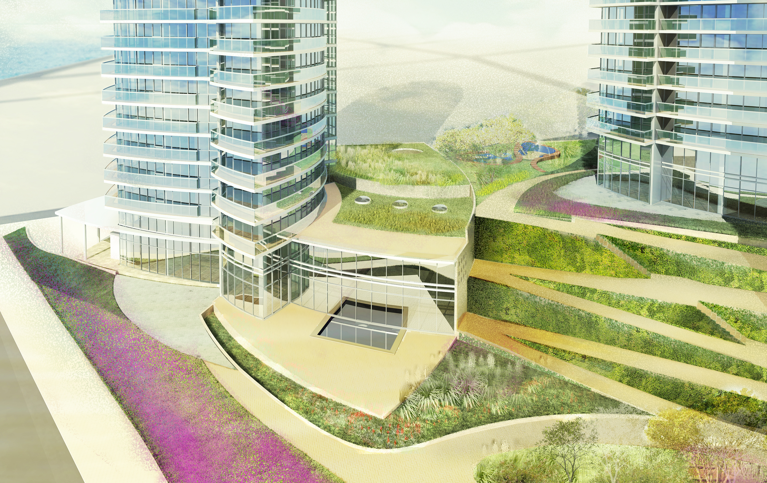
The three towers — 19, 21 and 23 stories tall — are arranged around a series of terrace gardens planted with indigenous plants. At the base of the tallest tower is a stepped, stone-clad podium with an accessible rooftop garden. Inside this podium is a large gym and indoor pool shared by the three towers.

From the base of the towers, the land drops steeply to the sea. The landscape design mediates this 10-meter incline with a series of terraces that recreate the natural coastline. The terraces include spaces for walking and leisure, as well as an outdoor swimming pool. Native Argentine salt resistant species of various textures delineate the property’s boundaries separating private from public.

Institute for Advanced Studies

1996 - Princeton, NJ

Institute for Advanced Studies

Princeton, NJ

CLIENT Institute for Advanced Study / SIZE 15,000 Sq ft. / STATUS Completed 1996 / DESIGN TEAM Balmori Associates, Inc. / Van Zelm, Spiegel & Zamecnik, Inc. / Geotech; Melick-Tully & Associates , Inc. 

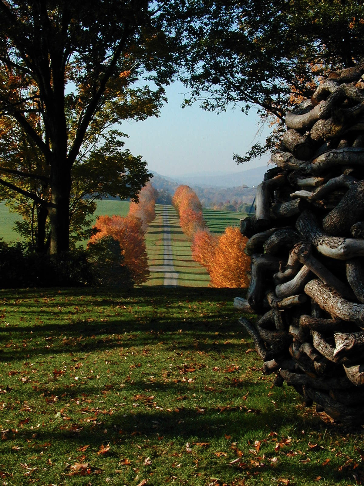
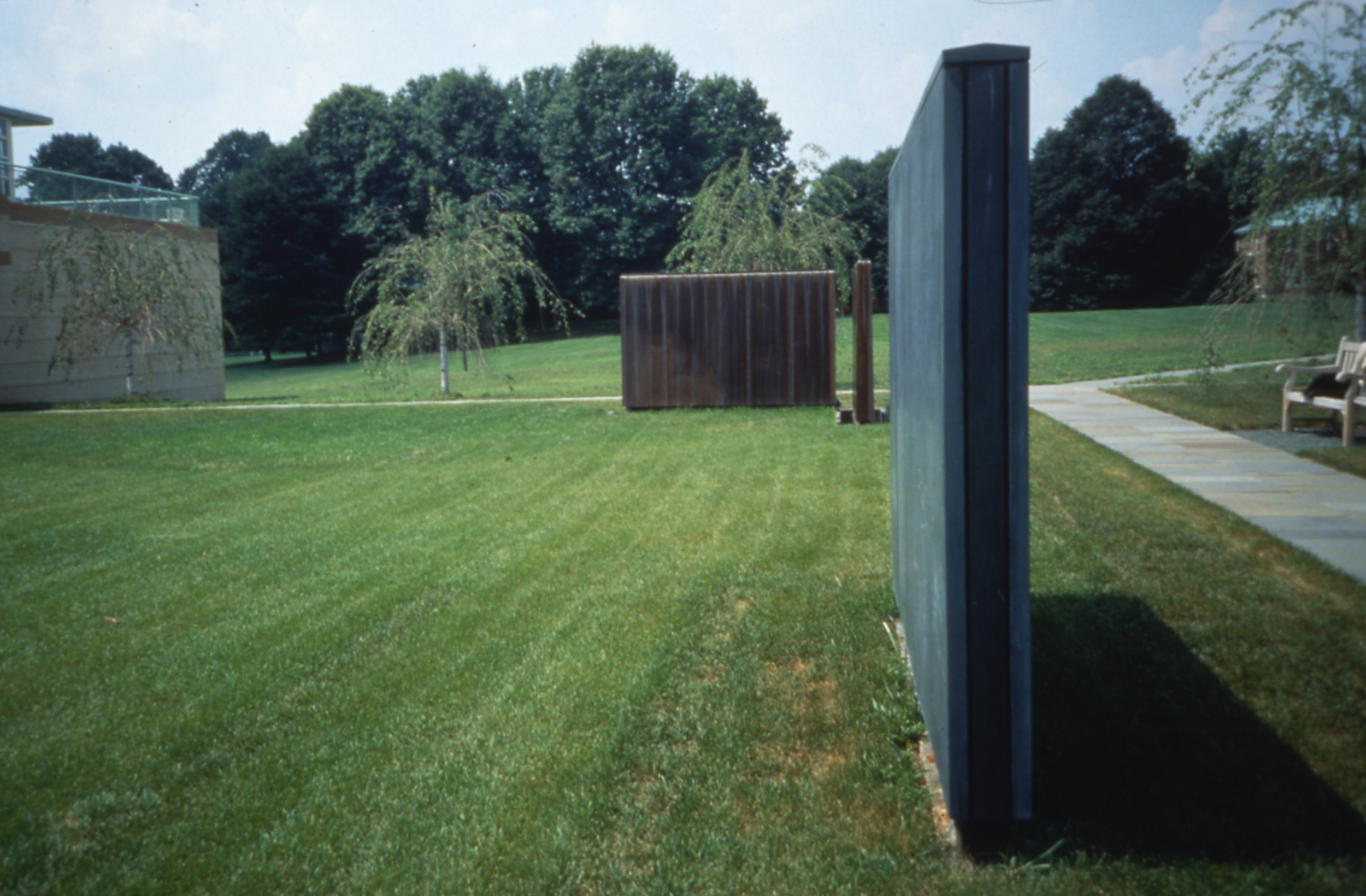
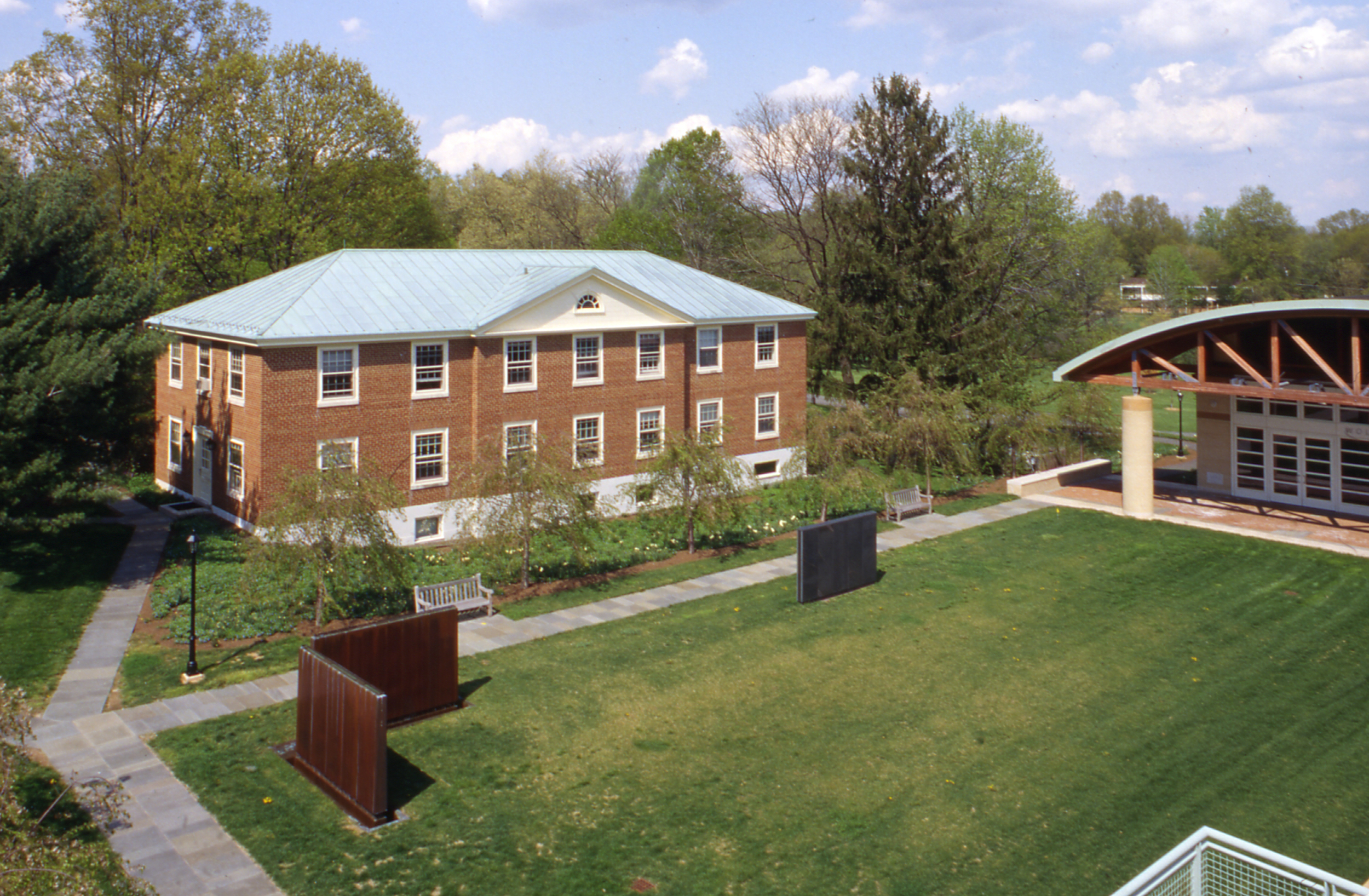
A spare quadrangle enclosed by cherry trees sits at the campus’ eastern edge; a vista towards the woods stretches out on one side of a vast open lawn. A traditional slate blackboard, a surface from within the buildings, is now a built outdoor element, to be written on and erased by the mathematicians passing through the courtyard.

Several feet away, two copper-clad slabs sit perpendicular to each other, forming a corner. Water streams continually down their surfaces and leaves a lasting mark visible in the winter when the water is turned off. These minimal components, with changing markings, are a modern reworking of the traditional elements of fountain and wall.

The courtyard is organized to provide access to the two buildings while maintaining an expansive central area where outdoor recitals may be held or individuals can sit under the cherry trees that define the edges of the courtyard.

Hudson Yards Park

2008 - New York, NY, USA

Hudson Yards Park

New York, NY, USA

CLIENT NYC DDC / LOCATION Hudson Yards, NY / STATUS Competition Finalist 2008 / DESIGN TEAM Balmori Associates, Work AC, Langan Engineering, L. Robertson Associates, Fritz Haeg, Projects Projects, Creative Time

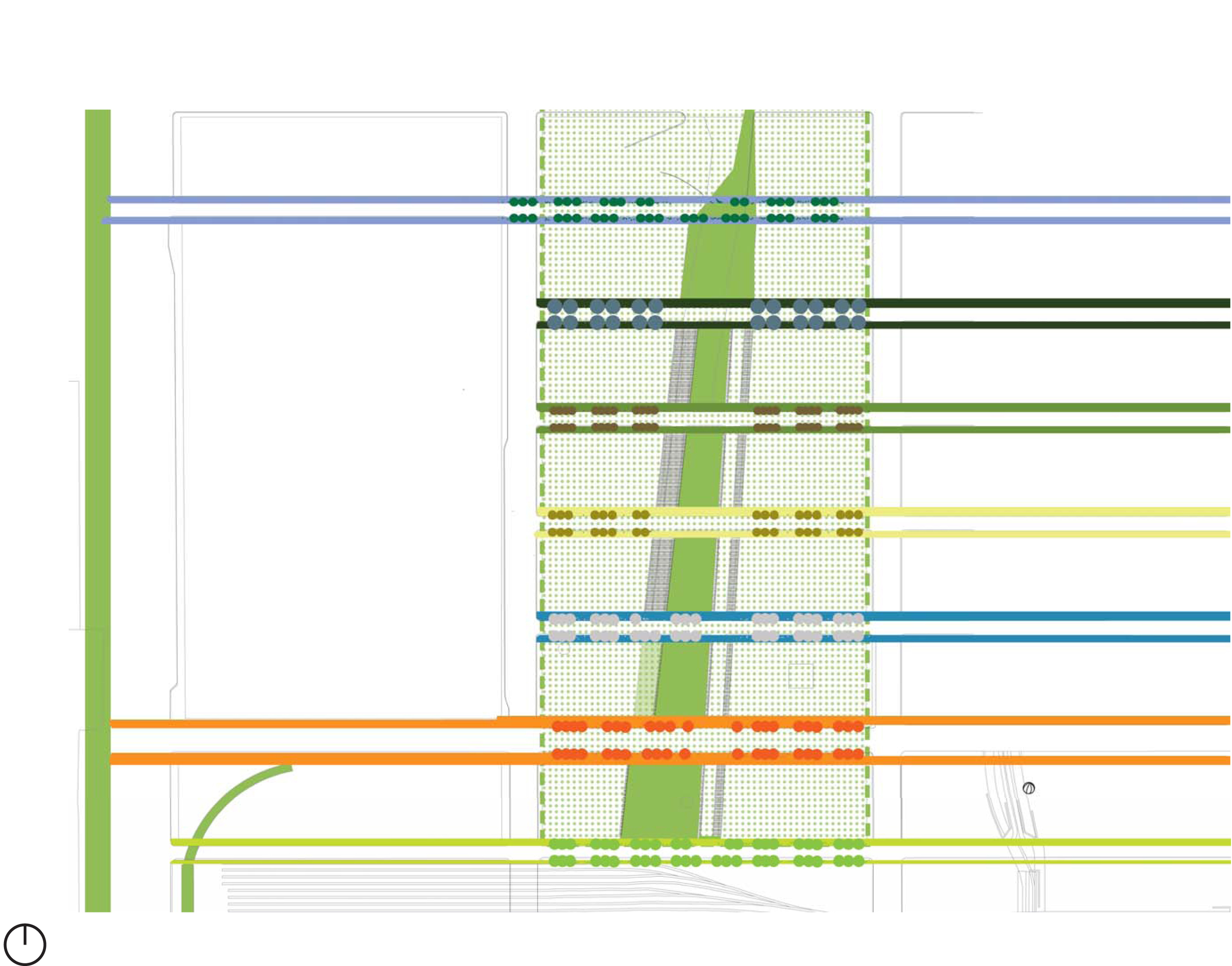
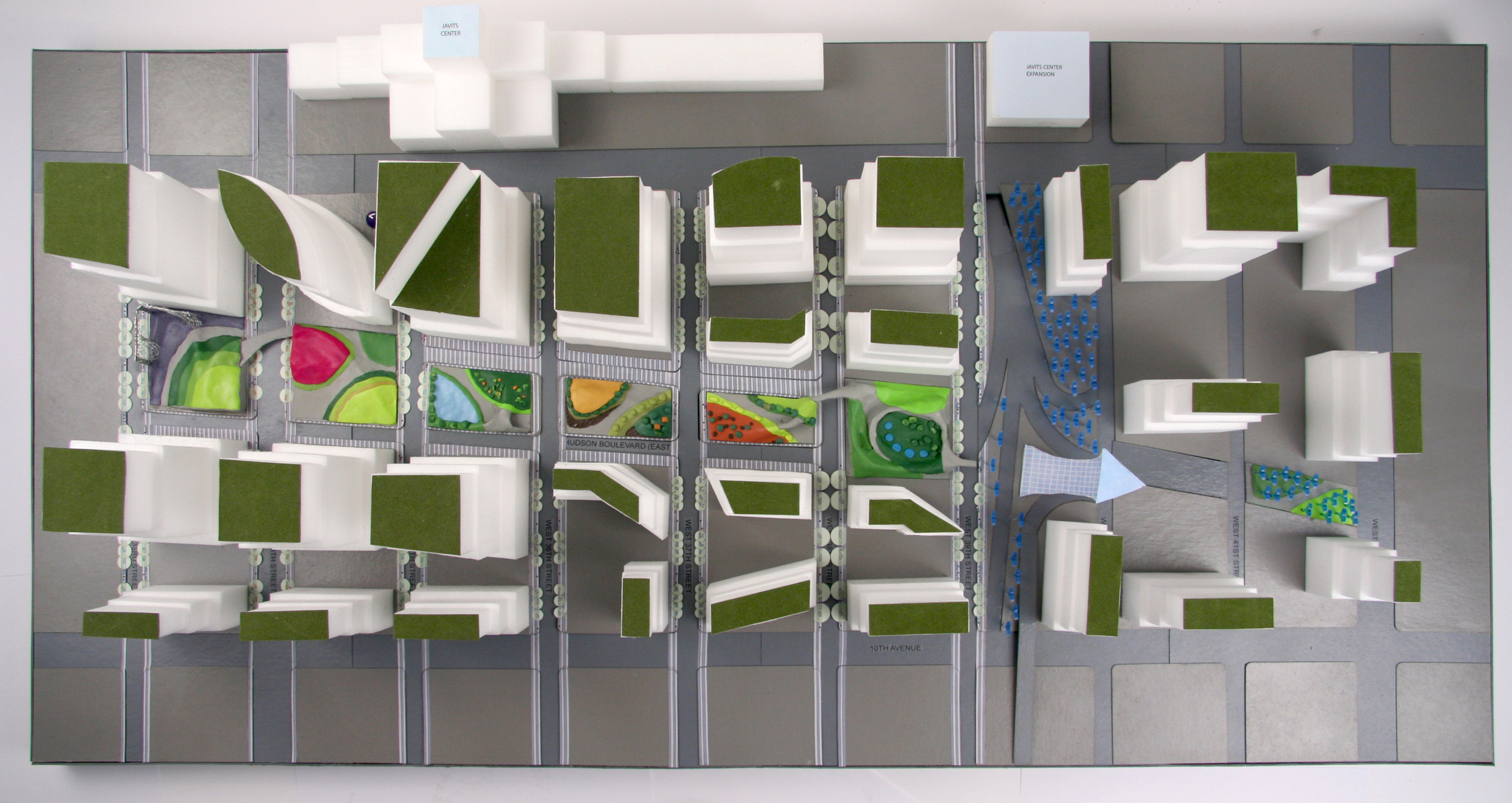
Hudson Yards linear park runs parallel to the Hudson River Park connecting the major transportation and cultural hubs of 34th and 42nd streets. Low Line Park is a linear park with a new context and form. It is a park of movement that creates an urban leisure infrastructure and includes diverse programming. 

Low Line Park in the Wild West Side responds to the architecture, infrastructure, topography and ecology to create what we term SuperCityPark(s). The park and streetscapes weave through each block, taking on specific character and creates a program accordingly. The park builds off the energy of the city- and by its nature the park retains and develops its traditional ecological functions: habitat creation, stormwater management, species diversity. This pattern of development and its mixed use will serve as a model for Low Line Park as a new kind of linear park, one with a programmed response to its surrounding development.  

Hua Qiang Bei Road

2011 - Shenzhen, China

Hua Qiang Bei Road

Shenzhen, China

CLIENT Bureau City Government of Shenzhen /  STATUS Commissioned 2011, Under Development / DESIGN TEAM Balmori Associates / Work AC / ARUP / Zhubo Engineering / Zhubo

In 2010 Balmori Associates and Work AC won an invited competition to redesign a 1 kilometer section of Hua Qiang Bei Road in Shenzhen. The design responds to the area’s growing commercial character by improving flows, organizing traffic and enhancing the pedestrian environment with a green streetscape.

To strengthen the identity of Hua Qiang Bei Road we created a series of nodes of activity that project a vibrant new vision for the district’s future. These nodes take on different scales. The most visible are the five “lanterns” that define a new space of the street, in the sky, providing connections and enabling a major expansion of public space. We imagine the “lanterns” to resonate with the famous entrance gates to traditional Chinese streets, creating a strong and memorable image. The lanterns are like the needles of acupuncture: used at only a few, precise points to bring energy and organize the flows around them, letting the street breathe better between. They are also bridges, connecting one side of the street to the other. We also provided a wide variety of shade trees and seating types, our designed fountains and paving will improve both air flow and pedestrian flow.

This is a new kind of urban design approach, we call it urban acupuncture: acting precisely and strategically to get through all the channels to create the maximum impact using minimal means. We use a systematic and synthetical Urban design method to combines the softness of landscape design, the precision of traffic engineering, and the power of architecture to improve flows, strengthen identity, and create new public space.