Skid Rows I & II

2008 - New York, NY, USA

Skid Rows I & II

New York, NY, USA

CLIENT Queens Museum of Art and Mildred's Lane / SIZE 2 acres / STATUS Skid Row 1 completed 2005, Skid Row II completed 2008 / DESIGN TEAM Balmori Associates, Brian Tolle Studio 

Skid Rows I was a winning entry of the Artists Gardens competition and exhibition organized by the Queens Art Museum in 2005 as part of a large-scale survey of contemporary artist gardens, Down the Garden Path: The Artist’s Garden After Modernism. 

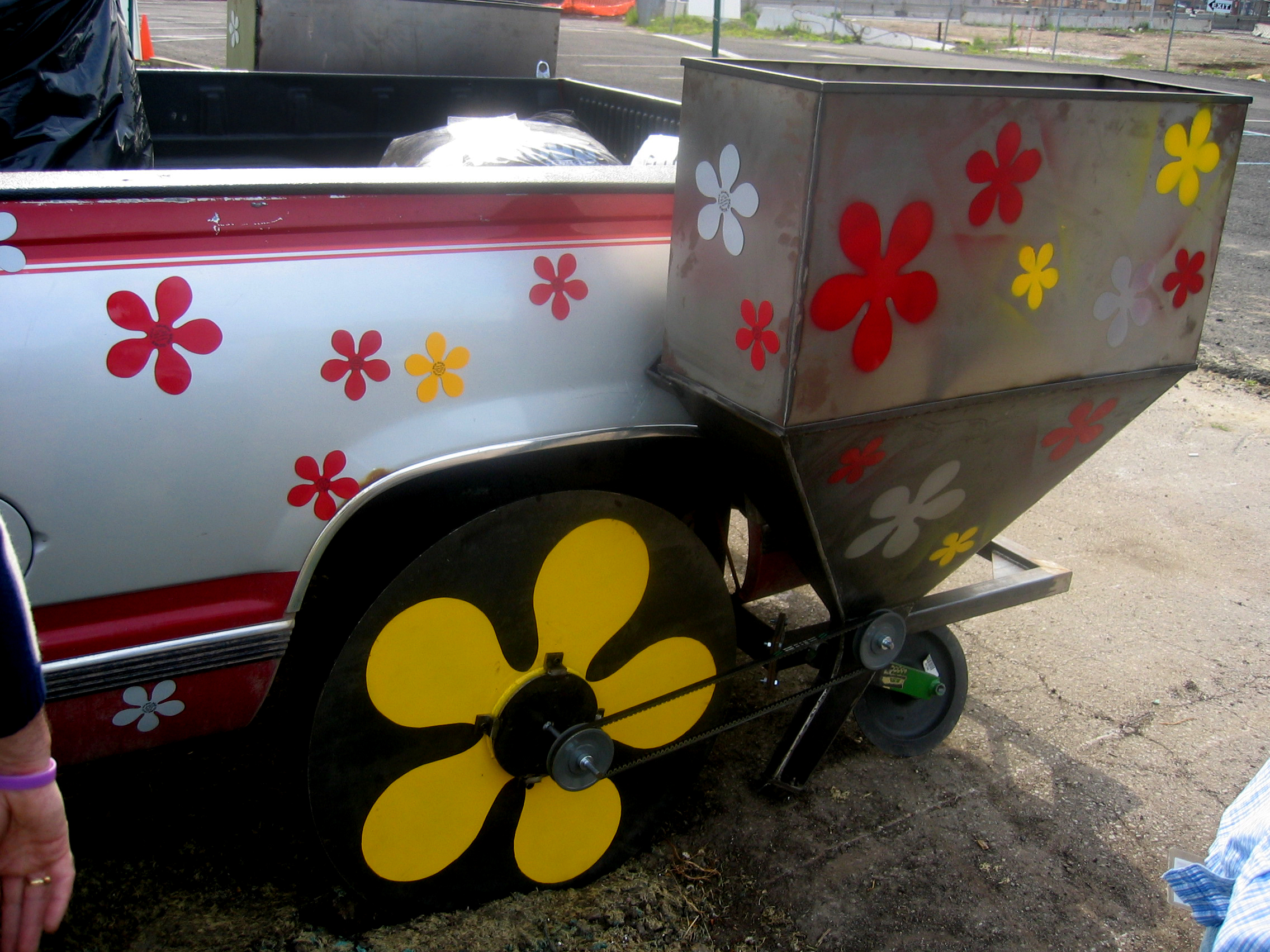
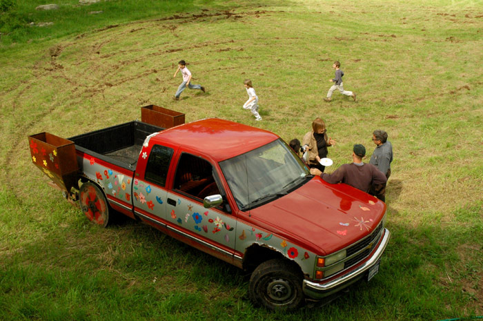
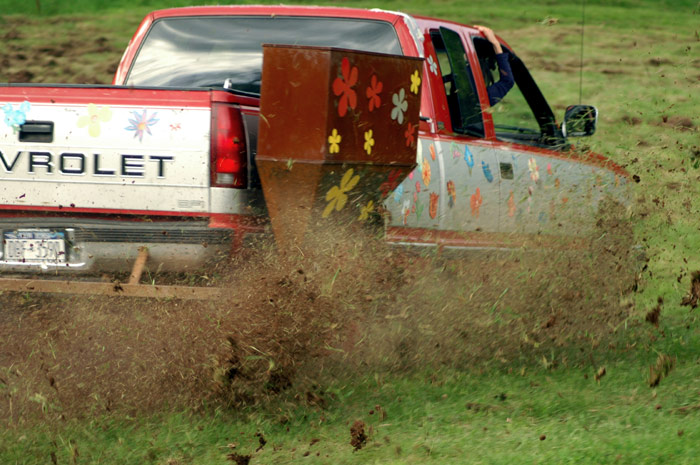
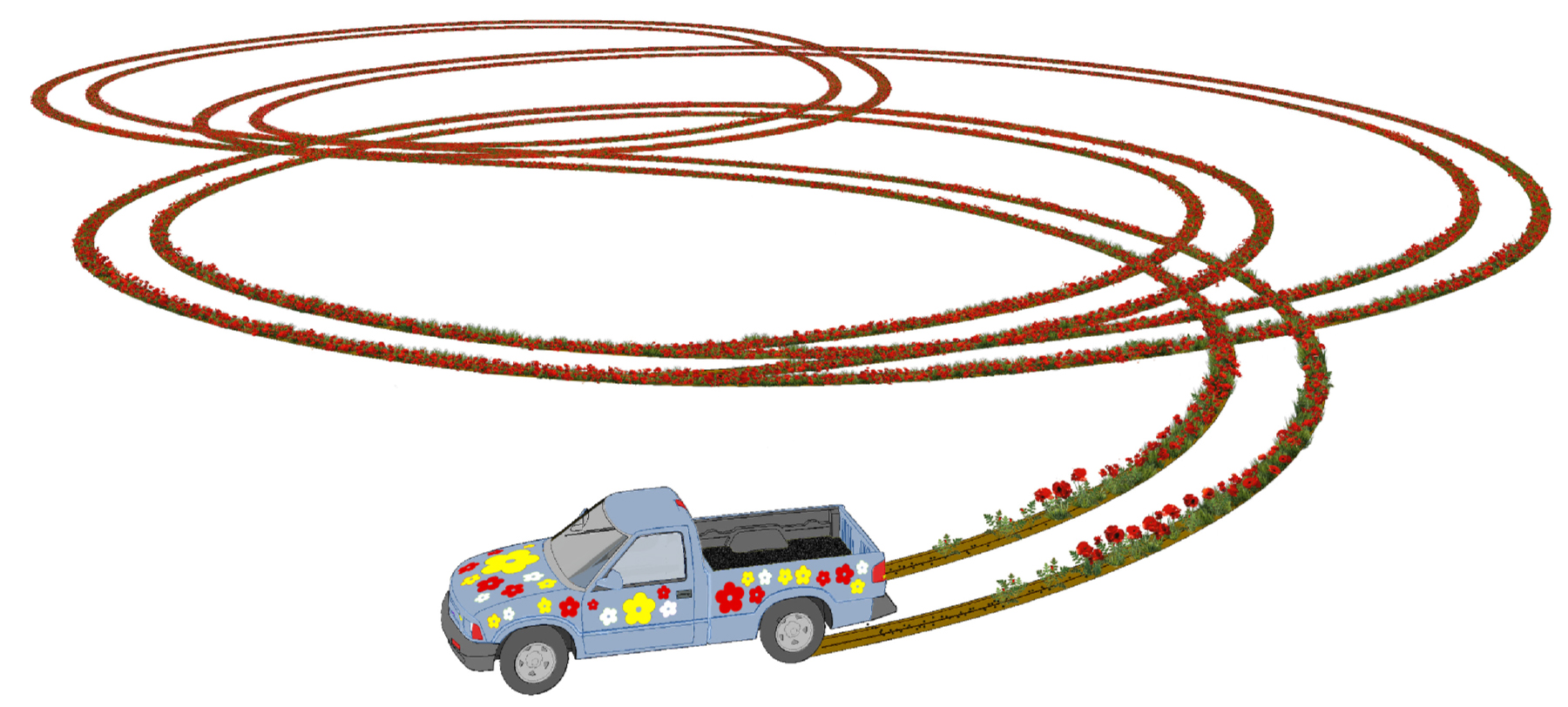
Skid Rows is both a garden and an artistic process. Diana Balmori and artist Brian Tolle careened around a grassy, two-acre expanse of the Queens Botanical Garden, doing doughnuts in a red Chevy pickup decorated with flower decals. With a custom-made trailer attached to the rear wheels, the truck inscribed circles in the earth while releasing yellow tickseed and red poppy seeds. This revolutionary method of low-impact cultivation called direct sowing challenges traditional planting techniques which tend to disturb the soil’s essential water and nutrient-retaining capabilities. Skid Rows is a hybrid performance and earthwork that created an unusual flower garden in the form of a two-acre drawing.

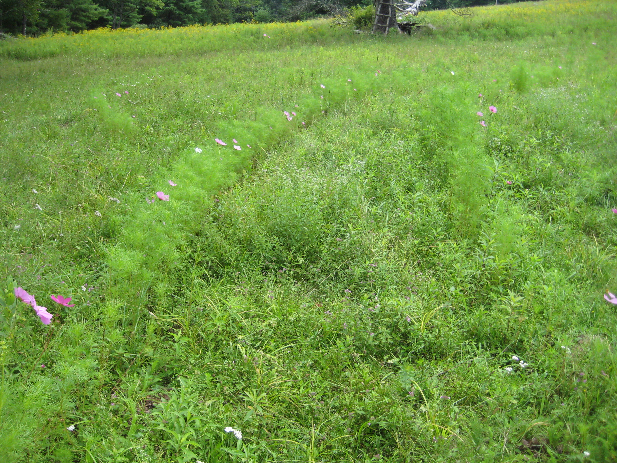
On May 24, 2008 Balmori Associates and Brian Tolle collaborated on Skid Rows II to celebrate the grand opening of Mildred’s Lane, an Artists’ Colony in Beach Lake, Pennsylvania.  Transformed into a hybrid plow and seeder, the truck inscribed circles into the earth while simultaneously releasing sunflower and cosmos seeds. The ecology enabled the project to come up with new landscape forms.

Bronx Greenway

2004 - Bronx, NY, USA

Bronx Greenway

Bronx, NY, USA

CLIENT The South Bronx Green Roof Community Outreach Project  / STATUS Completed 2004 / DESIGN TEAM Balmori Associates, Sustainable South Bronx, Columbia UniversitySchool of Public Health

The initiative is a collaboration among Sustainable South Bronx, the Columbia University Mallman School of Public Health, Cool City Project and Balmori Associates. Key goals are to create a network of living roofs in the South Bronx, monitor and document the benefits, and promote the use of living roofs throughout the South Bronx and the rest of the city.

The South Bronx is an ideal candidate for a network of living roofs. There is a dearth parkland and it has an extremely disproportionate amount of environmental burdens including than two dozen transfer stations, a sewage treatment plant and a sewage sludge pelletizing plan that plagues the area with odors and debris. Many of its citizens are especially vulnerable to the stresses of the urban heat island effect which can be severe in neighborhoods where the line population is elderly and lives in non-air conditioned apartments, surrounded by vast amounts of tree-less impervious surfaces.

In the urban context, the landscape is an active, living agent capable of changing local and regional conditions. A network of living roofs is a powerful new type of landscape which will play a significant role in reducing the city’s “heat island” effect: retaining and reusing storm run-off; and establishing many small, personally pleasurable oases in a landscape dominated by hot, tamed surfaces.      

Shanghai Cultural Plaza

2005- Shanghai, China

Shanghai Cultural Plaza

Shanghai, China

CLIENT City of Shanghai / STATUS Competition finalist, 2005 / SIZE 16 acres / DESIGN TEAM Balmori Associates / Beyer Blinder Belle

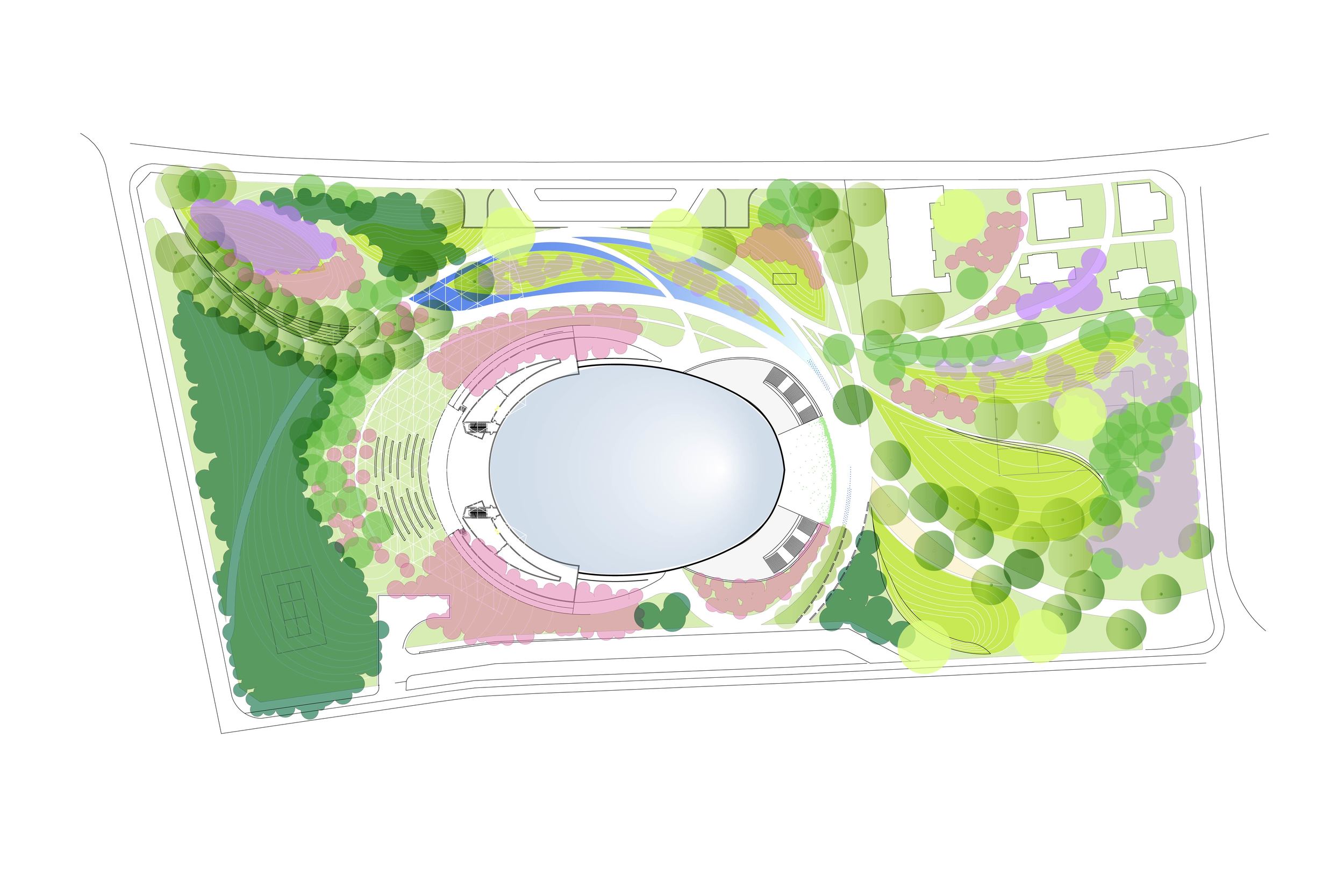
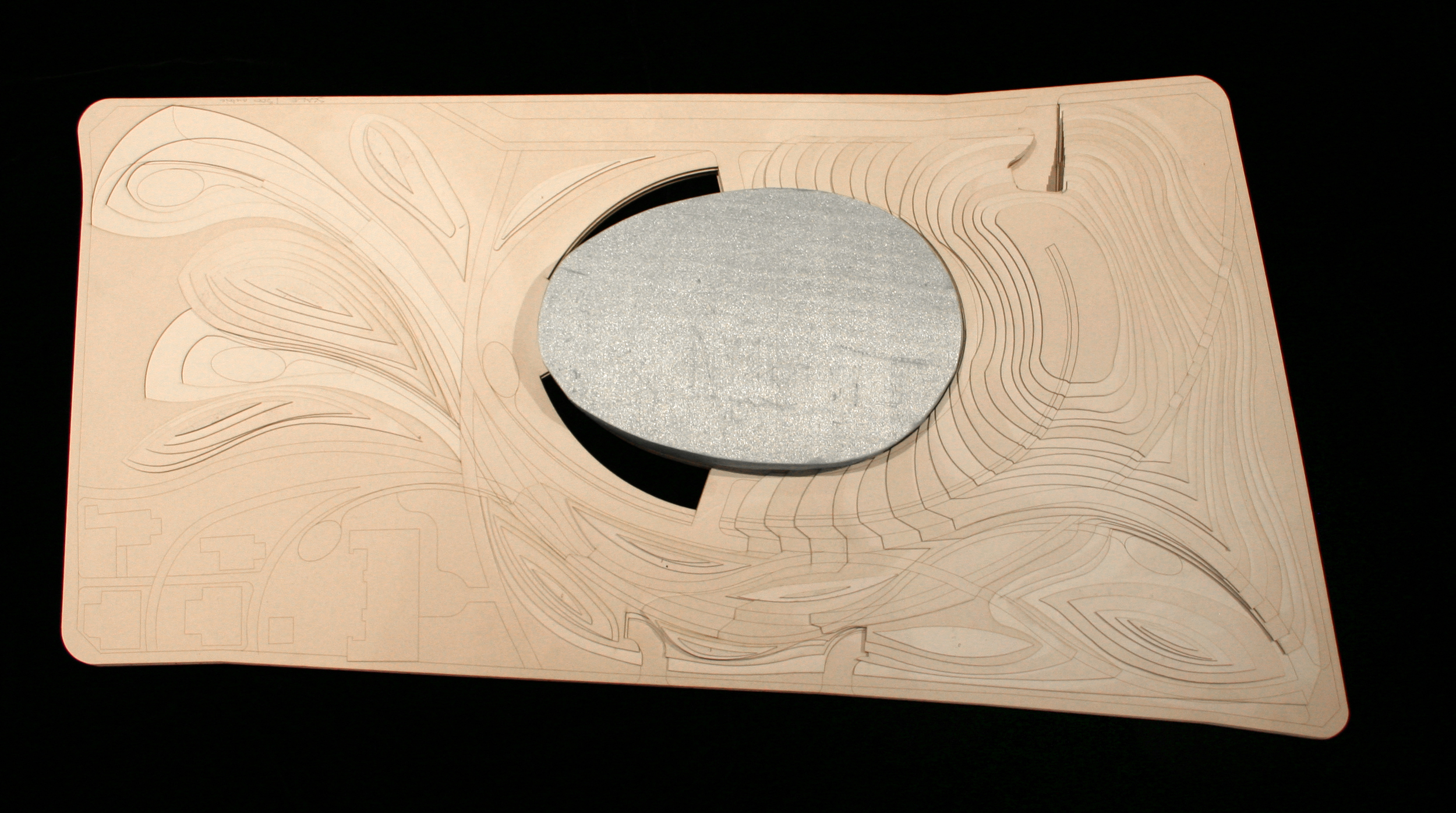
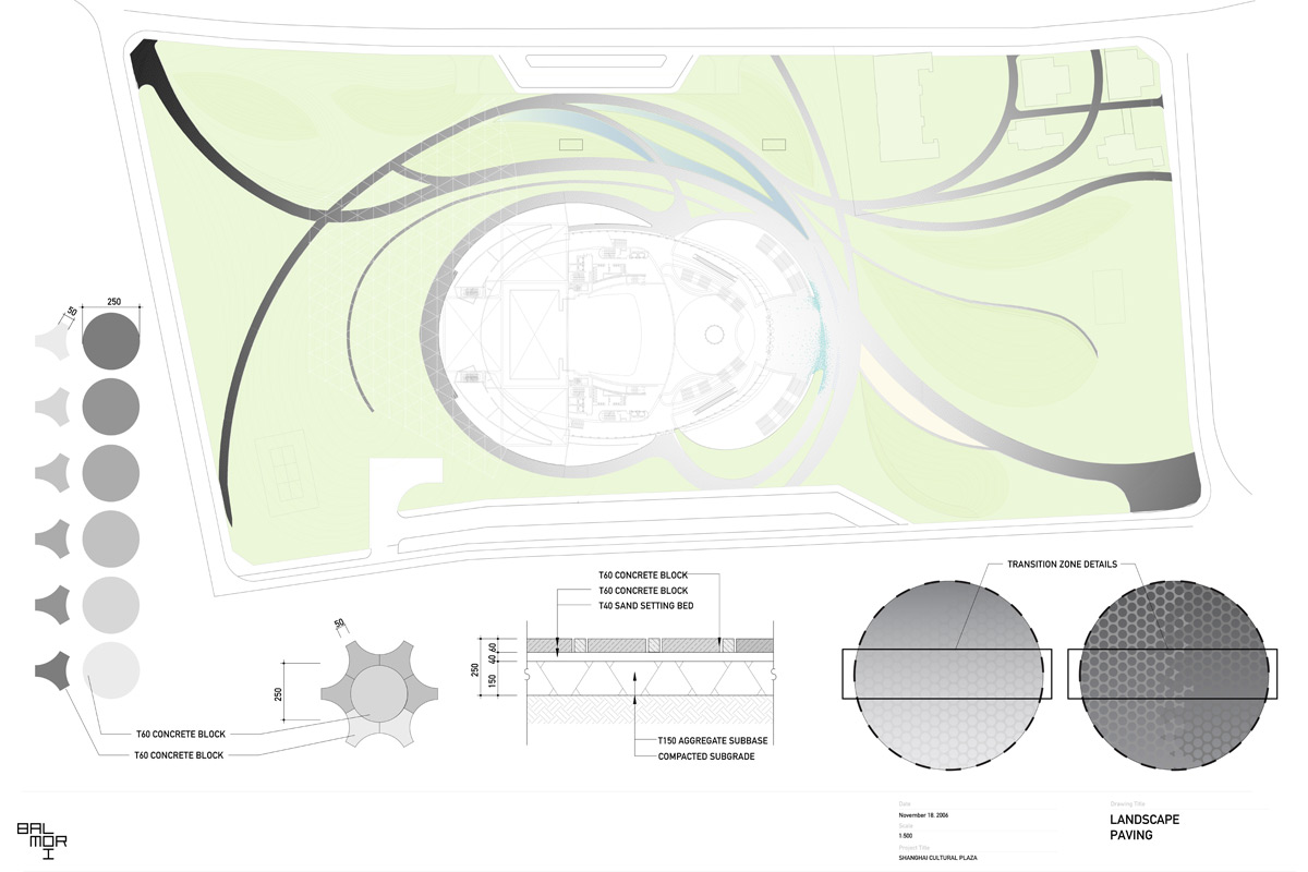
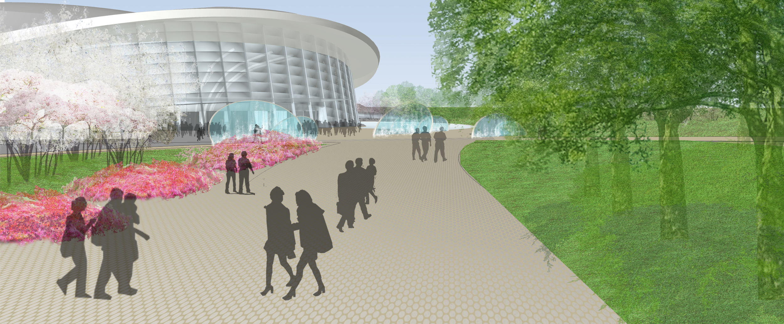
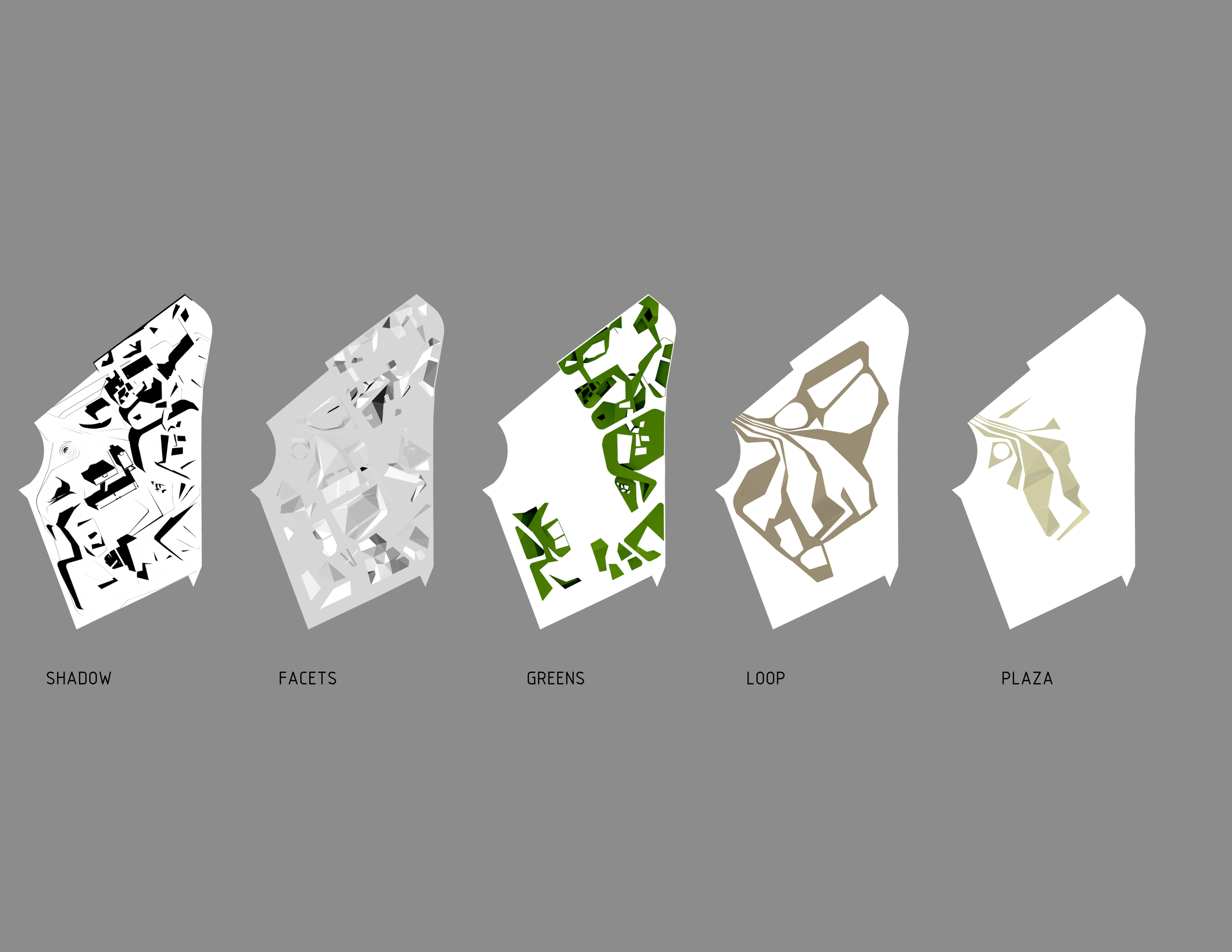
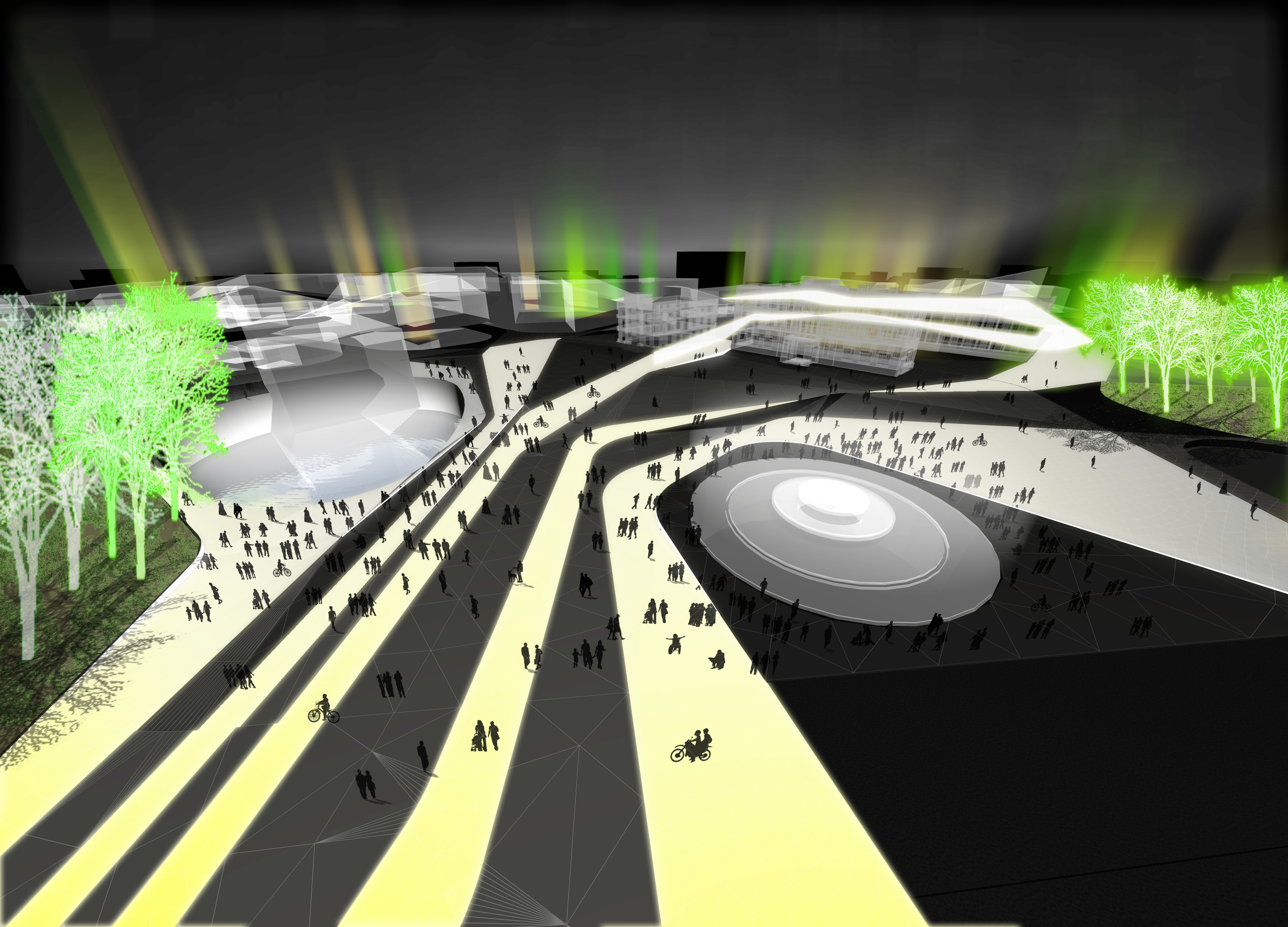
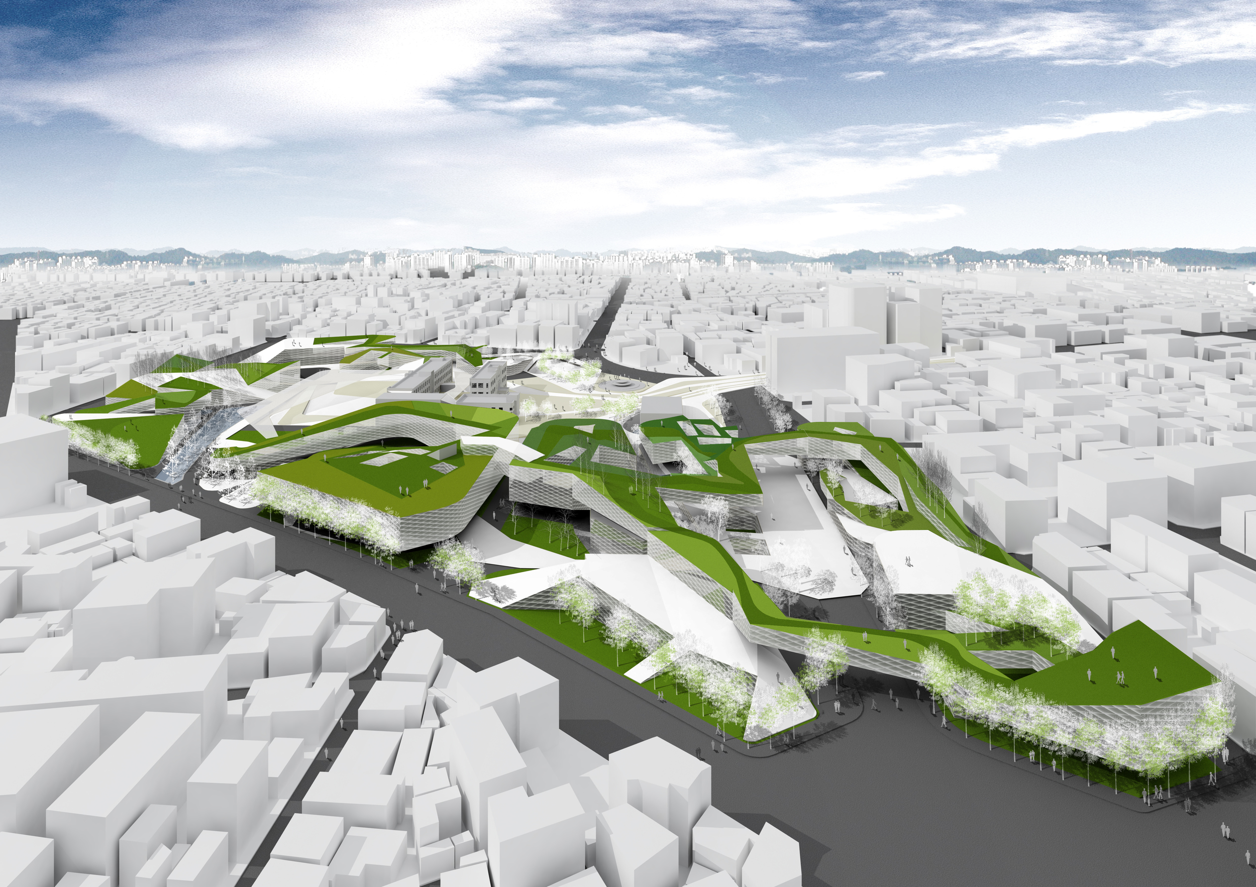
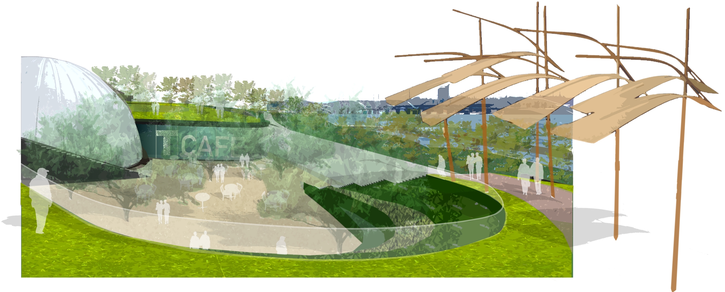
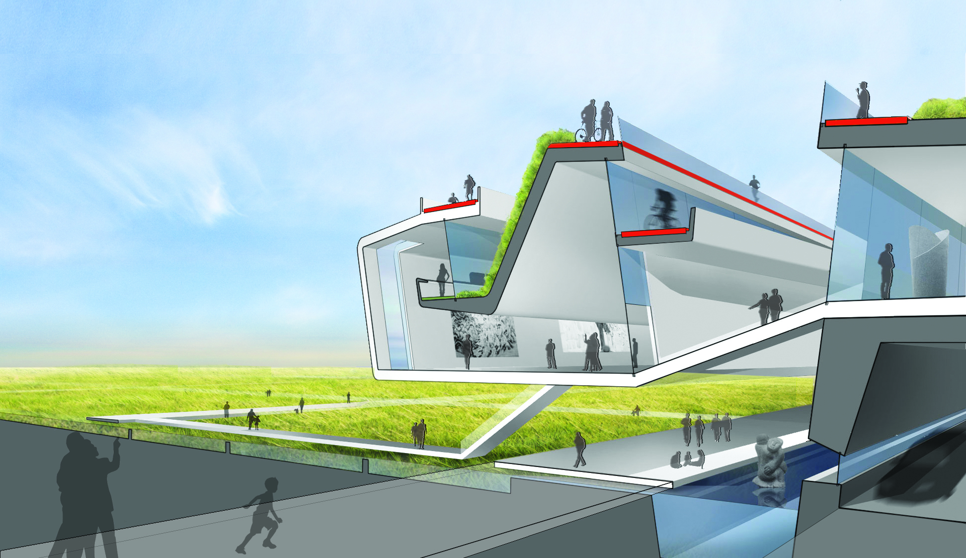
This park emerges as a continuous green gesture that unifies the diverse built elements of this urban site. The site is fragmented by remnants of various stages of urban development: historic residential buildings, a spaceframe canopy, an underground subway station, and a tree-lined street with bars and restaurants. These disparate pieces have been incorporated into a variety of park spaces through topography, planting and built elements.

A water garden surrounding the historic homes flows into the rest of the park as a series of water pools. A landform ramps below grade to extend the surface of the park to meet the underground subway exit.  A continuous balcony is built on the backside of existing bars and restaurants to open street life onto the park. New features such as a performing arts center and an amphitheater complete the transformation of this site and its diverse built elements into a dynamic cultural space.


Washington Mall

2012 - Washington, DC, USA

Washington Mall

Washington, DC, USA

CLIENT United States Washington Mall / STATUS Competition 2012 / DESIGN TEAM Balmori Associates, Work AC, Jacbos, ARUP, Local Projects, Quinn Evans, CMS Fountain Consultant, AIK Yann Kersale, Sherwood Design Engineers, LERA, JVP Engineers, F2 Environmental Design, Alice Walters / PHOTOS Courtesy Work AC

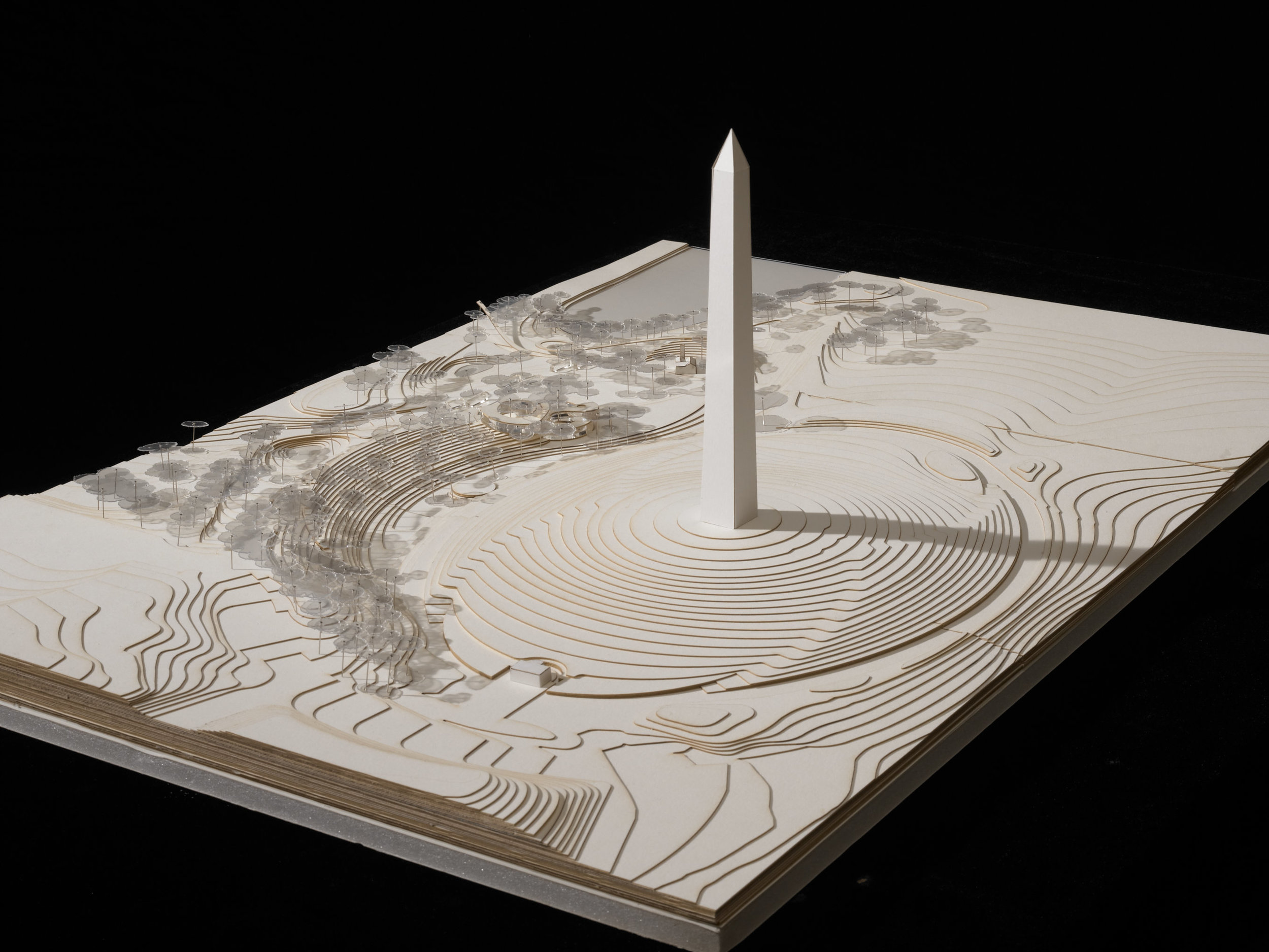
Throughout Washington DC’s history, the National Mall has represented the heart of the city and, by extension, the nation. The Mall’s landscape is as diverse as its uses: hosting protests and celebrations, accommodating vast crowds and intimate moments and paying homage to the past and the future. Like the country it represents, the Mall reflects the difference, offering the hardiness of “landscape” as a counterpoint to the formal austerity of its buildings and monuments.

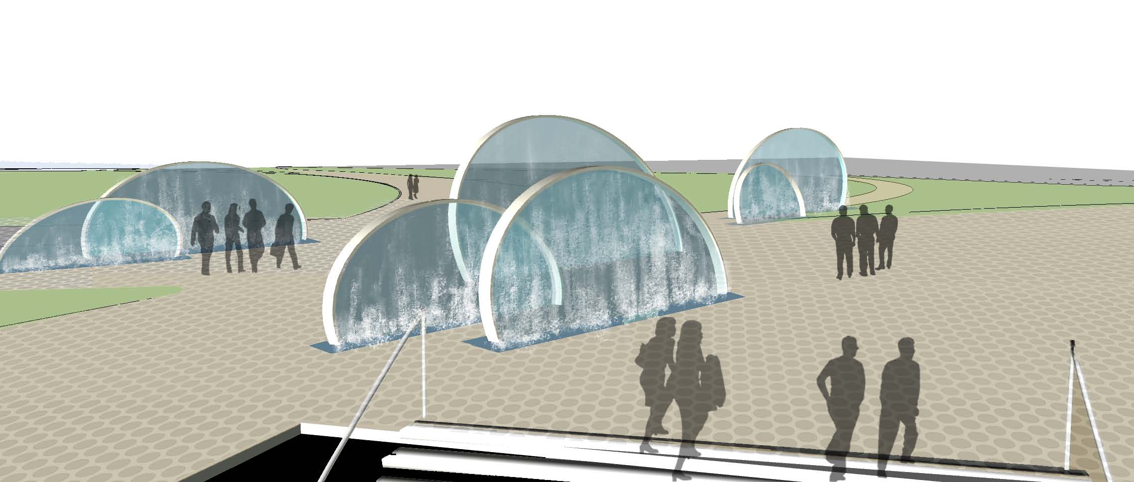
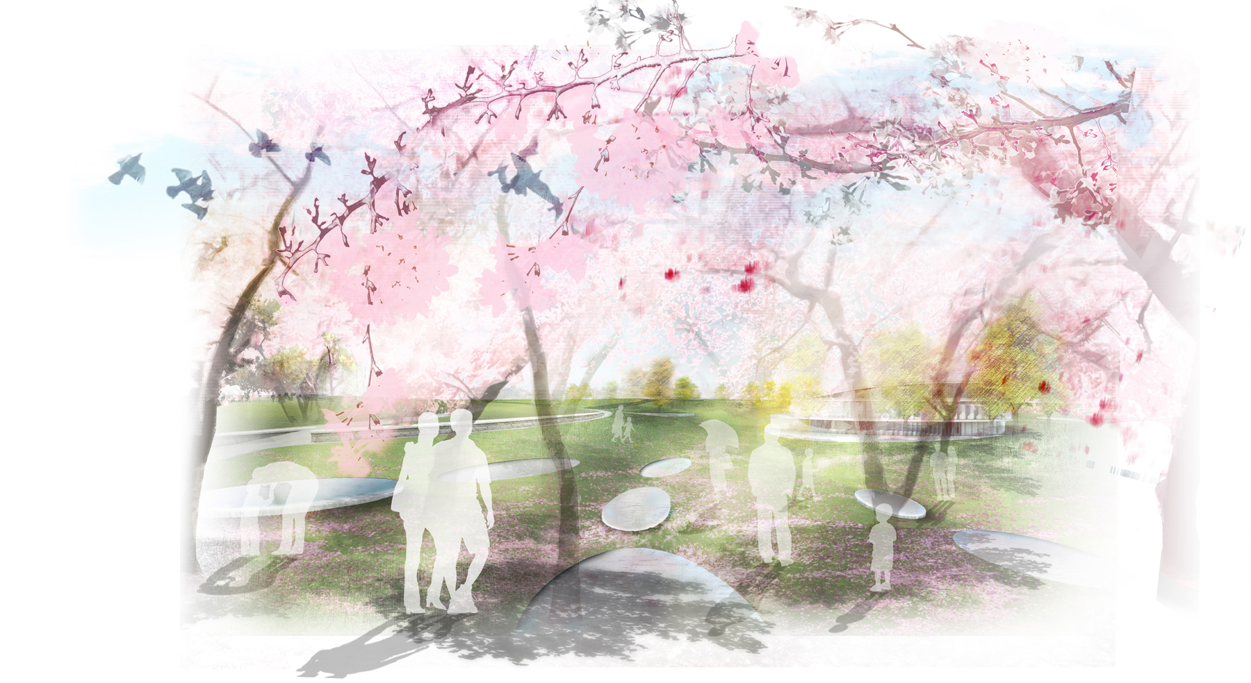
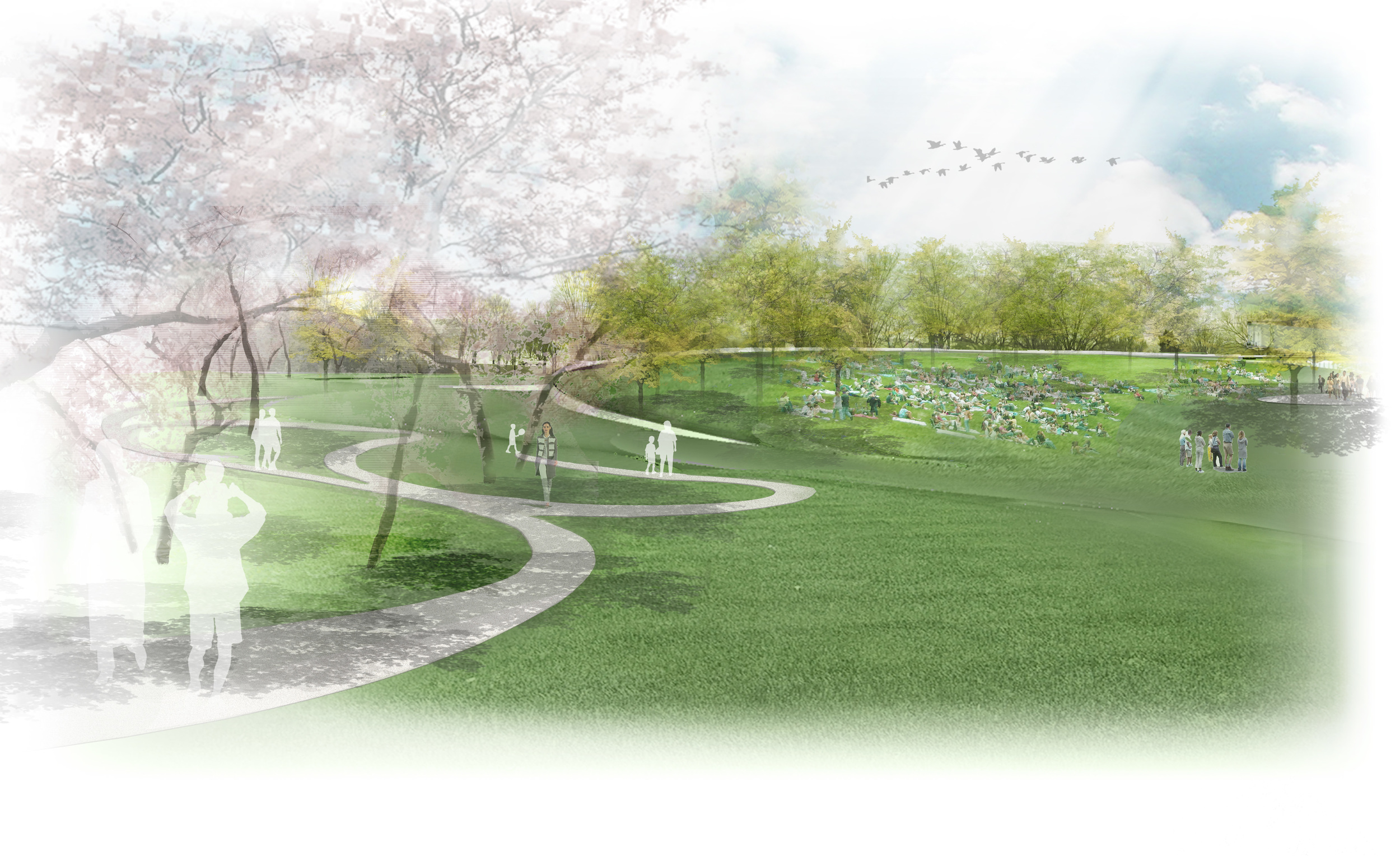
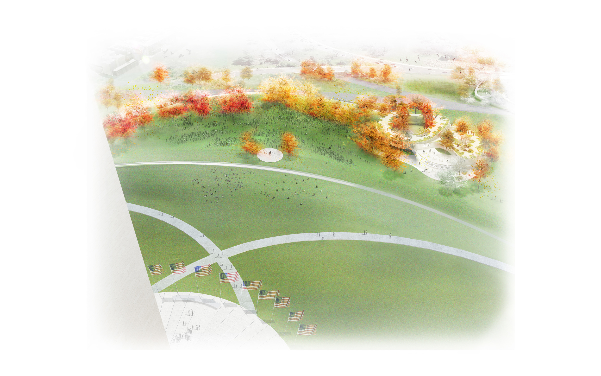
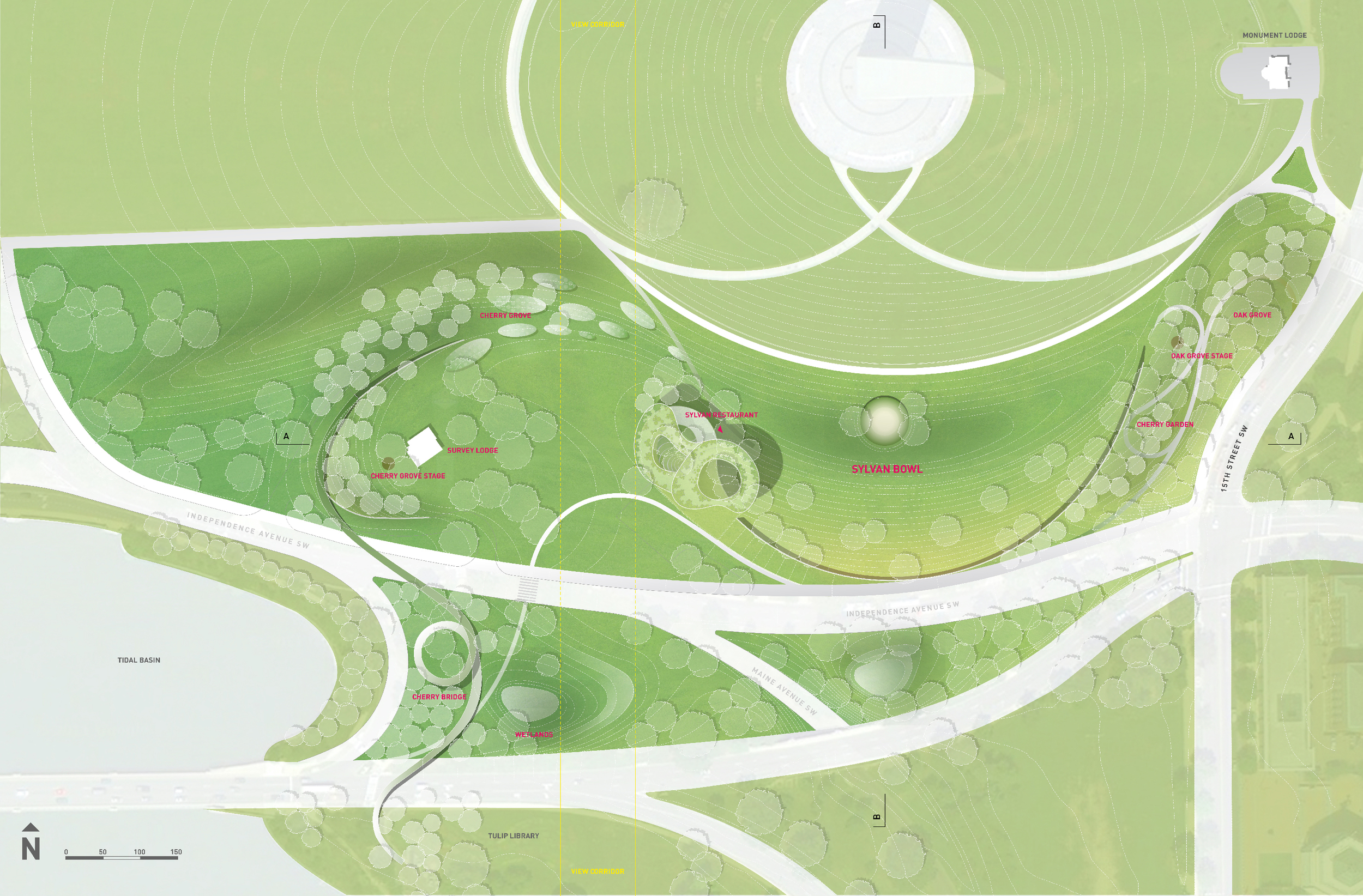
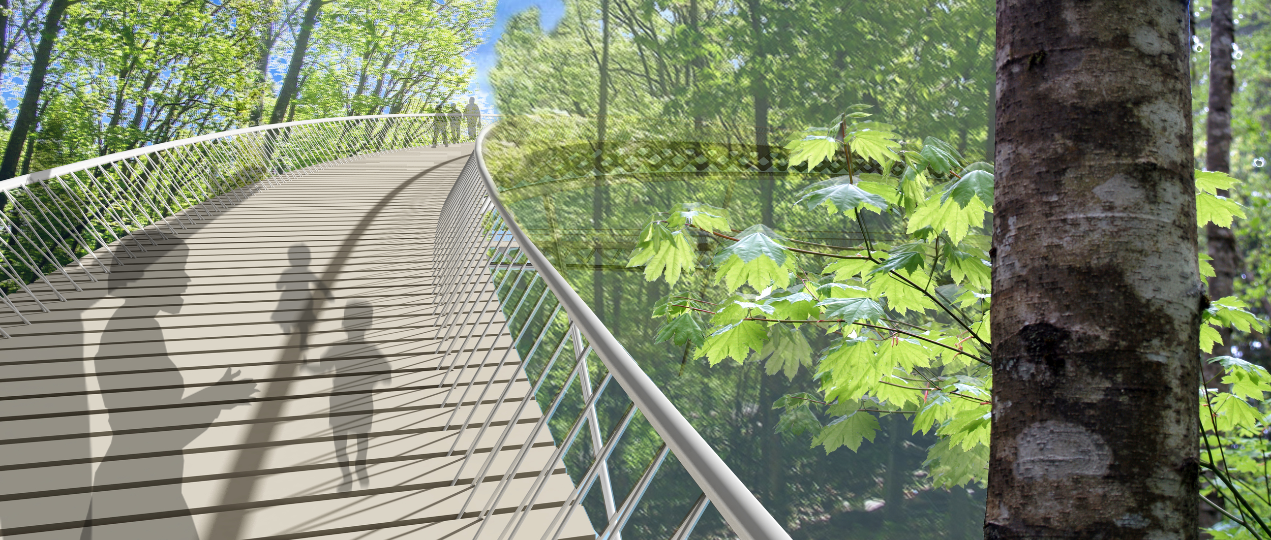
The Sylvan Way project is organized by a landform that flows east-west across the site, beginning with a new Oak Grove at the corner of 15th Street, which hosts an intimate Sylvan Theater for informal performances for up to 100 spectators. The landform continues and curves around to create the grass bowl for large spectacles, and bends back again to create the second grove, within which we have placed a “Sylvan Restaurant.” The line continues to create a playground within a small valley of ponds fed by a previously buried stream, and then carefully curls around the restored Survey Lodge to rise again in a gently angled lawn, which conceals a new maintenance shed. From this point, a new “cherry blossom” bridge leads to the Jefferson Memorial, bringing it and the MLK memorial closer to the Mall, extending the cherry walk and eliminating the confusing side trek which now requires three road crossings. This bridge touches down midway between streets in newly created wetlands, which help regulate water on the site.

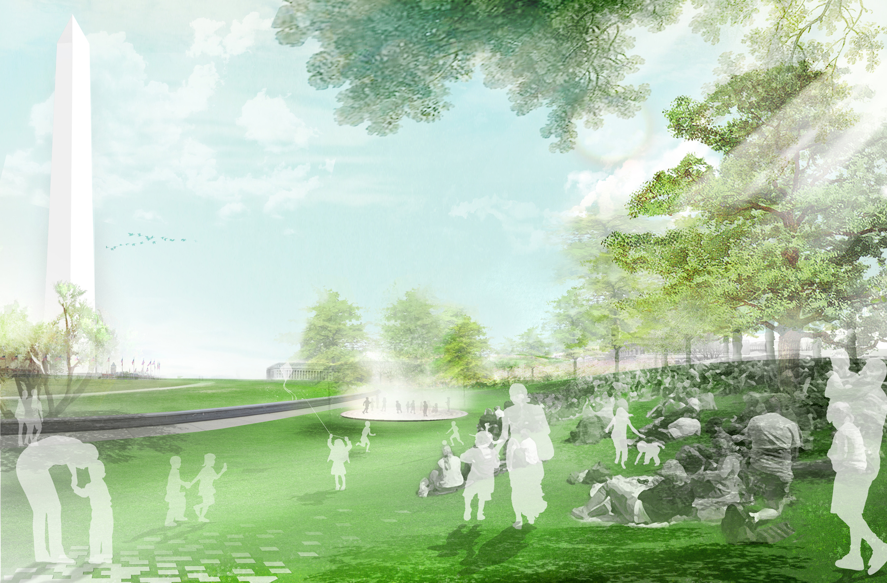
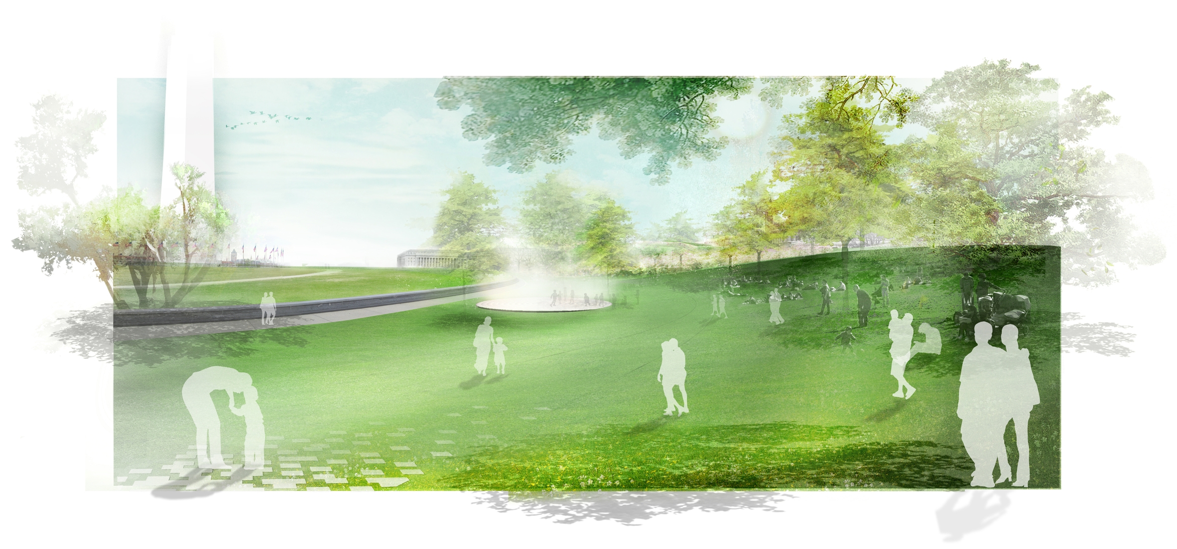
The primary landscape element of our scheme is the Sylvan Bowl, a grand new public space for the  Mall where visitors can linger in the shade to see spectacles, picnic, or to attend an NPS presentation. The grassy space is strategically “sylvaned” with trees, creating a shaded lawn where people can picnic, and rest. For the first time, people will be able to look directly up at the Monument behind a performance and enjoy everything from an intimate concert to a major event attended comfortably by 3,000 or even 10,000.

The Sylvan Bowl’s stage is a stone circle 65 feet in diameter. Harkening back to the original 1916 Sylvan Theater, it includes a  curtain of mist for this stage. When nothing is being performed, this will act as a fountain and play area for children. The simple materials of the stone stage surrounded by a thin channel of water, become part of the Sylvan environment of trees and grass. Other performance spaces include a small wooden stage in the Oak Grove, where a group of up to 100 can gather under the trees; another small stage close to the Survey Lodge; finally a smaller one in a courtyard of the building.. 

The design plays a dual role in reviving the historical on the site, while introducing elements of the contemporary. For the historical, the Monument and Survey Lodges are restored and their interiors redesigned; the mist curtain and grassy slope refer back to the original Sylvan Theatre of 1916; and the emphasis on theater recalls the importance of theater in the lives of Jefferson, Washington and Lincoln. Our present and future is represented by our focus on sustainability and the creation of a closed loop of soil recreation, water reuse, planting, recycling, and food production on site. With this approach, we enter the arena of our own times.

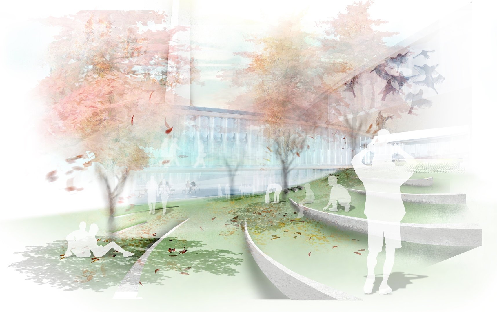
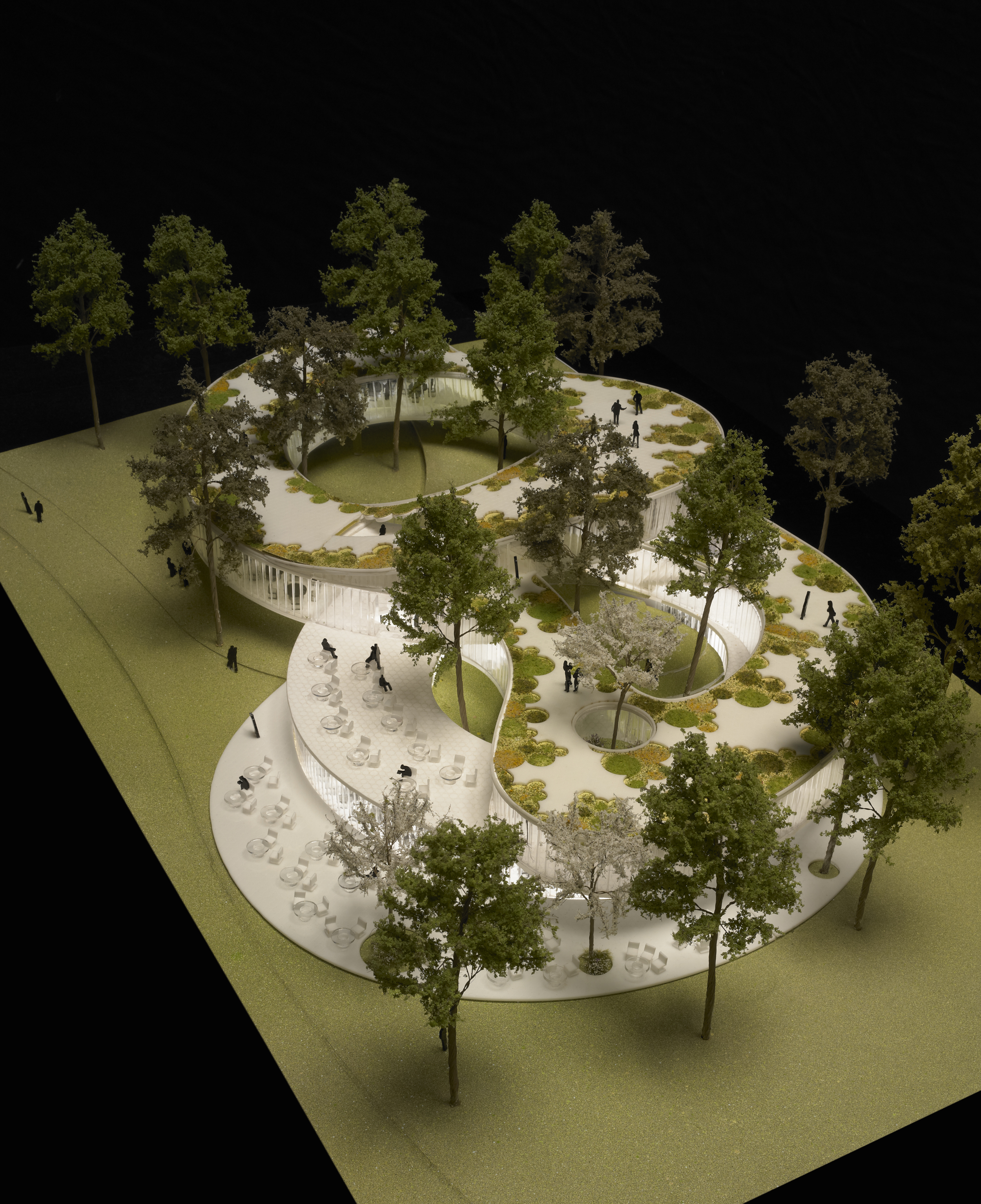
The “Sylvan Restaurant” is set within a new grove of trees at the west edge of the grass to accommodate the different programs creating three interior courtyards. The roof is a publicly-accessible spiral that supports a bounteous herb and vegetable garden for the restaurant, further emphasizing the site’s “bridge to Jefferson” and recalling Monticello’s embrace of agricultural landscape as an element in a uniquely American take on classical architecture. Each level of the building is seamlessly connected both internally and externally, through the publicly-accessible courtyards and rooftop. Within every level, the building’s functions intertwine with each other to become something more: a cafeteria formed around an open kitchen; a bookstore that doubles as a ”cultural gateway” to everything artistic happening in DC and that backs up on a flexible space for lectures, readings, performances; a restaurant that steps up to better and better views of the mall and where park rangers can eat lunch with visitors.

The second level, accessible directly from the top of the slope or via the largest courtyard accommodates the bookstore, the flexible event space and the entrance to a smaller full-service restaurant. We imagine, together with Local Projects, the bookstore as a “cultural gateway” to DC, providing up-to-the-minute information via electronic graphics and kiosks on the cultural life of the city.

The Survey Lodge has been re-imagined as a place to rent wheelchairs, electric vehicles and recreational equipment. It has also been reconfigured to accommodate a vastly expanded number of bathrooms and is designed to provide a major rest-stop for tour buses and passers-by. This slope also provides gentle access to the new Cherry Blossom Bridge which leads from here across the wetlands to join the existing cherry walk and access the Jefferson and Martin Luther King memorials.

The Monument Lodge will continue to serve in its historic role as the ticketing location for the Washington Monument. By removing the bookstore to the new Sylvan Restaurant building, the bathrooms and indoor ticketing accommodation can both be expanded and improved.
Repsol - YPF Headquarters

Buenos Aires, Argentina

Repsol - YPF Headquarters

Buenos Aires, Argentina

CLIENT Repsol-YPF / SIZE 1 Acre / STATUS Completed 2008 / DESIGN TEAM Balmori Associates / Pelli Clarke Pelli

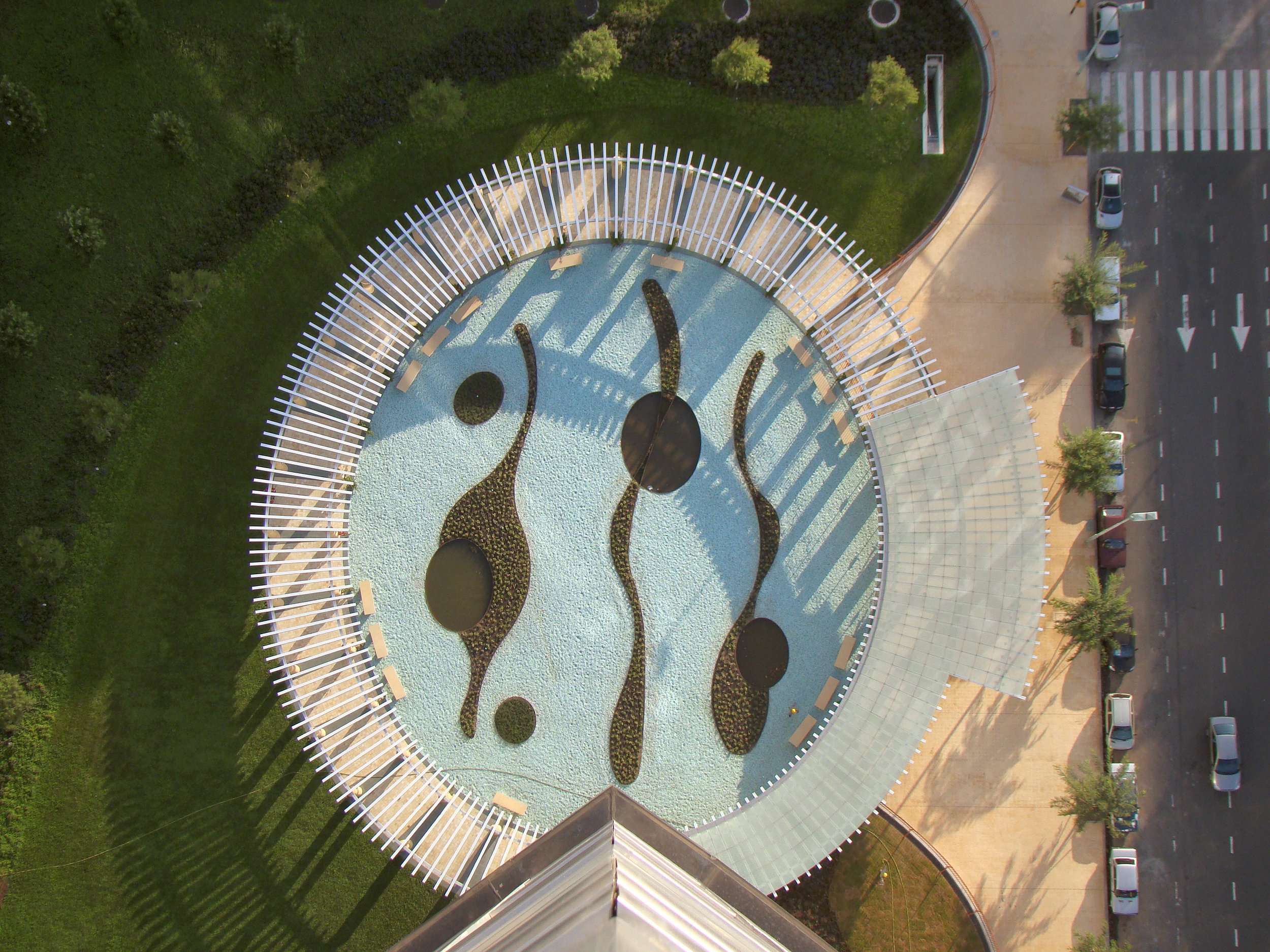
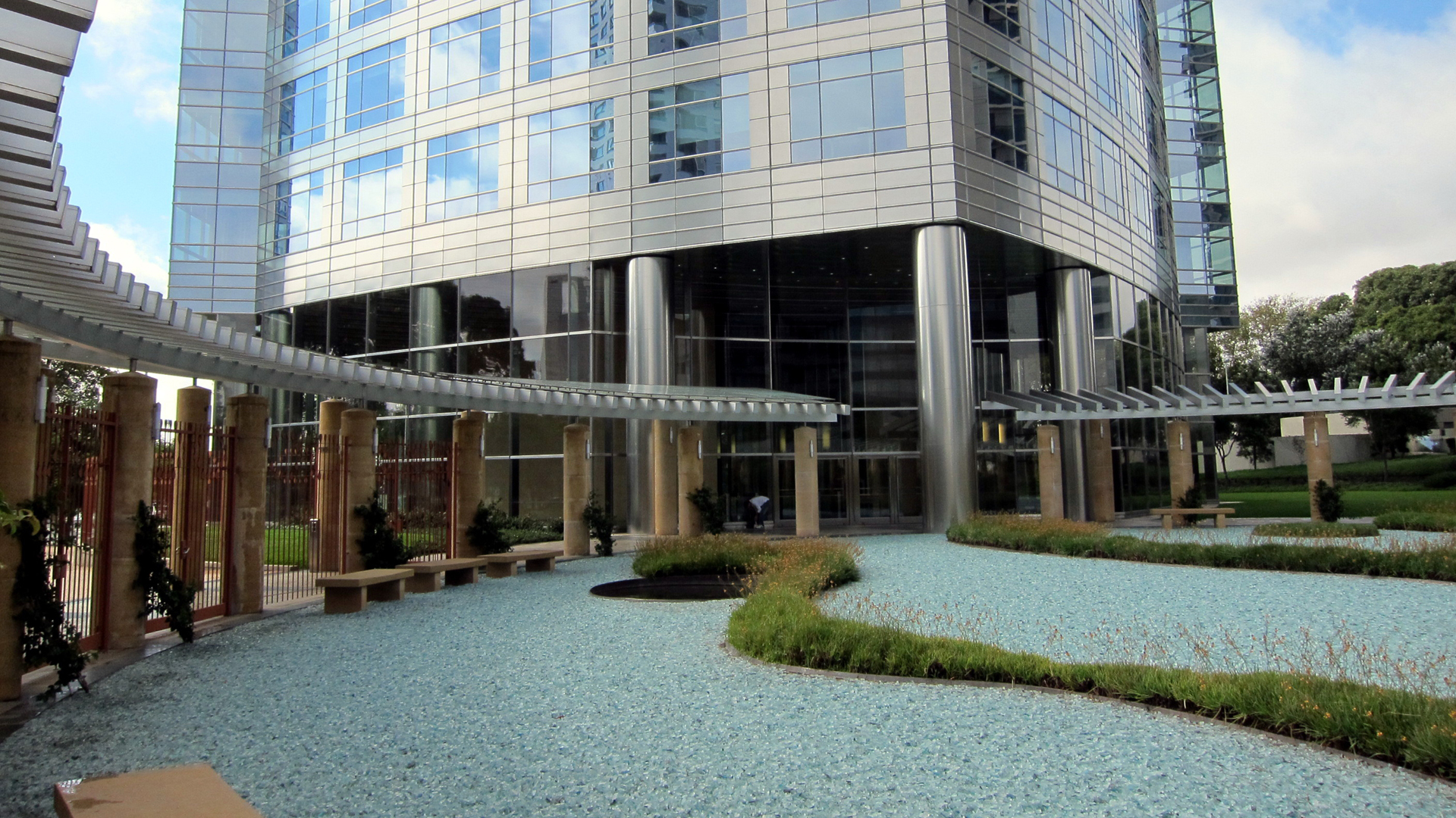
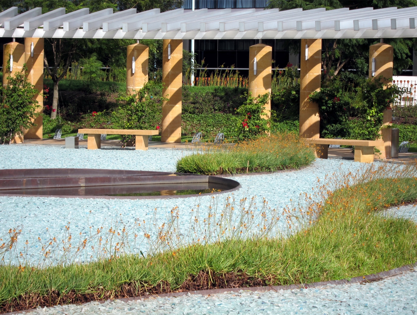
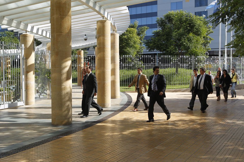
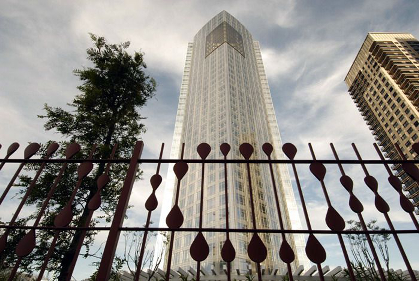
Repsol-YPF is located in the up-and-coming district of Puerto Madero in Buenos Aires. The design originally called for a three-story parking garage at the intersection of Macacha Güemes and Juana Manso streets. Balmori Associates buried the parking underground and created a one acre public plaza on top of it.

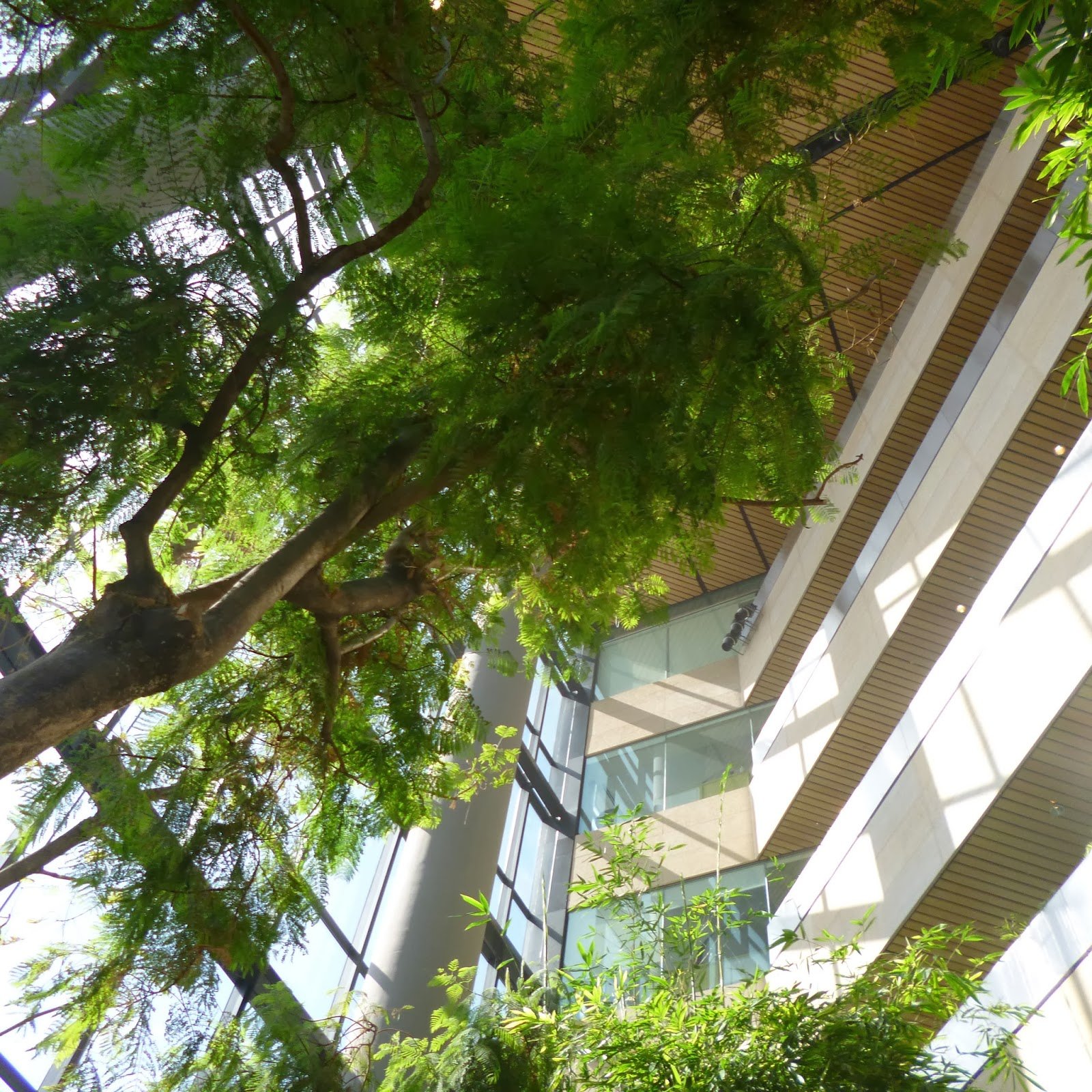
Patterns and motifs throughout the plaza echo the Pampas’ cultural history of the site. The selection of native and naturalized plants recalls the adjacent ecological reserve’s flora. A pergola runs along the edge of the courtyard while water features and planting beds emerge through a blue recycled glass surface. The six-story winter garden on the 27th floor showcases Argentina’s most important native trees such as Jacaranda.  The design and lighting of the winter garden allow these trees to be seen throughout the city at night.


Building an Urban Living Room

2010 - New York, NY, USA

Building an Urban Living Room

New York, NY, USA

CLIENT Meat Packing District Initiative / STATUS Design proposed 2010  / DESIGN TEAM Balmori Associates, Erik de Jong

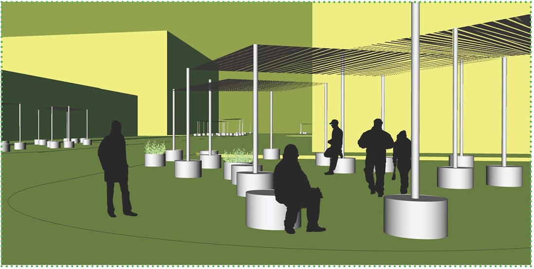
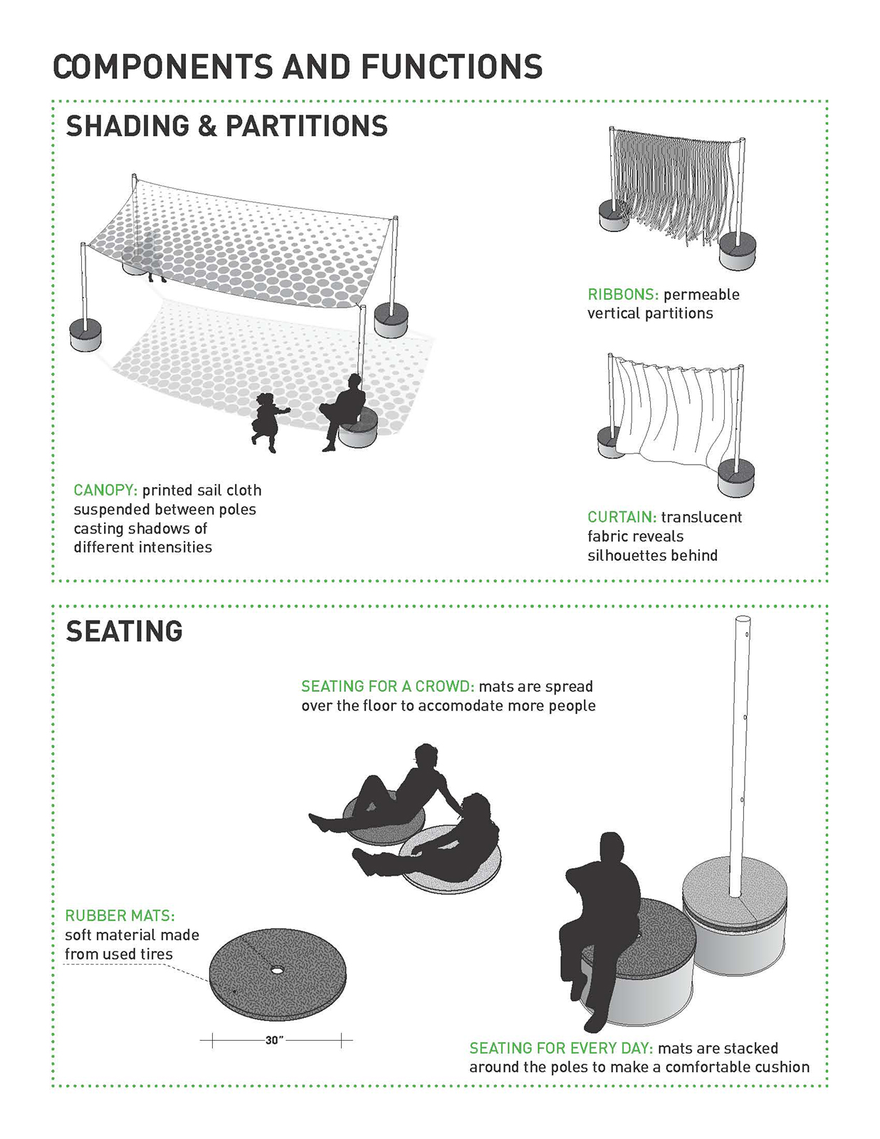
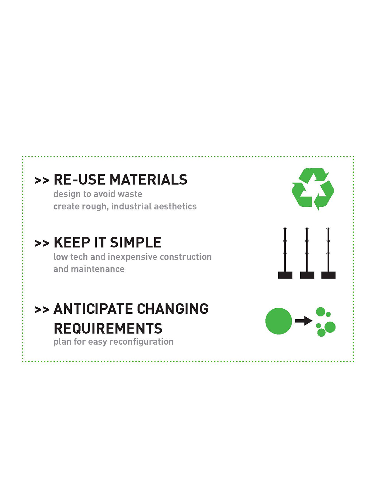
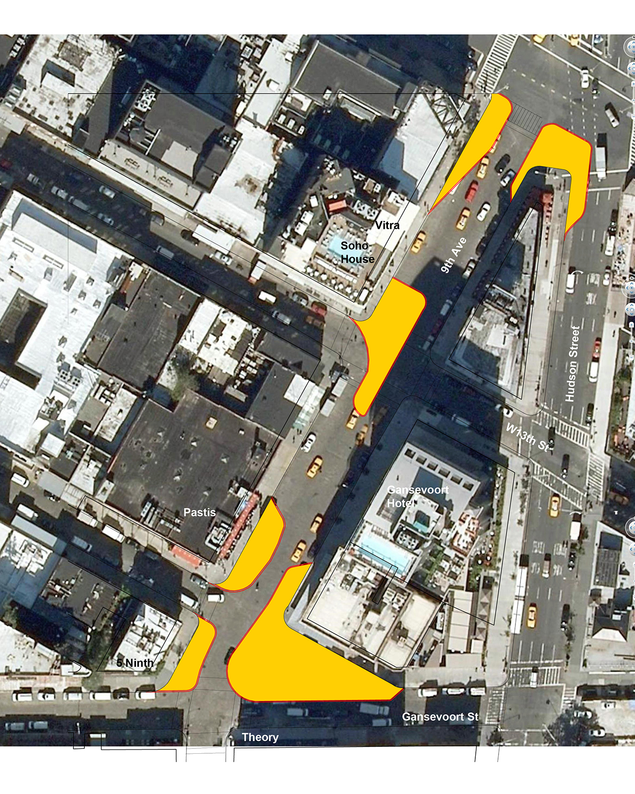
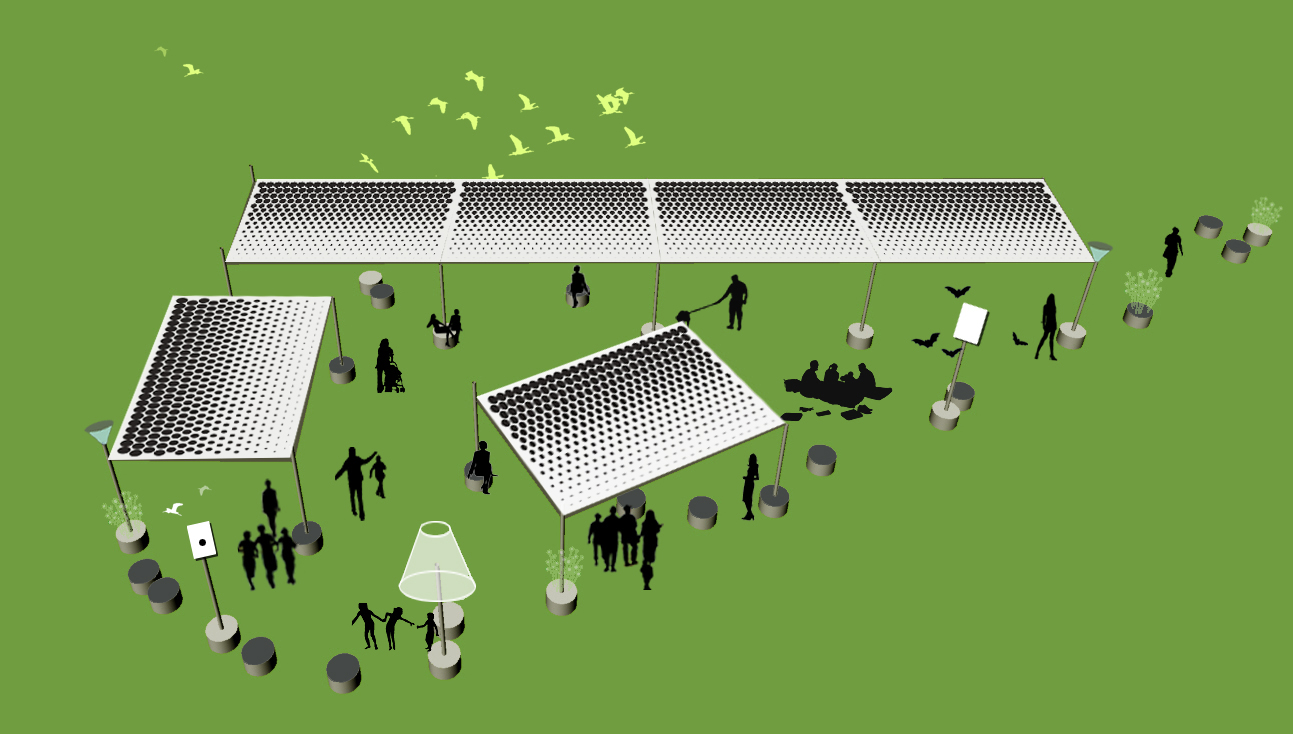
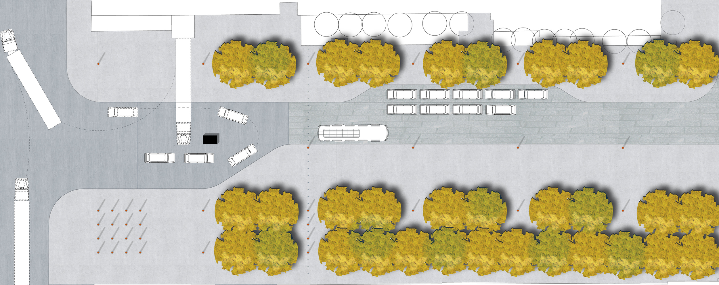
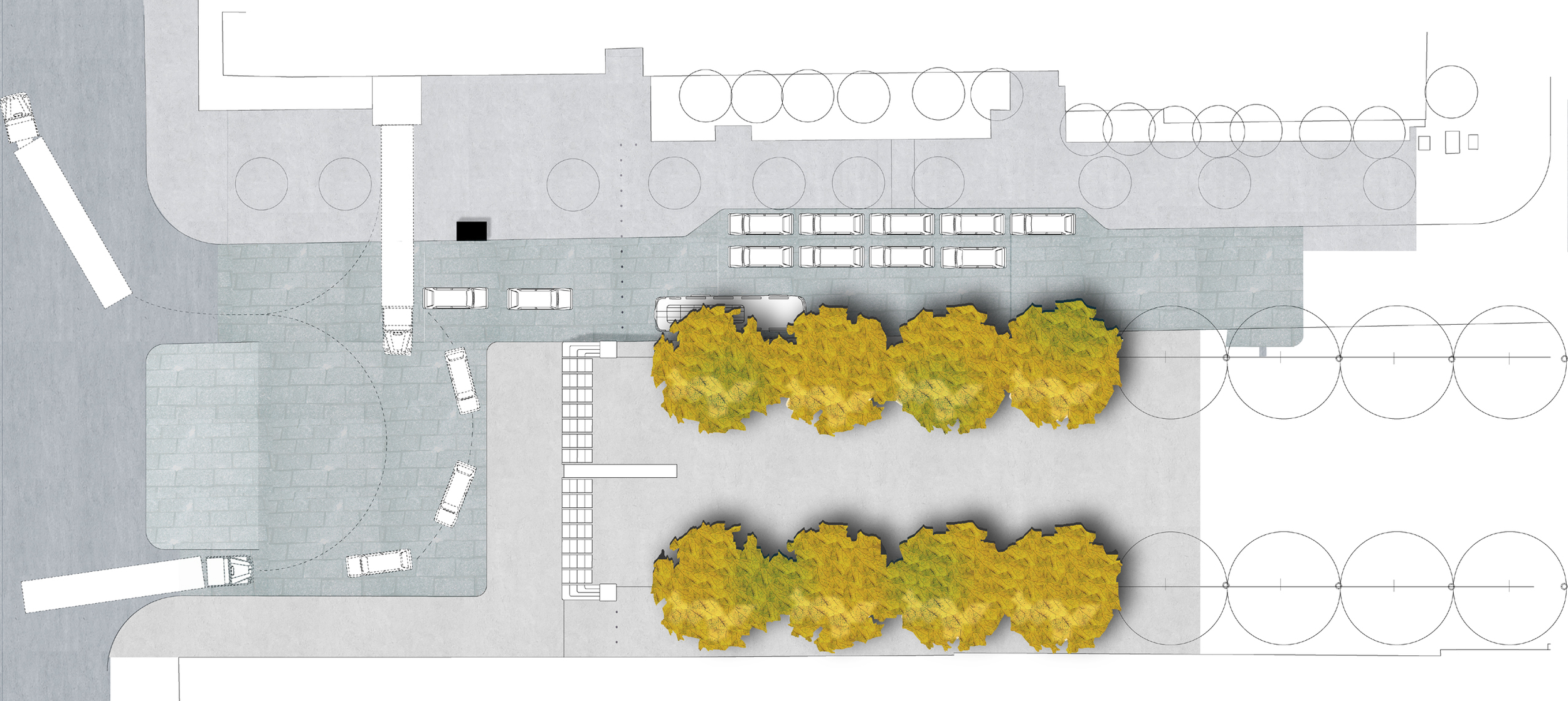
The proposal for a temporary solution for the public space of Gansevoort Plaza in the Meatpacking District (MPD) used the city’s streets for pedestrian use in a way that is flexible, inexpensive and contextually appropriate. Under the request of the Meatpacking District Initiative, Balmori Associates was given the task to re-imagine the public spaces created by the new traffic alignments and design a language of street furniture and planting that helped define the space. Before beginning to develop our design principles, we first had to ask, what should a public place be? We wanted to engage a wide audience in answering this question. We set up an online forum through live video and twitter and invited landscape architect Erik de Jong and planner Arnold van der Valk, with their 40 Dutch students to discuss urban public space in the American context. We extended the conversation to the neighborhood by participating in a street festival “Conflux City”, and we also made a video that could be shown in various online blogs. We turned this community engagement exercise into a preliminary design scheme where one simple and inexpensive piece of furniture with interchangeable components – a pole and hollow pole base, canopy and rubber mats – can perform the functions of planter, shading, space partition, seating, lighting…even a birdhouse. The flexibility of this solution allows for a variety of layout options, from grouped seating at right angles or in triangles, to a weekend market activities or event space.

Qing Huang Dao Park

2005 - Bejing, China

Qing Huang Dao Park

Bejing, China

CLIENT City of Qinghuandao / SIZE 98 acres / STATUS Competition Winner, 2005 / DESIGN TEAM Balmori Associates / MAD Architects Office

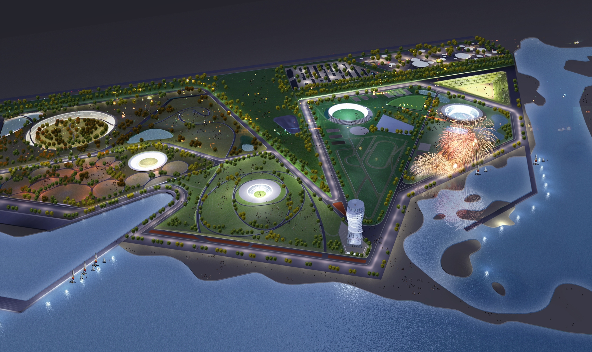
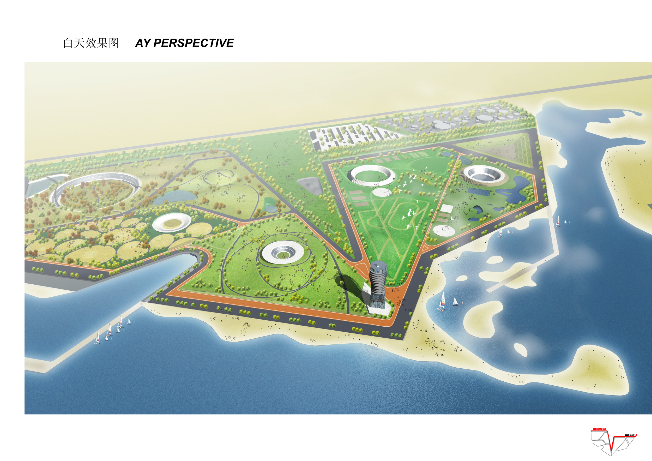
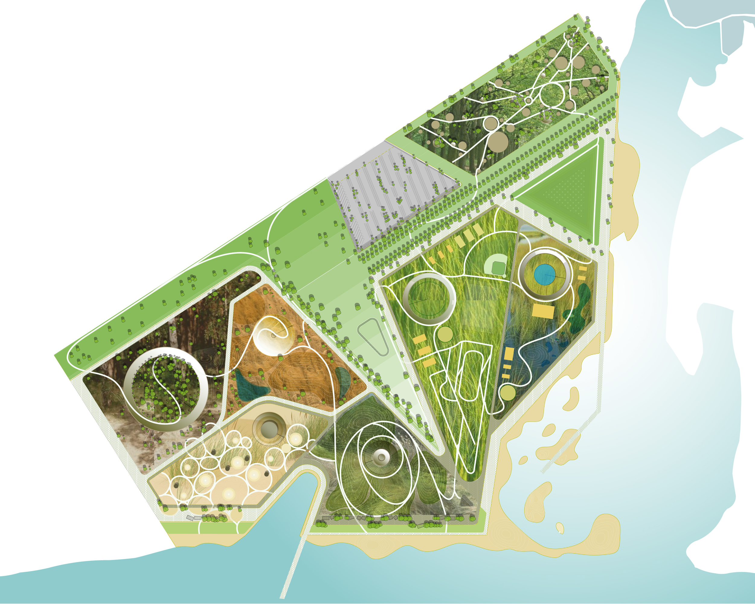
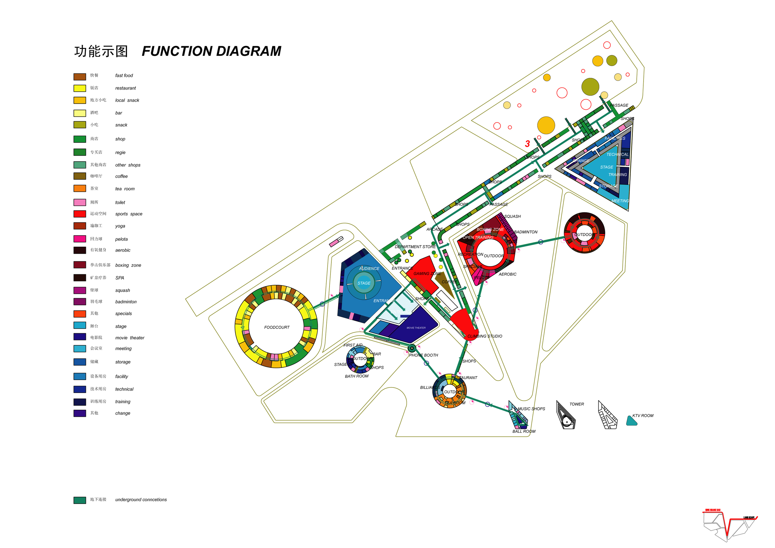
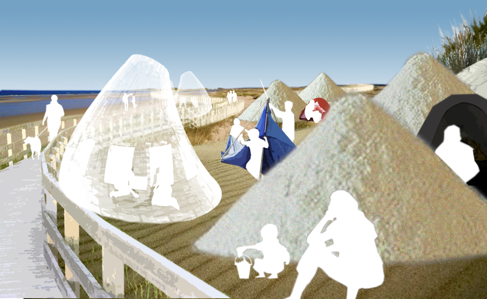
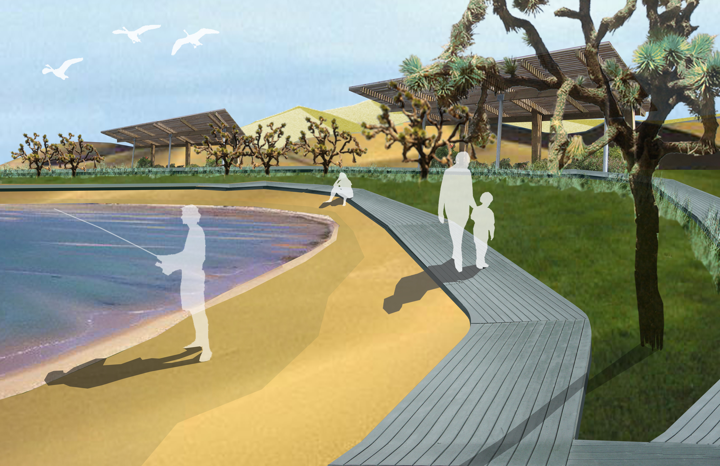
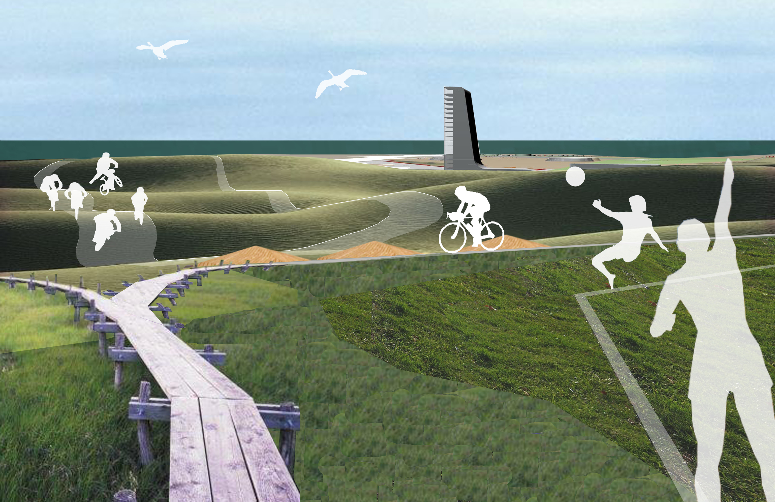
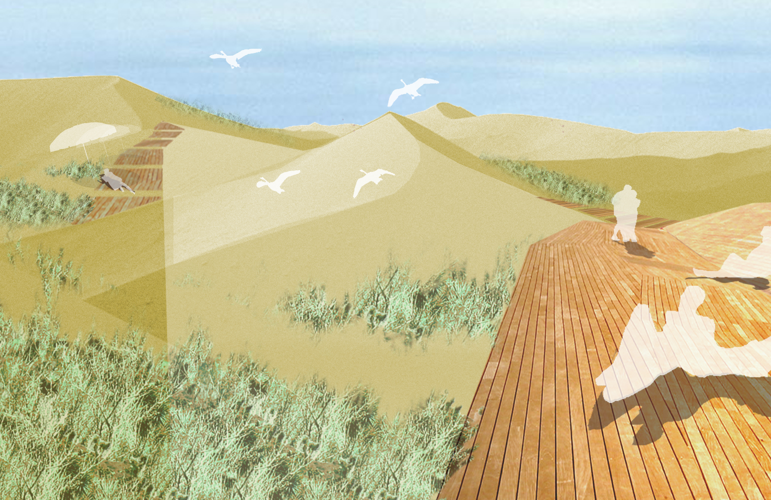
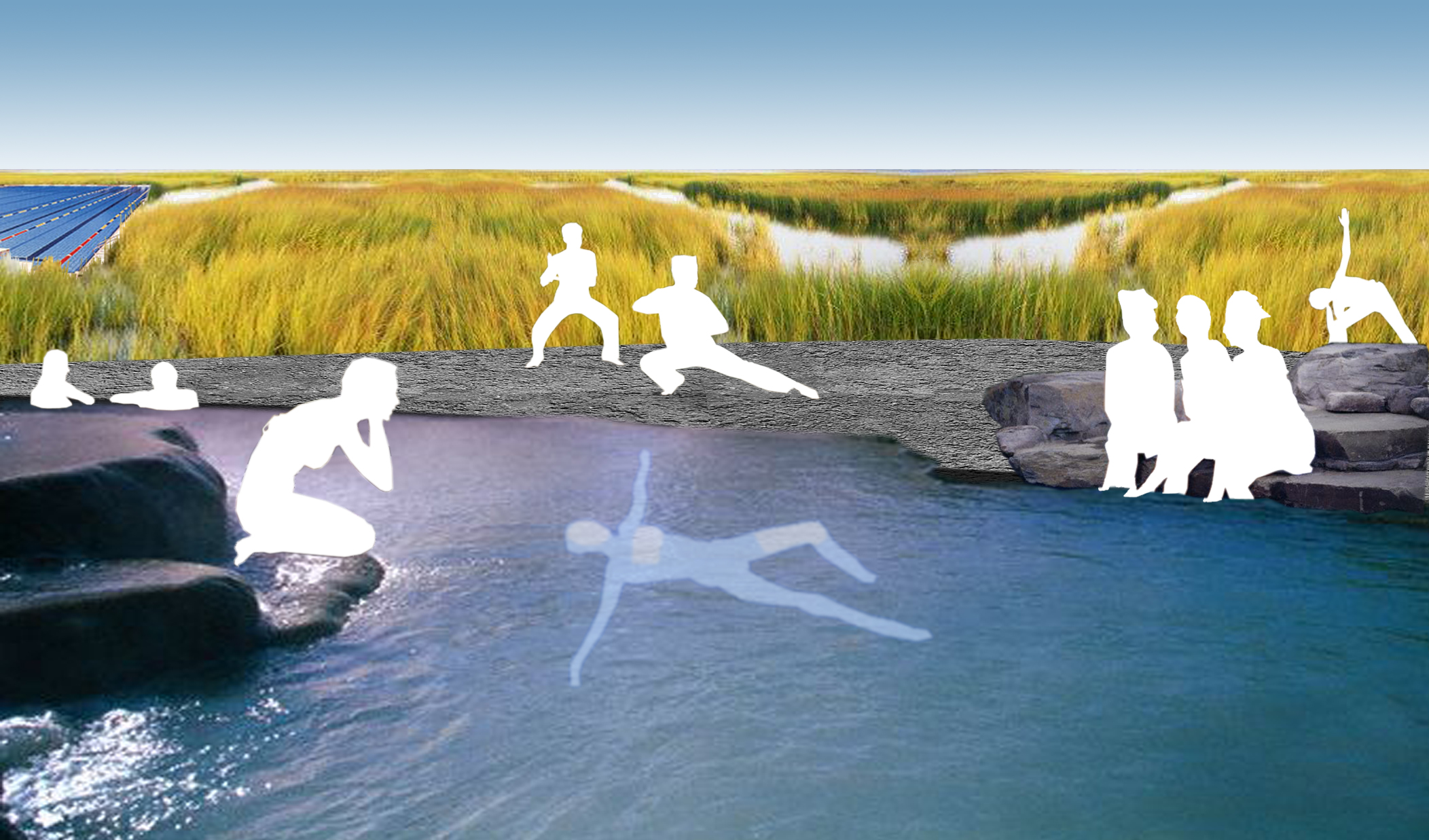
The entry for the Qinghuangdao Park invited competition consists of juxtaposed landscapes, extreme in their differences, some indigenous, some foreign.  Five ecological zones compose a landscape mosaic: tidal marsh, dune prairie meadow, red pine forest, oak woodland, and finally a purely urban landscape.  The landscapes have been jumbled and mixed to produce intense experiences.  Woven together by active recreational programming, a network of paths, and architecture, they appeal to a wide variety of senses—smell, sign, touch.

The entire seaside site reads as one landscape that reveals its richness within each mosaic. The division of the parcels and landscape mosaics may take many forms. The contrasts between program and landscape in each parcel enliven the mosaic and create unique public and private spaces such as a spa in the marsh and a camping in the dunes. The development parcels paired with landscape mosaics are an innovative model of ecological design and development.


BBVA Headquarters

Madrid, Spain

BBVA Headquarters

Madrid, Spain

CLIENT BBVA / STATUS Competition Finalist 2009 / DESIGN TEAM Balmori Associates / Zaha Hadid Architects

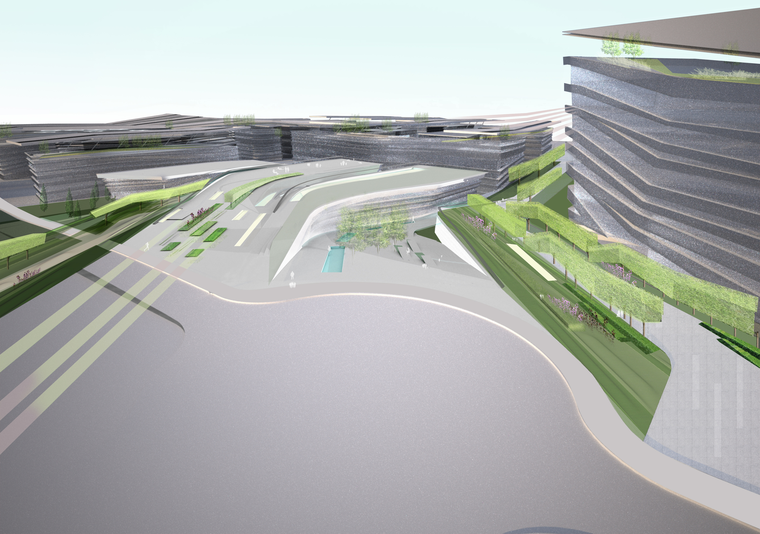
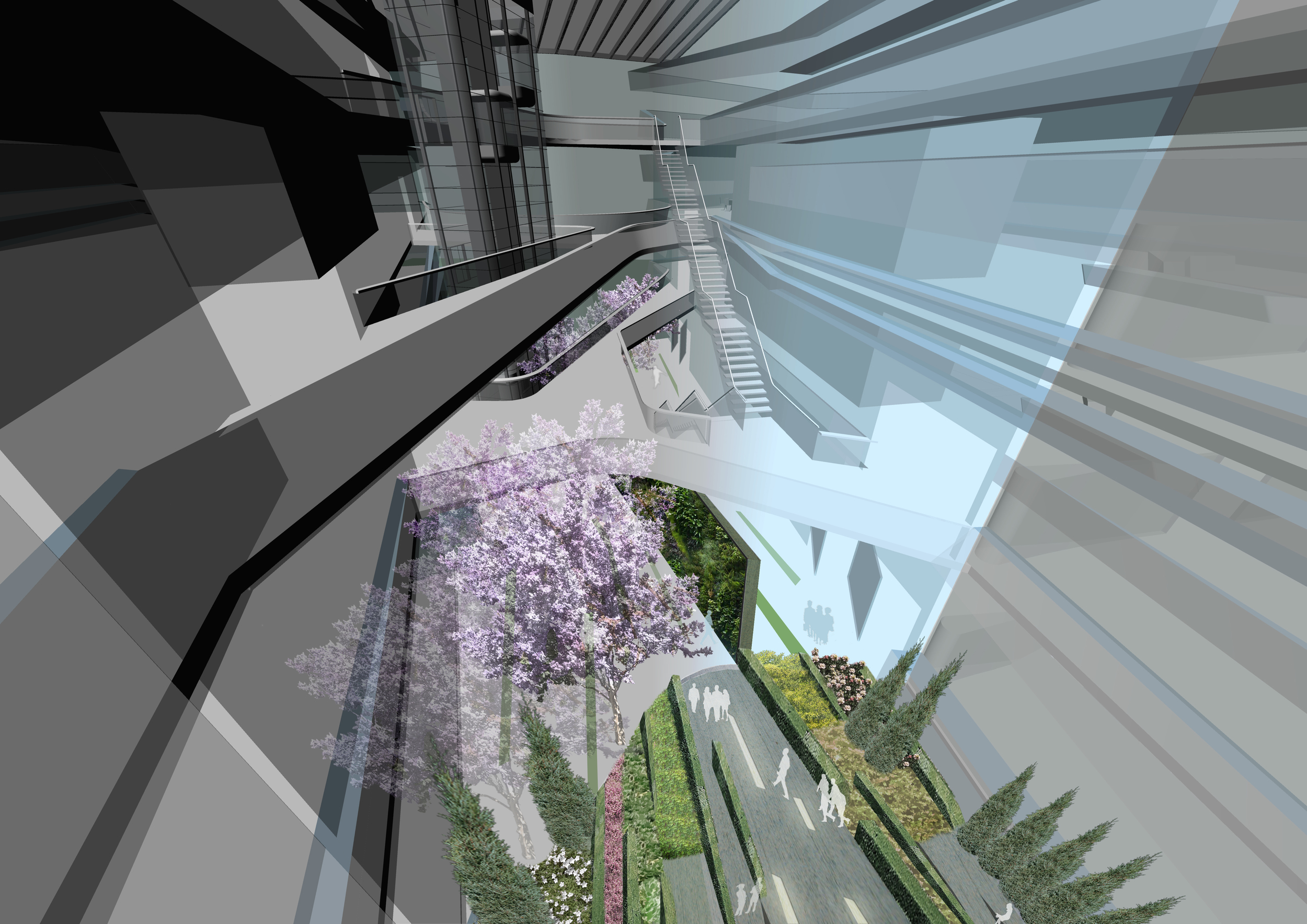
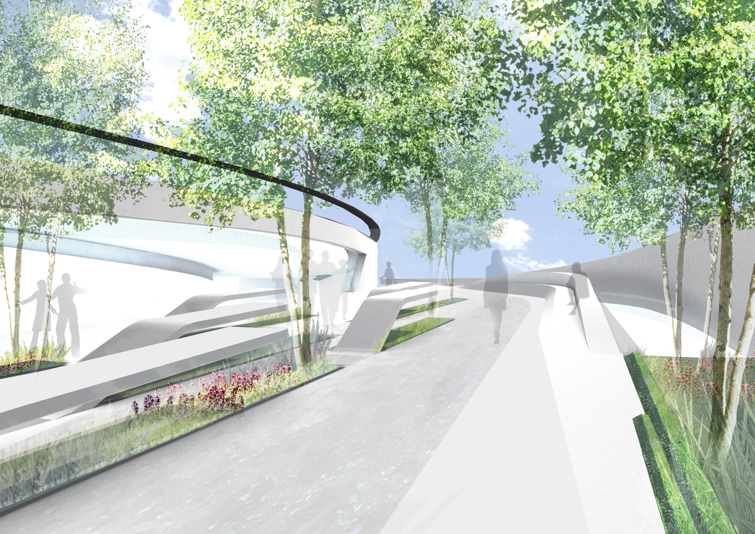
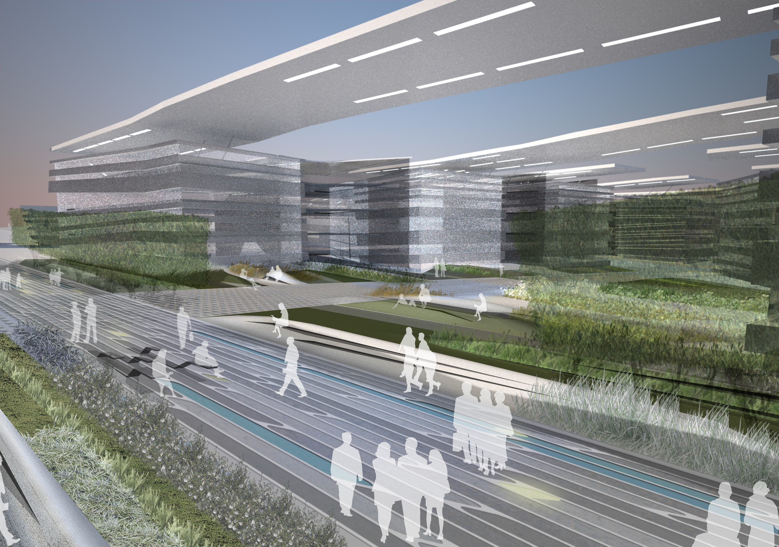
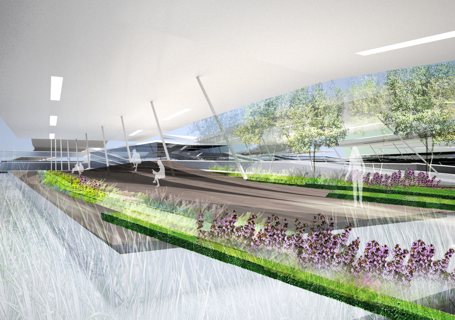
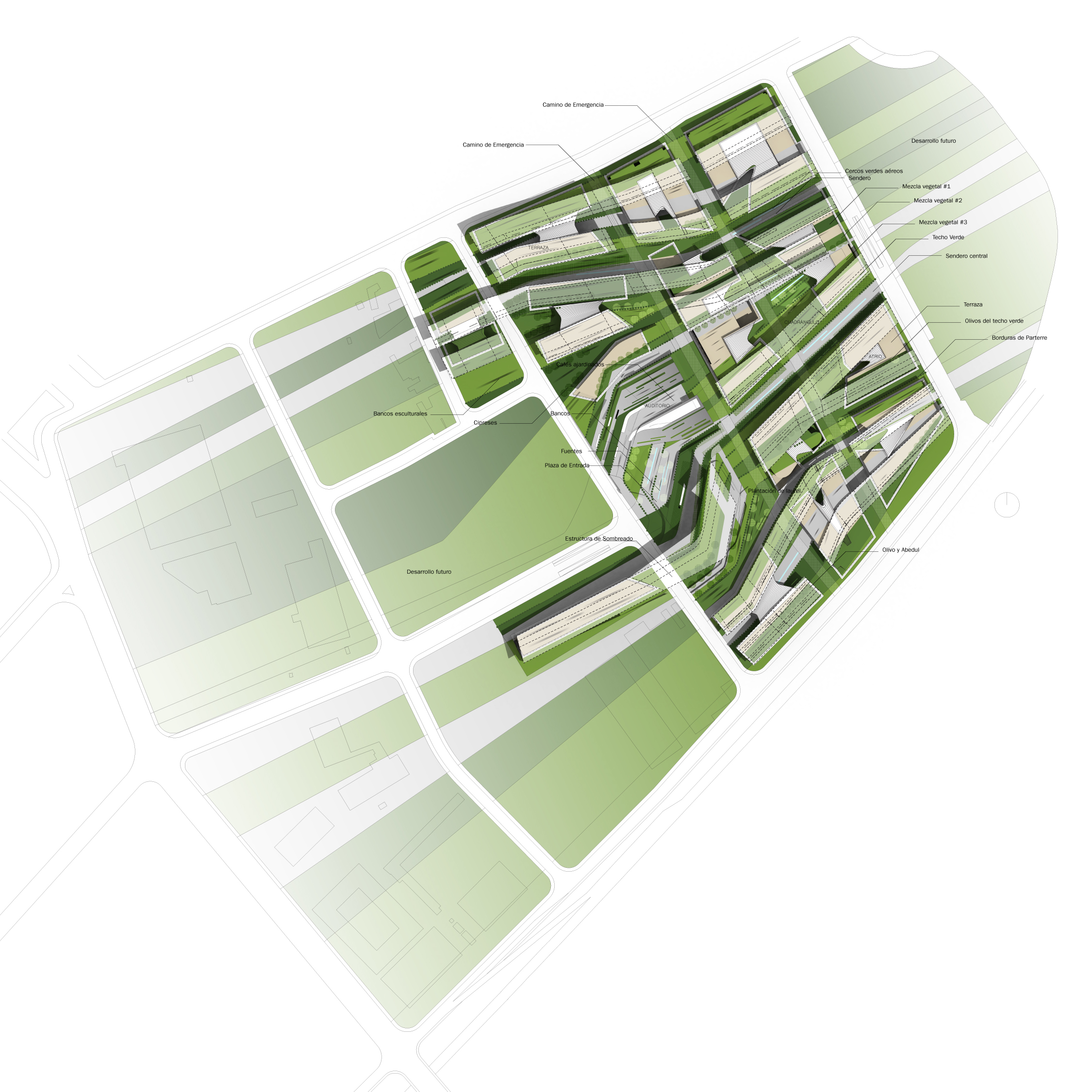
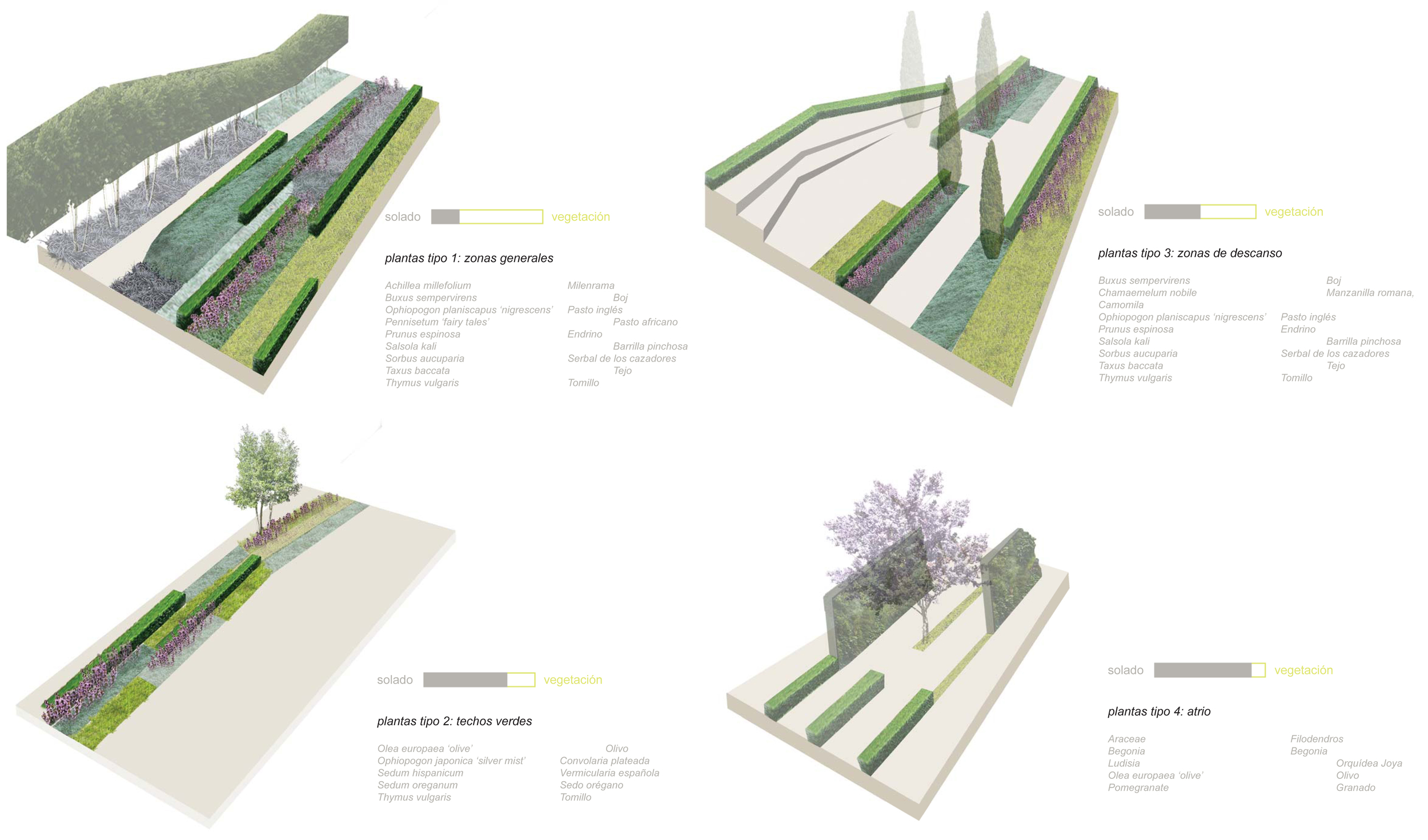
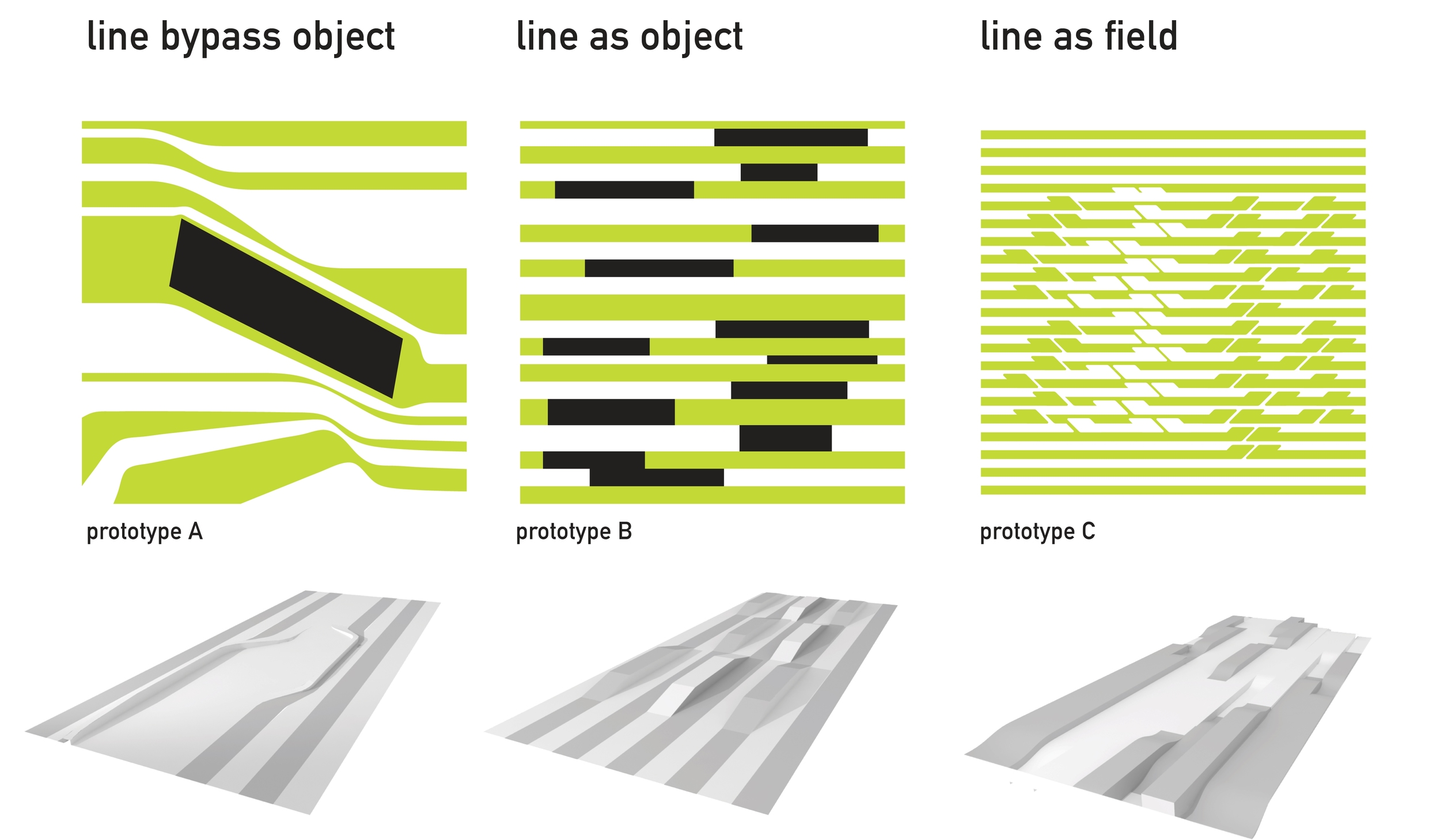
Our team was one of the two finalist in a bid to design the new headquarters of the leading financial group in Spain. Working with Zaha Hadid Architects and the concept of speed, our landscape proposal emphasized the linearity and movement of the building design in a cohesive banding of planted and paved areas that fillet and constrict in reaction to the built environment.  The initial reasoning behind the concept of speed is consistent with BBVA’s goals of technology and progress.

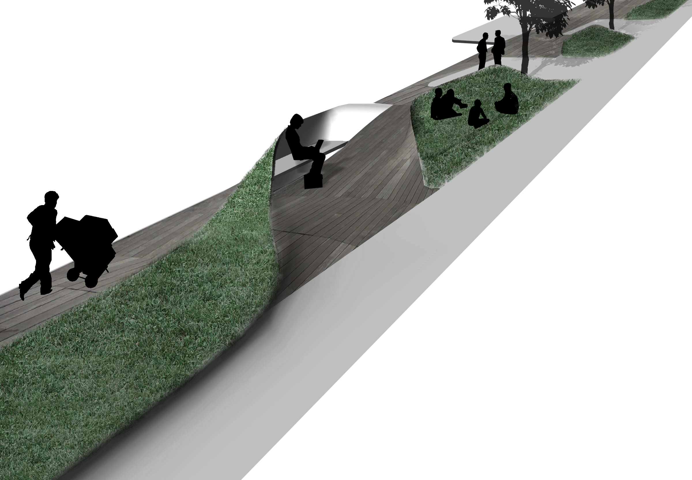
Topographical shifts in the groundplane help to further define the different areas within the office park. As the linear bands peel away and bifurcate, exterior elements such as seating areas, tables, and enclosures are created as moments of rest within the matrix of speed that makes up the site.  

Bay of Pasaia Masterplan

2009 - Pasaia, Spain

Bay of Pasaia Masterplan

Pasaia, Spain

CLIENT Provincial Government of Gipuzkoa / SIZE 68 Ha / STATUS Competition Finalist, 2009 / DESIGN TEAM Balmori Associates / S333 / IKEI / Lantec

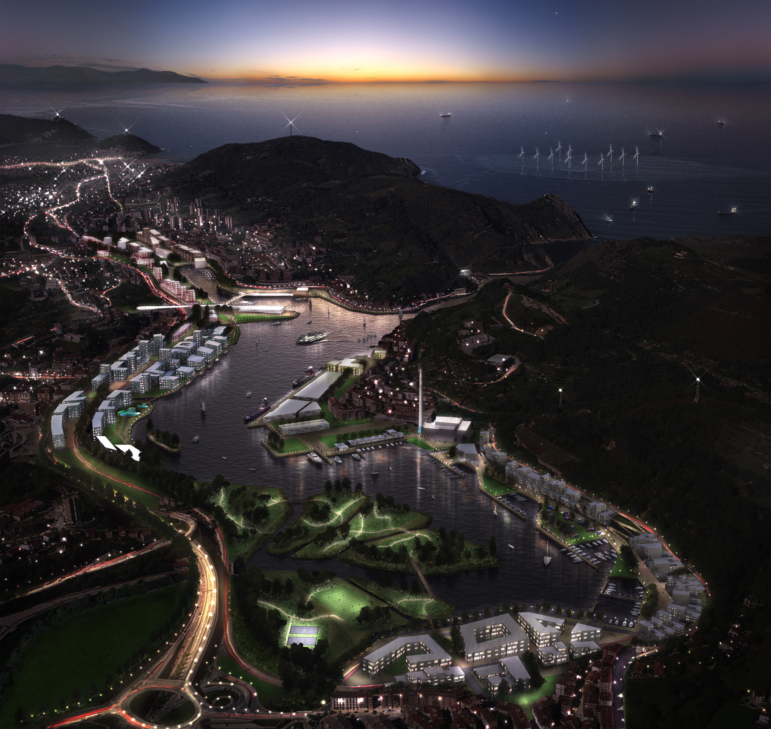
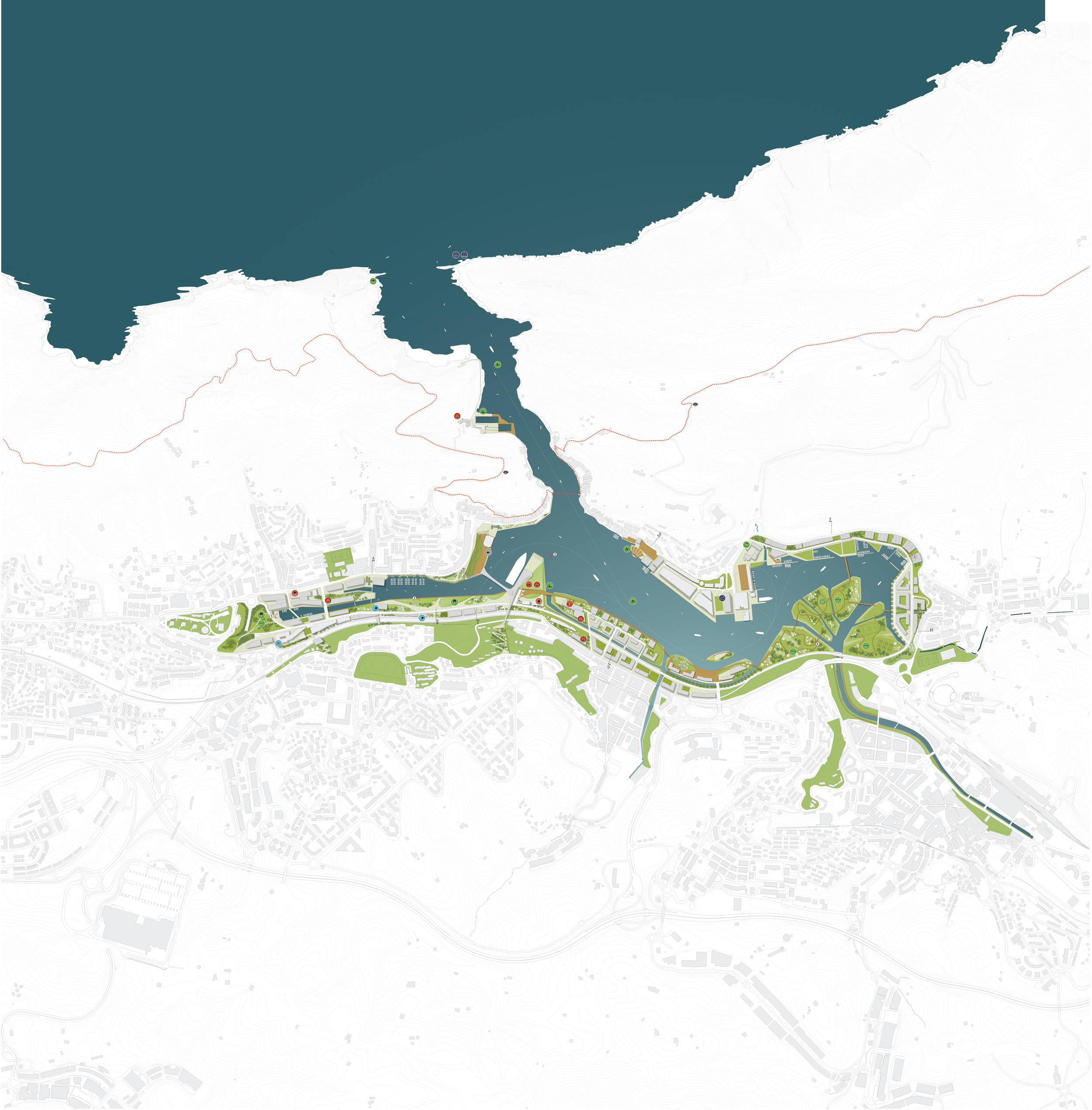
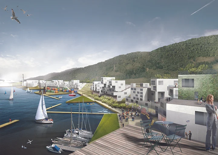
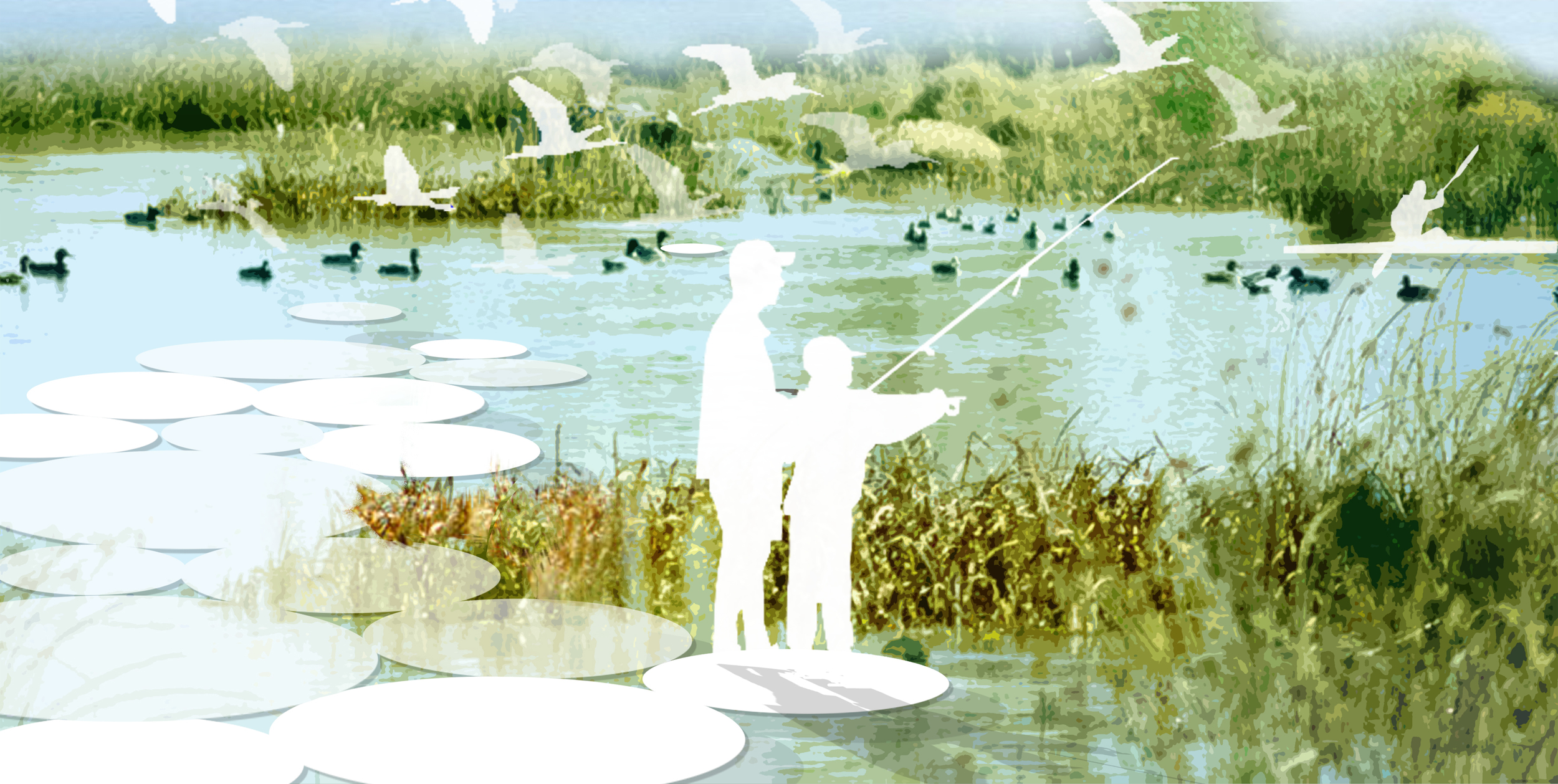
The Bay of Pasaia was once an attractive, natural estuary for the River Oiastzun but over time the waterfront areas have been transformed into large man-made sites for shipyards, warehouses and for the storage of materials and goods. Titled ‘Revealing the Water’, the masterplan is premised on breaking down this artificial land, returning the waterfront sites to their natural state. The masterplan is premised on five planning concepts:

(1) revealing the water and transforming the present sites to a hybrid state that allows for new development while improving drainage, water quality and biodiversity;

(2) making waterfront parks and open spaces, linked into a wider network of parks and routes around the bay, such as the Camino de Santiago;

(3) re-establishing connections to the surrounding context at different scales by road, rail and boat;

(4) strengthening the existing neighborhoods around the bay, reflected in their distinctly different identities, architectures, public spaces, streetscapes and relationships to the coastline;

(5) building on local know-how to establish an accompanying cultural renewal and branding the site’s future in a solid base of marine and energy technology, gastronomy and fashion through Paco Rabanne’s label.


Asian Culture Complex

2005 - Gwangju, Korea

Asian Culture Complex

Gwangju, Korea

CLIENT Executive Agency for Culture Cities / MCT / SIZE 118,170 m2 / STATUS Competition, honorable mention, 2005 / DESIGN TEAM Balmori Associates / iArc, LLP

The Asian Culture Complex should be a place where new culture emerges, rather than manufactured by institutions. Emergence can be achieved by maximizing social contacts, in other words, network complexity. As an urban strategy, differentiation of the whole site into smaller parts is executed by continuing existing and neighboring urban fabric, further being transformed by programmatic interpretations. Then the parts are connected with each other according to specific relationships between sub-programs, forming a 3D complex of nested networks. Two distinct network organizations emerge out of it; programmatic network (shop¬ping, eating & drinking, learning, conferencing, showing & playing, working and living) and ecological network (park, water and wind). The interest is in generating urban capability of producing a flexible system that is dynamically adaptable, a creative system that can adjust itself freely to temporal events and urban challenges. The differentiated connectivity of each network plays a vital role in modulating its emergent system. The question of what is culture and what is Asian will be constantly redefined and re-generated by means of this new urban system

The technique of generating a form for composites of landscape and architecture is instigated from close reading of spatial organization of existing urban fabric. Seemingly random urban development which pervades the central district of Gwangju, in fact, reveals an intricate sys¬tem of connected interstitial spaces. Alleys, courtyards, plazas, sometimes a large private front yard for an institution, are interconnected each other, bounded by elaborate randomness of buildings around. The relationship between buildings and open spaces is reinterpreted as positive/negative of a relief and generates a latent 3D pattern for a new typology between landscape and architecture.

Arverne

2001 - New York, NY, USA

Arverne

New York, NY, USA

CLIENT Architecture League of New York / SIZE 100 acres / STATUS Yale Design Charrette, 2001 / DESIGN TEAM Yale School of Architecture Team, Balmori, Deborah Burke, Peggy Deamer, Keller Easterling.

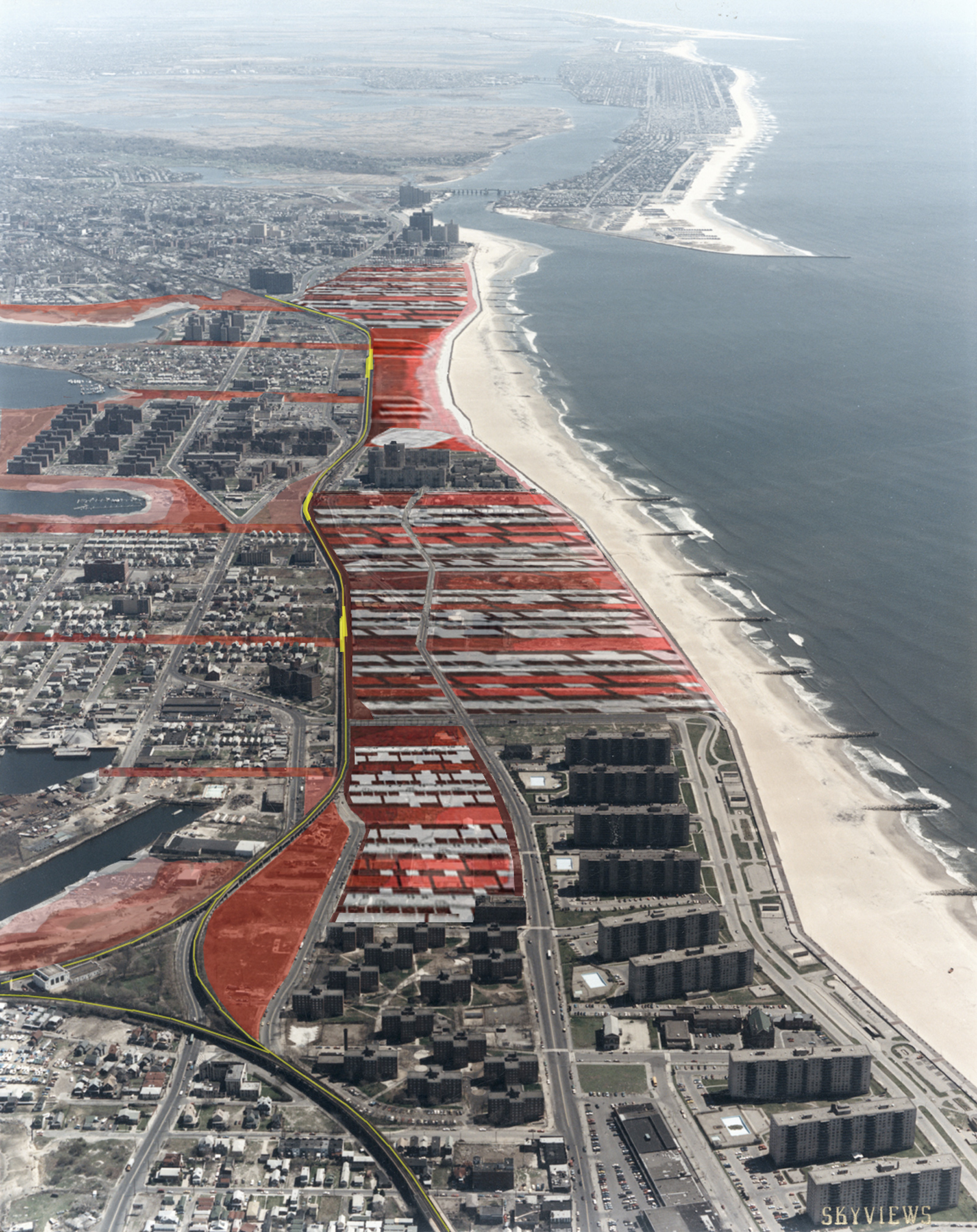
Arverne, a housing proposal produced as part of a Yale competition with Deborah Burke, Peggy Deamer, Diana Balmori and Keller Easterling in collaboration with two other universities and a Dutch team, was an attempt to influence developers building housing on the site.

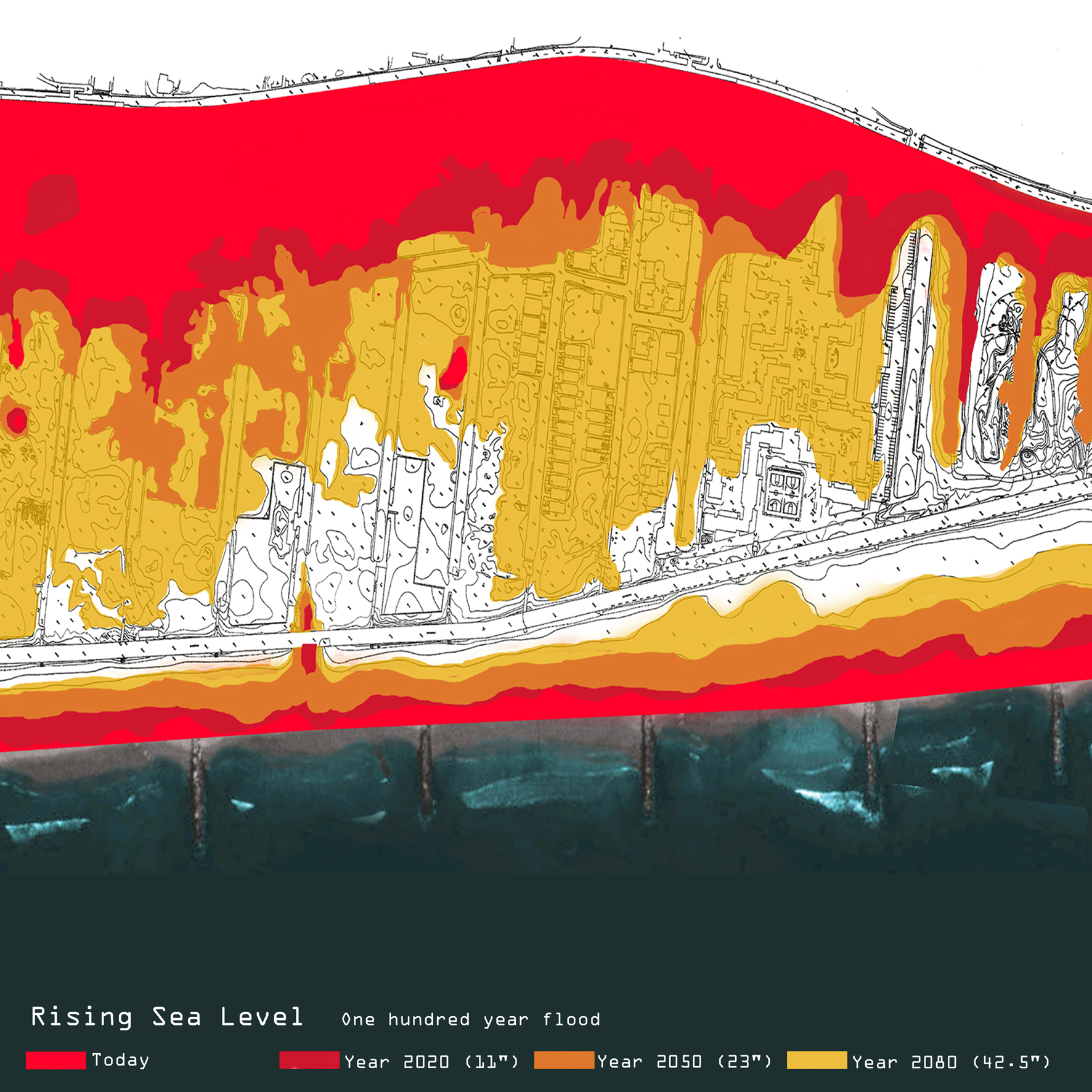
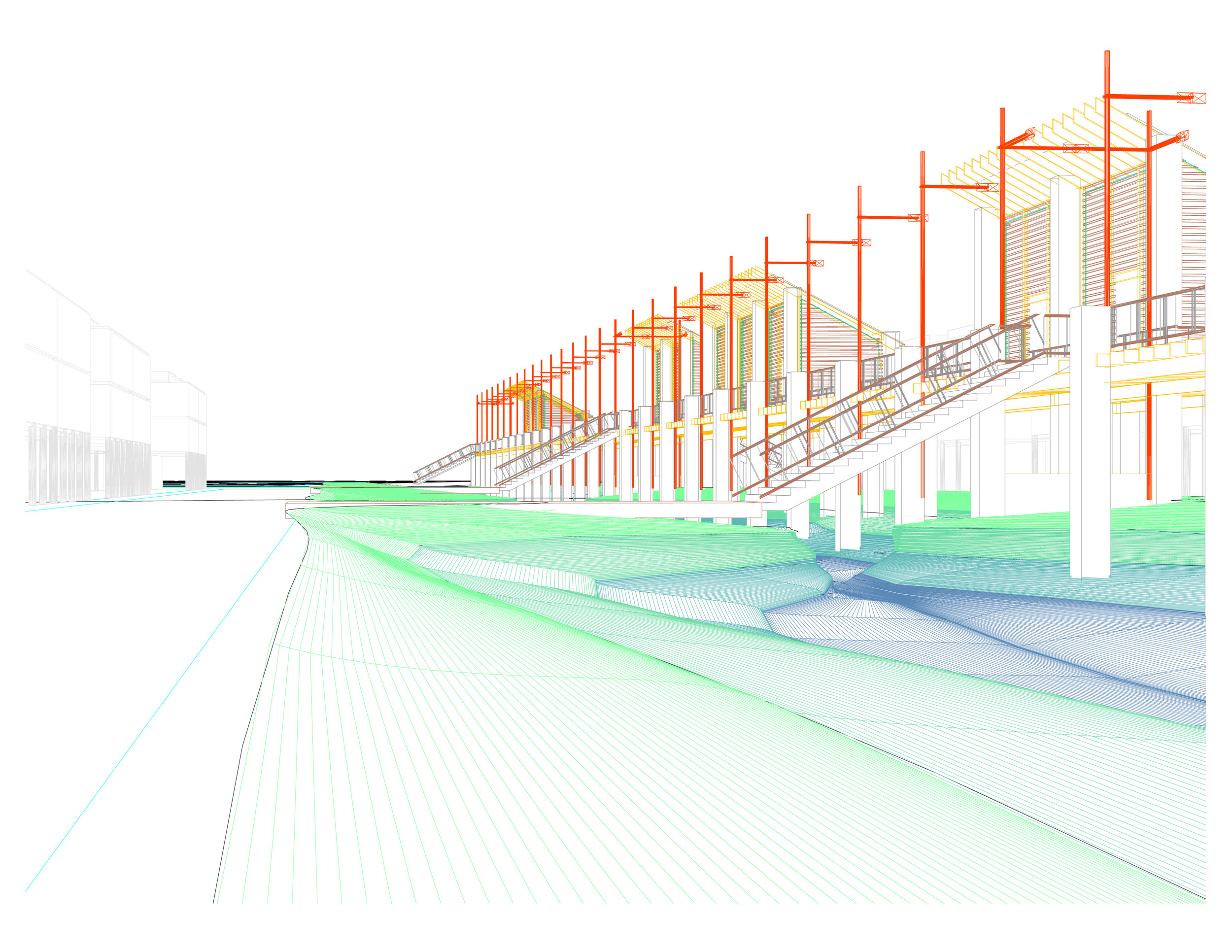
Balmori’s contribution to the work was based on the site’s present condition and the prospect of rising water levels over the next eighty years. Taking into account the rising sea levels and already yearly floods makes this a reinvented site. Water drainage becomes the leitmotif for its reinvention. Even its dunes, nearly destroyed by misuse, have to be recreated and protected.  The houses were placed on stilts facing the street with only a garage at the ground level. At their backs, they were lined up along a swale (or small stream) that filtered and drained gray water, as well as any flood water, from the site. These swales were used as backdoor public gardens (in addition to their drainage function). They vary in length and planting throughout the seasons.
240 Central Park South

2008 - New York, NY, USA

240 Central Park South

New York, NY, USA

CLIENT Douglas Lister Architect / SIZE 13,000 sf / STATUS Completed 2008 / DESIGN TEAM Balmori Associates

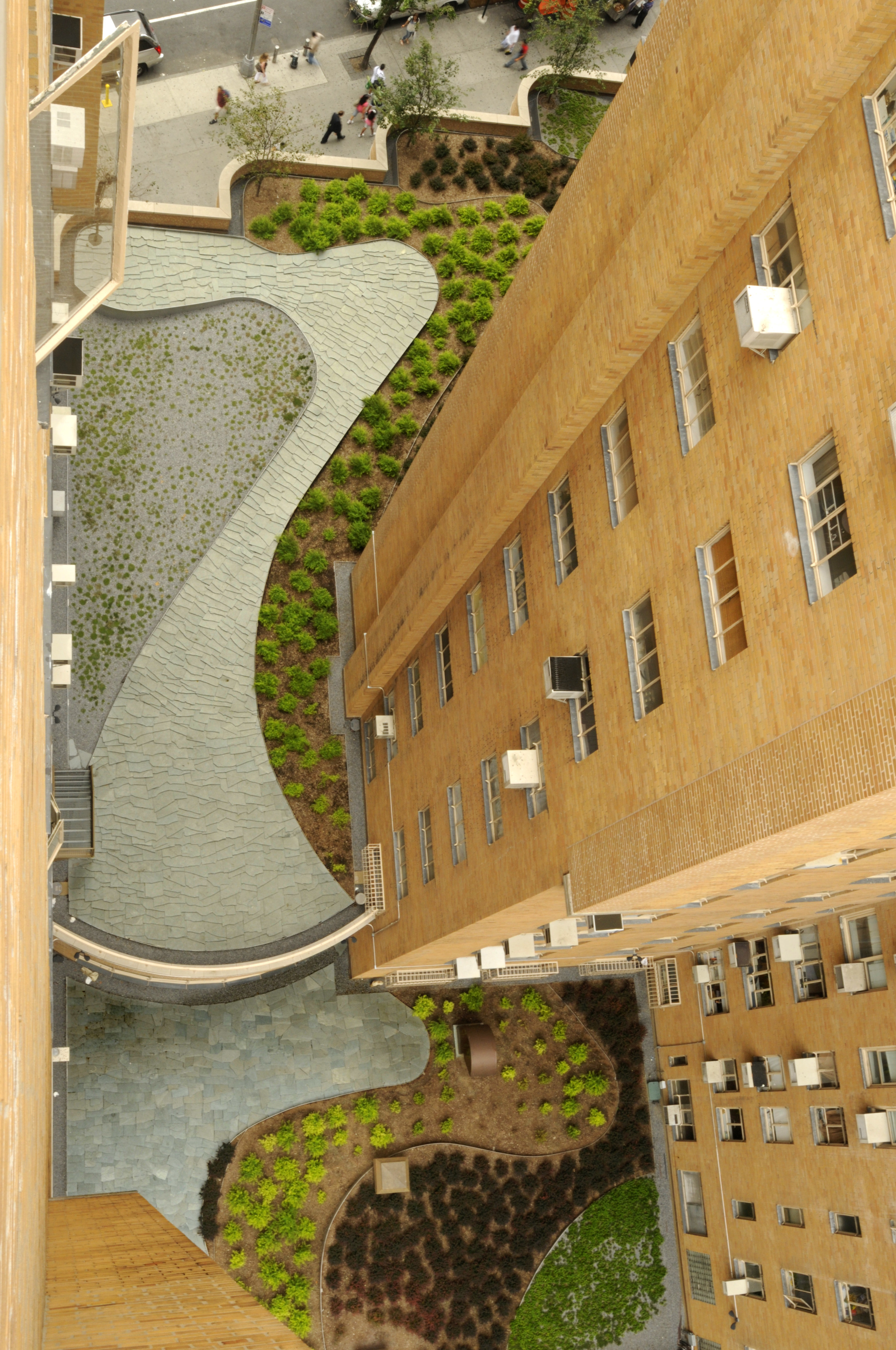
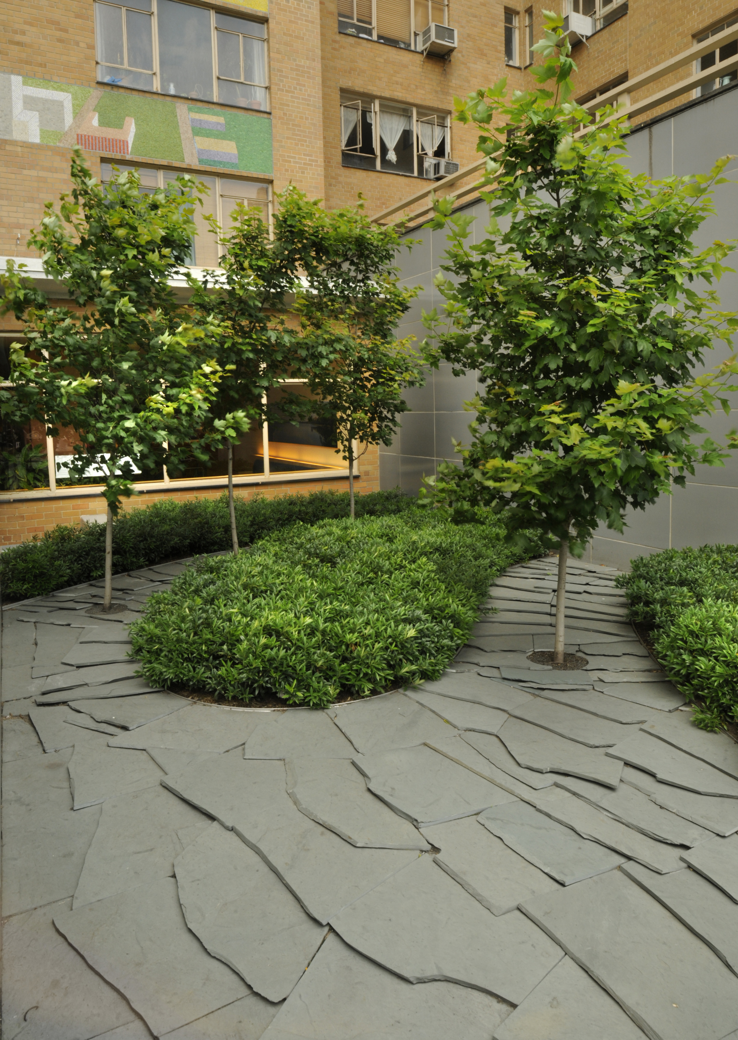
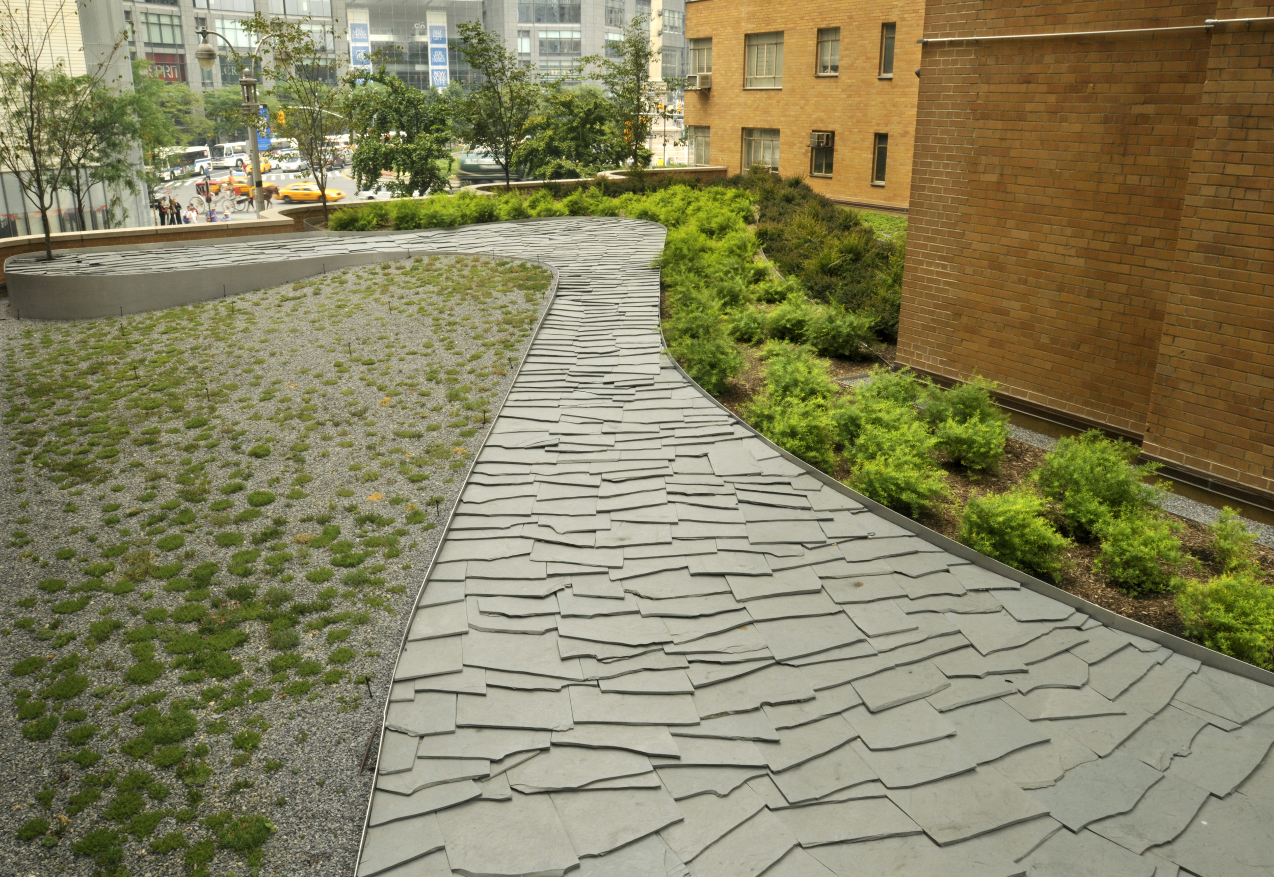
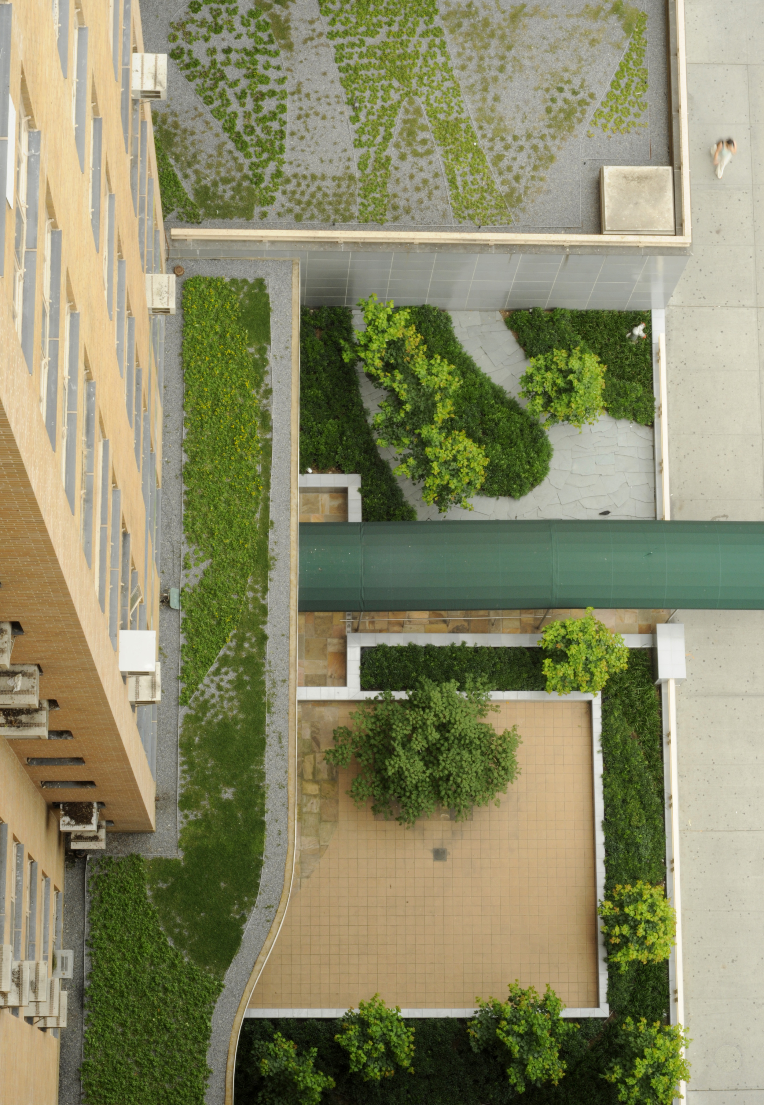
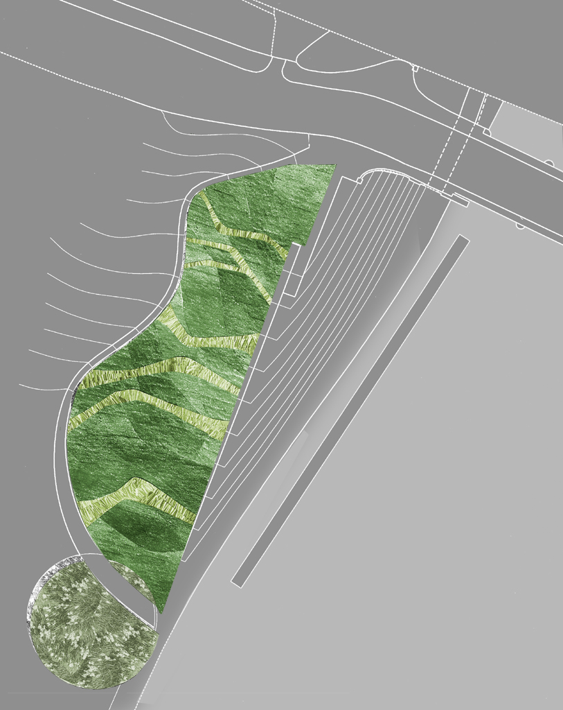
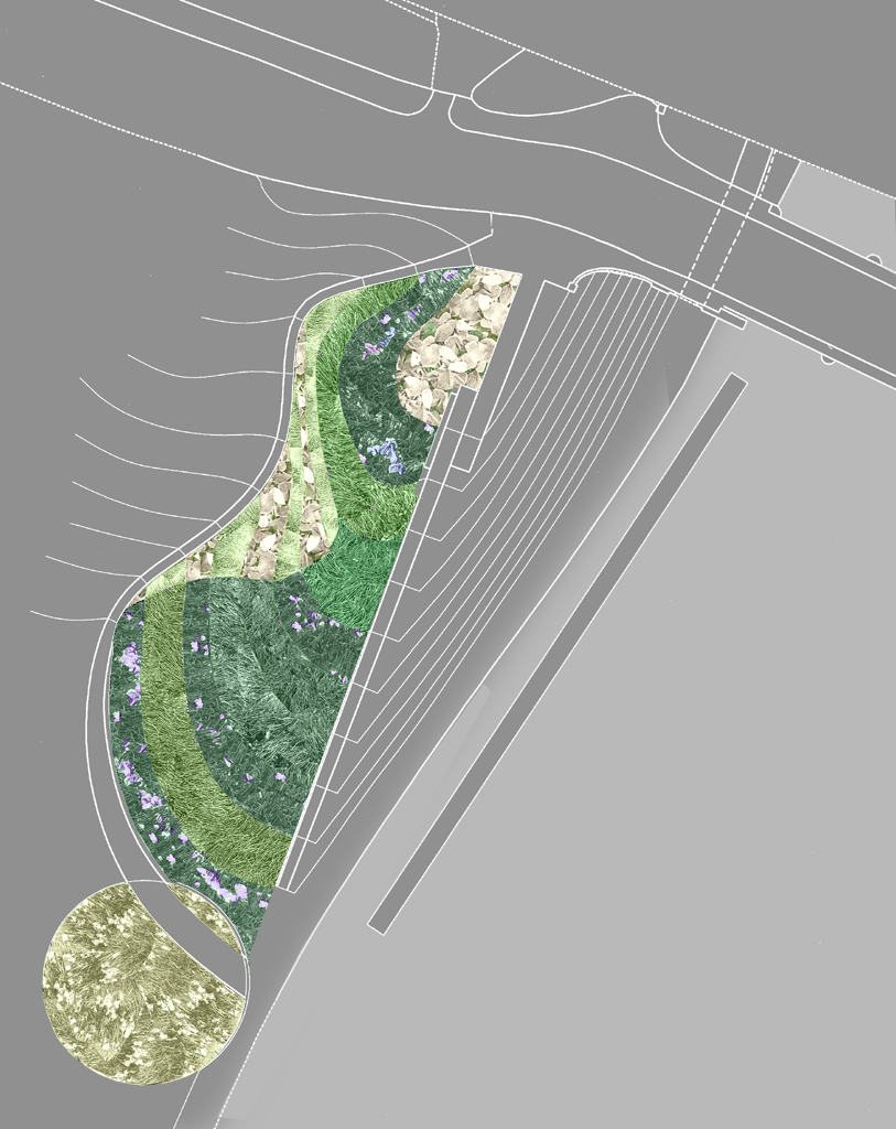
The green roofs and entry courtyard of 240 Central Park South pull the character of Central Park through the building and up to the roof. Contoured ribbons of shrubs and sedums are interwoven with lines of slate, mimicking the rock outcroppings in the park. 

This landscape is designed to be experienced from multiple viewpoints. Visitors walking by the building catch glimpses of the cherry trees peaking over the parapet wall, while tenets inside the building are surrounded by the rolling ribbons of plants.  From the neighboring buildings and apartments above, the multiple levels of rooftops appear to join together into one unified landscape.

Pennsylvania Avenue at the White House

2002 - Washington, DC, USA

Pennsylvania Avenue at the White House

Washington, DC, USA

CLIENT National Competition for Government Services Administration / STATUS Competition 2002 / DESIGN TEAM Balmori Associates

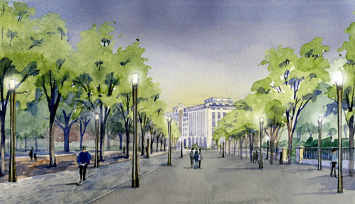
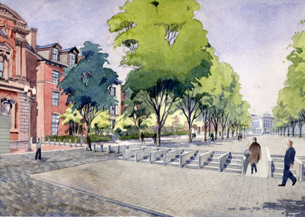
The National Capital Planning Commission initiated a competition to create a plan for a safe and beautiful civic space on Pennsylvania Avenue in front of the White House. Currently blocked with jersey barriers and police cars, the avenue has not been open to vehicular traffic since President Clinton ordered it closed in 1995 after the Oklahoma City bombing.  In light of increased national security, the competition sought innovative solutions to integrate security with urban landscape design.

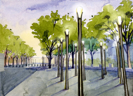
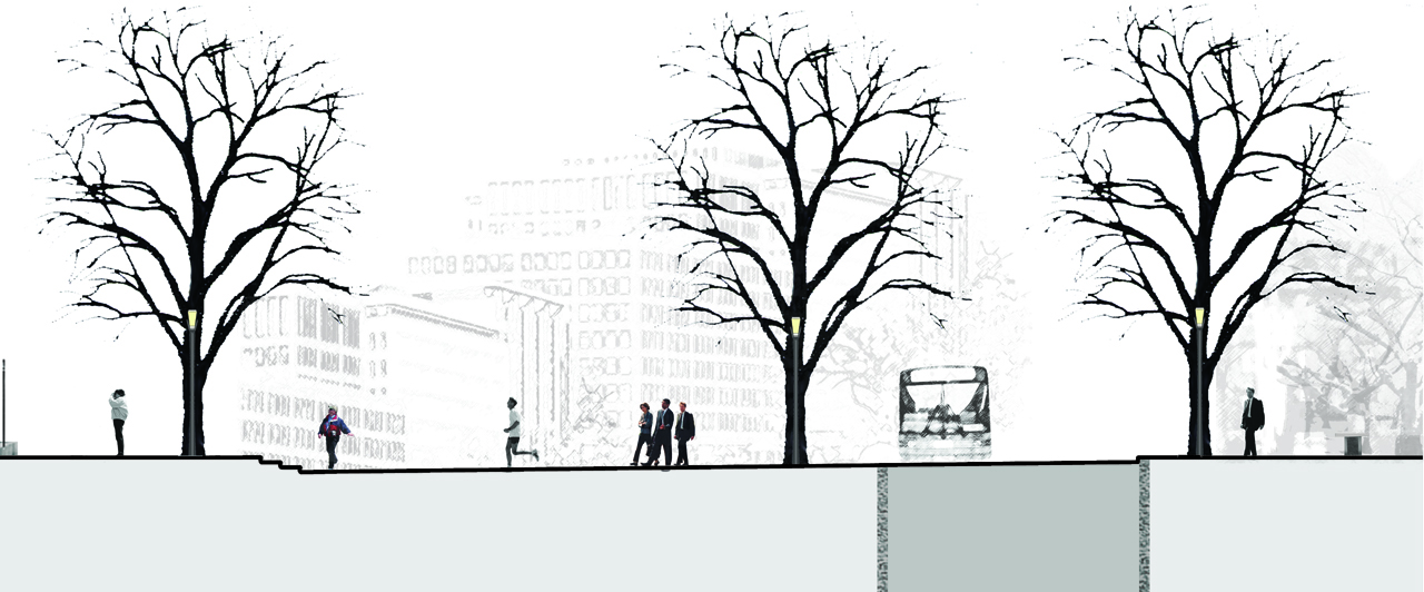
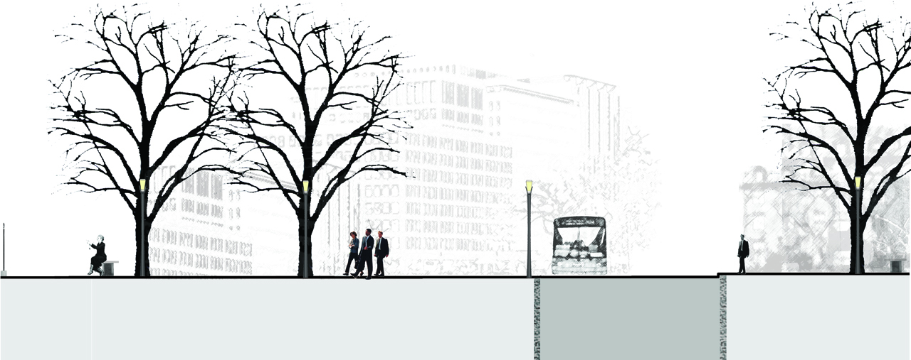
Balmori Associates proposal reinstates Pennsylvania Avenue’s civic prominence.  The plan uses subtle grading shifts to visually elevate the White House and provide security at the intersections of 15th and 17th Streets.  The expanse of the former six lane road is transformed into a dignified pedestrian boulevard through a rhythmic placing of trees, urban furniture and atmospheric lighting. Directly in front of the White House, Pennsylvania Avenue is lowered slightly to reveal three steps. This inflection creates a platform and frames a view of the White House.  The elegant bowing of the grade smoothly reverses itself by rising at the ends of Pennsylvania Avenue to provide the required security barrier in the form of a civic entry staircase.  This promenade is easily converted from a pedestrian plaza to a parade route for inaugurations and other events and guard posts are integrated into a separate security and future trolley circulator on the Lafayette Park side of Pennsylvania Avenue.

Park(ing) Trenton

2006 - Trenton, NJ, USA

Park(ing) Trenton

Trenton, NJ, USA

CLIENT State of New Jersey, Department of the Treasury, Division of Property Management and Construction / STATUS Competition Entry 2006 / SIZE 53 acres / DESIGN TEAM Balmori Associates, ACT Engineers, Robert A.M. Stern Architects, Alan Dye , The Bioengineering Group, City Smiles, Ear Studio, Guy Nordenson and Associates, Urban Trees + Soils

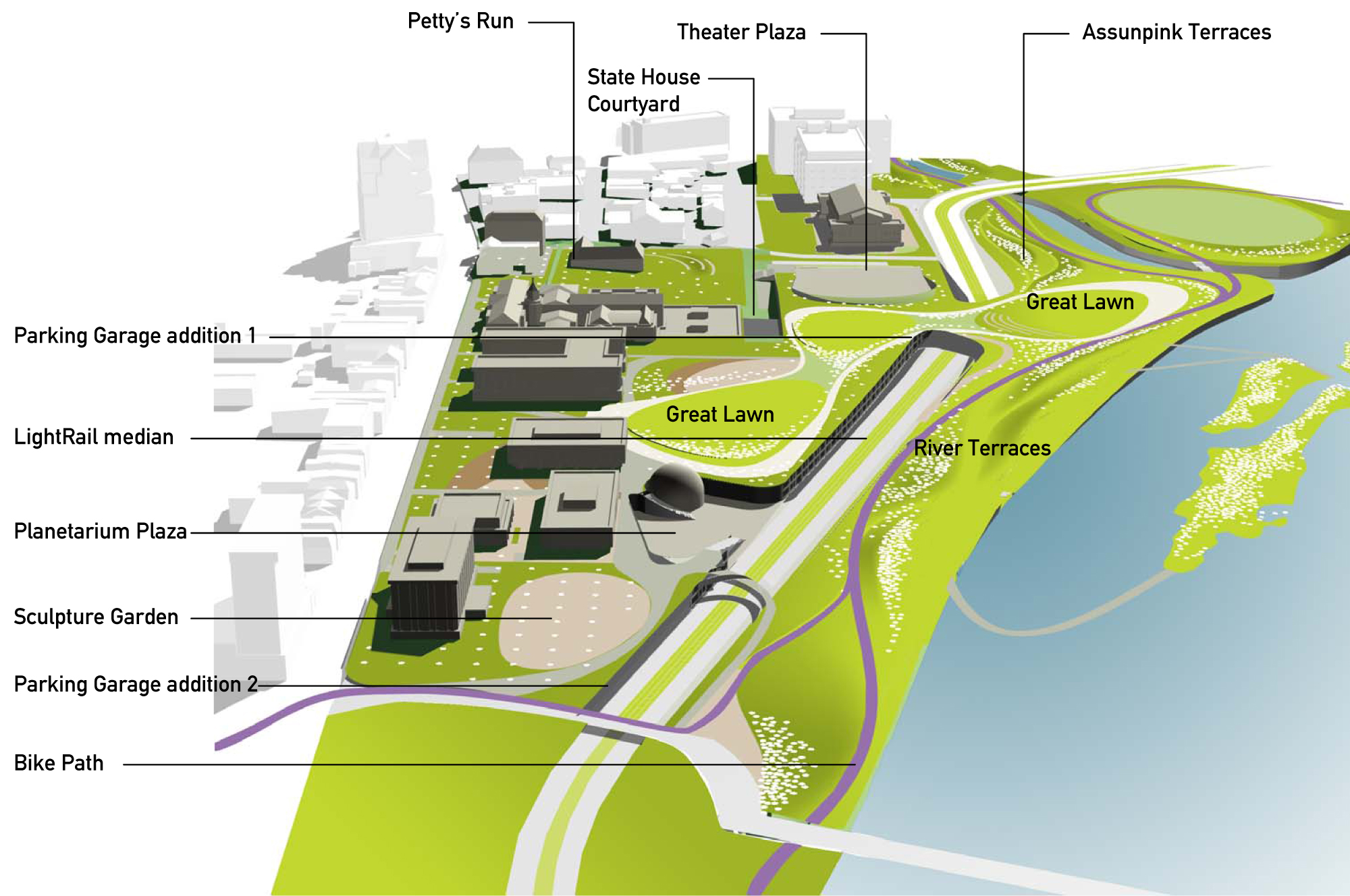
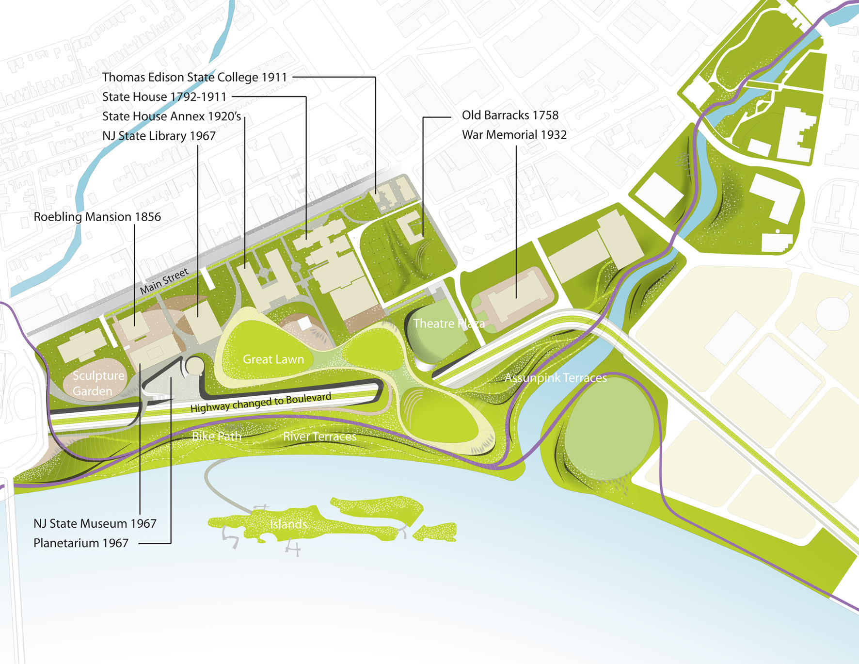
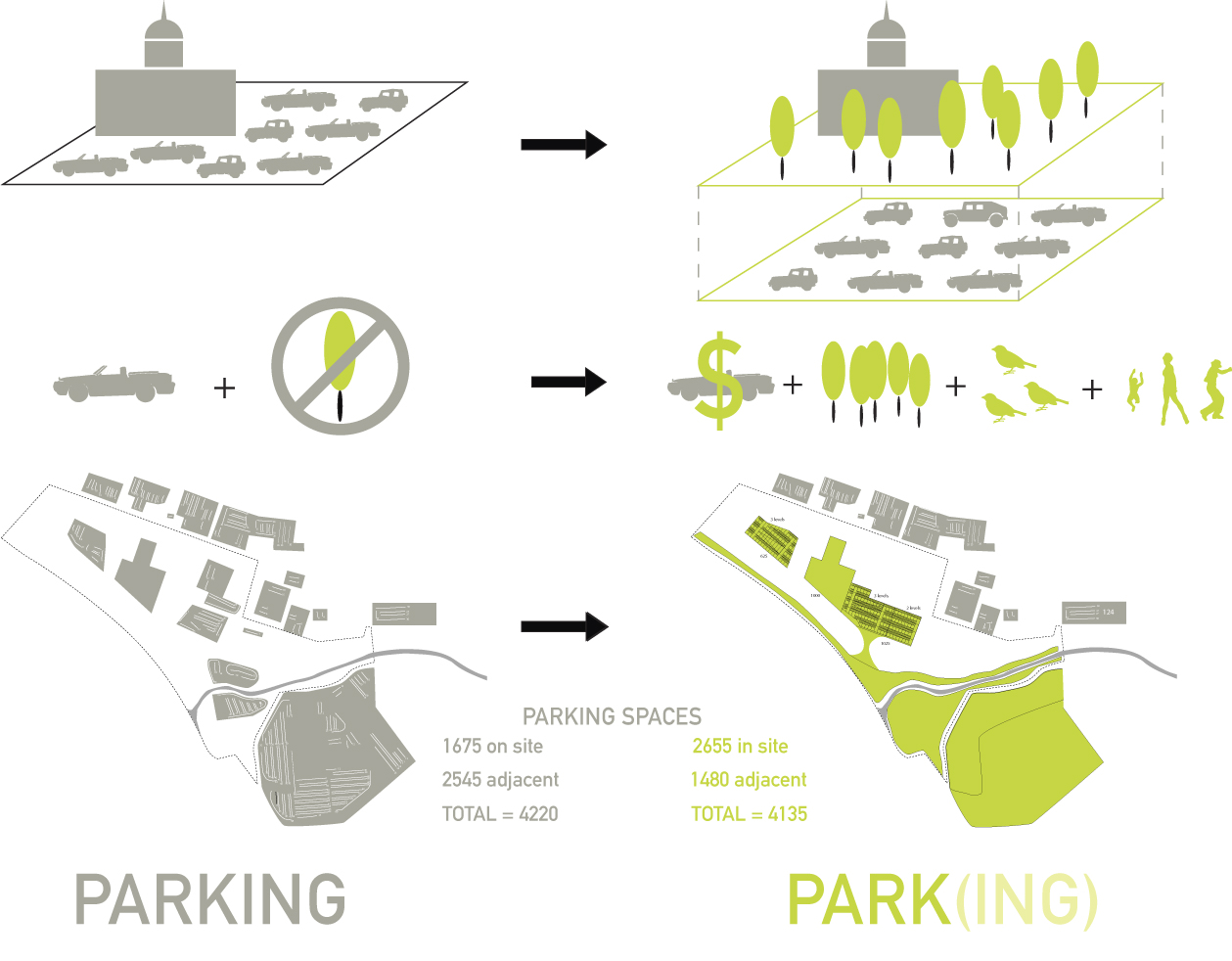
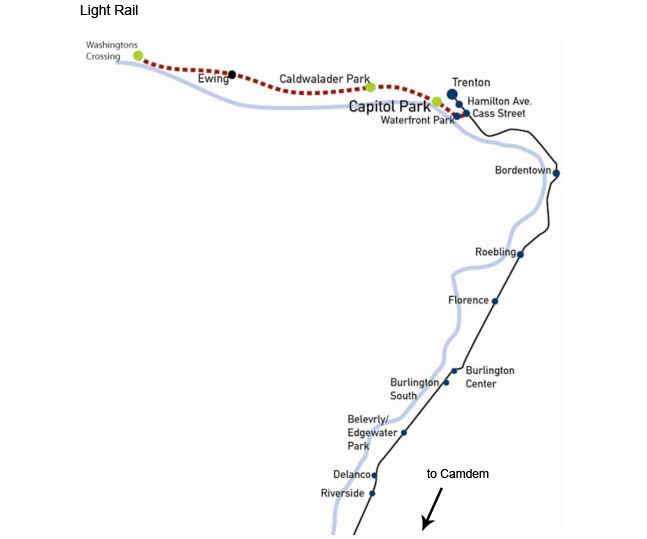
This is a park created out of land liberated through the consolidation of existing surface parking into a stacked system. The newly gained elevation from the parking garage re-creates the bluff that once existed behind the state house, providing a fantastic view of the Delaware River. From this new bluff a gentle descending slope crosses the boulevard and brings you to the river’s edge.

This project is about the creation of a new identity for Trenton’s Capitol Complex through a landscape that unites and relates to the historical context without being tied to the historical concept of a park.

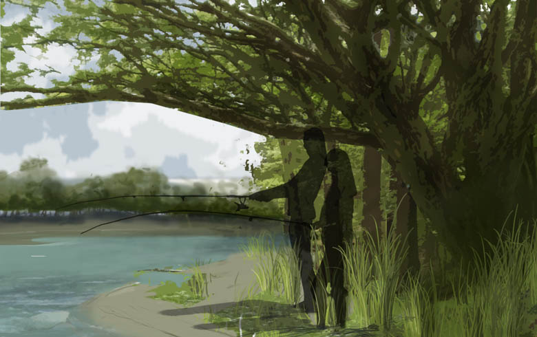
For this competition, we met with local community groups in order to better understand the needs of local users. Our goal was to work with these groups as well as others to ensure that the park is one which serves the people of Trenton. Biking, walking, bird watching, sunbathing, school groups learning about the New Jersey plants and history, these are all activities envisioned for Trenton’s new park.

10 Li Park

2007 - Seoul, Korea

10 Li Park

Seoul, Korea

CLIENT Multi-functional Administrative City Construction Agency of Korea / PROJECT AREA 2,700,000 m2 / STATUS Competition Finalist, 2007 / DESIGN TEAM Balmori Associates, Inc. / Joel Sanders Architect / MAD office Ltd. / EXE Ltd.
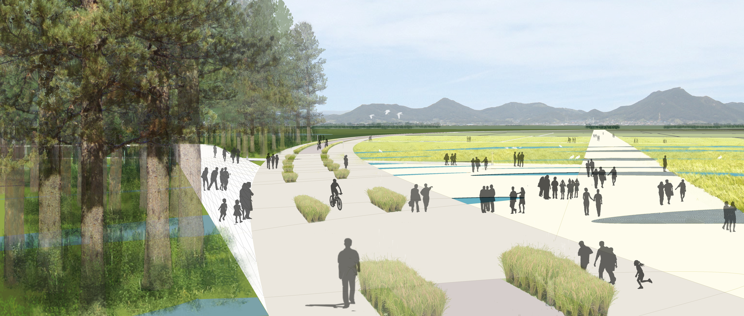
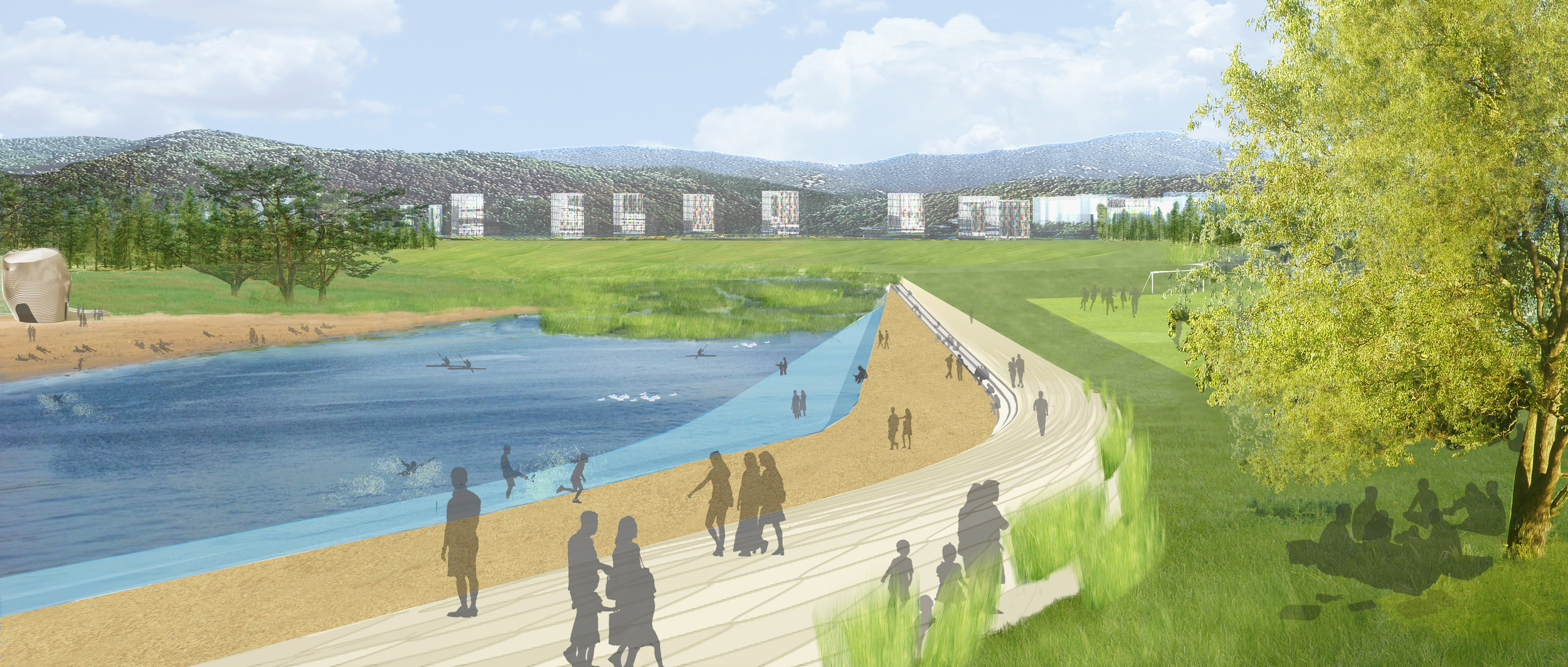
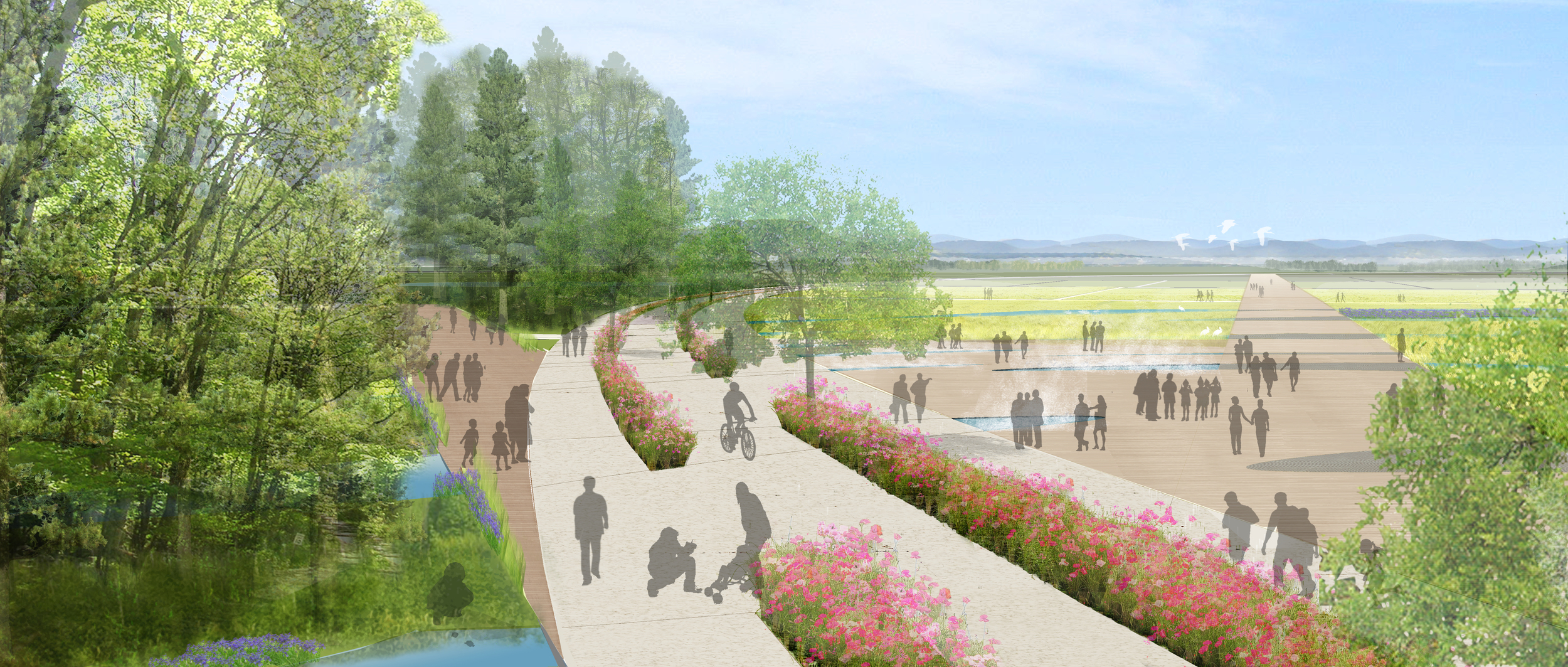
10 Li Park evolves from the overlay and intersection of a central park, a linear park, and architecture. The central park is a space for recreation and experiencing nature, while the linear park “climbs” the nearby mountains, extends onto the river, and weaves through the site to connect the various areas of the immense site. Architectural elements exist at the interface of these two typologies binding them at their most significant intersection. It is a fresh interpretation of each typology that results in new spatial and programmatic strategy for occupying the landscape. The 10 Li Ring combines historical, natural and constructed order of the river, the levee and Public Administration Town (PAT). Li is a traditional Korean unit to measure distance; 10 Li becomes a tool to engage the spatial experiences of the park.

The Ring is a ‘Museum Mile’ that connects 3 of the planned facilities; a line of culture that creates a porous public boundary between the various landscapes and the architecture. The Li-near Loop is the primary line in the park’s succession and growth. All program and park spaces develop out of this loop in time. It is the primary circulation path and an ecological corridor for habitat, filtering, cleaning and purifying air and water; an active environmental engine. In order to maintain a continuous park surface that links to the river and the 10 Li Ring, traffic through the park is placed under this surface before emerging and linking with PAT’s road network.

Super Duper Mare

2008 - Weston Super Mare, UK

Super Duper Mare

Weston Super Mare, UK

STATUS Competition Entry 2008 / DESIGN TEAM Balmori Associates, Work AC / PHOTOS Courtesy Balmori Associates, Work AC

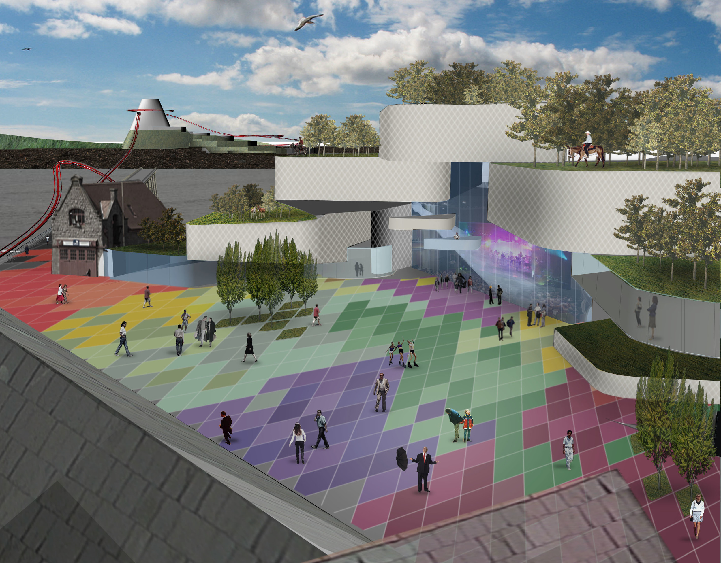
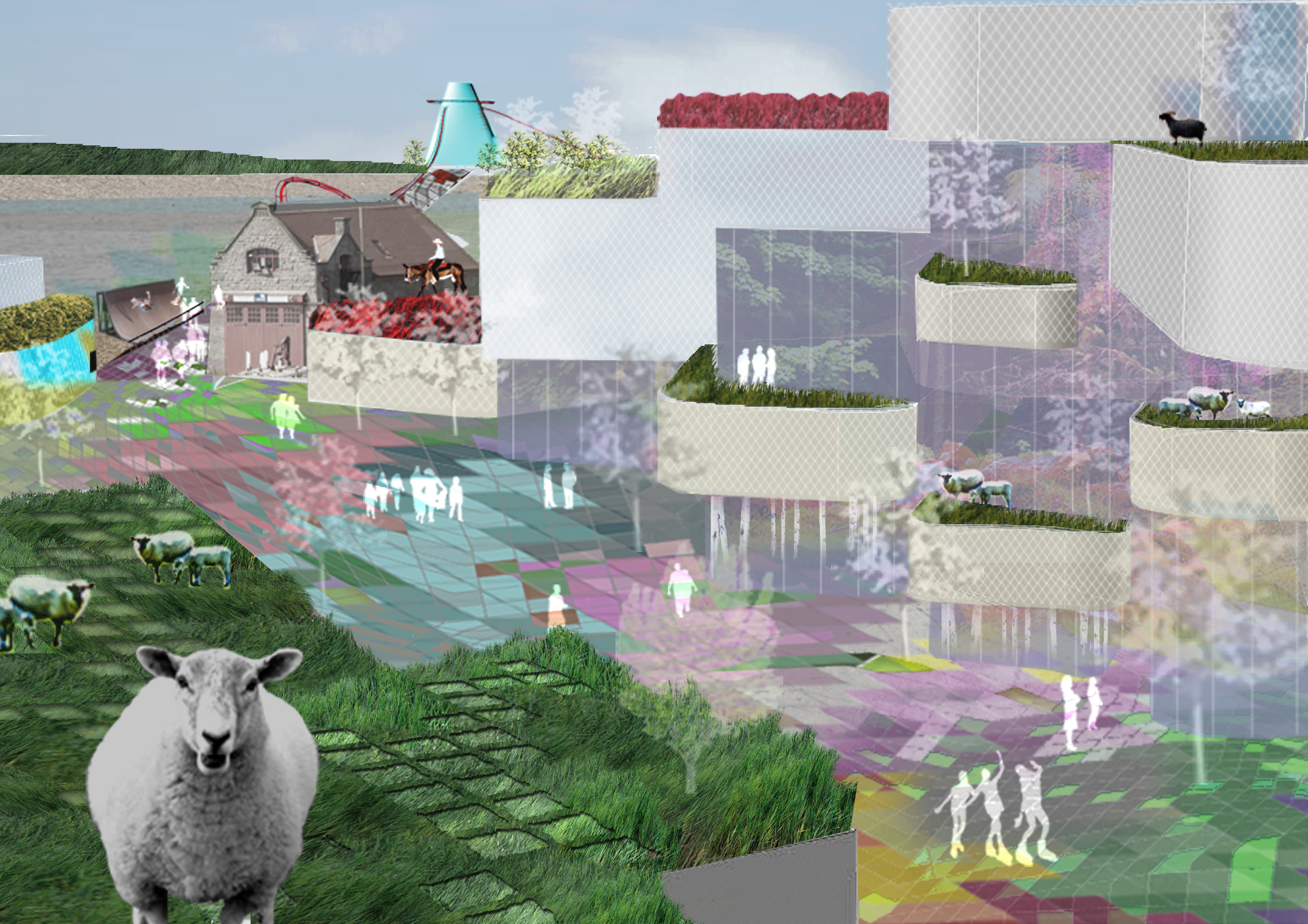
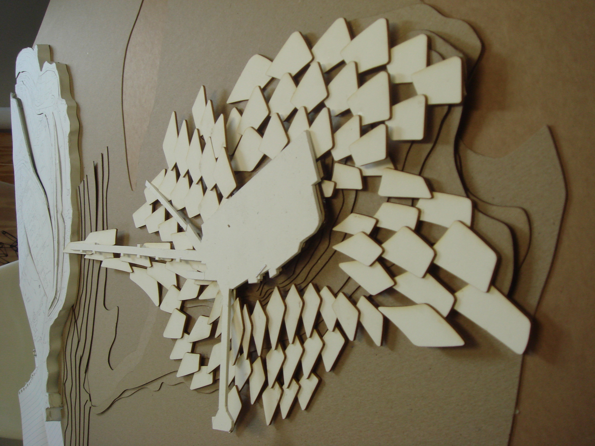
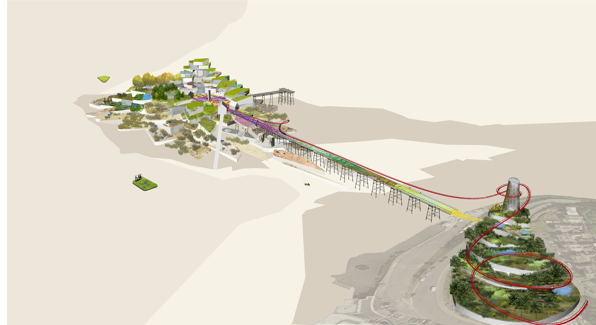
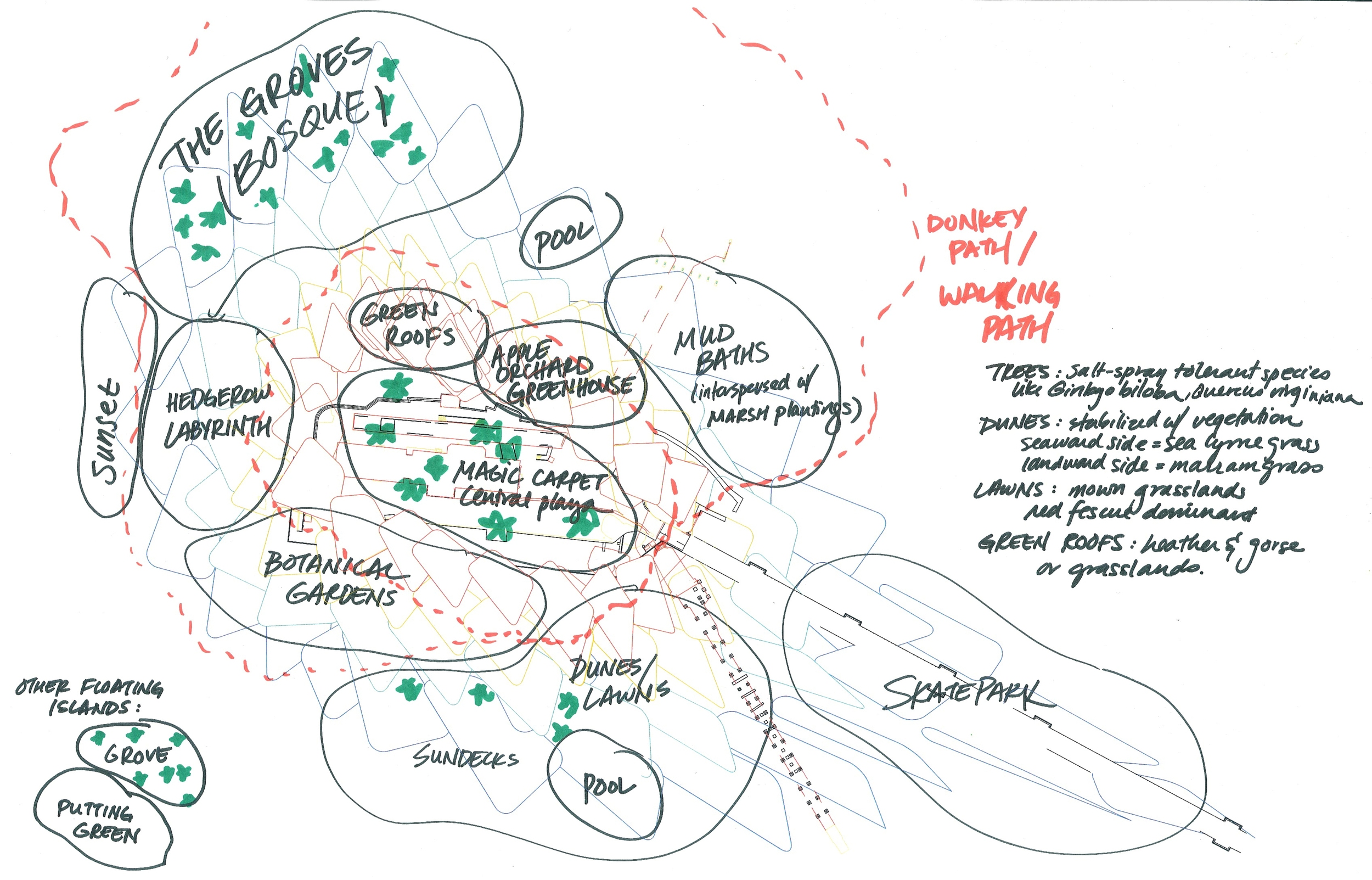
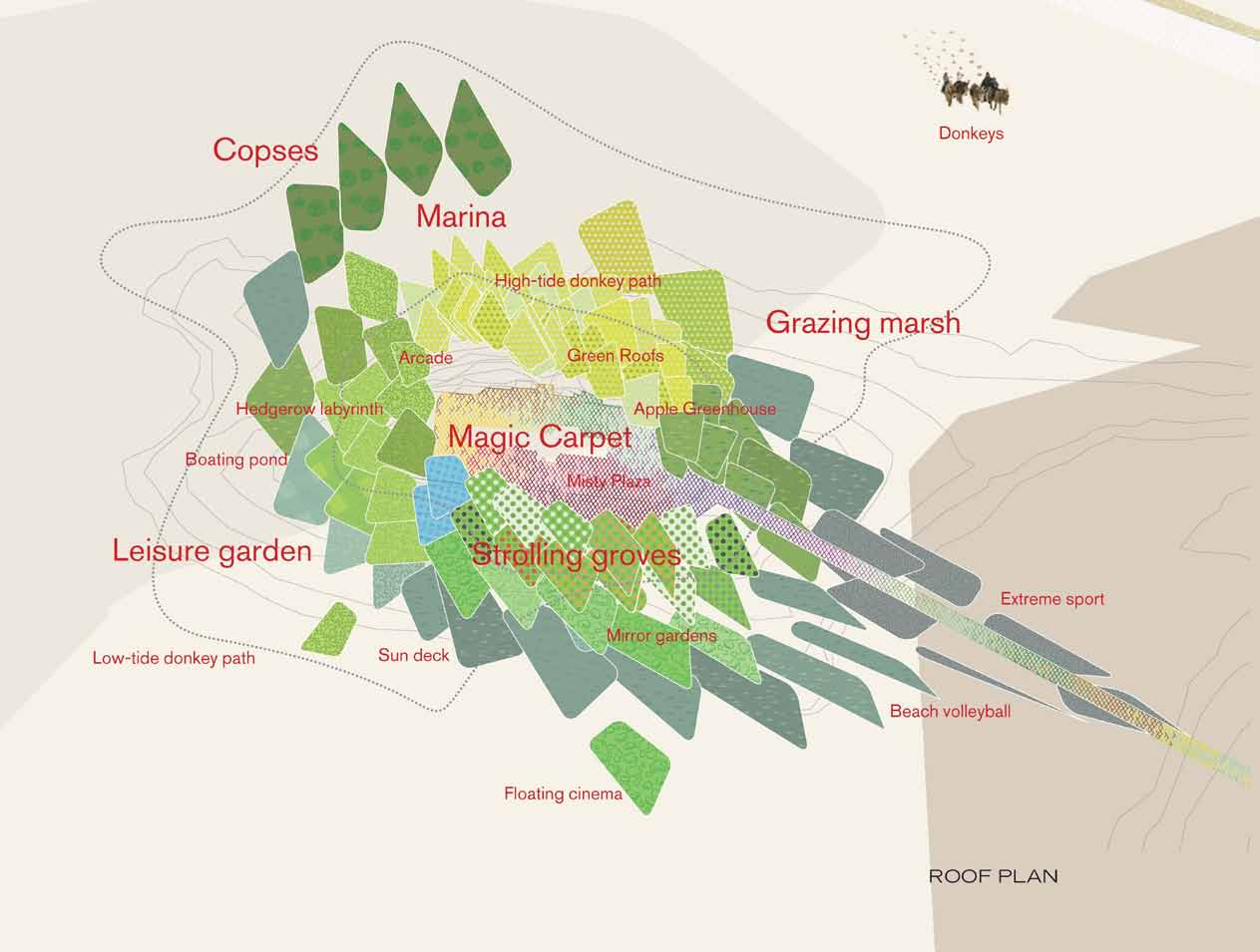
Birnbeck Pier’s history is re-imagined as a Twenty-First Century Victorian Pleasure Garden, where landscapes offer a multi-programmed architectural lattice of recreation and event spaces. Birnbeck Island blossoms with activity and life- programmatically through the creation of an island of leisure and diverse activities that include clubs, concerts, spa and hotel – with a series of thematic and distinctive gardens that mirror the landscapes of the region.

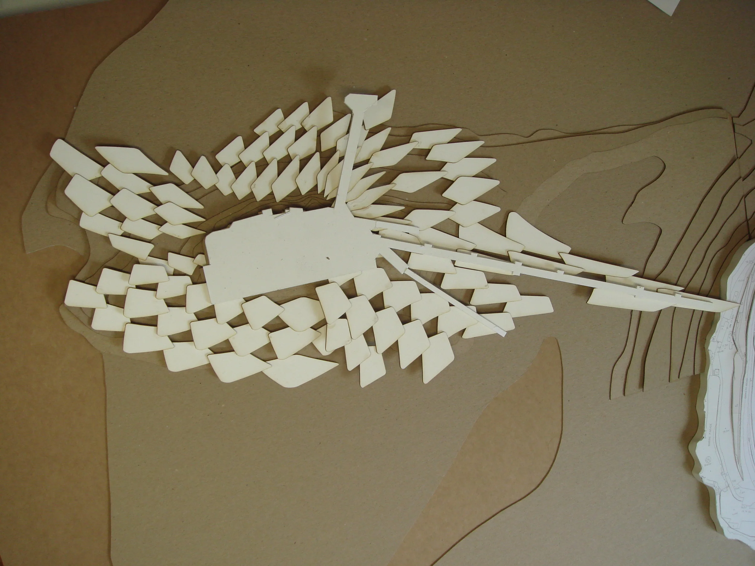
We imagine the island’s activities matched with its natural environment and sustainable systems, creating a unique destination combining the excitement of massive events with the serenity of garden strolling. The project will be primarily serviced with sustainable systems that include a wind and tidal power generation. We propose many of the island’s activities to occur with the tidal cycle rather than night-day. Inspired by sources as diverse as the clumps of mussels found in the Severn Estuary, the rock formations of East Quantoxhead and Kilve, and the ecotones of the region, our design concept creates a new statement for Weston Super Mare through programmatic “chips” that stack on top of each other to create areas such as the hotel and “pleasure cave,” or layered at different levels so that the overall effect and spatial configuration changes dramatically with the tide. Each “chip” is set deep enough to support abundant plant life as a green roof and generous space within it.

Princess Diana Memorial Fountain

2002 - London, UK

Princess Diana Memorial Fountain

London, UK

CLIENT The Royal Parks / SIZE 15,000 Sq ft. / STATUS Competition Finalist 2002  / DESIGN TEAM Balmori Associates / Atelier Ten / Atelier One / Price & Myers / Sam Price / Long & Kentish / Andrew Grant

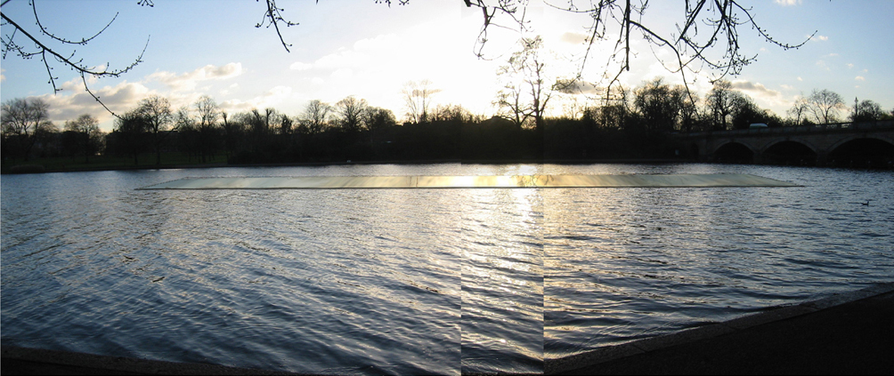
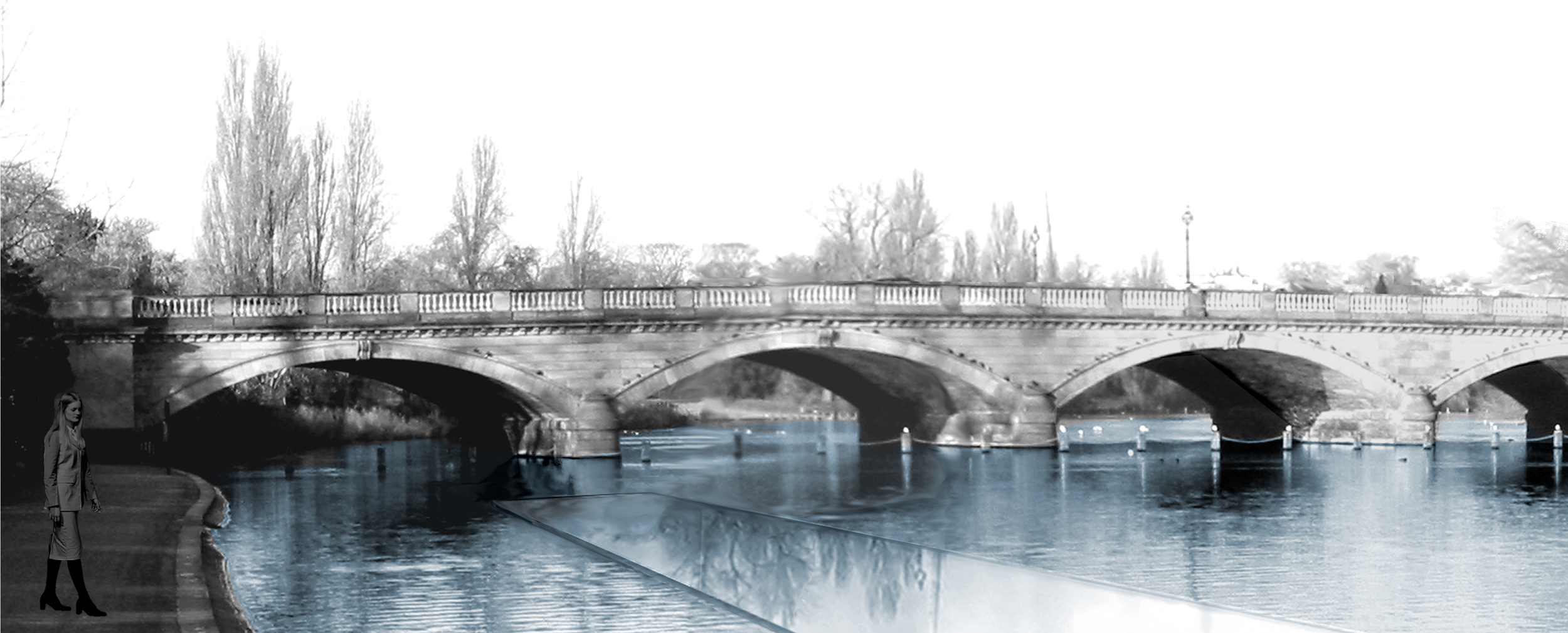
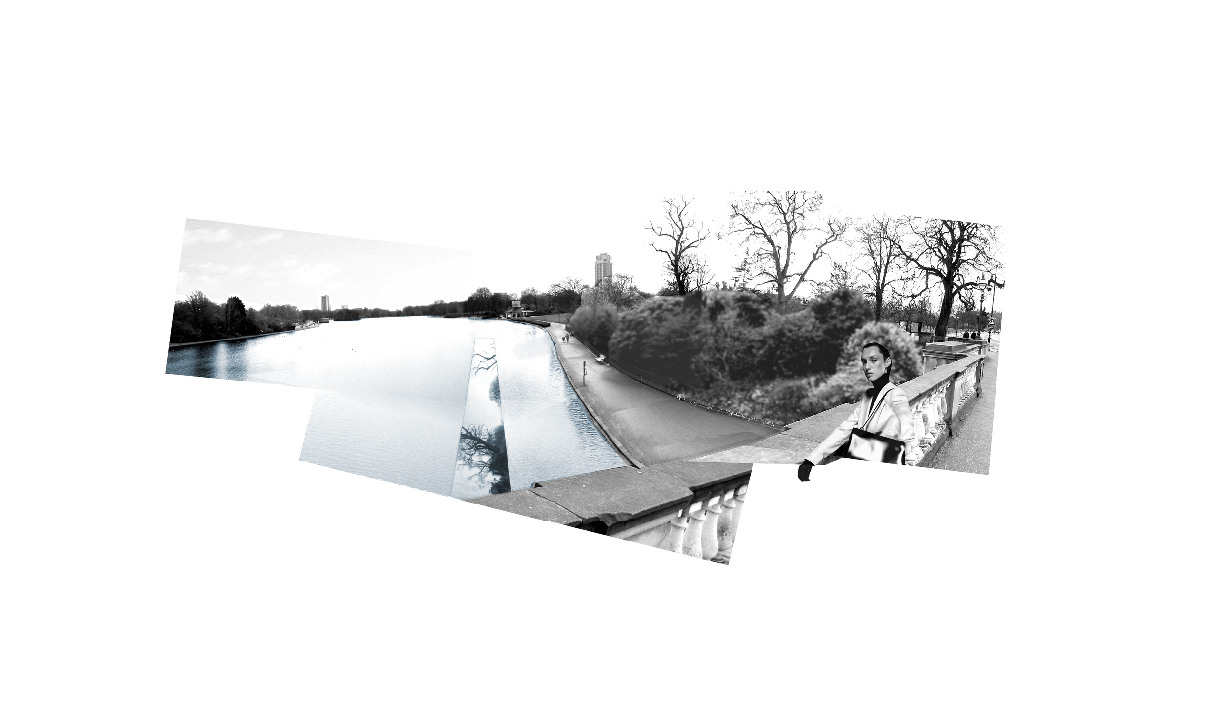
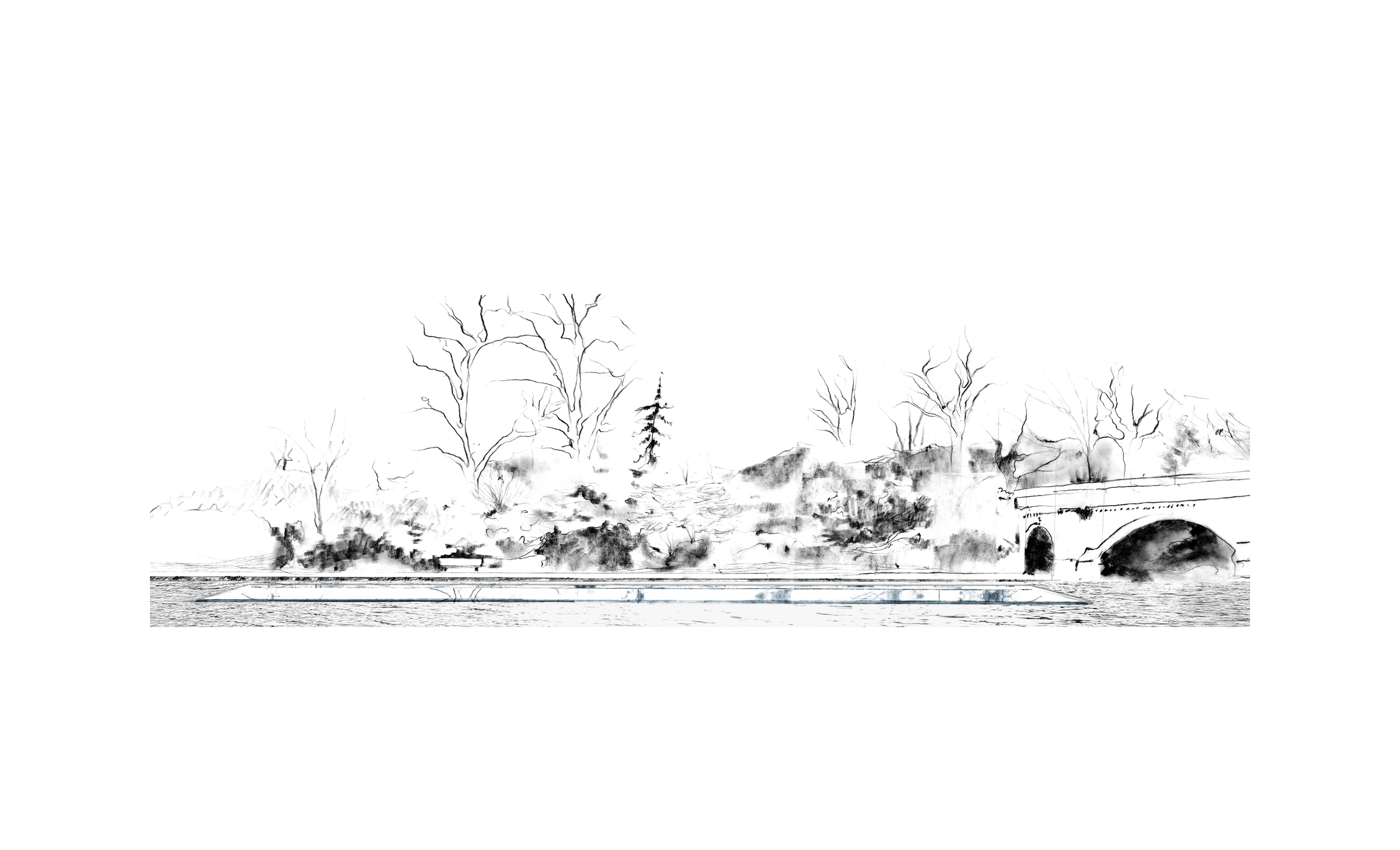
To commemorate the life of Diana, Princess of Wales, the Royal Parks Agency invited proposals for a memorial in London’s Hyde Park; Balmori Associates was among the design firms short-listed.  The competition called for the design of a permanent memorial with a water element as well as a redesign of the surrounding area to contribute positively to the Hyde Park’s historic landscape and ecology.

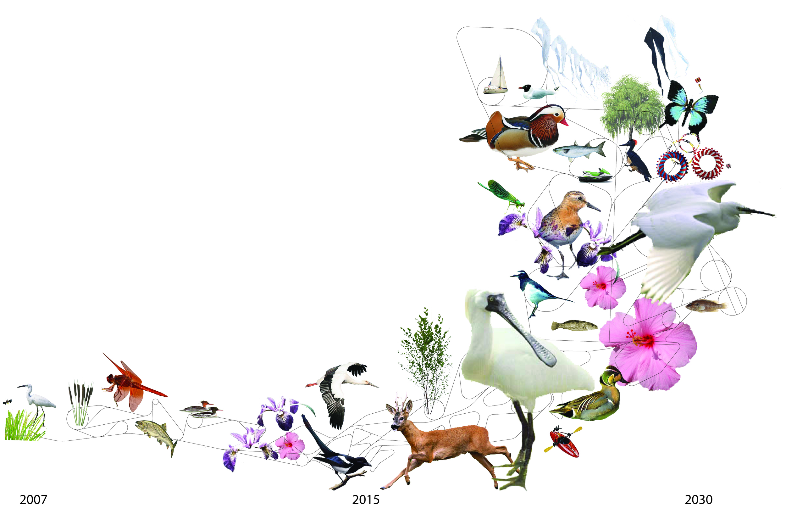
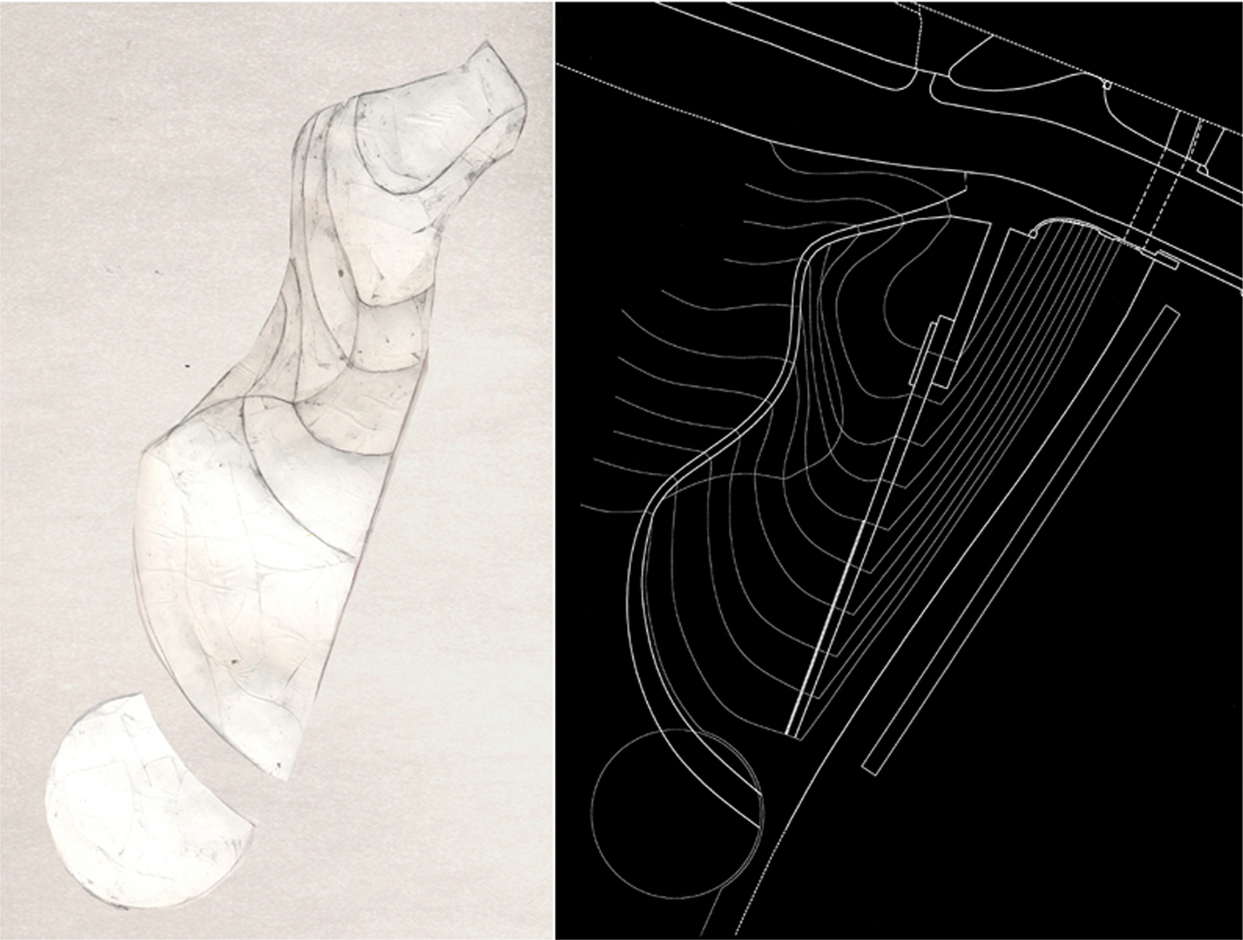
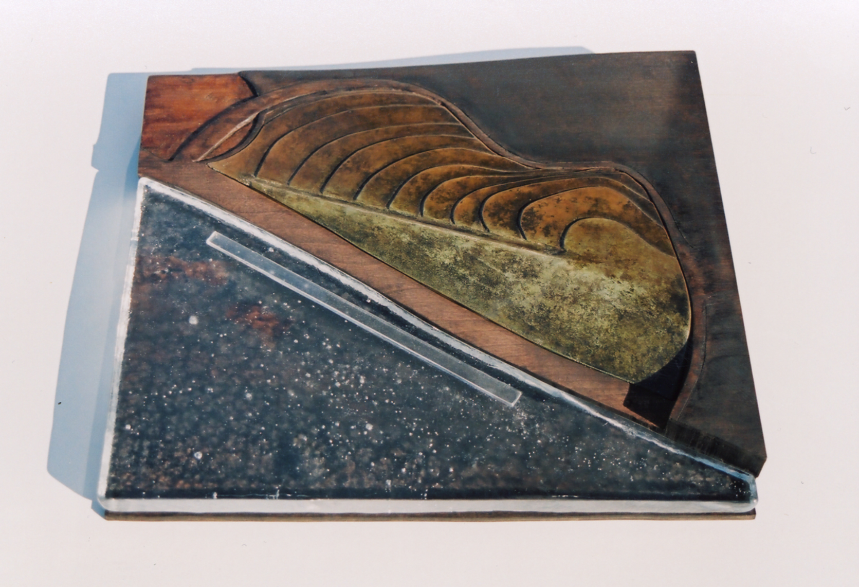
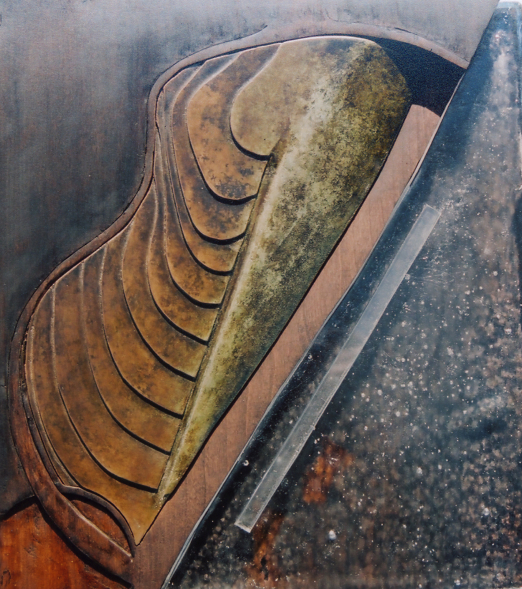
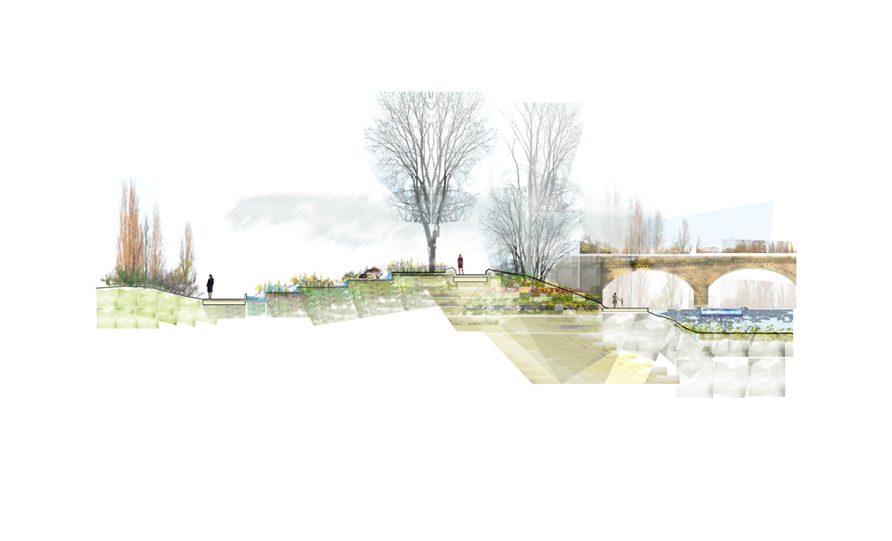
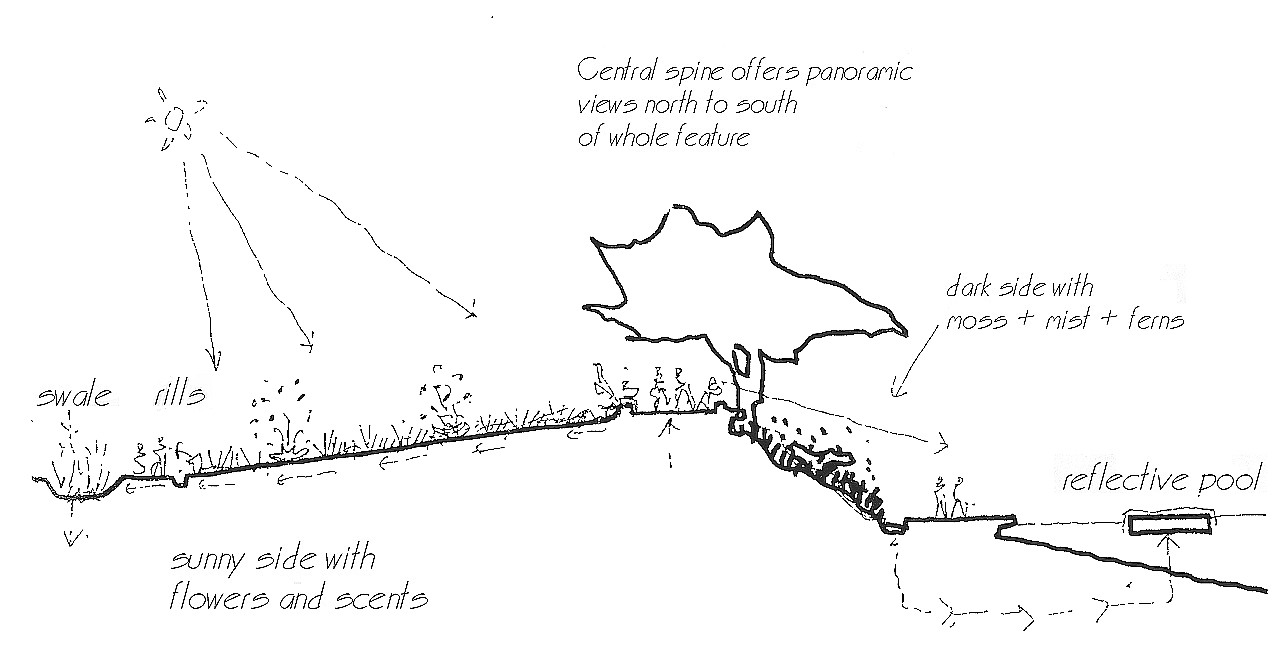
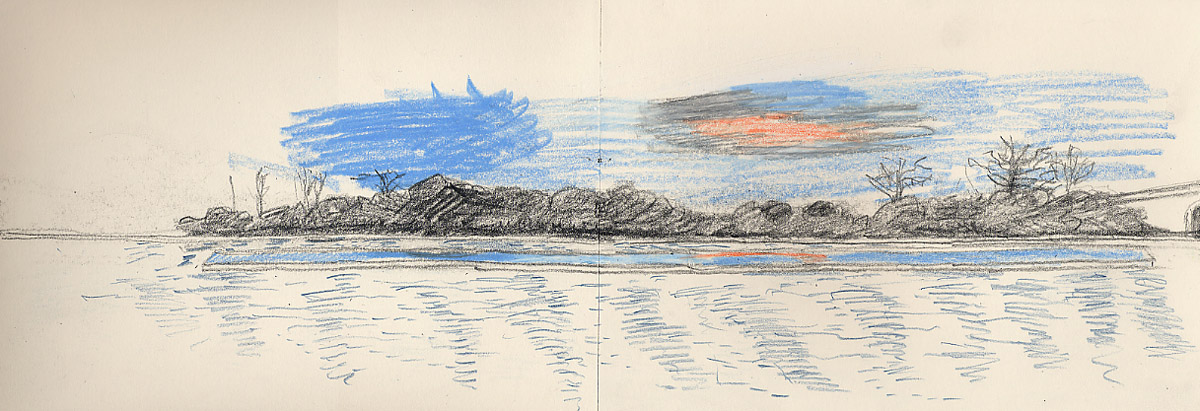
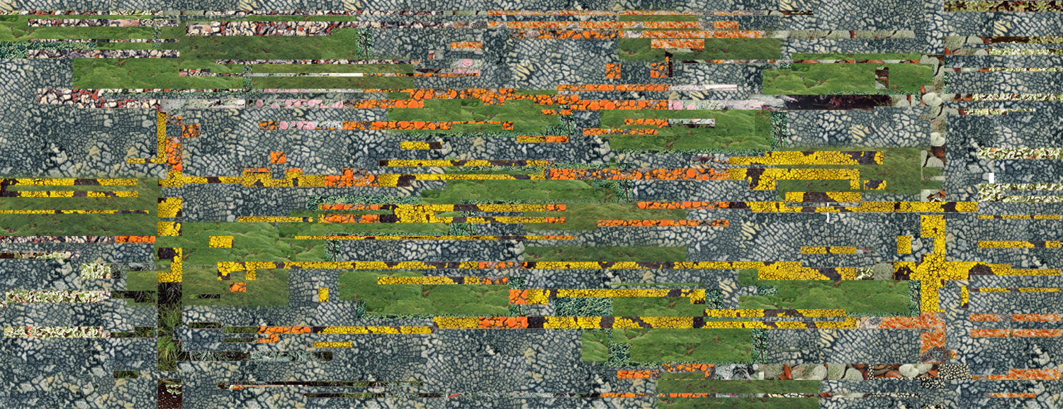
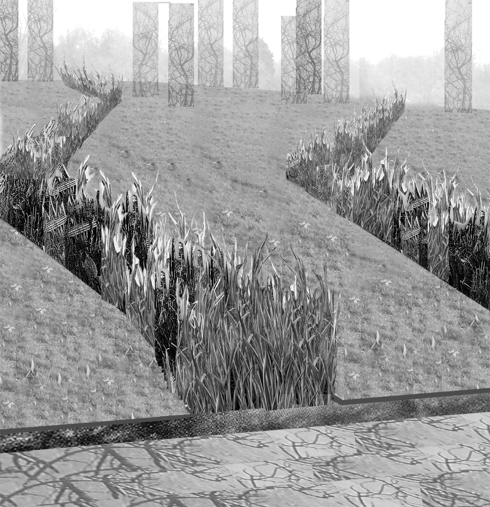
Situated alongside the Serpentine and historic Serpentine Bridge, Balmori Associates’ proposal elegantly displays the process of water cleansing through a series of terraced water gardens and moss and lichen walls. Water taken from the Serpentine is naturally filtered through gardens of iris and native grasses. The water then aerates in a small garden pond before being drawn into a still reflecting pool, located in the Serpentine. The linearity and serene quality of the water plane contrasts with the dynamic Serpentine; the water is returned to its source. This ongoing purifying cycle provides a series of contemplative gardens and moments in which to reflect on the life and memory of Princess Diana, while enhancing the landscape and supporting ecology of Hyde Park.

Phoenix Island

2008 - Sanya, China

Phoenix Island

Sanya, China

STATUS Commissioned in 2008 / DESIGN TEAM Balmori Associates, Inc. MAD Architects

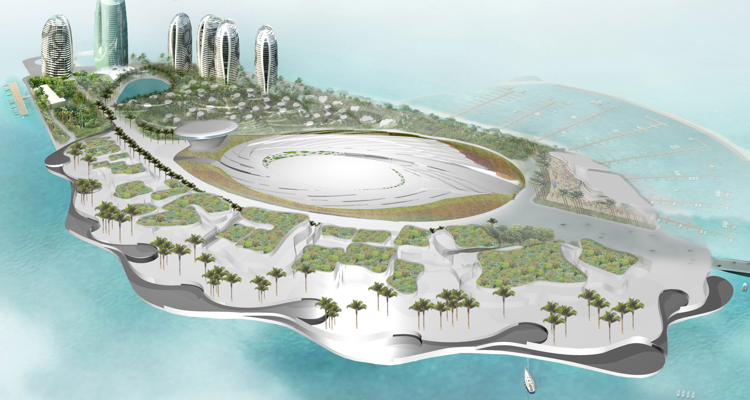
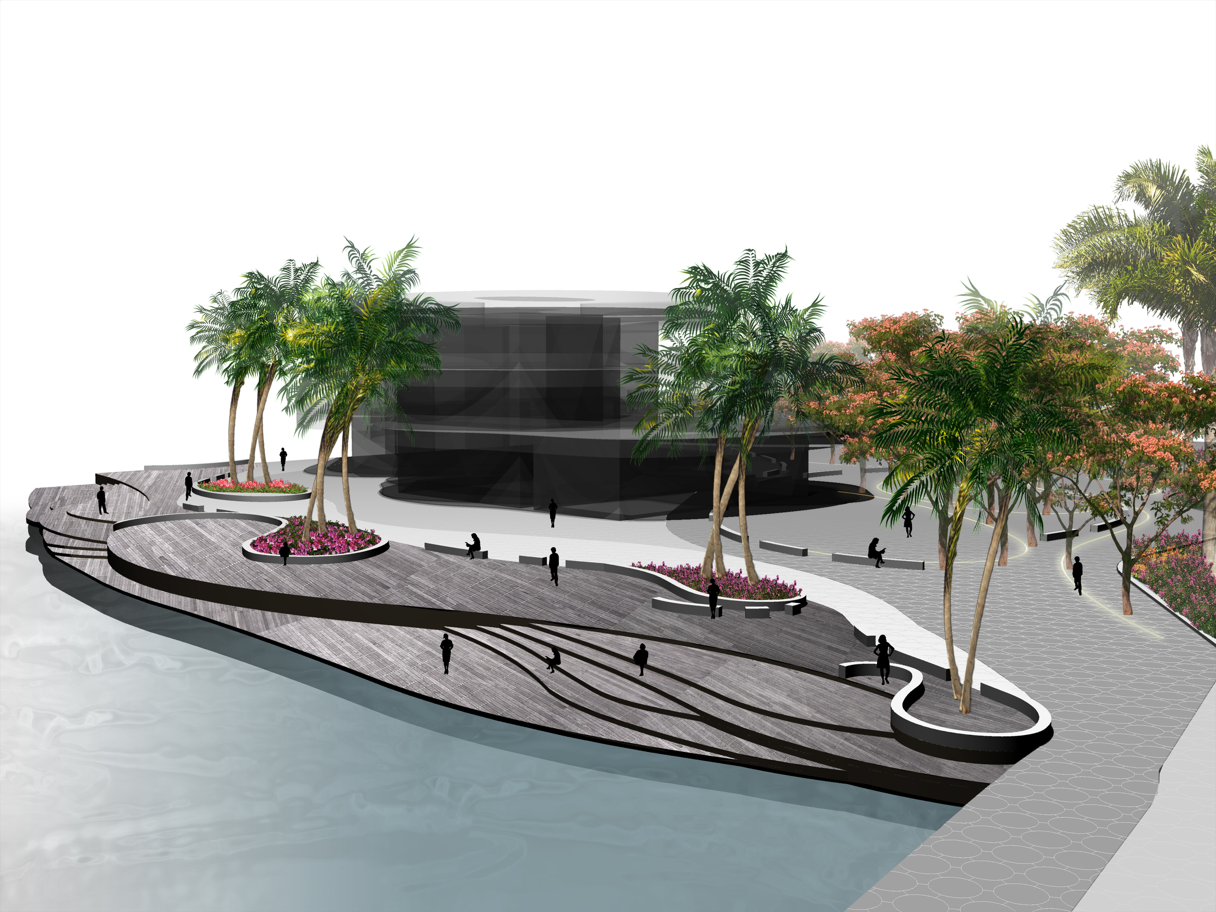
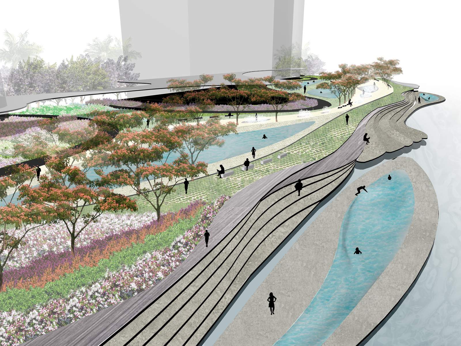
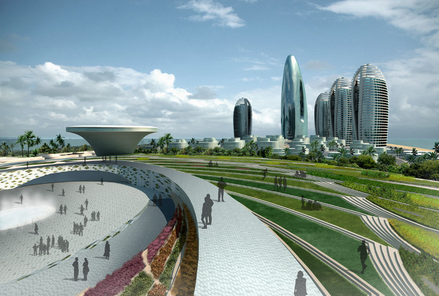
Sanya Phoenix Island, located in Sanya China, covers an area of 300,000 square meters, with a total project investment of over 3 billion yuan, Phoenix island is an artificial island designed by Balmori Associates along with MAD architects. With high-level seven-star resort hotels and six hotel-style apartment complexes and a harbor for international passenger liners, the landmark will be the highest hotel in the region of Hainan. The underlying public space are tentacles that extend from the starfish, covering the ecological park. The island will represent the future of Sanya as the international tourism and resort city. Construction work is due to finish in 2014.

Pennine Lancashire Squared Accrington

2009 - Accrington, UK

Pennine Lancashire Squared Accrington

Accrington, UK

CLIENT Pennine Lancanshire Squared / STATUS Competition Finalist, 2009 / DESIGN TEAM Balmori Associates / s333 / QUATRO / Larry Barth

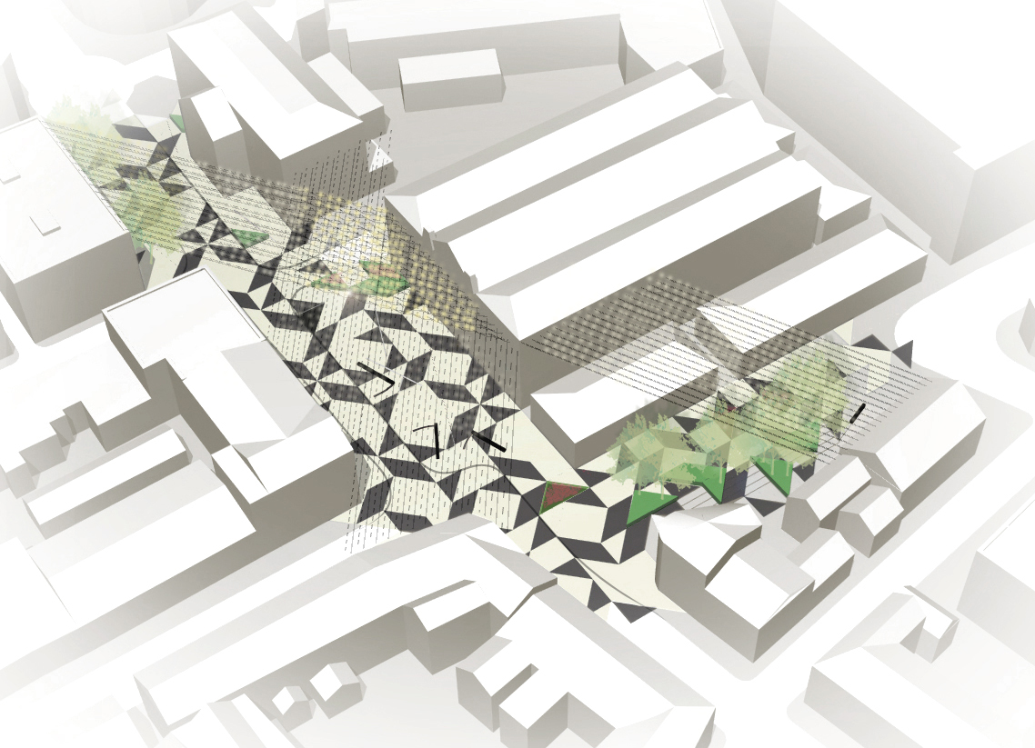
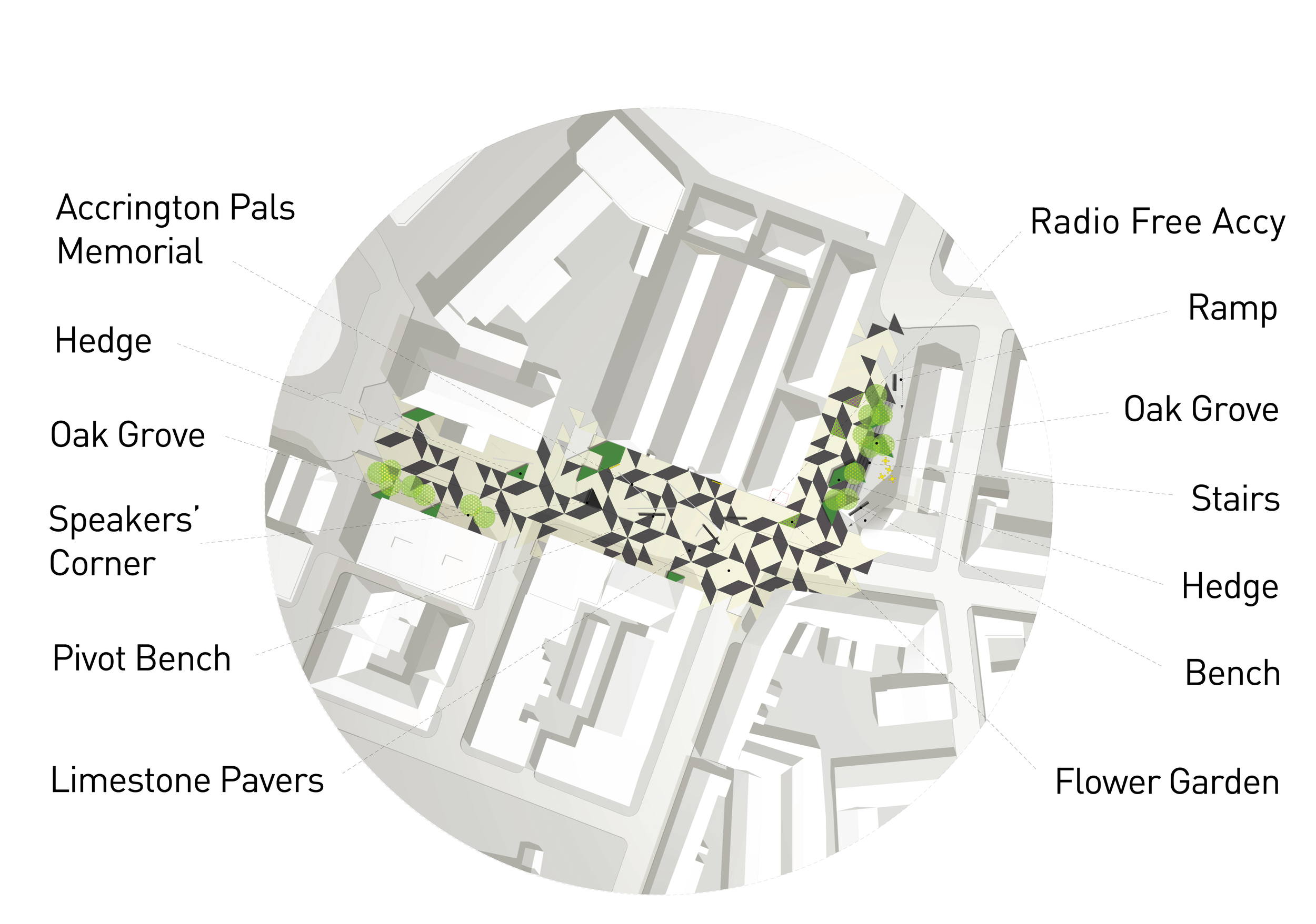
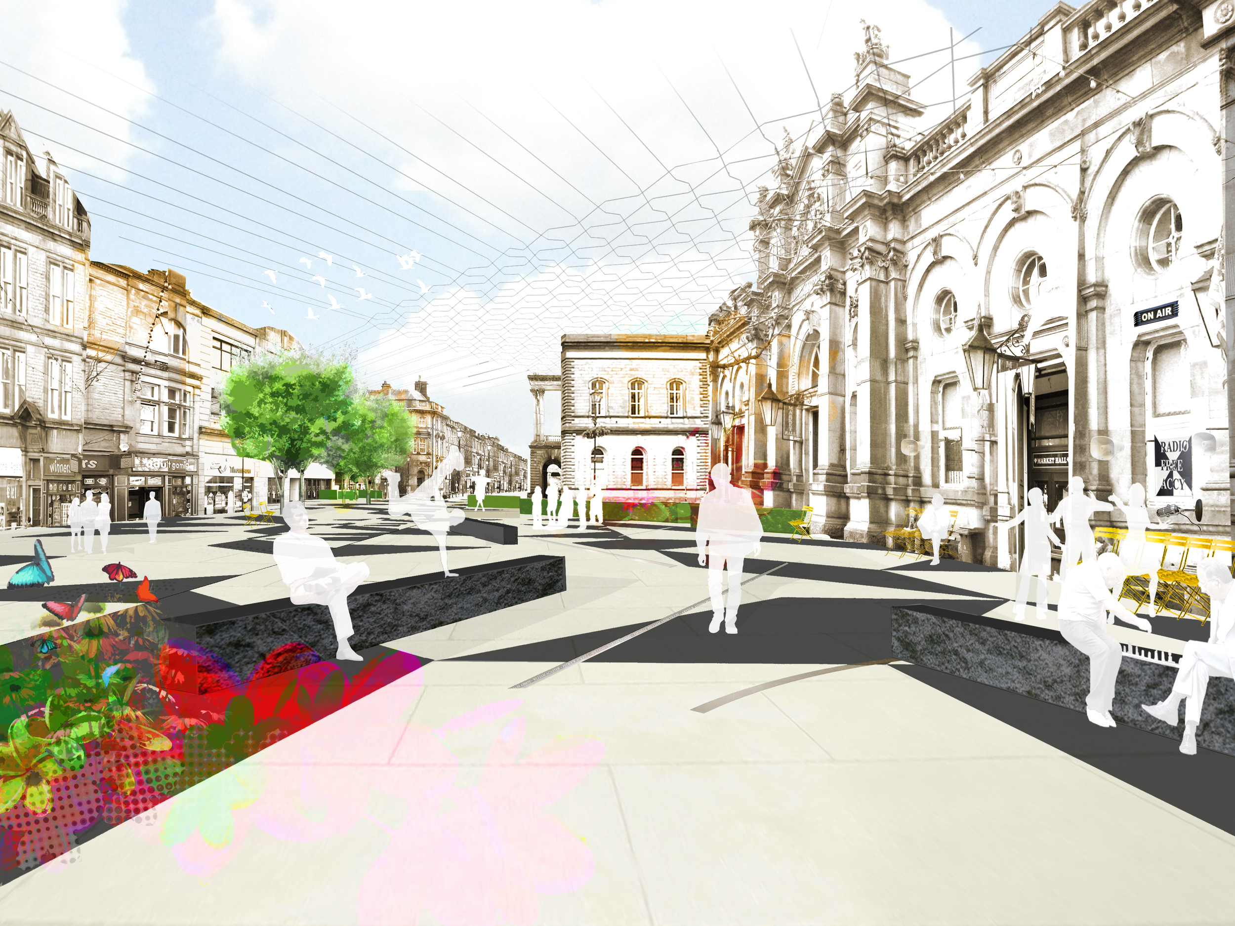
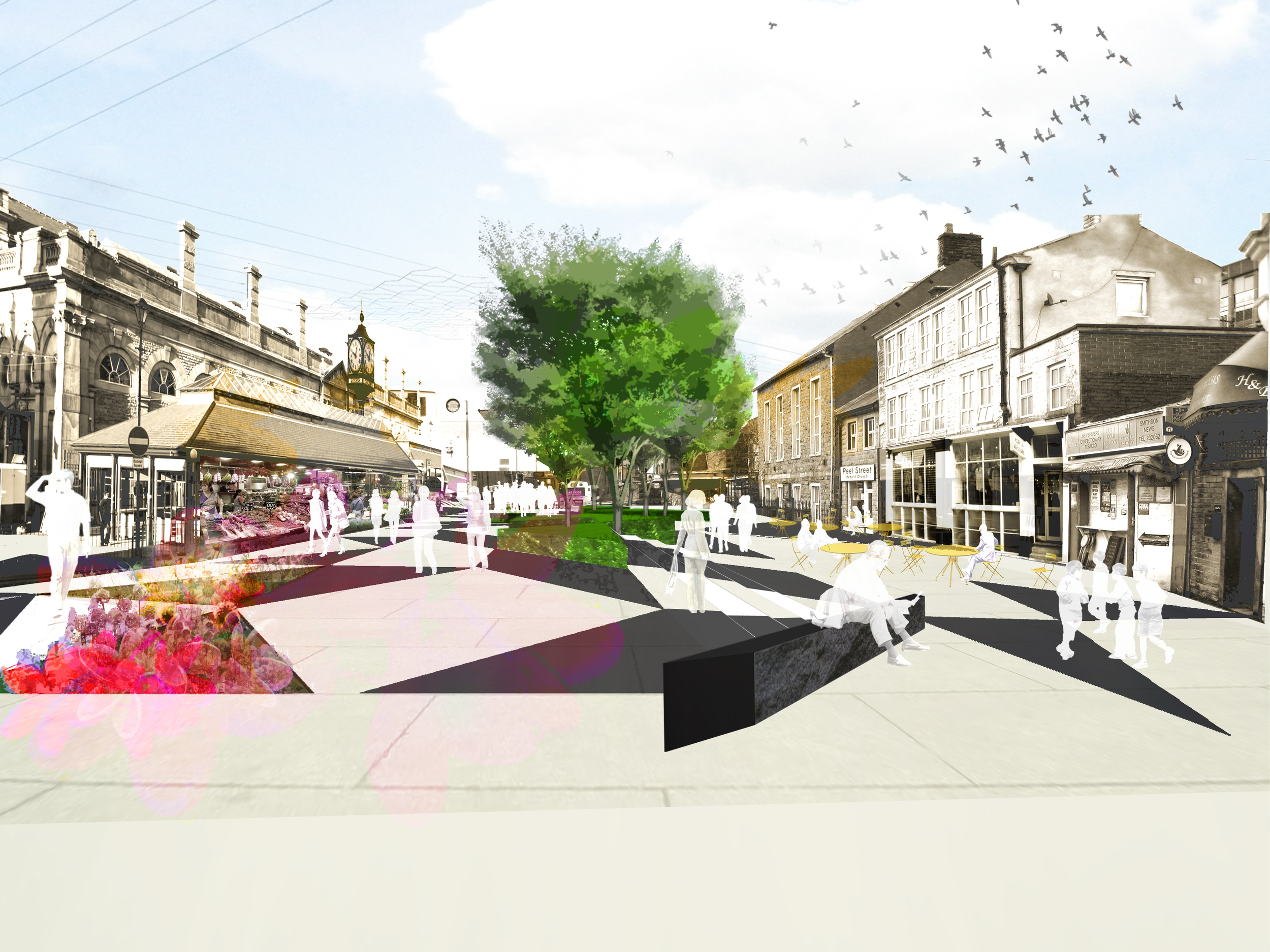
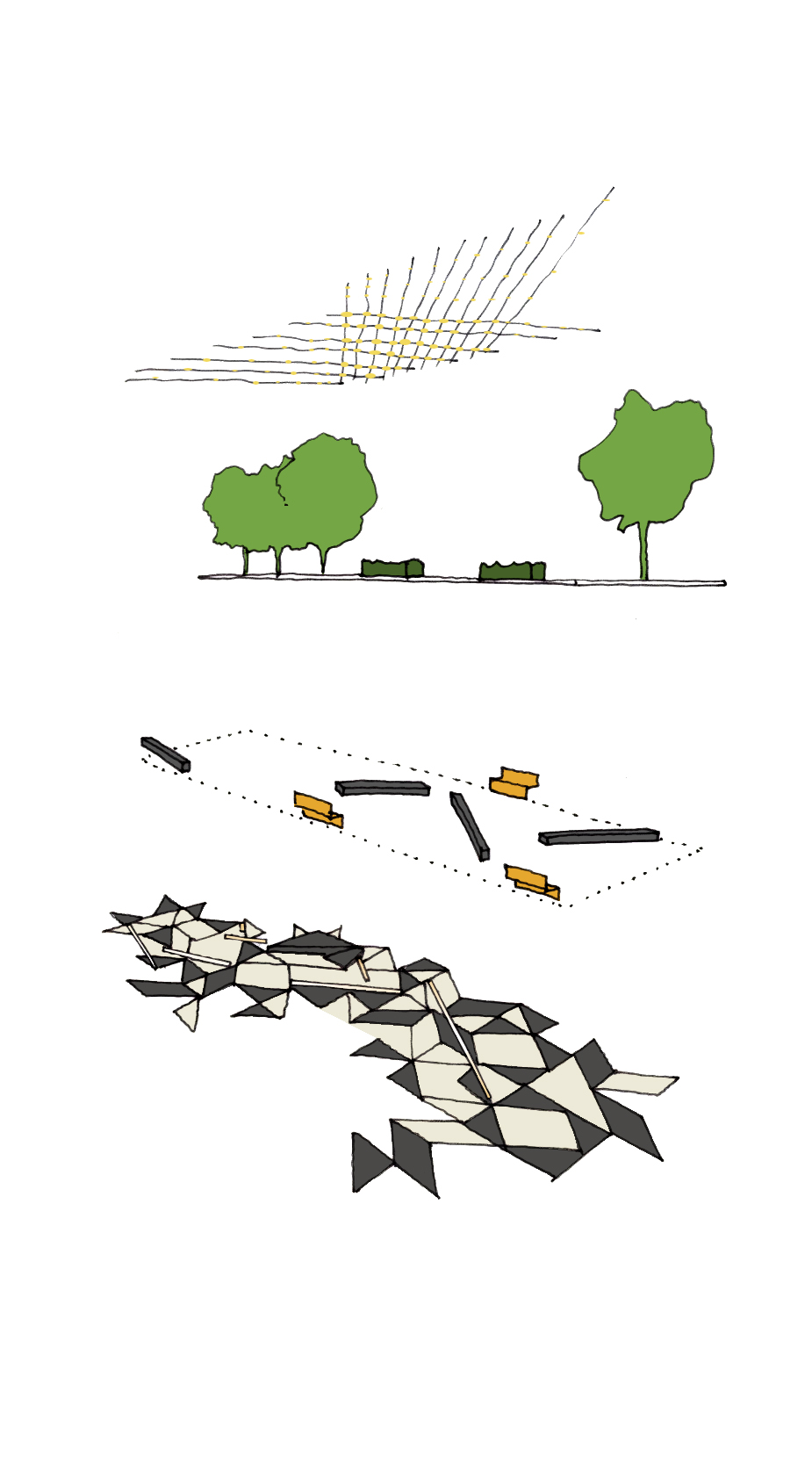
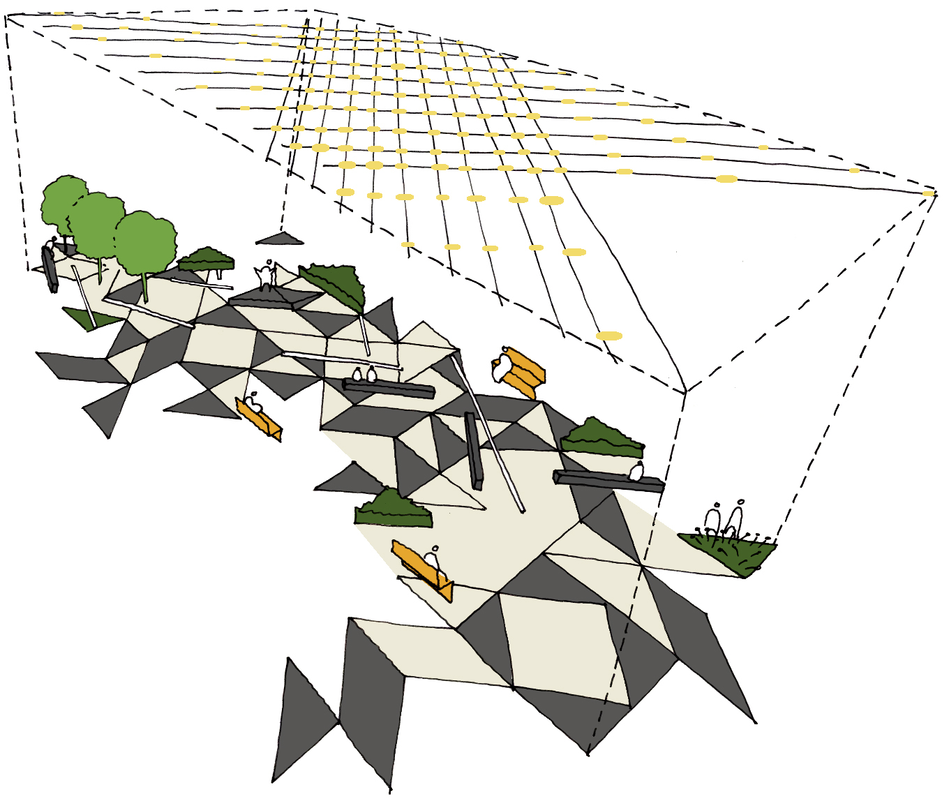
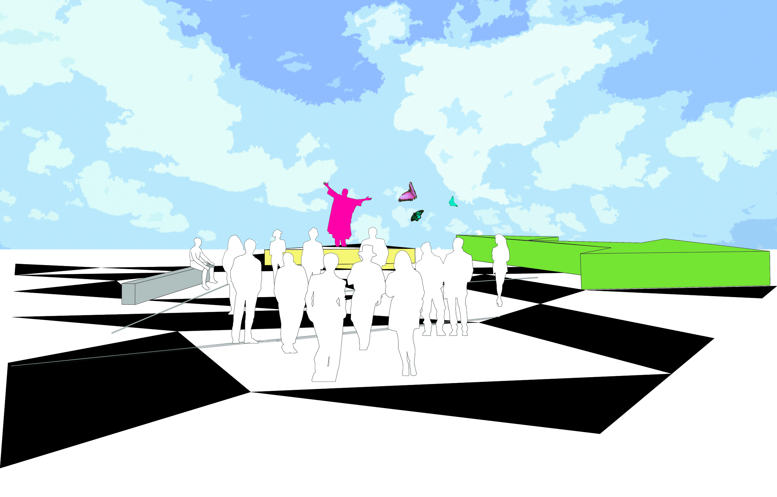
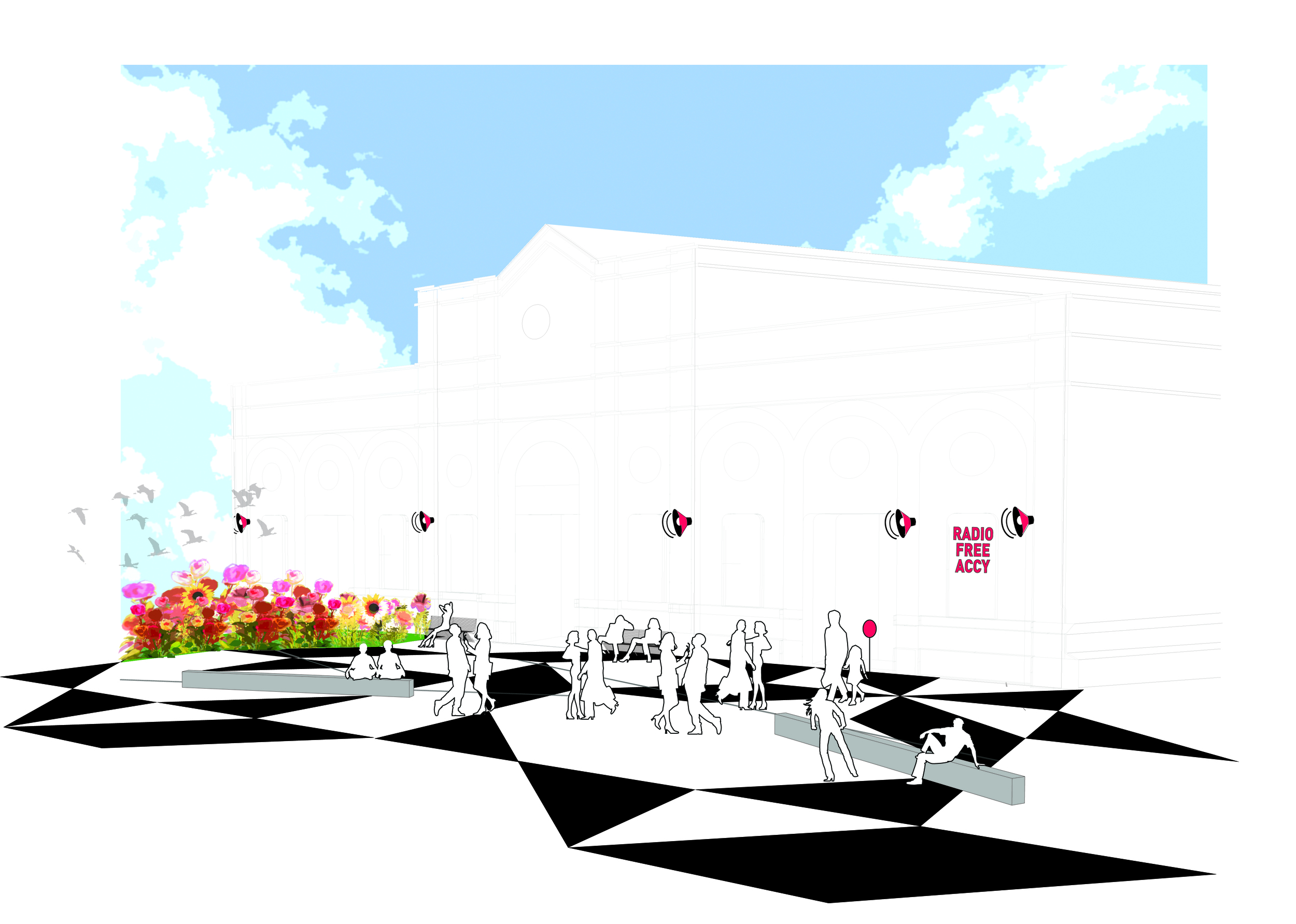
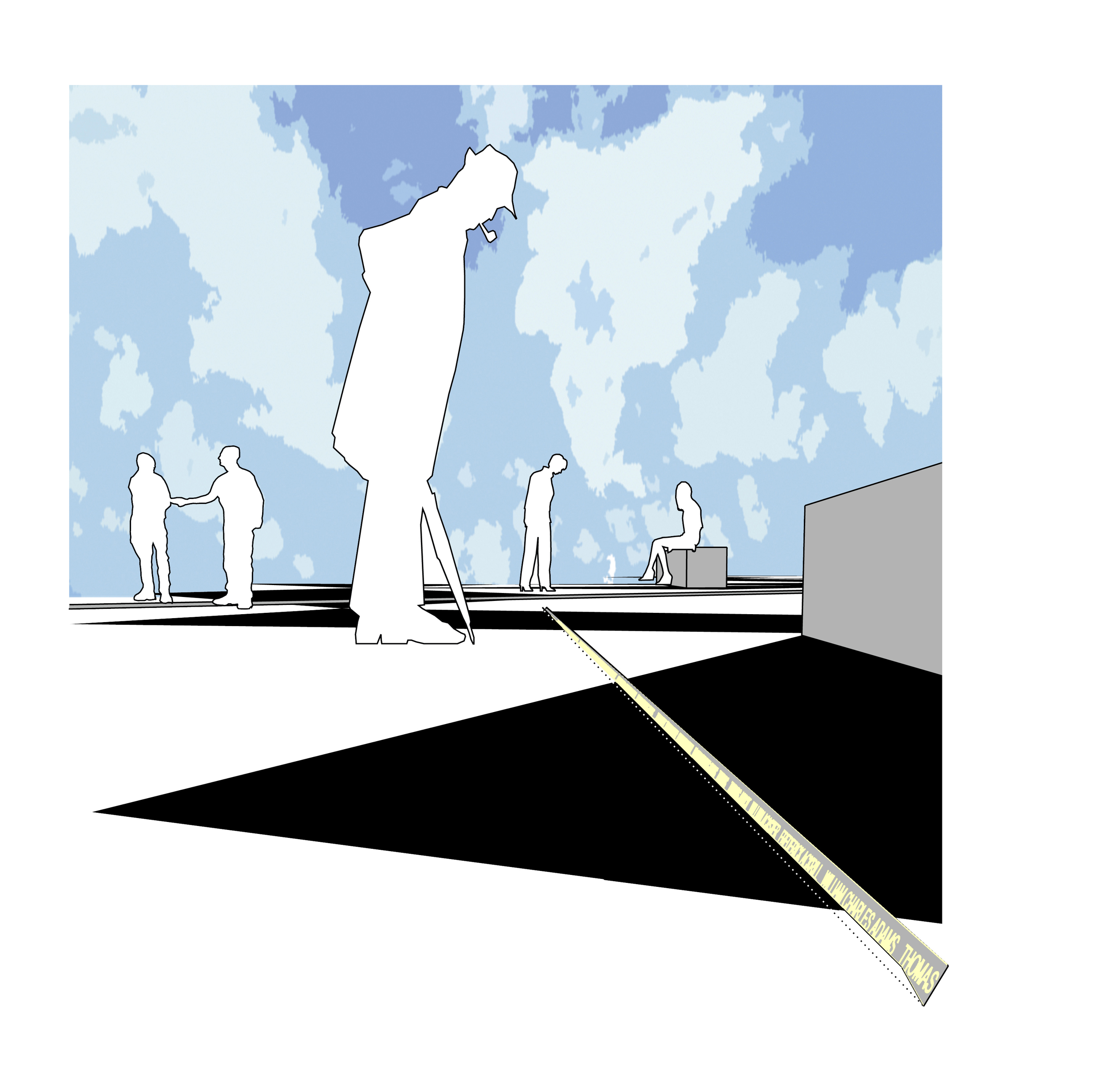
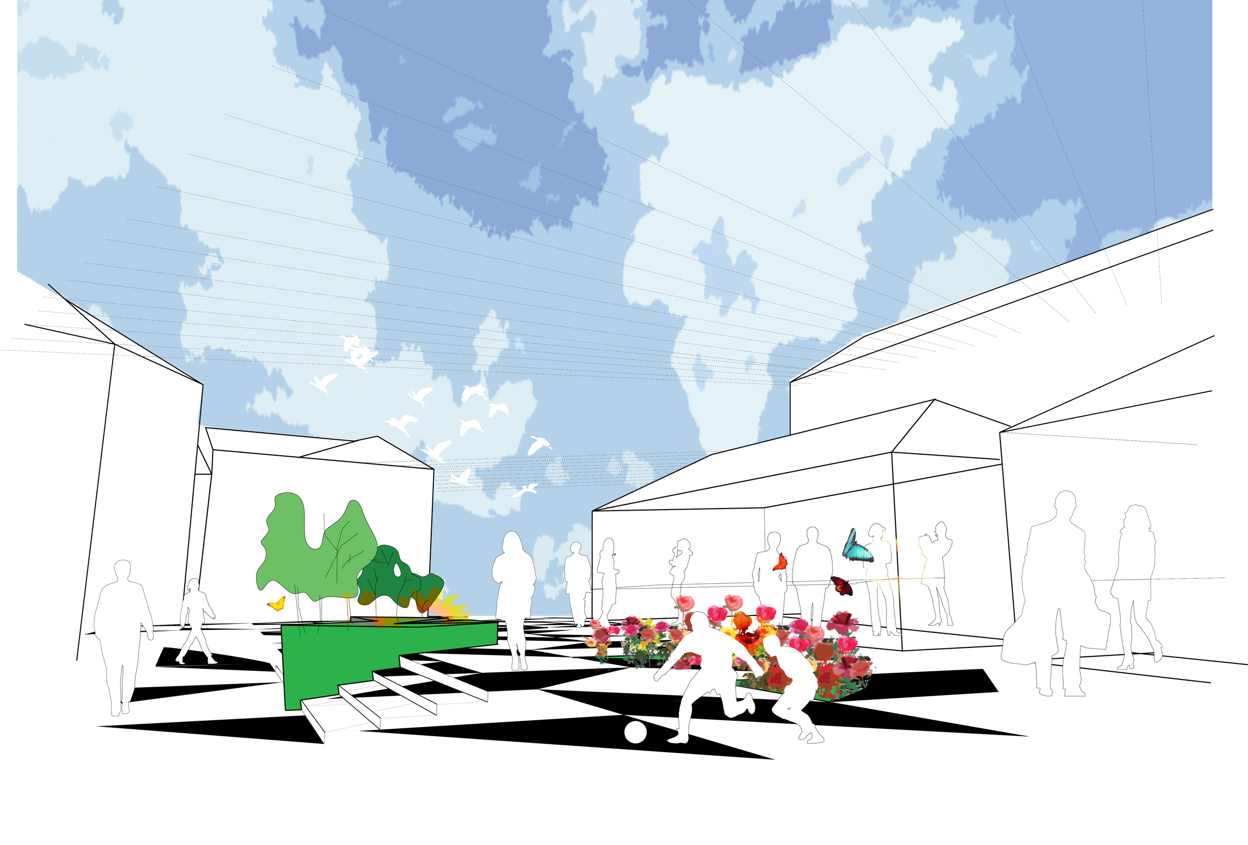
The Design for Pennine Lancanshire Squared competition aimed to protect and enhance Accrington’s strongest features, to incorporate new ones from its own history, and to create a distinctive and timeless space with elements, which strengthen the local character, offer new opportunities, and engender civic pride. Through Programmatic Elements Including Radio Free ACCY, a Speakers’ Corner the project brought people together aiding community cohesion.

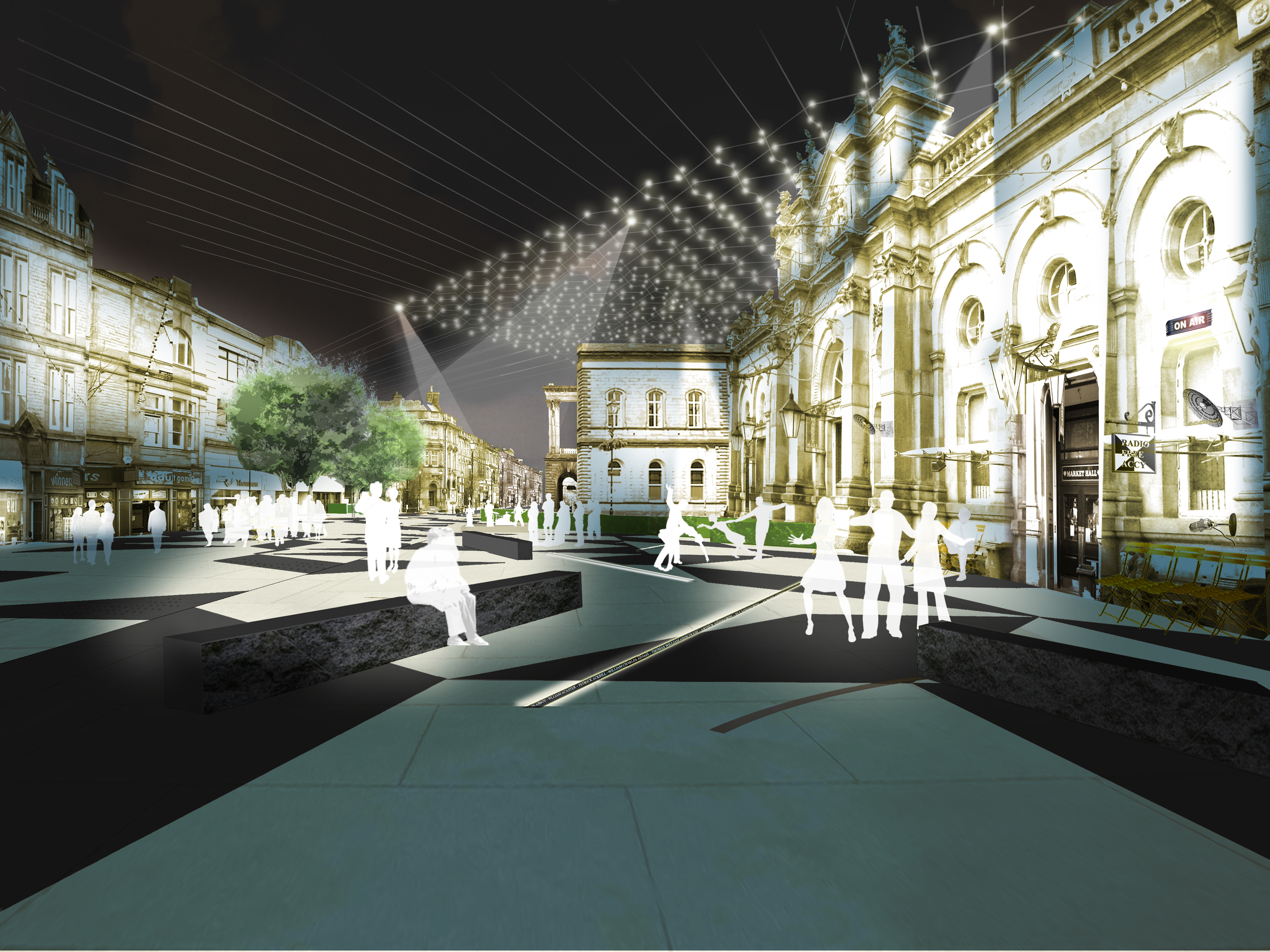
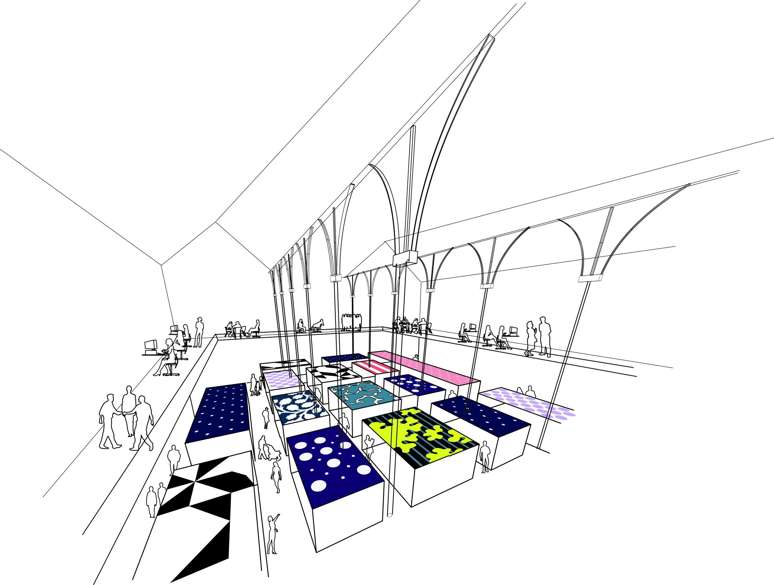
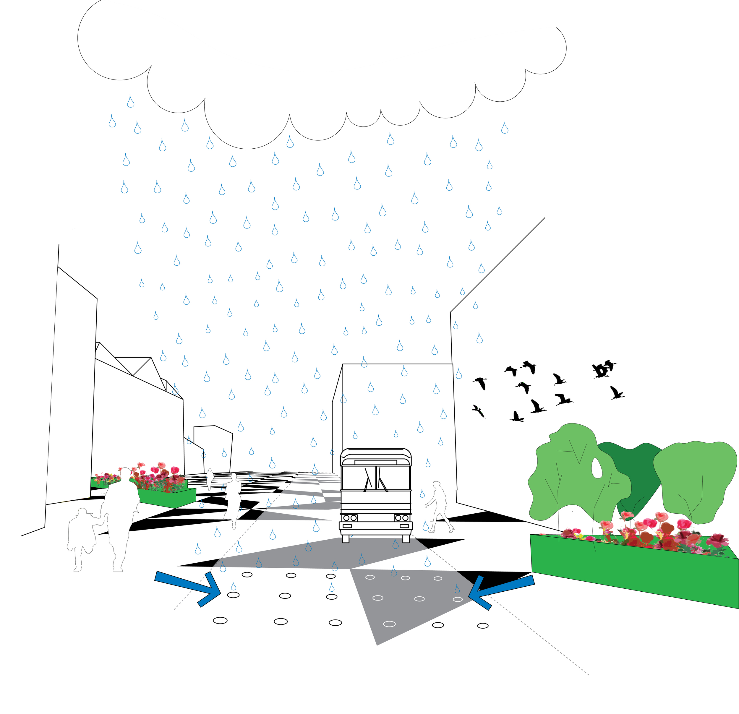
Peel Square Market Hall has been made the new hub of Peel Square, cornerstone of its regeneration. The hub of activities planned inside and outside (radio station, incubator office, internet café, organic food organization, cabinet for Accrington history display, Speakers Corner, Accrington Pals memorial, see report) all make it the radiating center capable of spilling out in its surroundings and activating them in the form of citizen activities, of additional temporary market stalls, cafes, etc. The space has been designed accordingly as a very simple uncluttered expanse with good quality pavement, an abundance of benches -- which can be reconfigured for flexible spatial arrangements -- and strings of lighting creating a lit-up urban room out of Peel Square. These three elements can be phased. In the end regeneration is about quality of life. It can lead to attracting people to the town and keeping its young people in it. A beautiful place that gives a sense of place, many towns have found , can be the trigger for economic transformation.
 

Parque de la Luz

2005 - Canary islands, Spain

Parque de la Luz

Canary islands, Spain

CLIENT Ayuntamiento de Las Palmas de Gran Canaria / SIZE 4,000 acres / STATUS Competition winner, 2005 / DESIGN TEAM Balmori Associates / Pelli Clarke Pelli

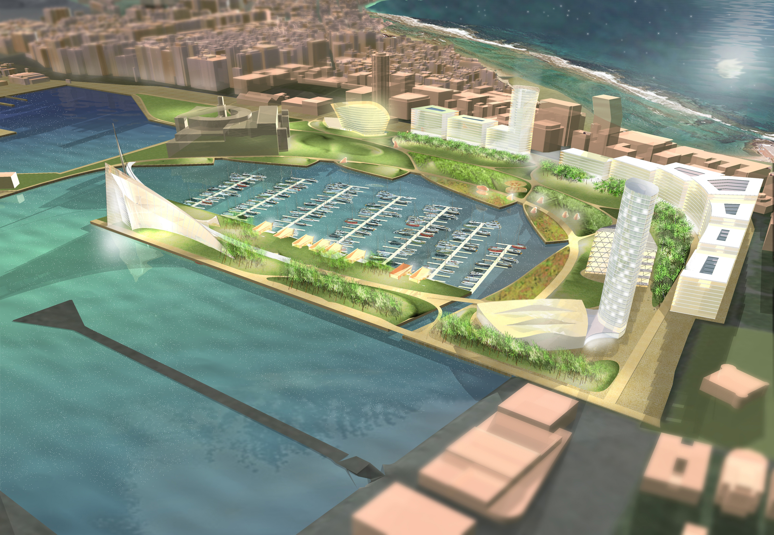
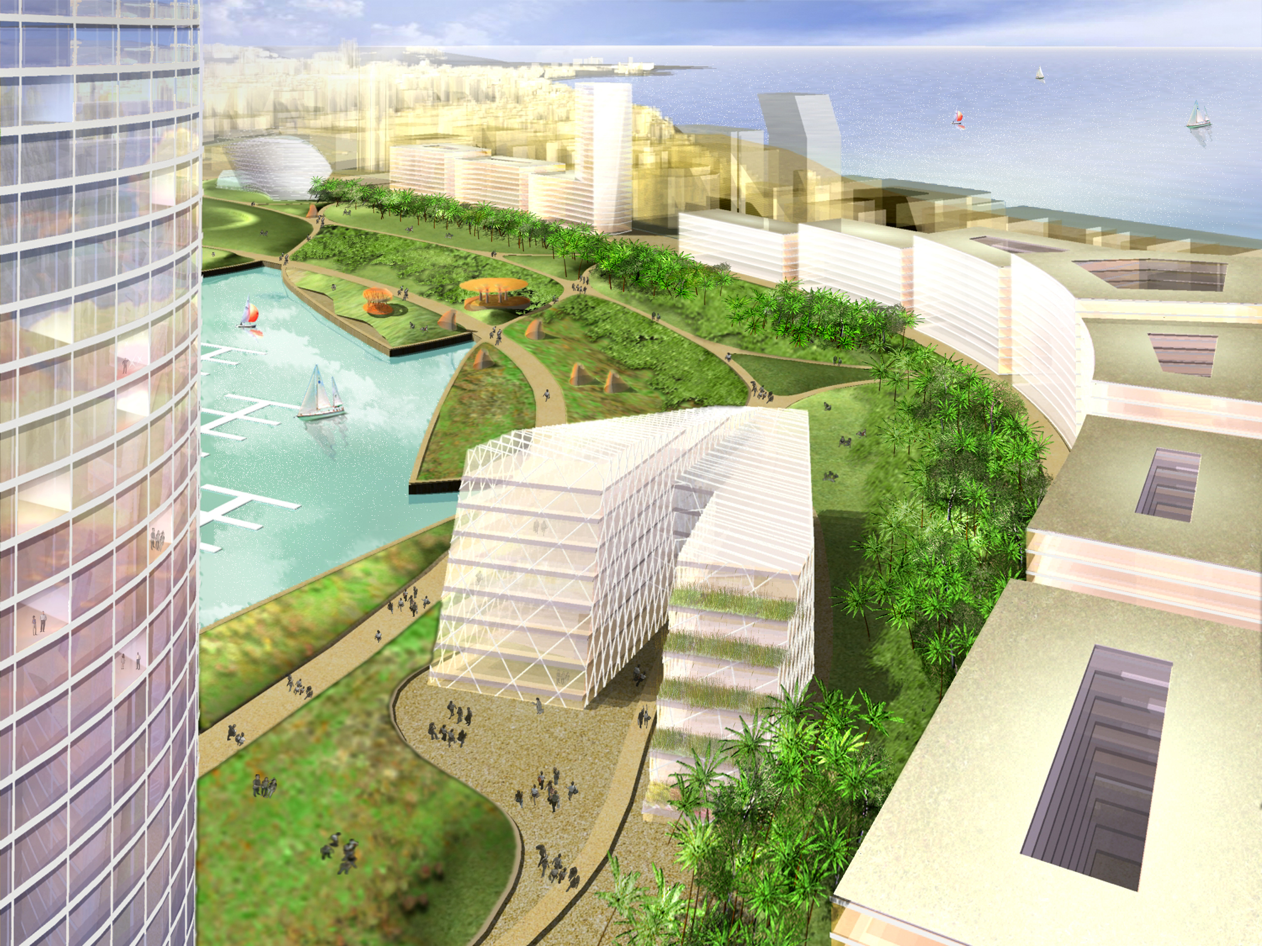
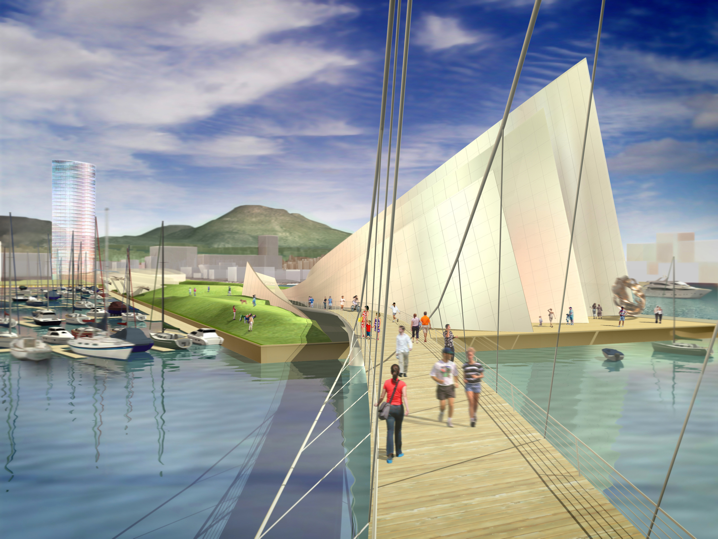
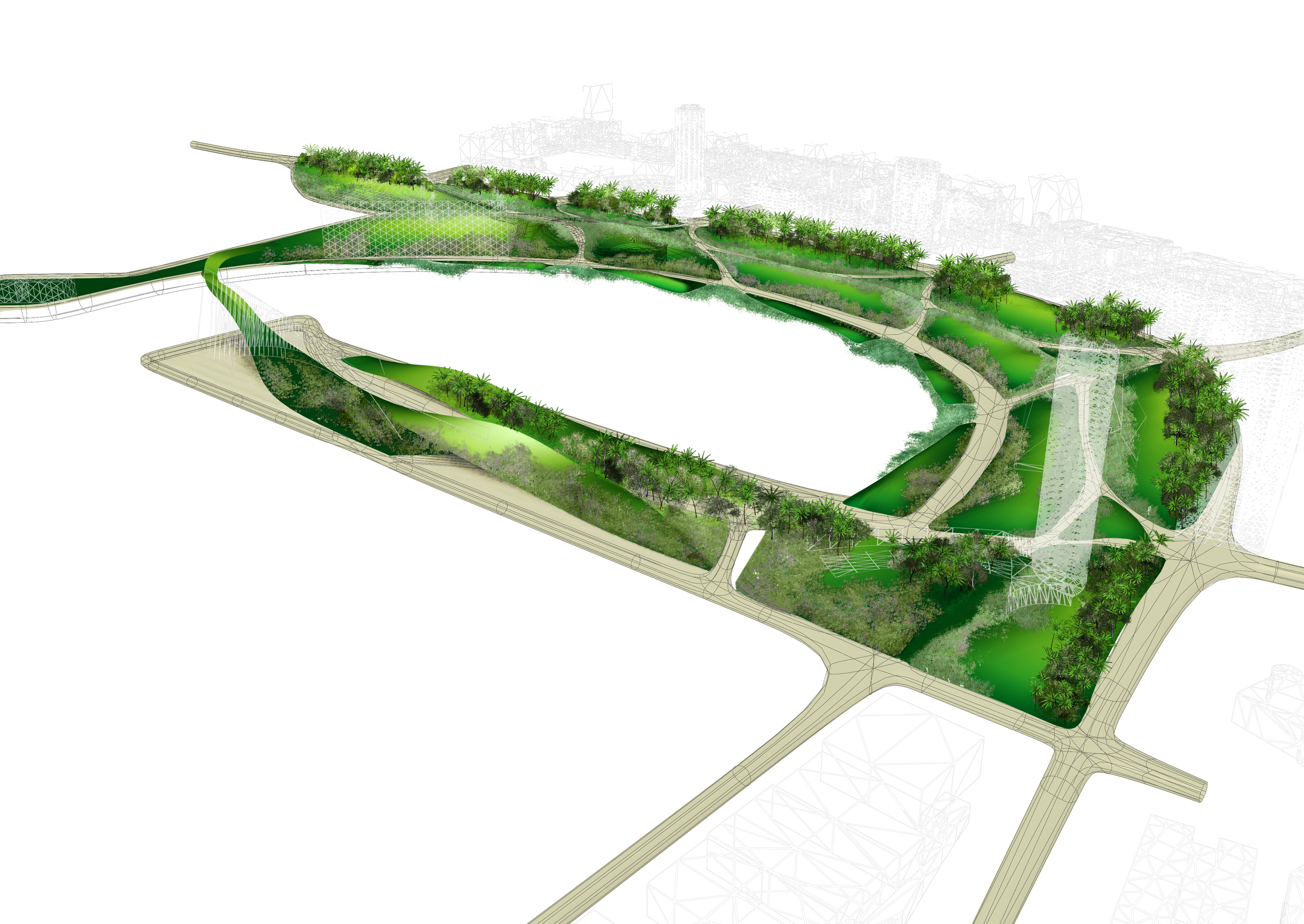
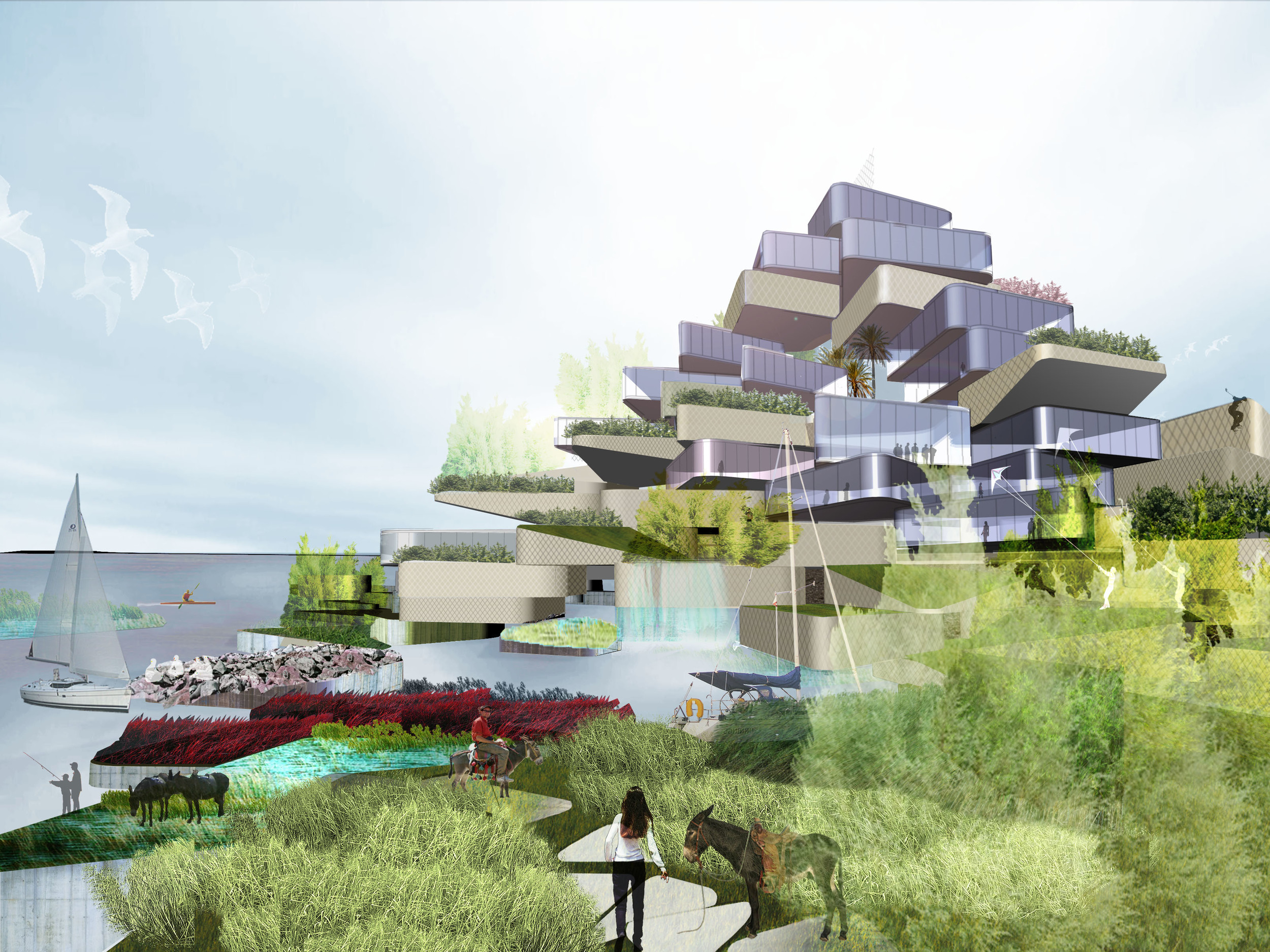
The Park of The Light is designed as a fundamental change of infrastructures, from a hard infrastructure of an ancient port to a soft one of living systems, producing a beautiful green belt in the middle of the water. This living system cleans the water, protects against the wind, and provides an inviting setting for visitors and residents. The park creates a remarkable postcard image of Las Palmas for the ships who anchor to his edge.

Bands of the interface between the sea and the ground, previously lost to urban development, are re-created to improve the quality of the water and diminish the environmental impact of the marina.  The straight angles of the bulkhead, which would normally accumulate sediment, are filled to become floating islands of vegetation. These refuges are in direct contact with the daily changes of the tides, forming diverse biological communities that contribute to the health of the water by oxygenating and purifying it from pollutants.

Separate channels at opposite ends of the marina promote flow-through currents, directing the flow of the water towards the center of the marina. This diminishes future costs by protecting the bulkhead structures from water erosion.