New Government City

Sejong, South Korea

New Government City

Sejong, South Korea

CLIENT Multi-functional Administrative City Construction Agency of Korea / SIZE 667 acres / 2,700,000 m2 /STATUS Competition - 1st Place 2007, 1st Phase Completed 2012, 2nd Phase Completed 2014  / DESIGN TEAM Balmori Associates / H Associates / Haeahn Architecture / PHOTO CREDIT Efrain Mendez, archframe.net

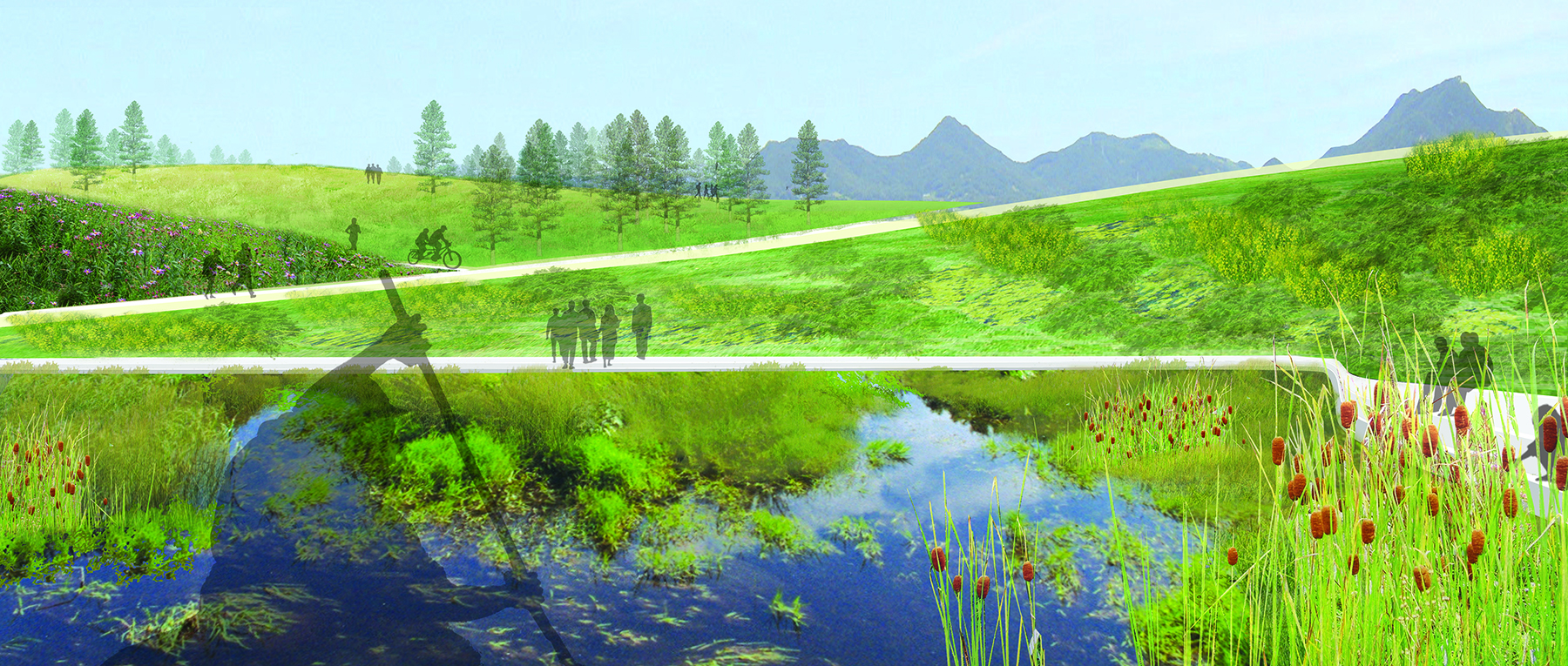
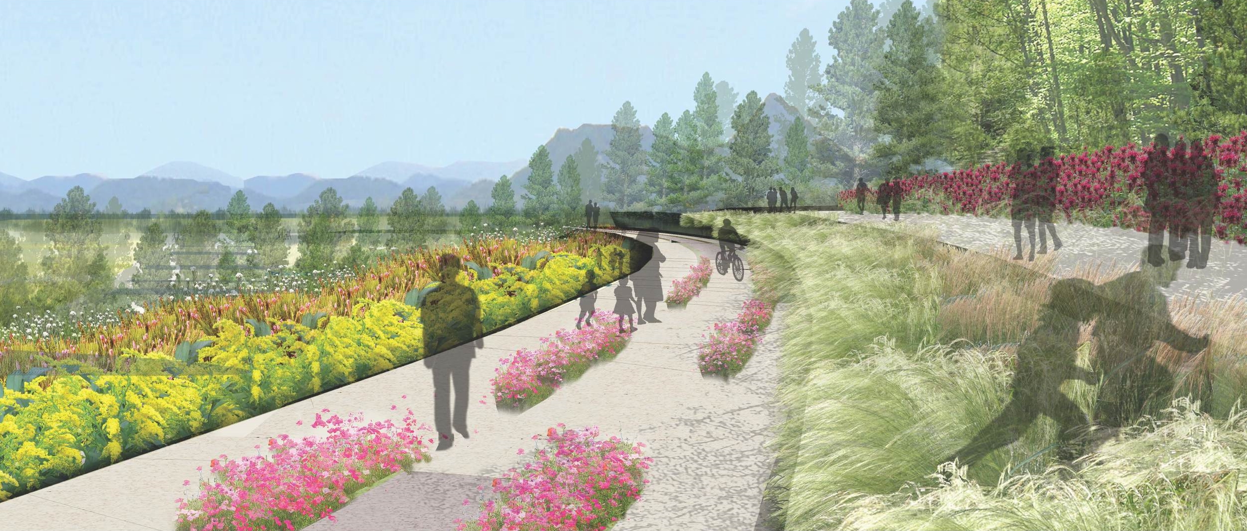
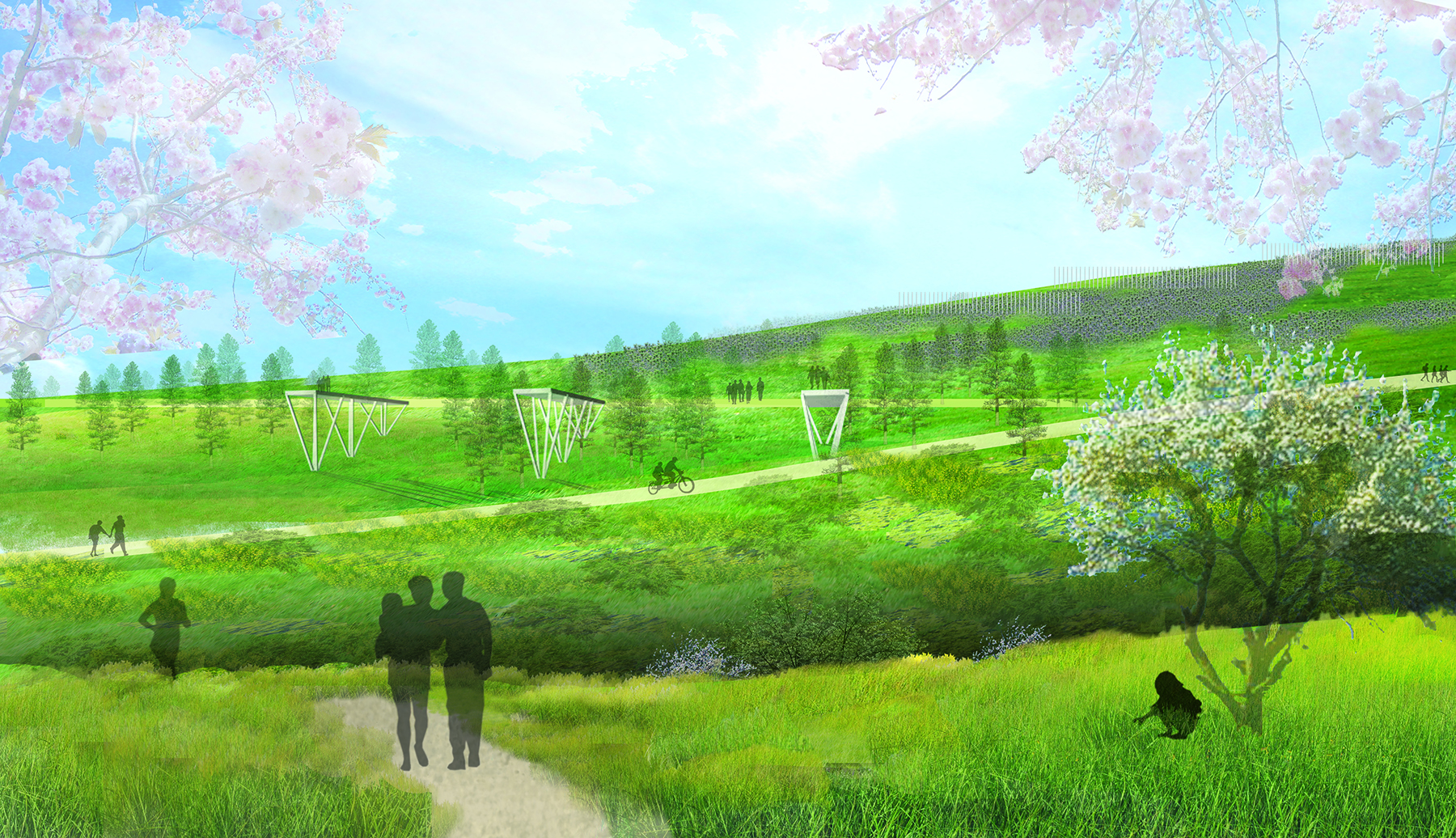
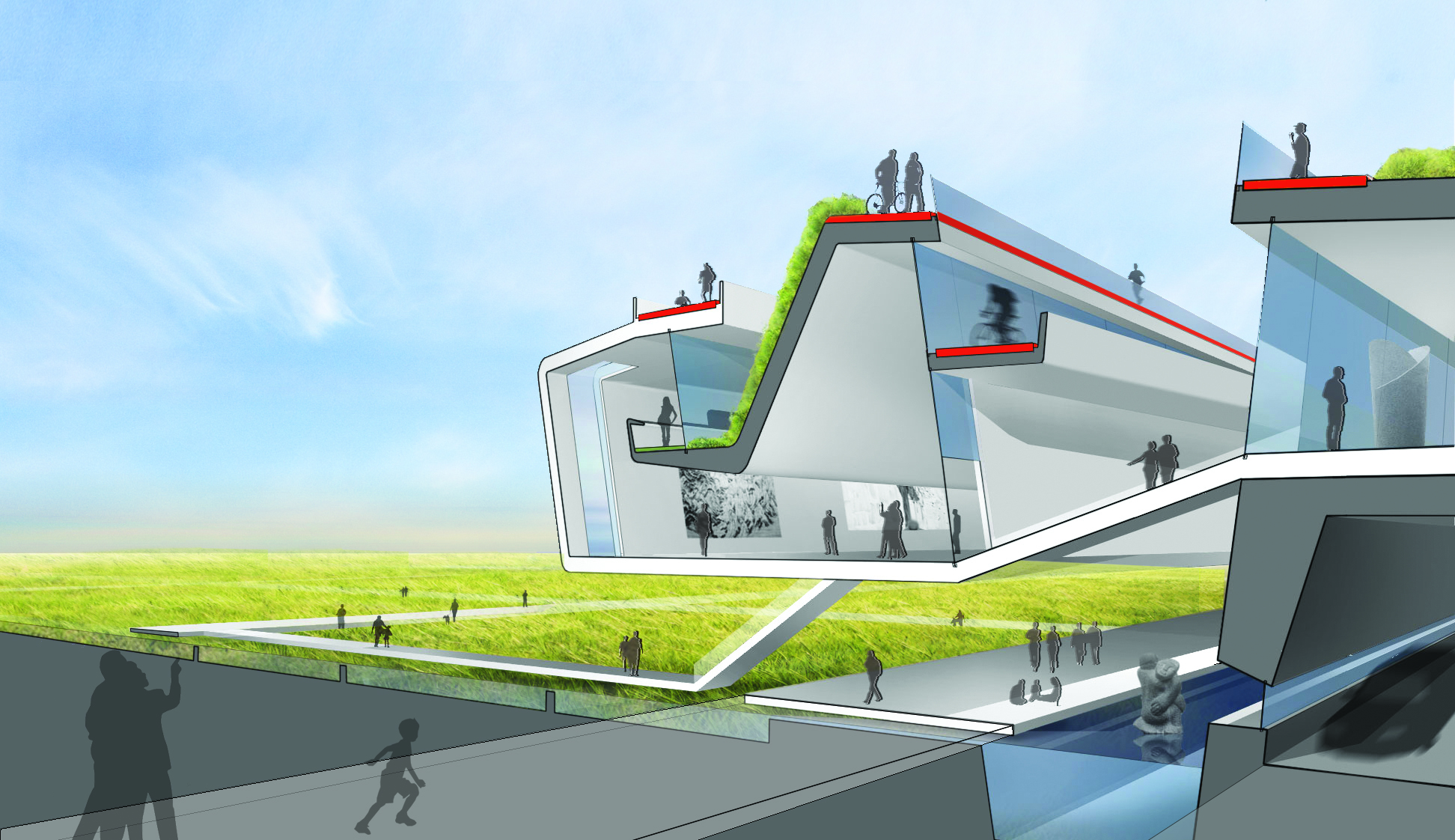
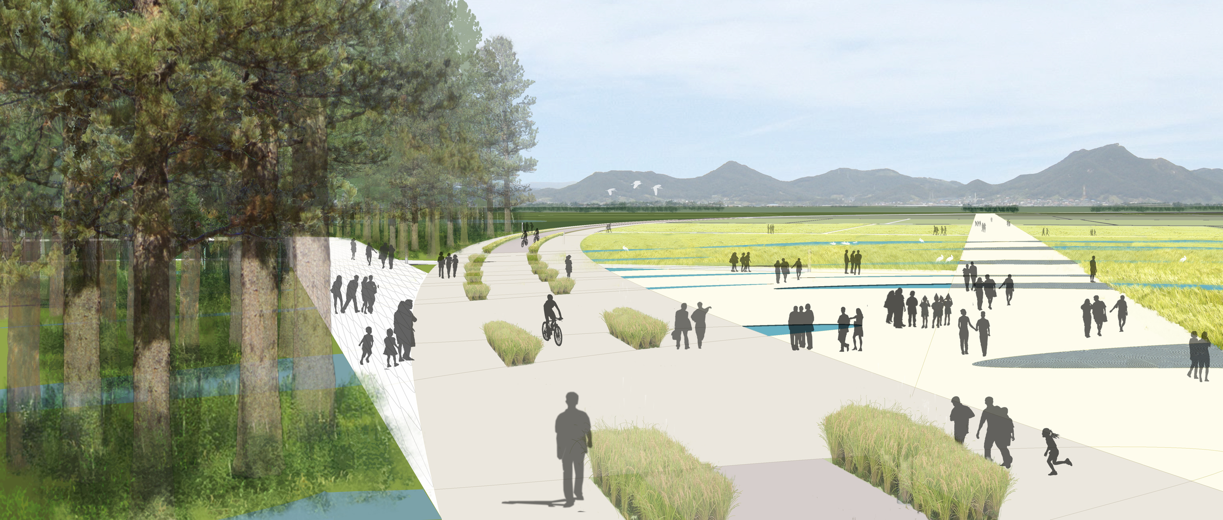
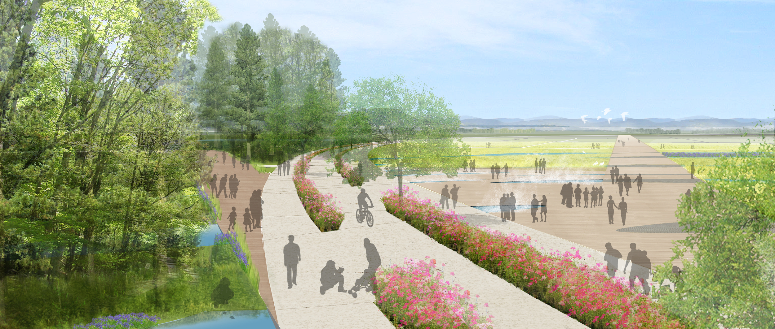
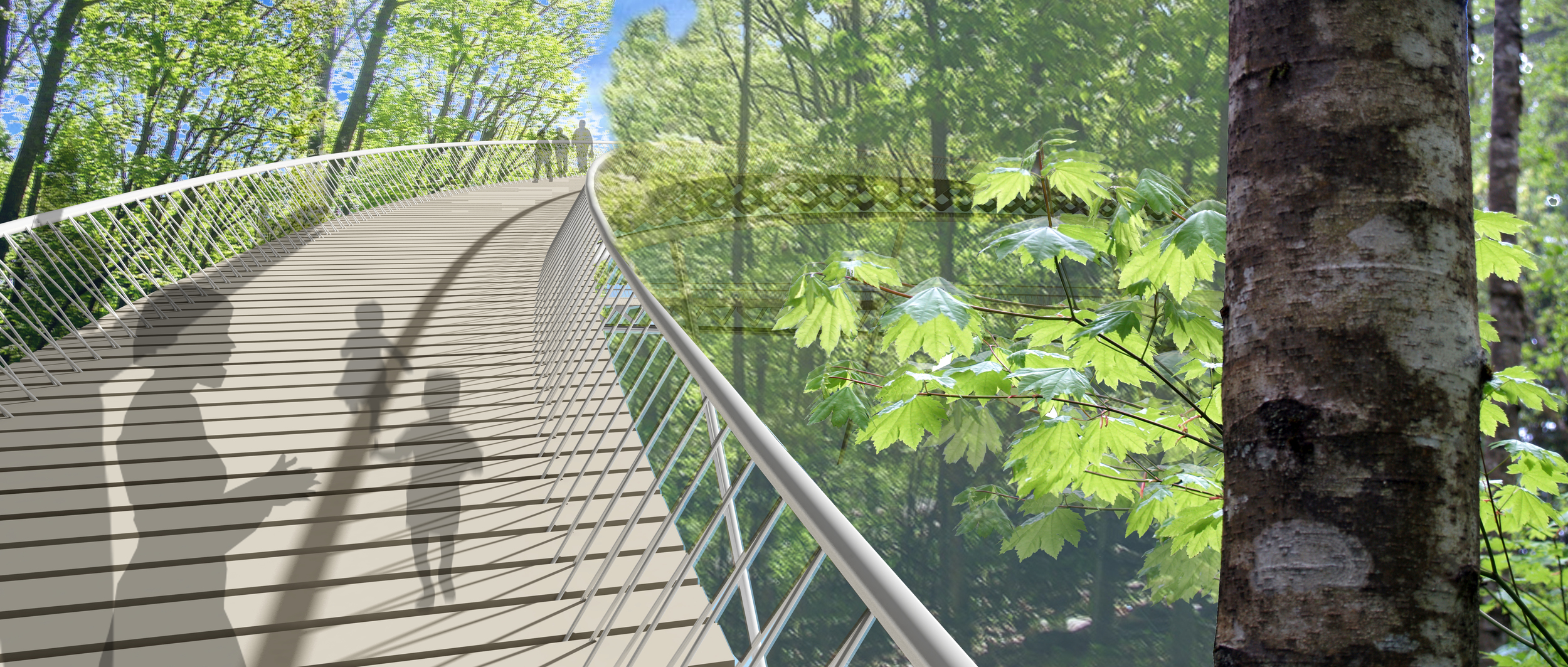
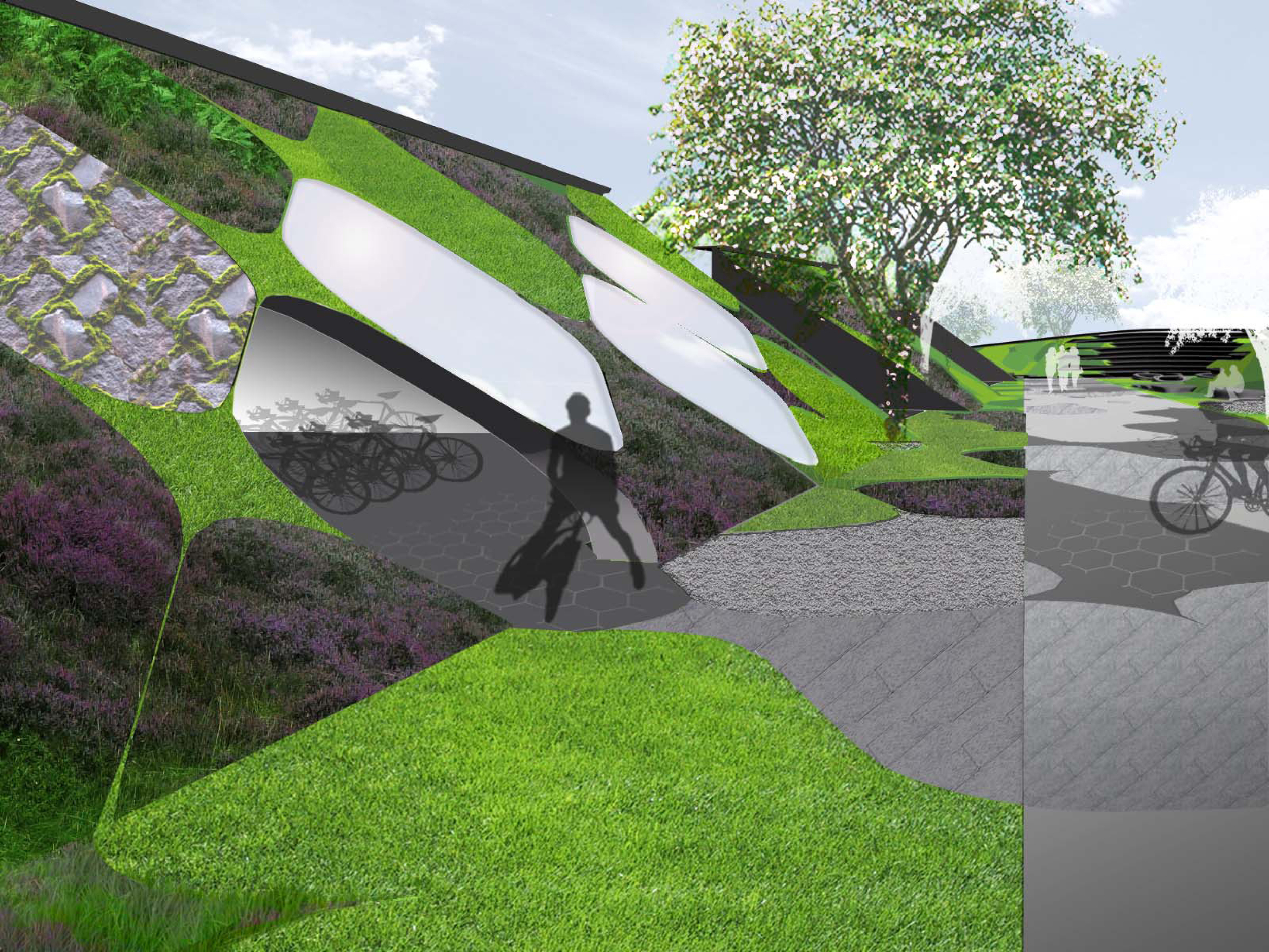
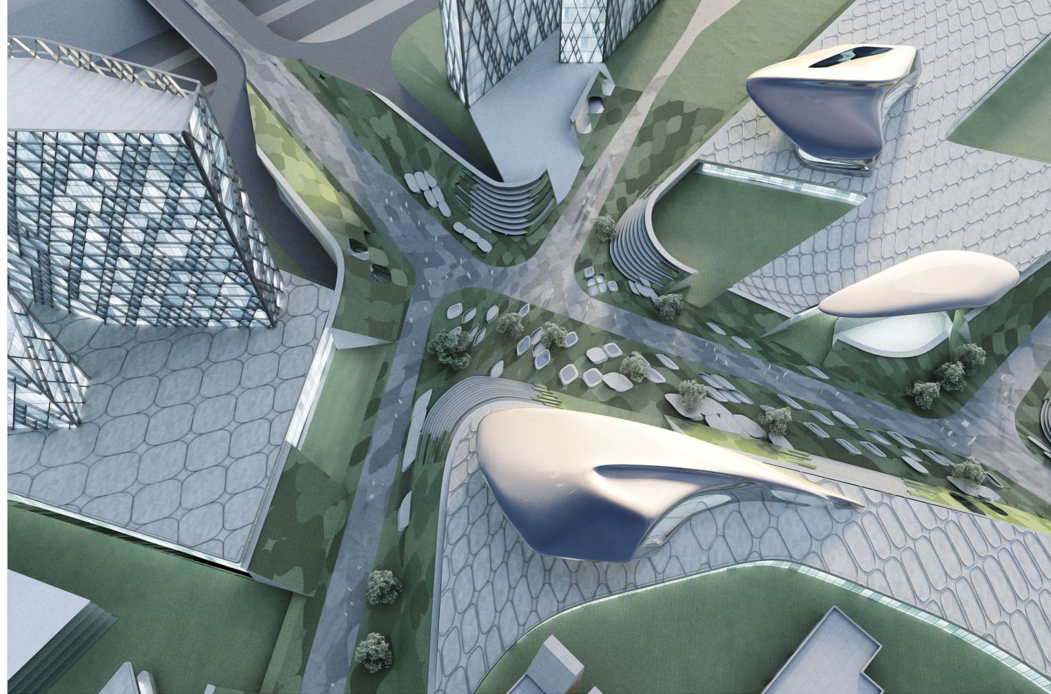
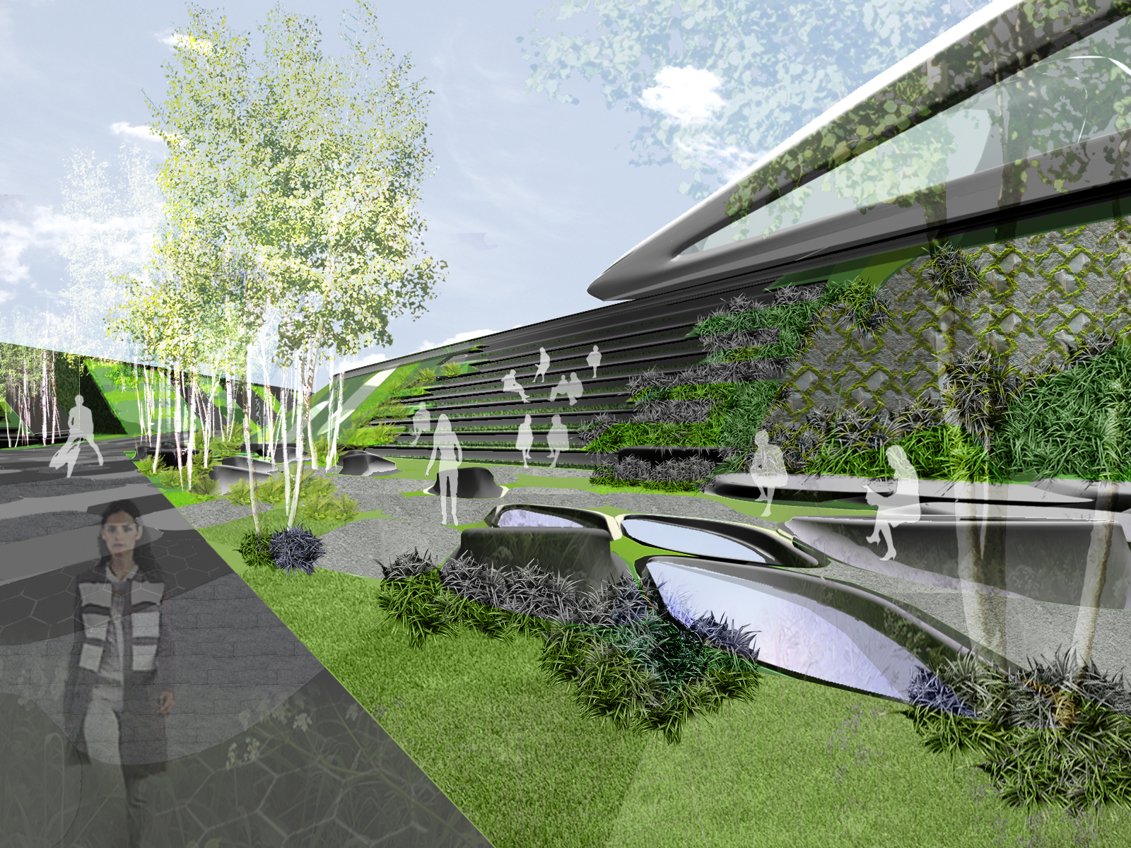
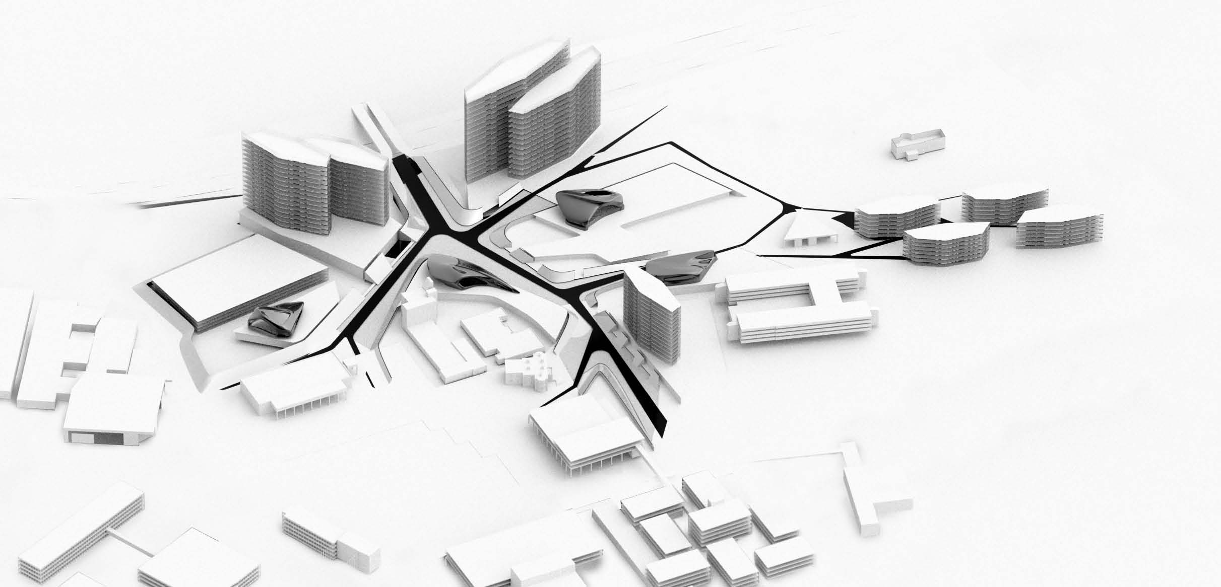
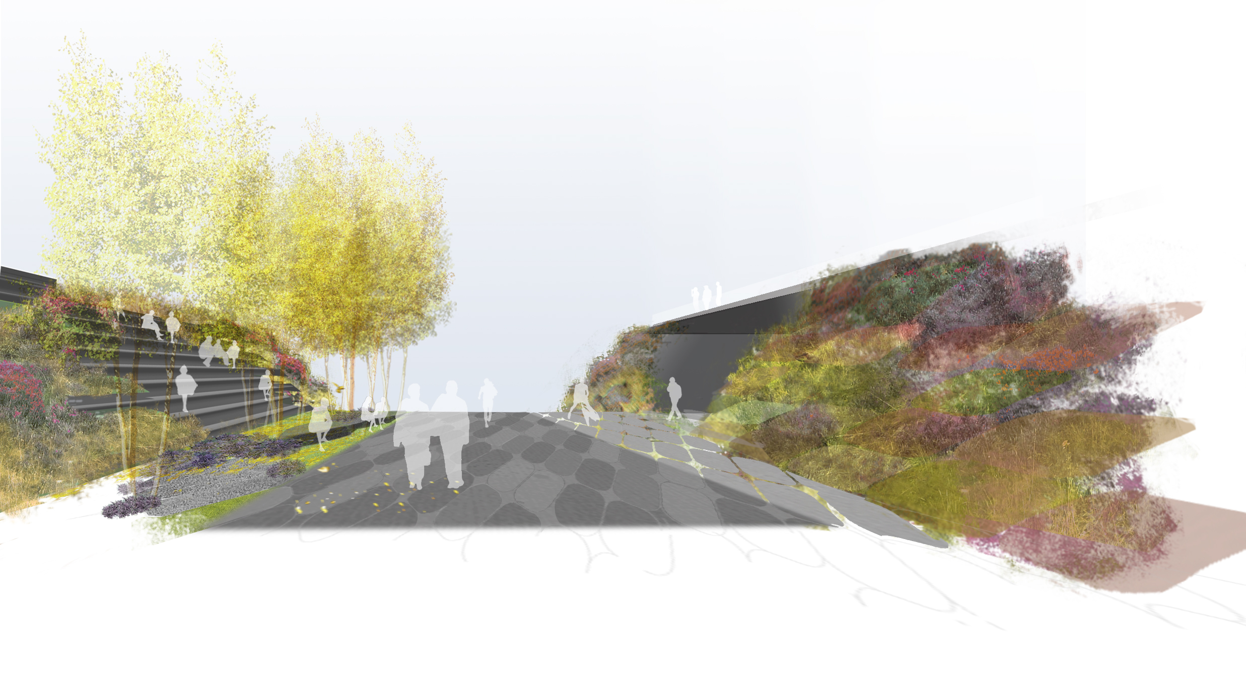
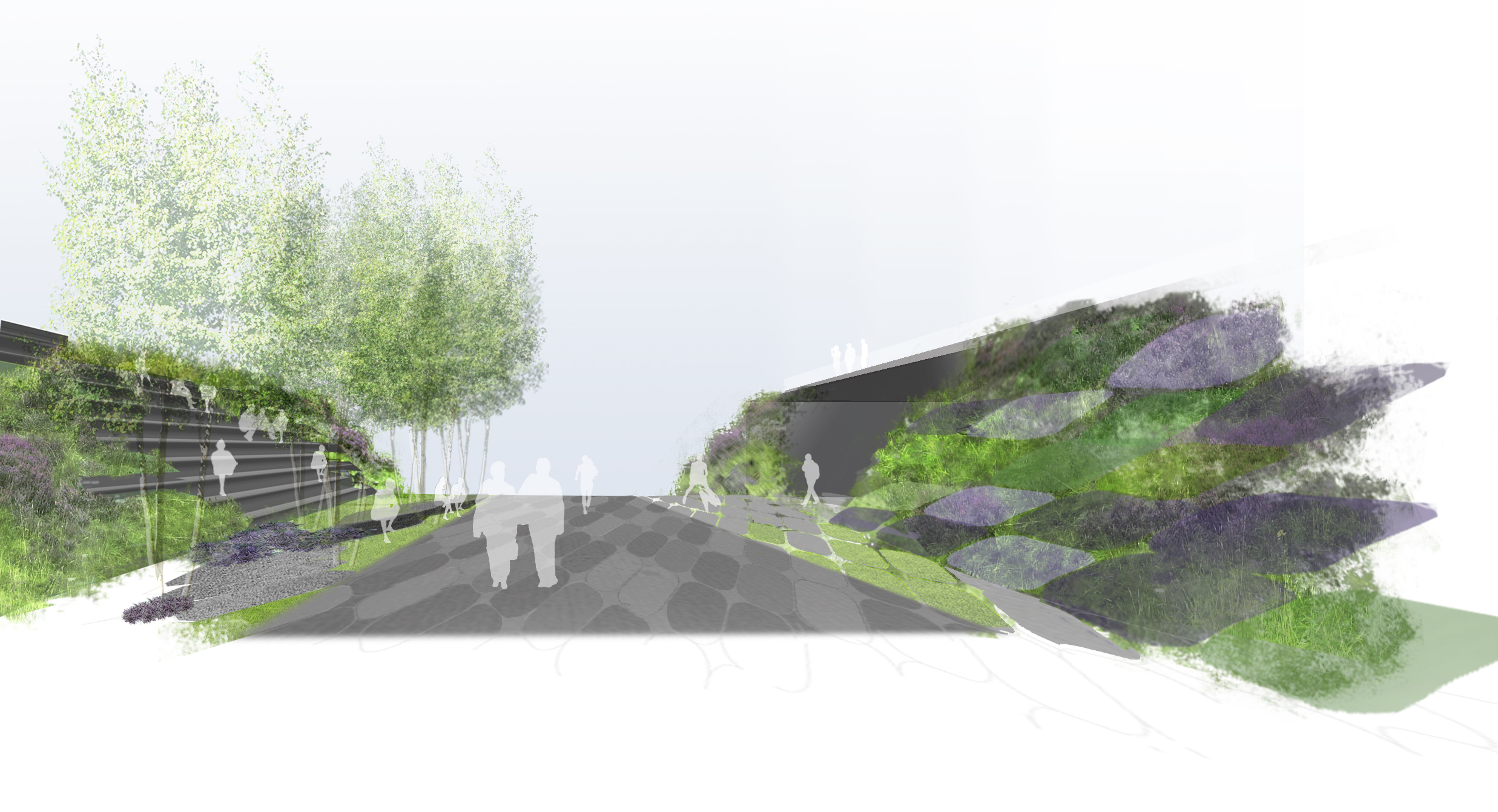
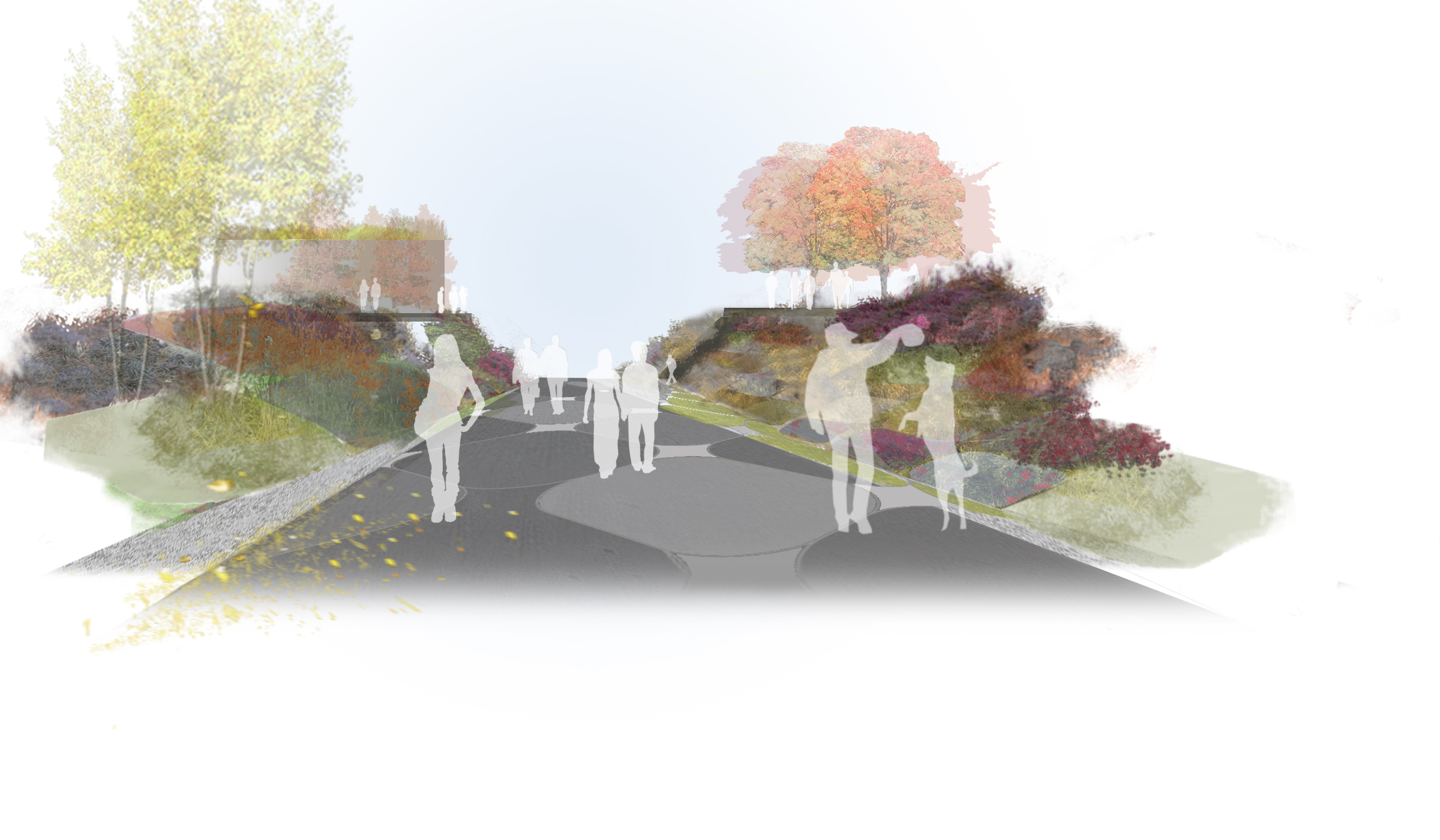
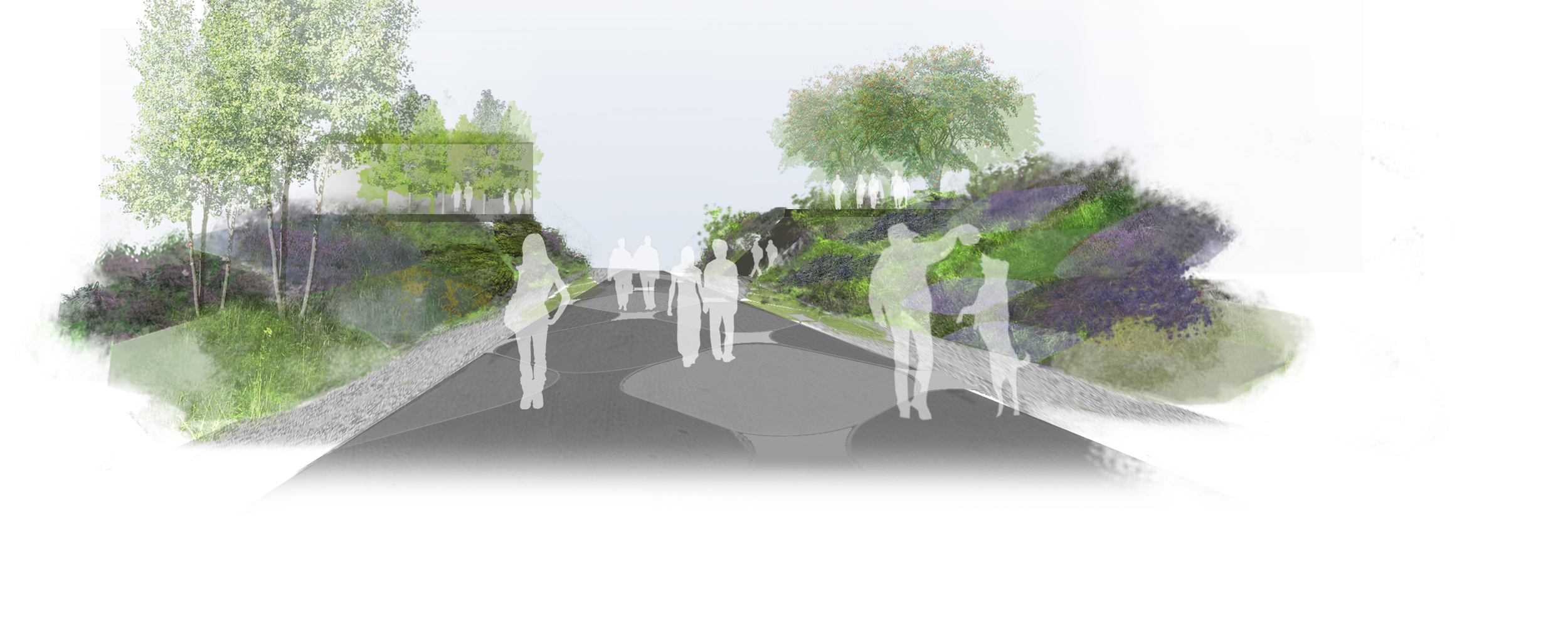
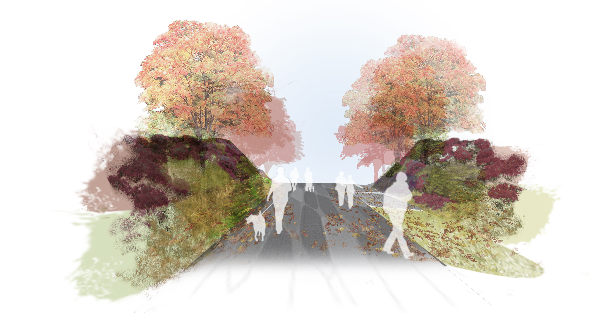
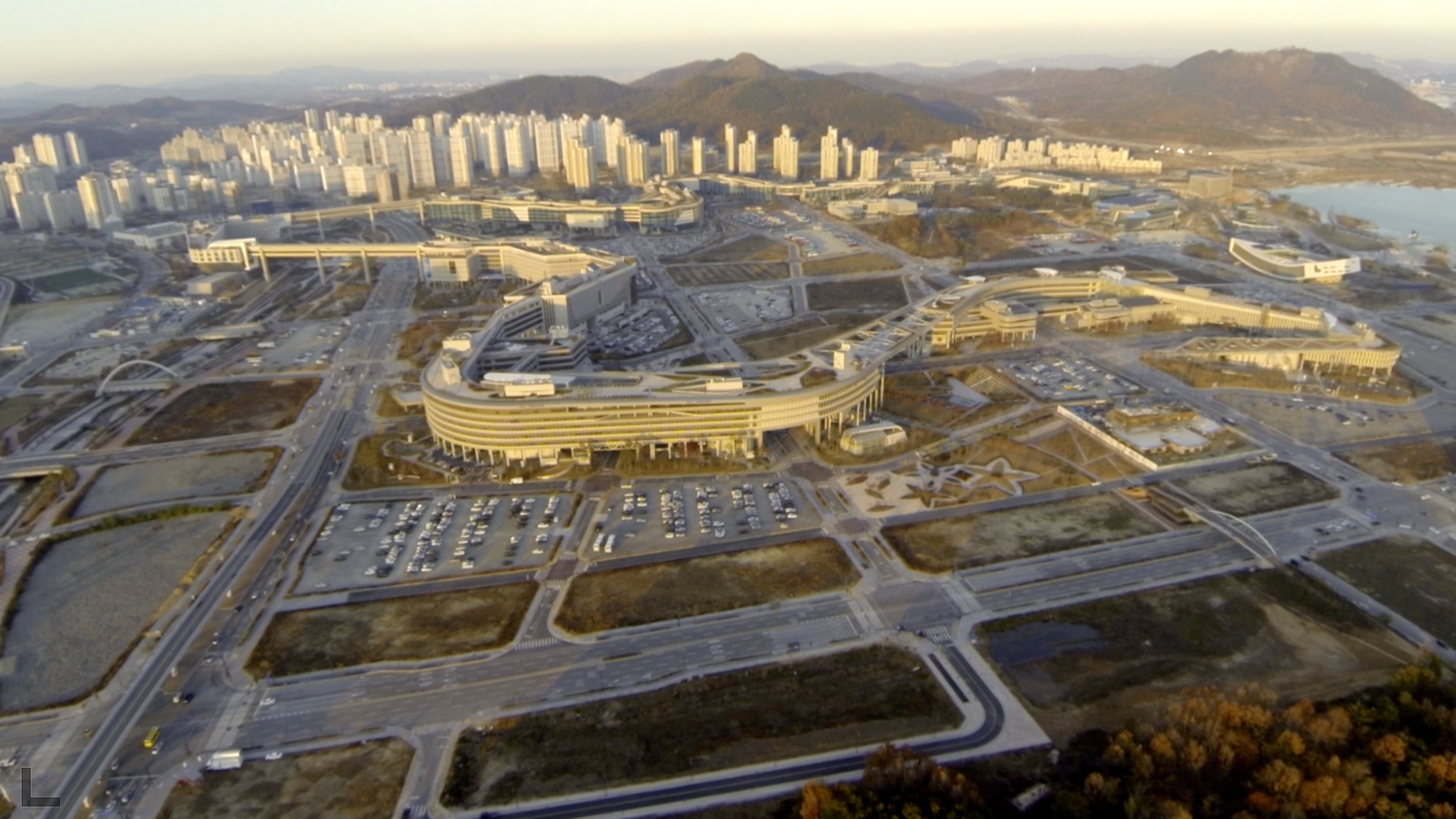
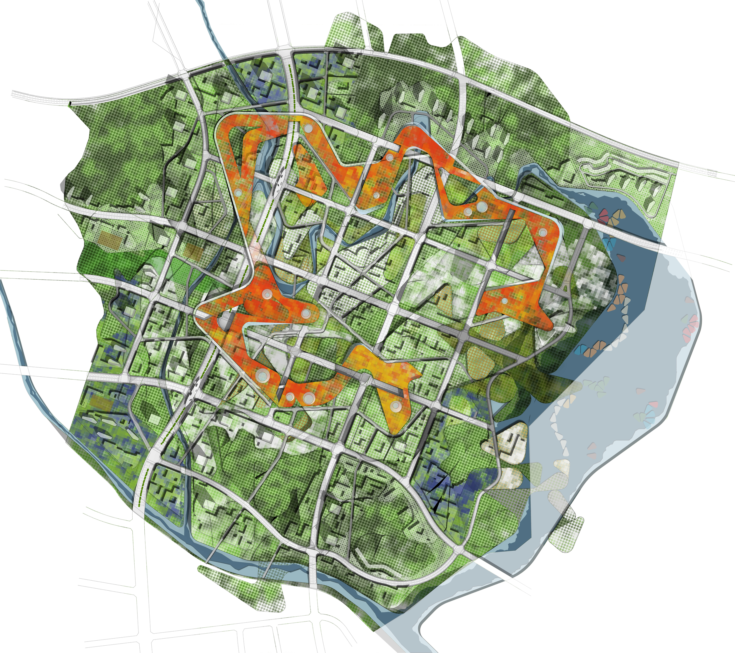
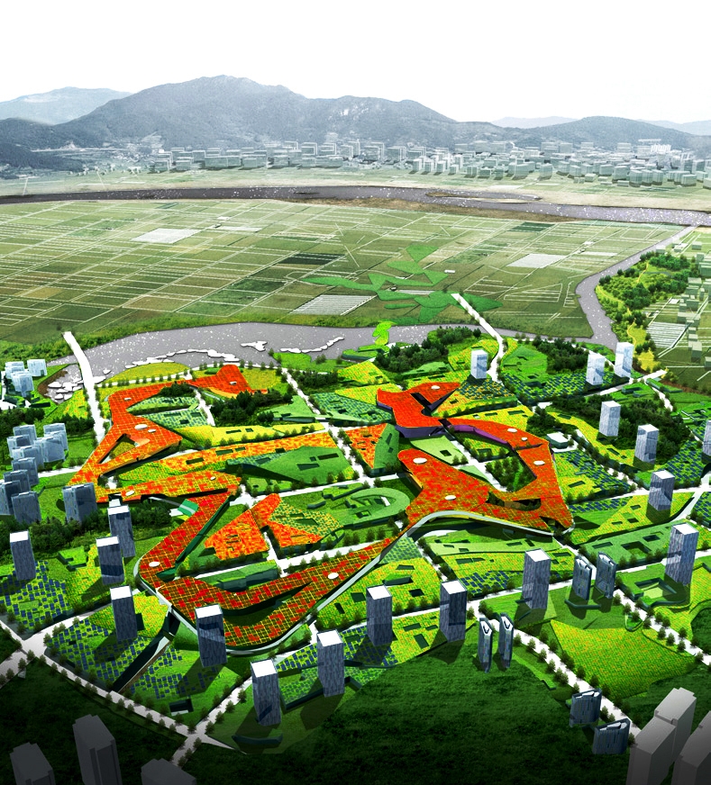
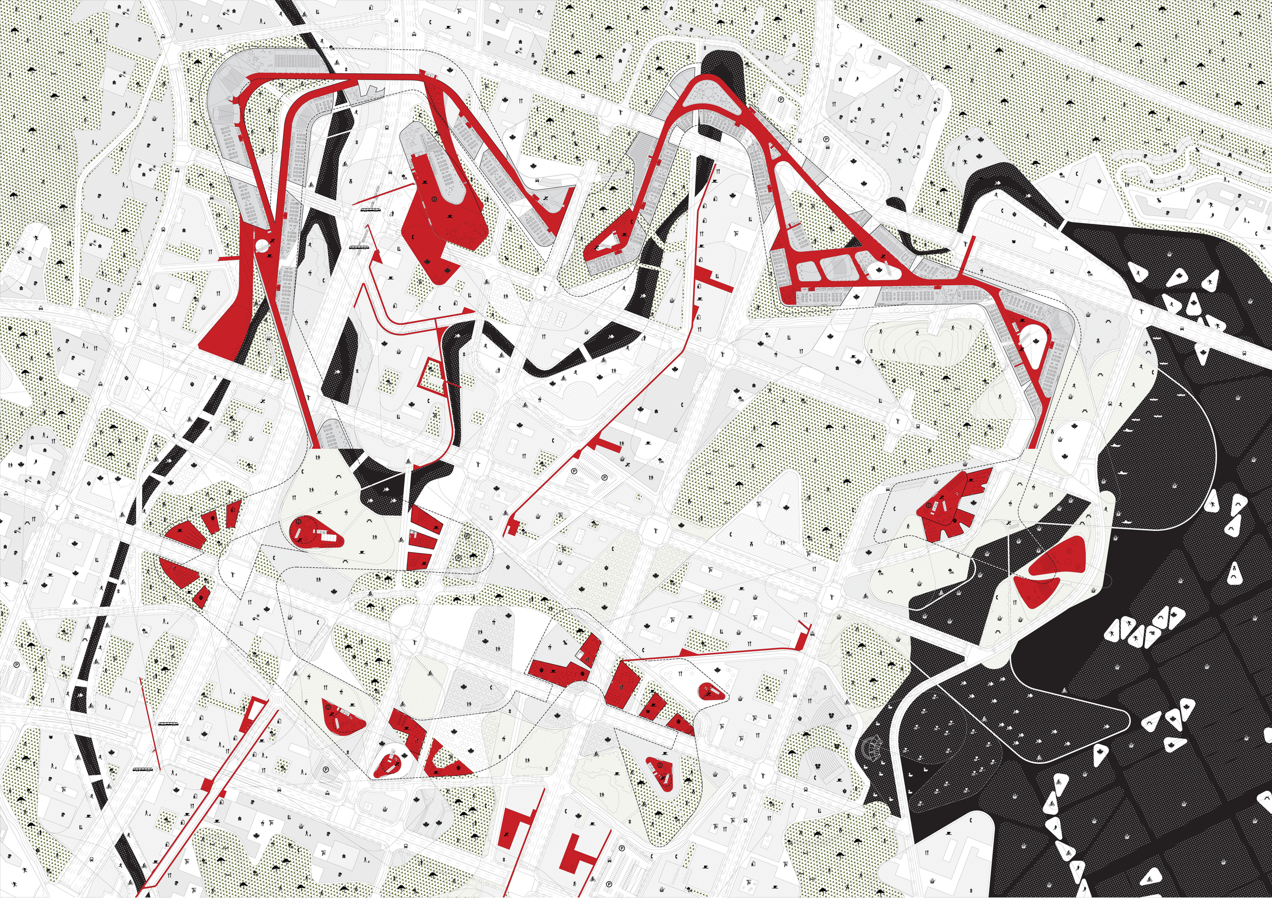
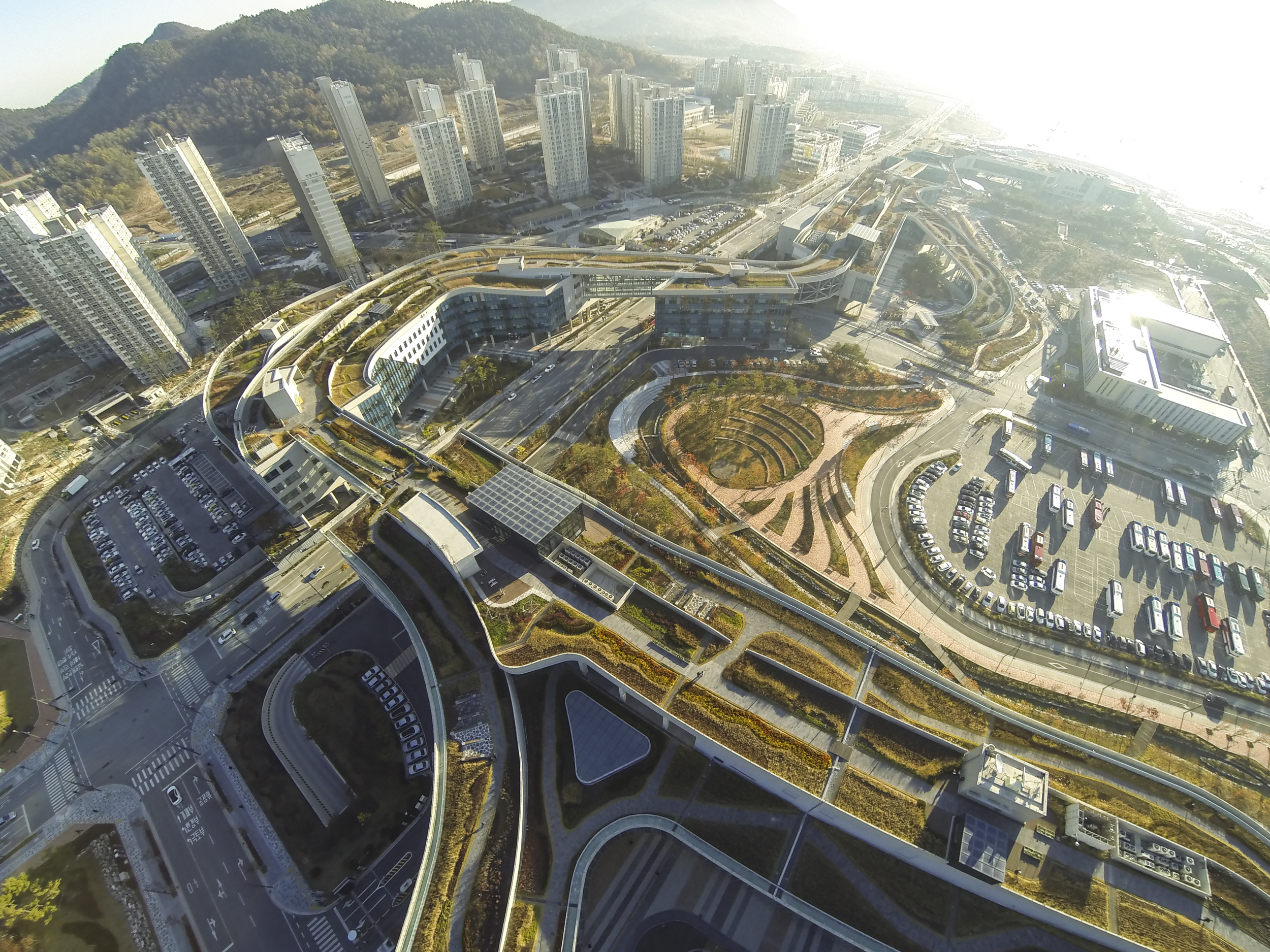
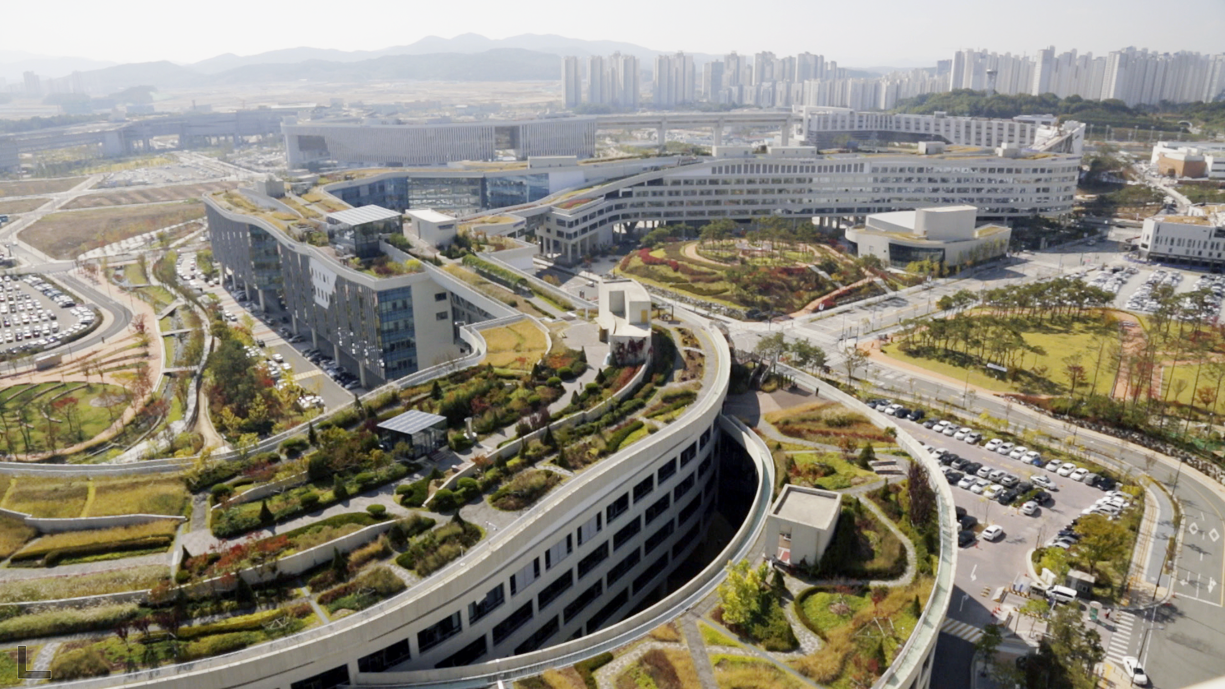
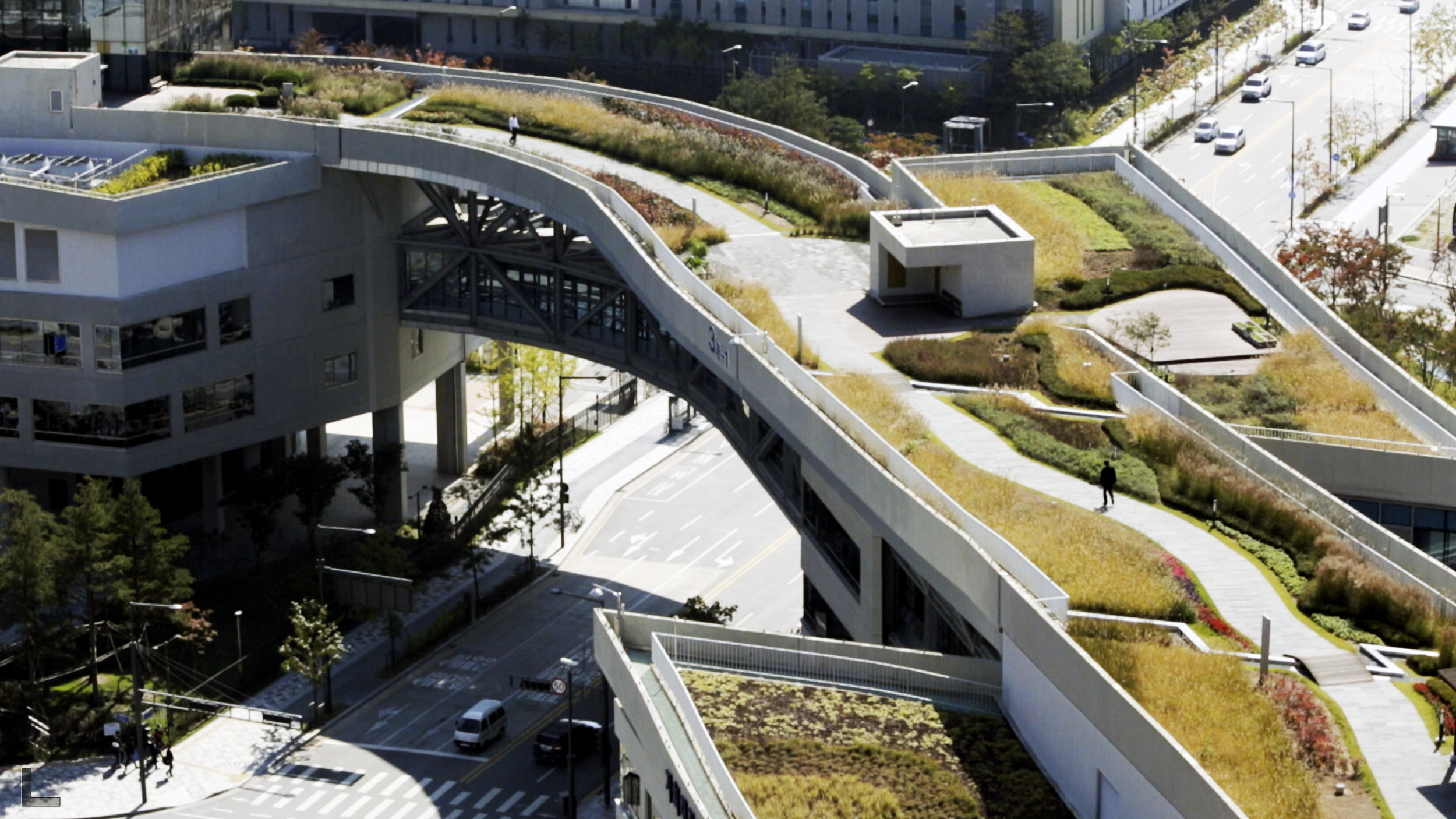
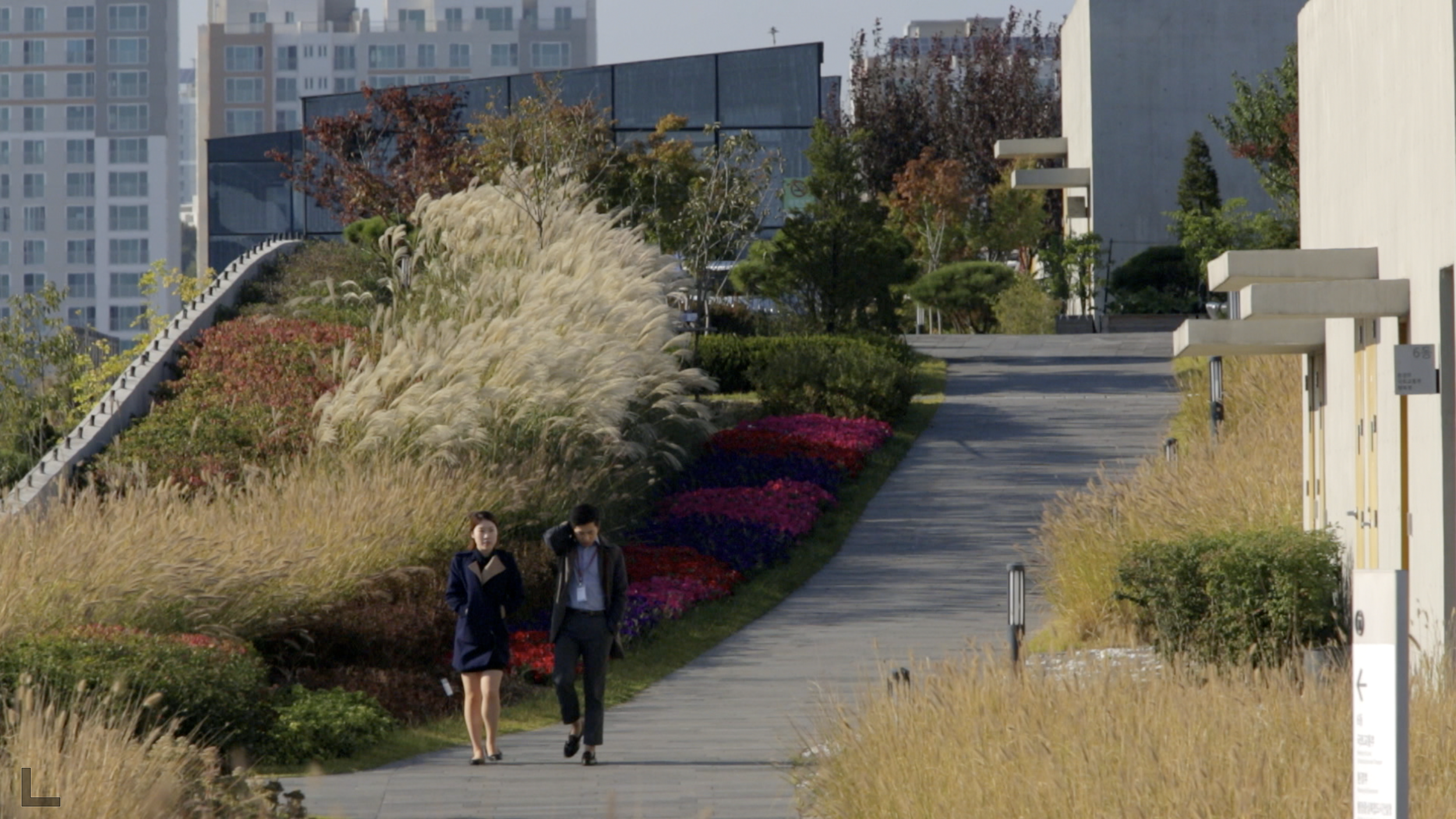
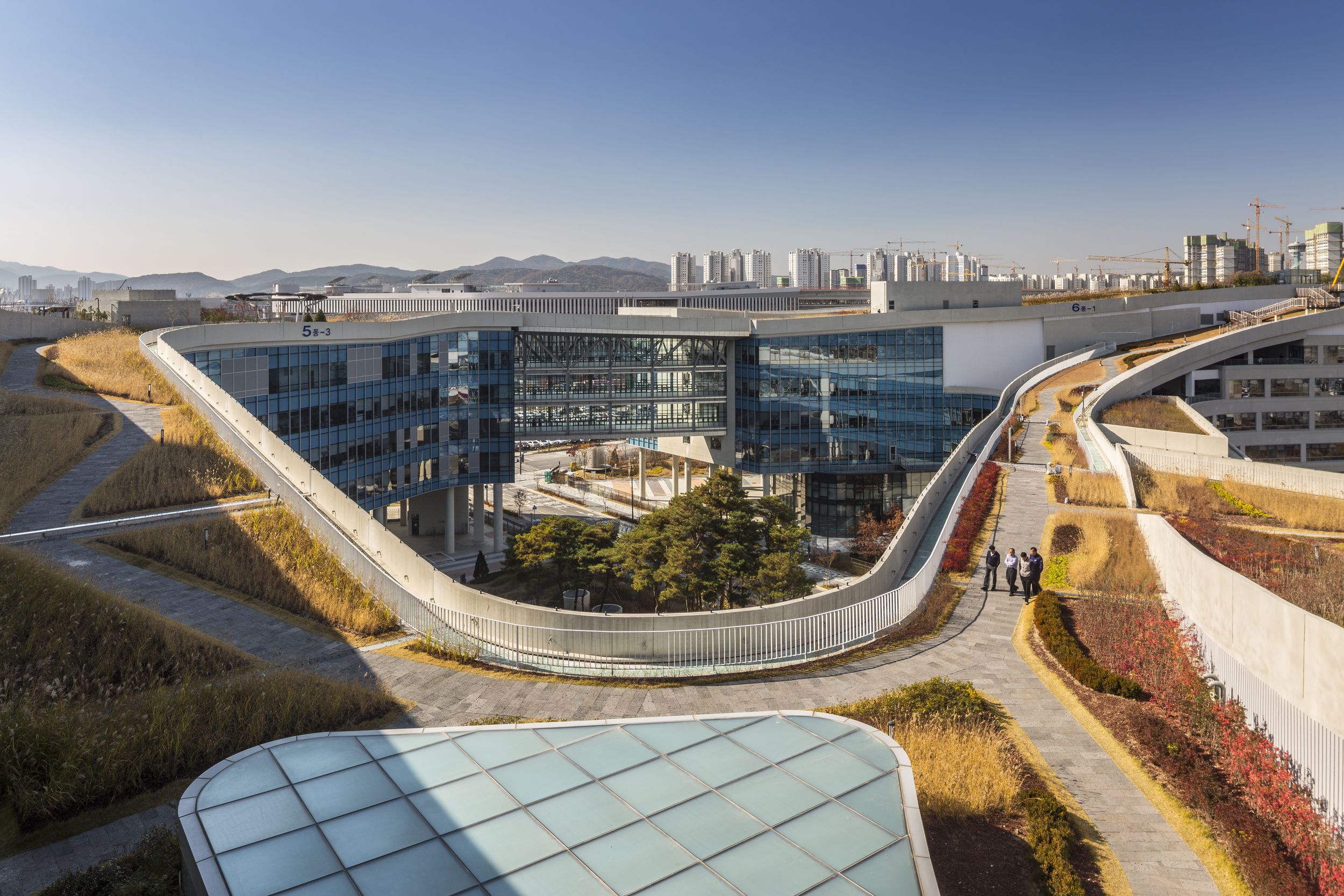
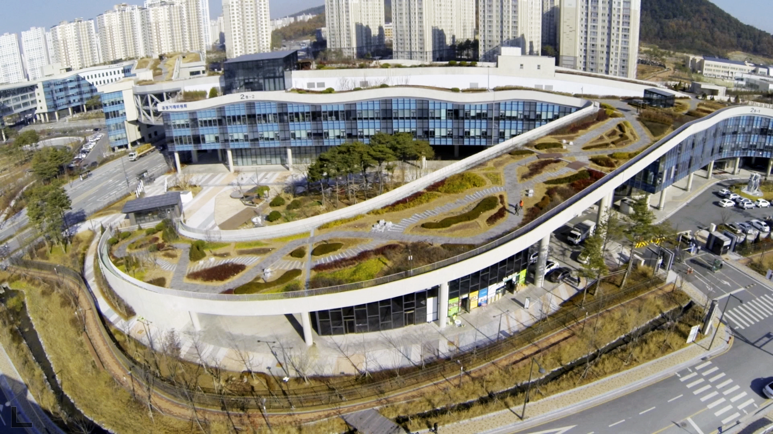
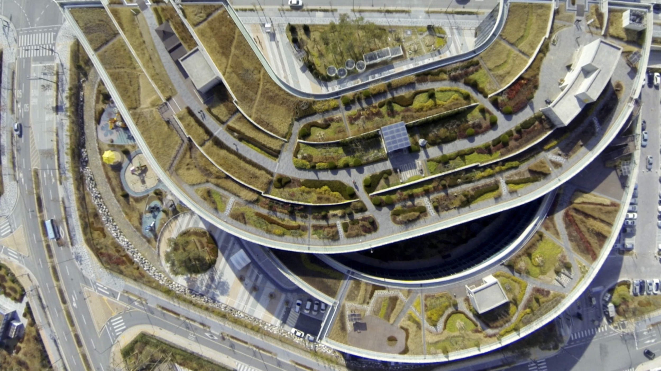
This is a project that took a modest idea, that of green roofs as a public spaces and converted them into the generating idea for shaping a whole city. The four kilometer continuous connecting surface uniting ministries transforms the understanding of public space which here becomes the generator of the architectural form and is completely integrated into the architecture.

The design of the Master Plan for South Korea’s new administrative city. Sejong City, some 90 miles south of Seoul, will be home to 36 ministries currently located in or near Seoul. This project was won in an international competition and is now under construction. 

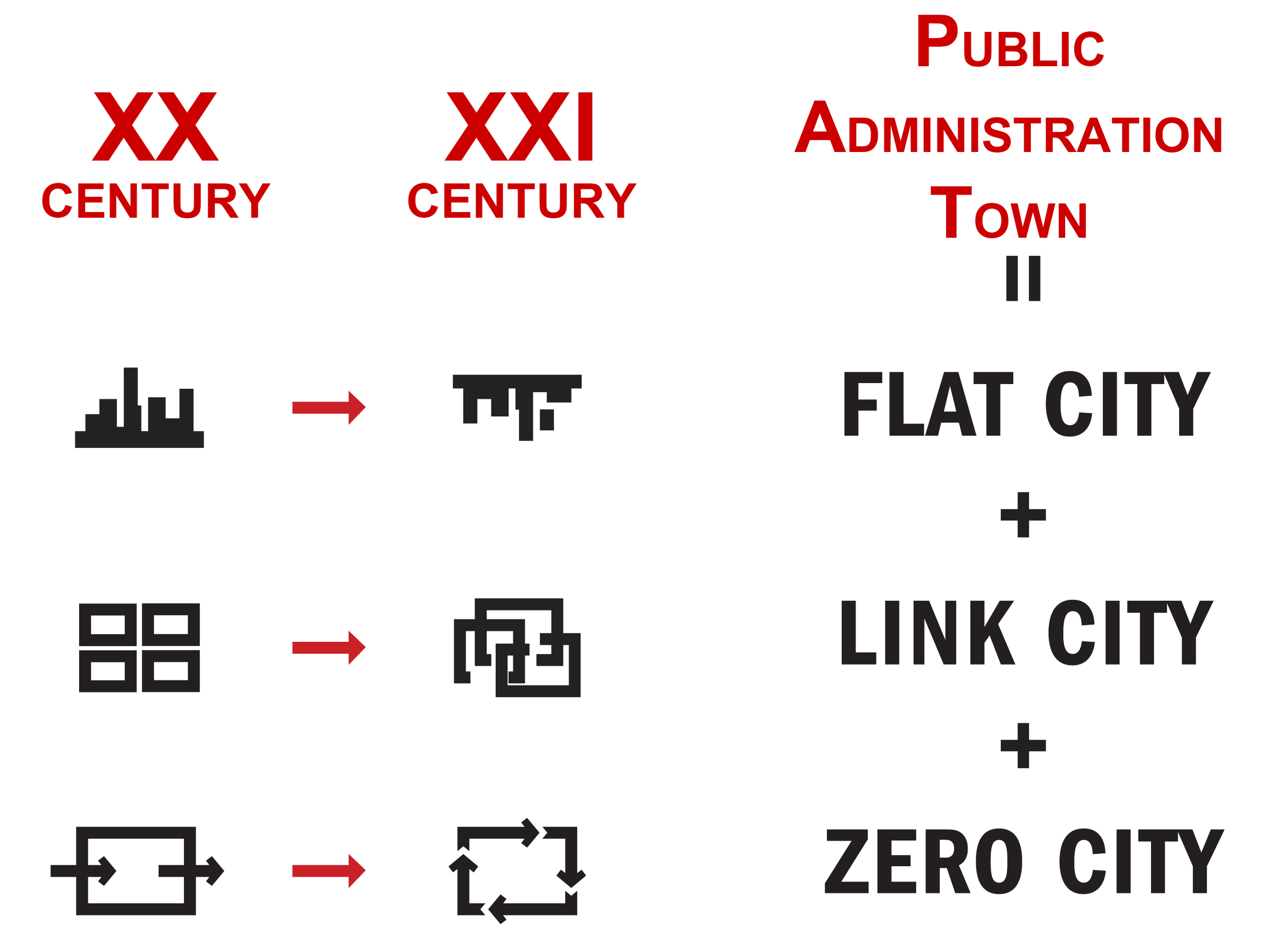
Three concepts ruled its overall definition:

FLAT CITY: The iconic plane--the physical and conceptual datum of aligned building rooftops--symbolizes the interconnected unity and democratic nature of the people and the government.

LINK CITY: Physical and visual linkages are created between the government and the people, the urban and the natural, the ground and the sky.

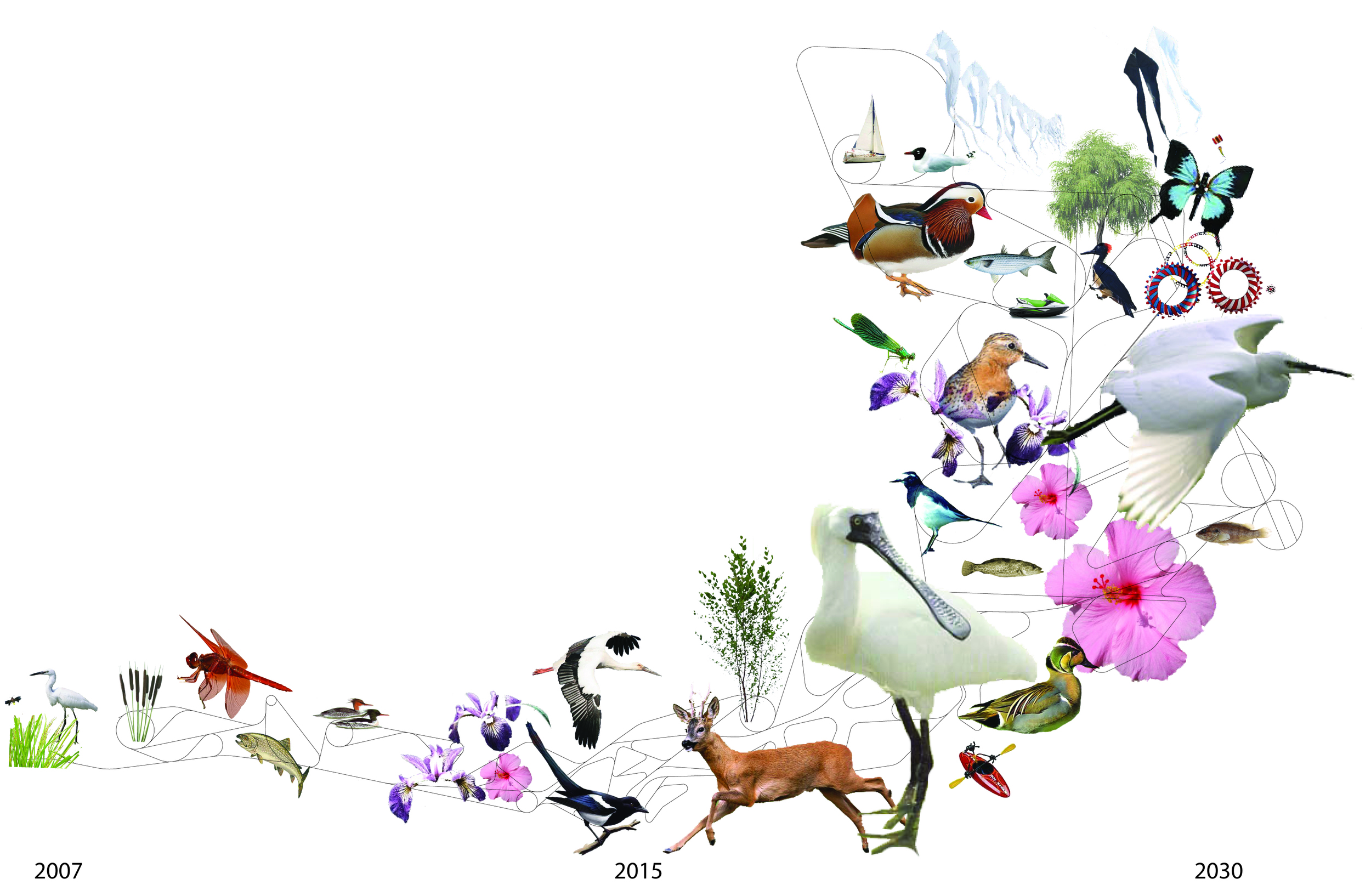
ZERO WASTE CITY: We created a strategy for the model city development that is based on zero waste principles. All waste from one system becomes the food for another. The third, Zero Waste City was not carried out.

New Asian Cities Pursue Sustainable Design, Architectural Record
Asian Cities Go Green, Bloomberg Businessweek
City’s Evolution Offers Lessons in Korean Politics, New York Times

SEJONG, KOREA, MPPAT (Masterplan for Public Administration Town)

Talgar Master Plan

2007 - Talgar, Kazakhstan

Talgar Master Plan

Talgar, Kazakhstan

CLIENT Alau Co. LLP / STATUS Competition Entry , 2007 / SIZE 6 acres / DESIGN TEAM Balmori Associates / Space Group

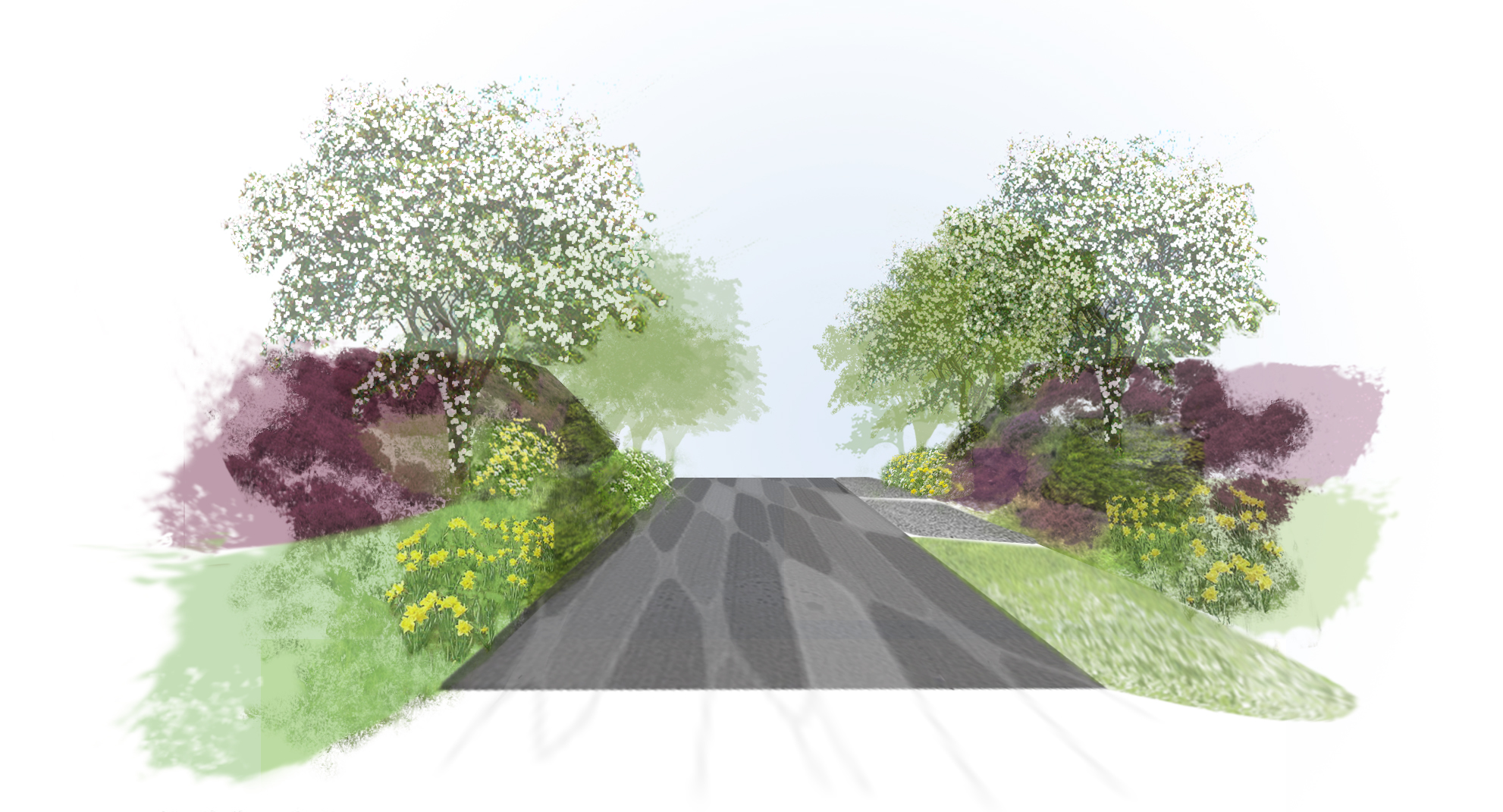
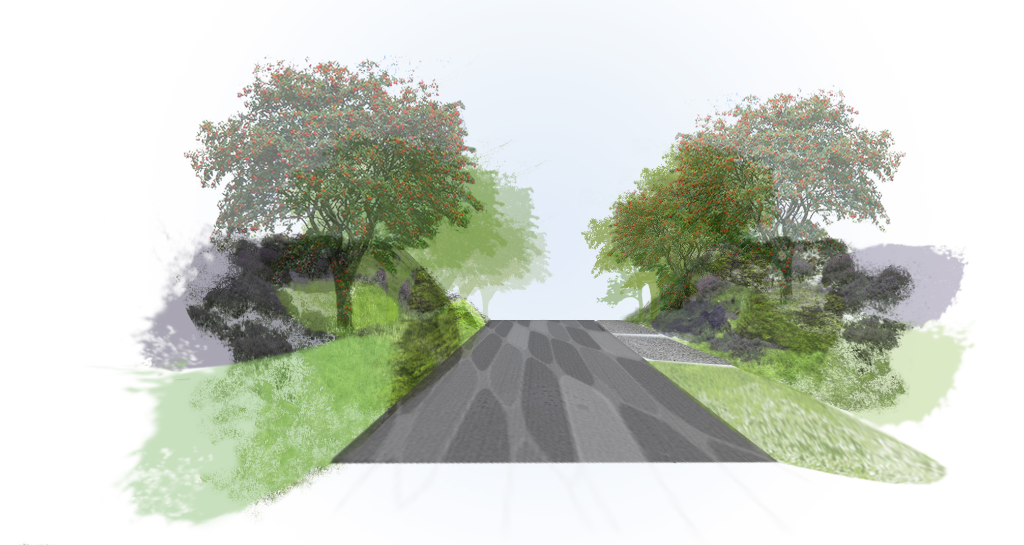
The landscape design for this project was an active ecological surface, filtering, cleaning, building and sustaining Talgar and the regional surrounds. Innovative development strategies add a layer of ecological infrastructure that enhance the diversity and richness of the site. The site operates as a responsive habitat, constantly evolving and changing according to the ecological processes and social usage patterns.

This fluid development strategy twines the landscape with development blurring the lines between both. Swaths of open space that protect sensitive natural features, steep slopes and wetlands, allow for fluid movement of both people and nature between site conditions. Considered insertions of residential and commercial development will advantage the spectacular setting and respect the existing terrain while maximizing site development potential. A unique system of physical and visual passages and linkages between the region and the people, the constructed and the natural, the ground and the sky, it allows for free movement from one realm to the other. With few barriers in Talgar, enhanced interactions will contribute to an environmentally responsible, adaptable and efficient development. This strategy will reach beyond the site as Talgar engages adjacent developments and landscapes.

Talgar was designed to be a Loop City with zero waste. In nature, all waste from one system becomes the food for another. Loop City emulates nature’s efficiency; independent but interconnected infrastructure systems help reuse waste and reduce pollution while taking care of essential development functions.

10 Li Park

2007 - Seoul, Korea

10 Li Park

Seoul, Korea

CLIENT Multi-functional Administrative City Construction Agency of Korea / PROJECT AREA 2,700,000 m2 / STATUS Competition Finalist, 2007 / DESIGN TEAM Balmori Associates, Inc. / Joel Sanders Architect / MAD office Ltd. / EXE Ltd.

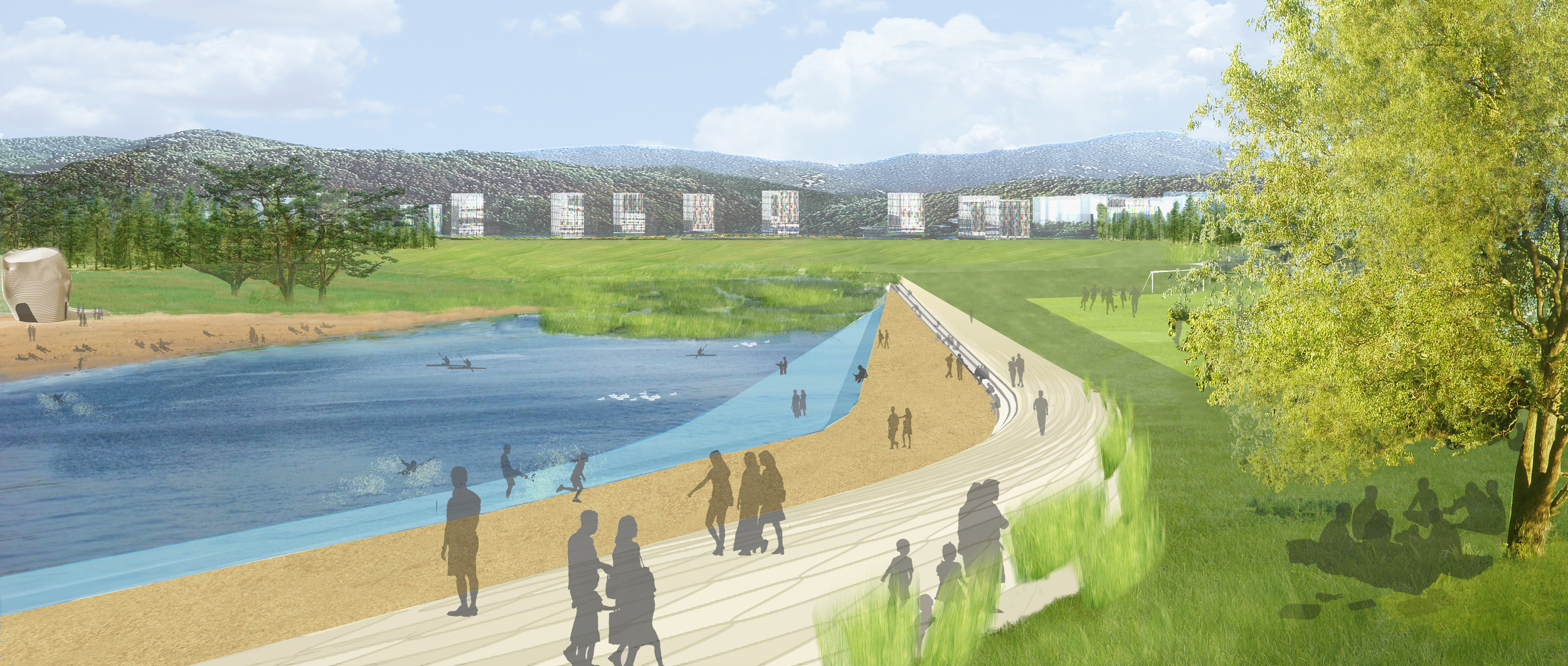
10 Li Park evolves from the overlay and intersection of a central park, a linear park, and architecture. The central park is a space for recreation and experiencing nature, while the linear park “climbs” the nearby mountains, extends onto the river, and weaves through the site to connect the various areas of the immense site. Architectural elements exist at the interface of these two typologies binding them at their most significant intersection. It is a fresh interpretation of each typology that results in new spatial and programmatic strategy for occupying the landscape. The 10 Li Ring combines historical, natural and constructed order of the river, the levee and Public Administration Town (PAT). Li is a traditional Korean unit to measure distance; 10 Li becomes a tool to engage the spatial experiences of the park.

The Ring is a ‘Museum Mile’ that connects 3 of the planned facilities; a line of culture that creates a porous public boundary between the various landscapes and the architecture. The Li-near Loop is the primary line in the park’s succession and growth. All program and park spaces develop out of this loop in time. It is the primary circulation path and an ecological corridor for habitat, filtering, cleaning and purifying air and water; an active environmental engine. In order to maintain a continuous park surface that links to the river and the 10 Li Ring, traffic through the park is placed under this surface before emerging and linking with PAT’s road network.

Miami Performing Arts Center

2007 - Miami, FL, USA

Miami Performing Arts Center

Miami, FL, USA

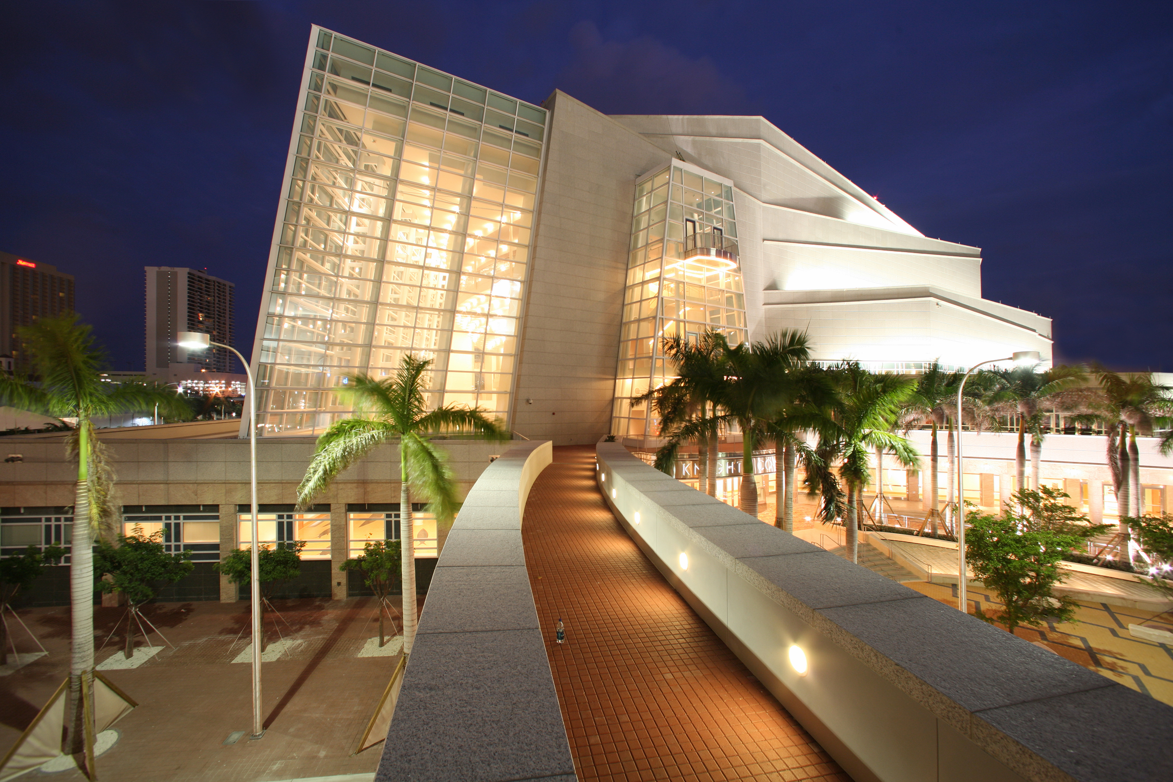
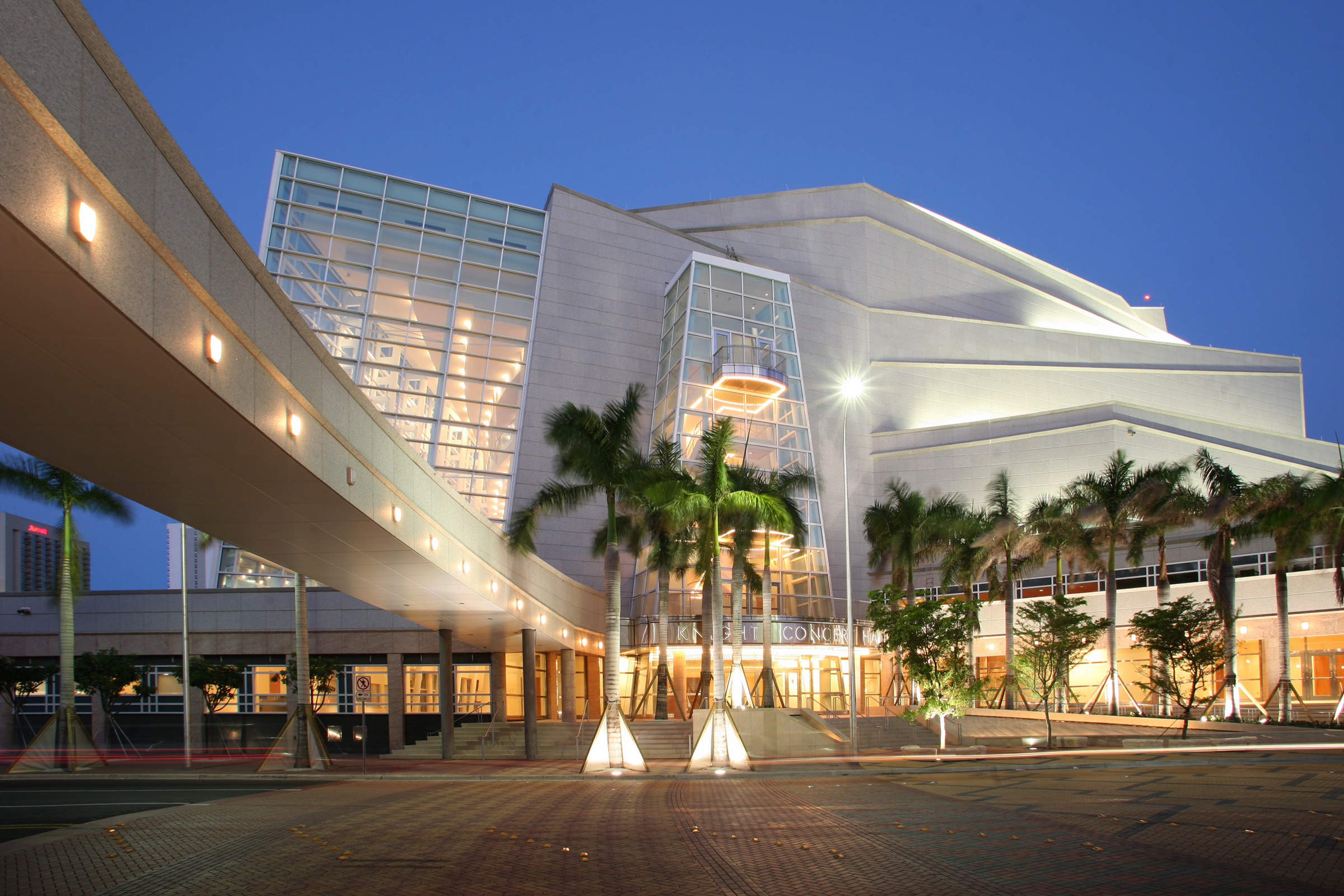
CLIENT Performing Arts Center Foundation /  SIZE 5.8 acres / STATUS Completed 2007 / DESIGN TEAM Balmori Associates, Pelli Clarke Pelli

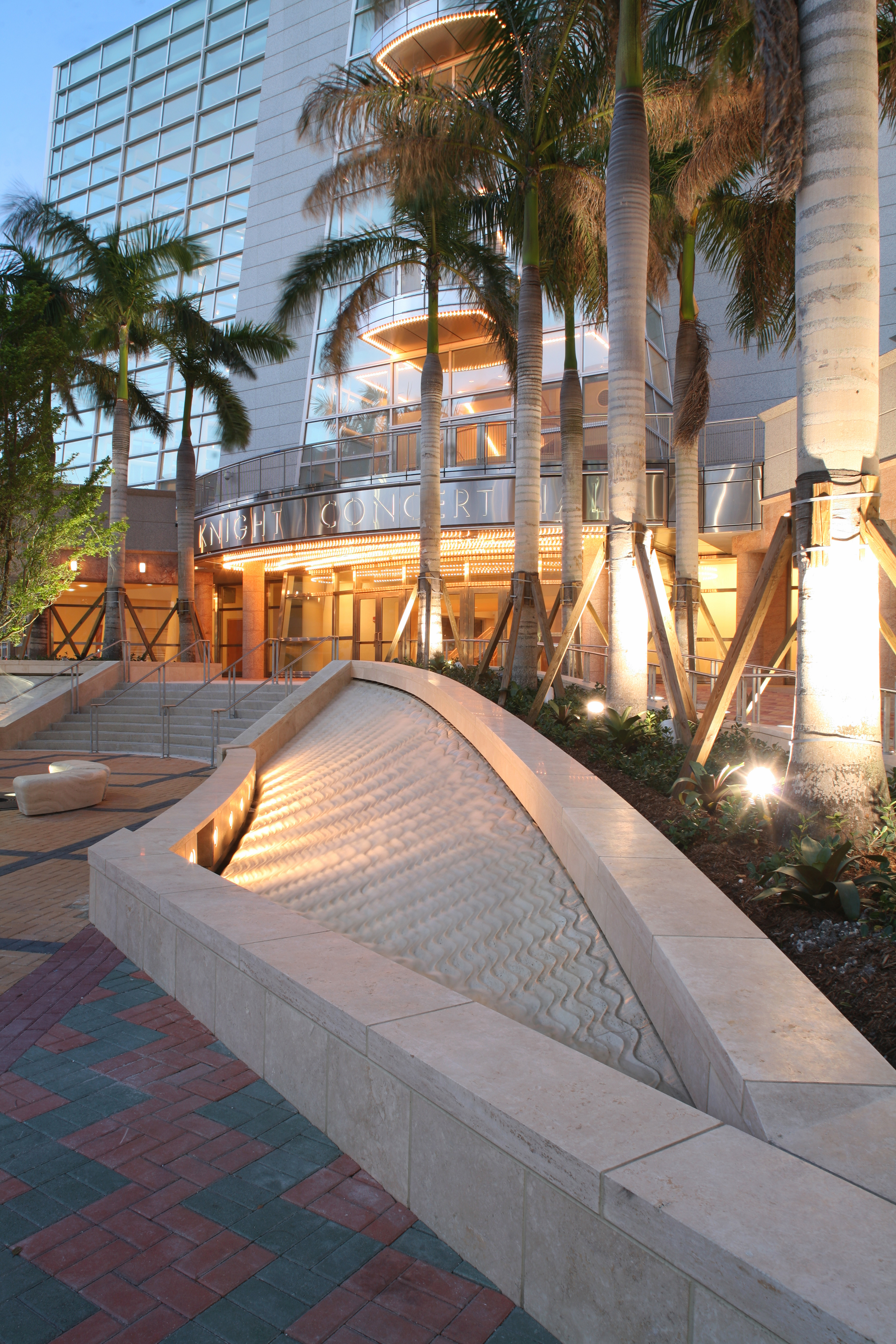
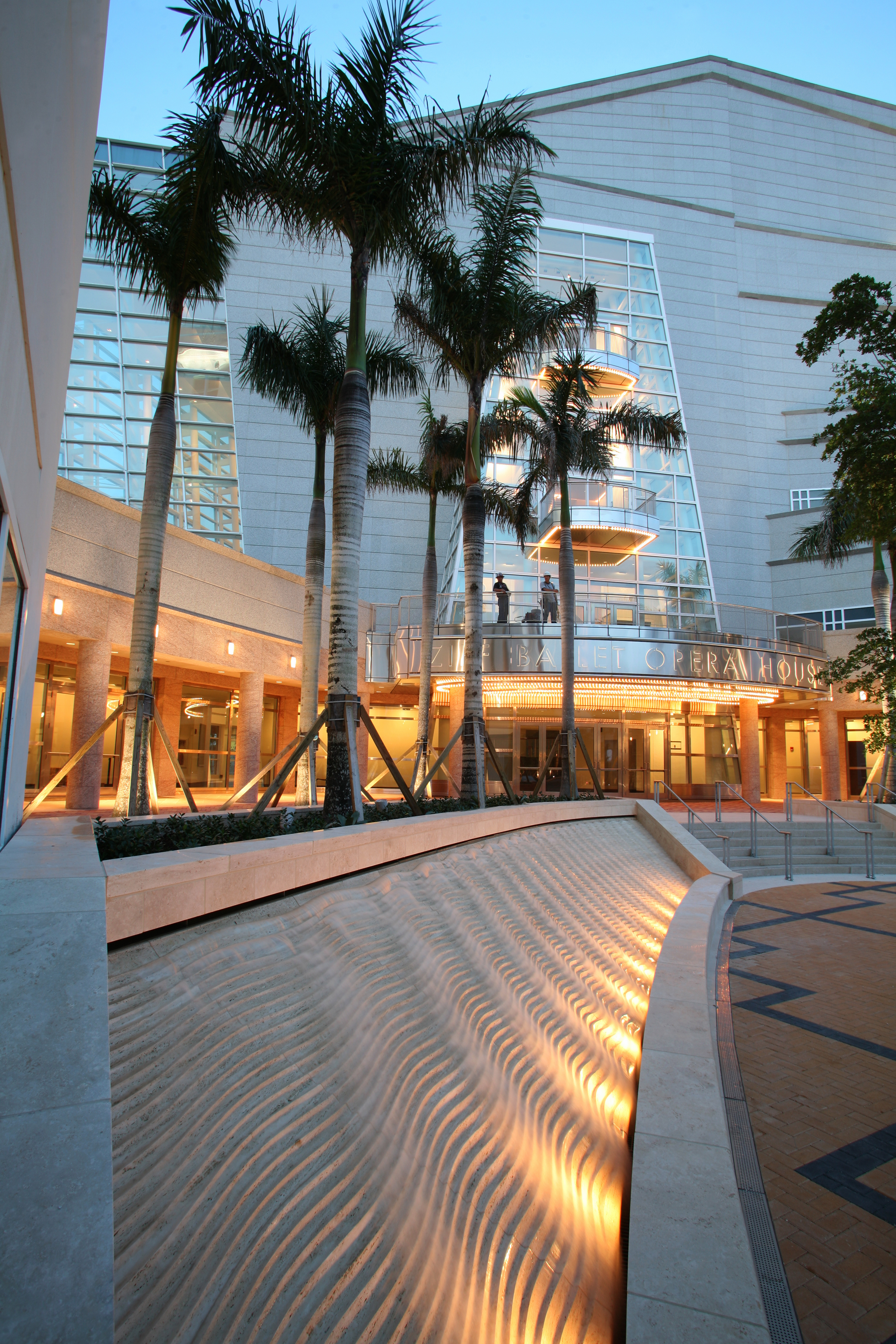
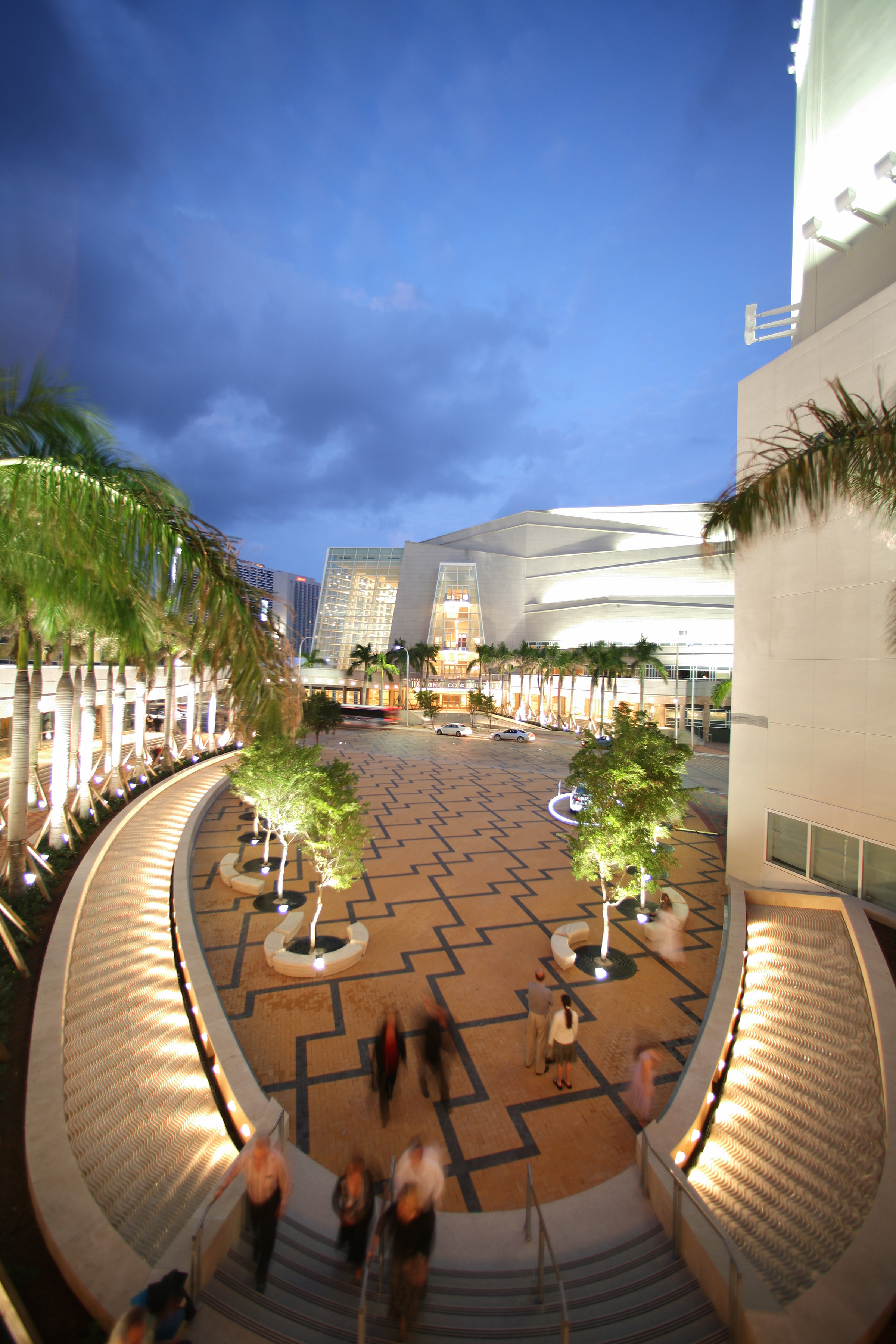
The Performing Arts Center, a catalyst for a large urban revitalization project, is located within the Miami-Dade Empowerment Zone and houses a planned arts, media and entertainment district for Miami’s Omni-Venetia area. The Central Plaza for the Arts, designed by Balmori Associates, links the opera house, symphony hall, theatre, and Art Deco tower that sit on either side of the Biscayne Boulevard.  This urban plaza bisects Biscayne Boulevard, thereby creating connectivity between the built forms.  A wide variety of social and cultural public life is supported by the Plaza. 

Furthermore, it can transform from two courts bisected by vehicular traffic into a continuous outdoor plaza for outdoor events when the street is closed.  Landscape elements mitigate the changes in elevation, distinguishing elements from each other while creating transitions between others. Rings of plants and fountains at the plaza’s edge provide a transition between the street and buildings, which are elevated for purposes of flood protection. The fountain, designed by artist Anna Murch, draws upon wave paths to create a space that is animated even in the absence of water.

University College Dublin

2007 - Dublin, Ireland

University College Dublin

Dublin, Ireland

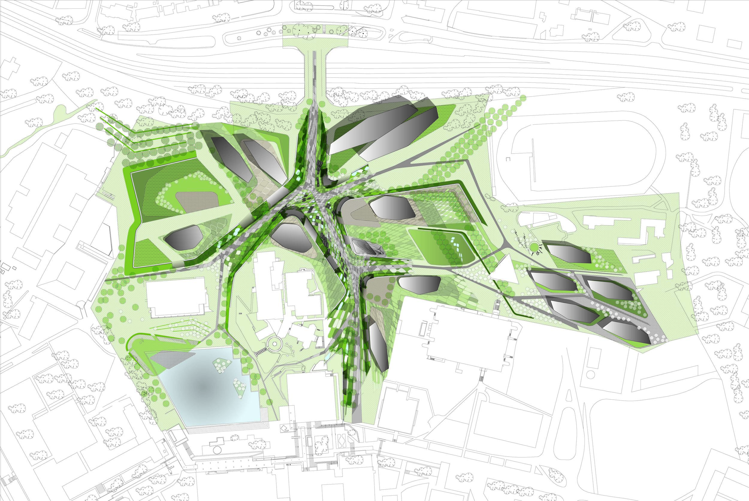
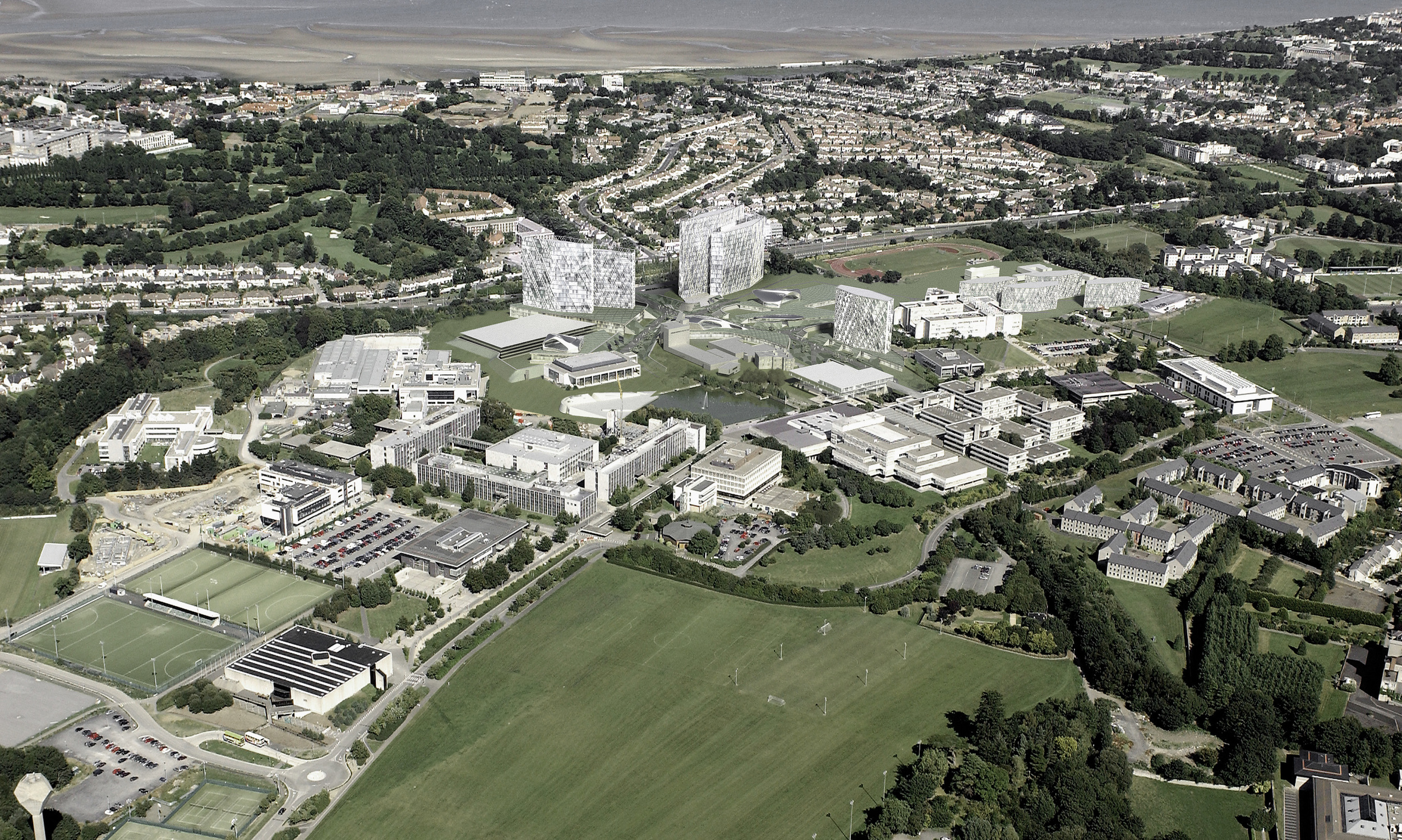
CLIENT University College Dublin / STATUS Competition Finalist, 2007 / DESIGN TEAM Balmori Associates / Zaha Hadid Architects 

In collaboration with Zaha Hadid, Balmori Associates submitted a master plan for the expansion of the University College in Dublin.  This design proposed hybridity as a strategy to create new building and landscape typologies.  Landscape and architecture merged to form continuous multi-layered public surfaces and green building facades.  The slopes that transitioned between the path and the buildings were exemplary of the thickening interface.  They were layered with plantings and materials and became usable and occupiable spaces that extend the landscape to a 5th facade of roof garden.  This interface also became a sustainable strategy that aimed to maximize campus biodiversity by extending existing green space and branching out to form a new campus green network. 

684 Broadway

2007 - NEW YORK, NY, USA

684 BROADWAY

NEW YORK, NY, USA

CLIENT Matthew A Blesso, Blesso Properties / SIZE 3,100sf / 288 m2 / STATUS Completed in 2007 / DESIGN TEAM Balmori Associates / Joel Sanders Architect /  ANDarchitects Architect / R2P Studio / PHOTO CREDIT Mark J.Dye

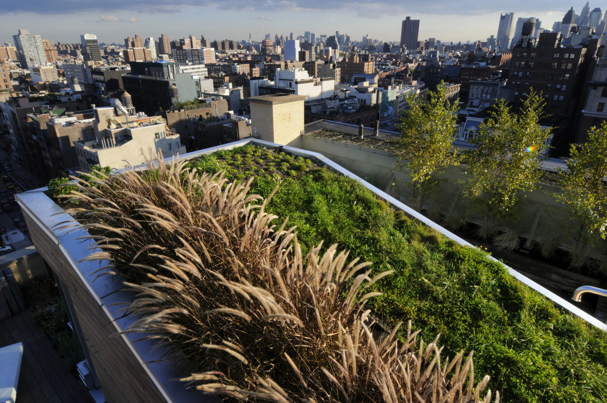
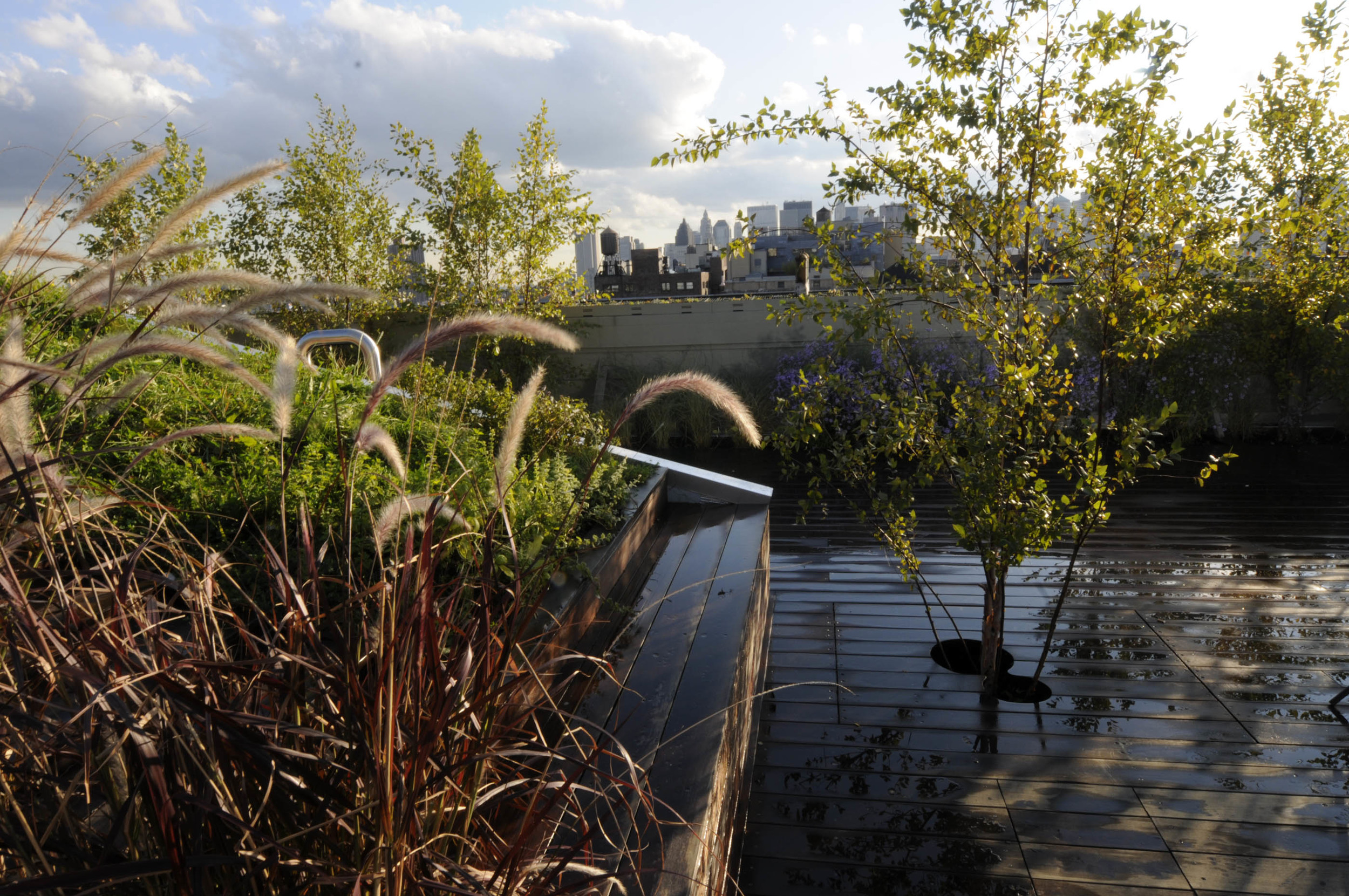
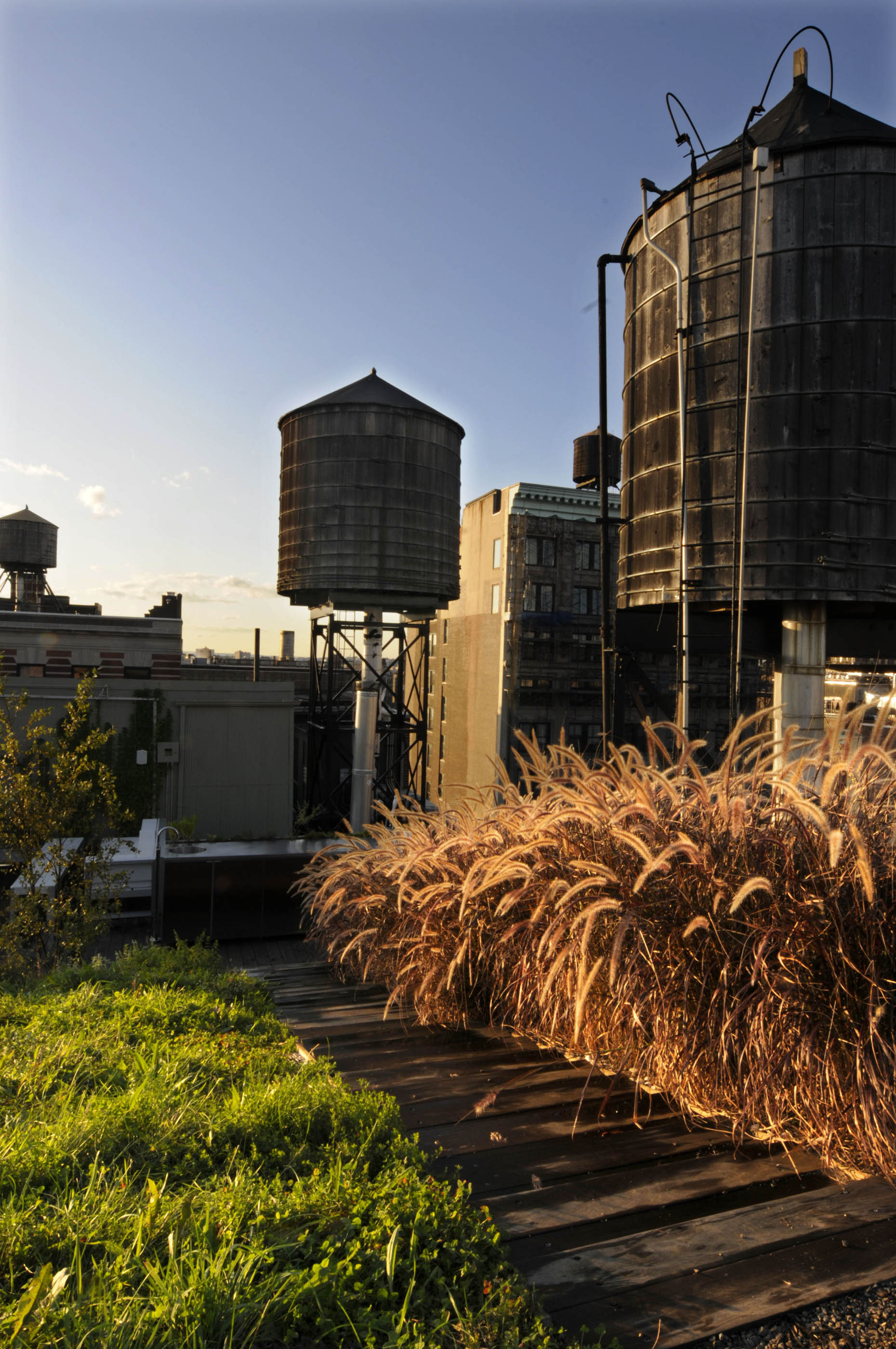
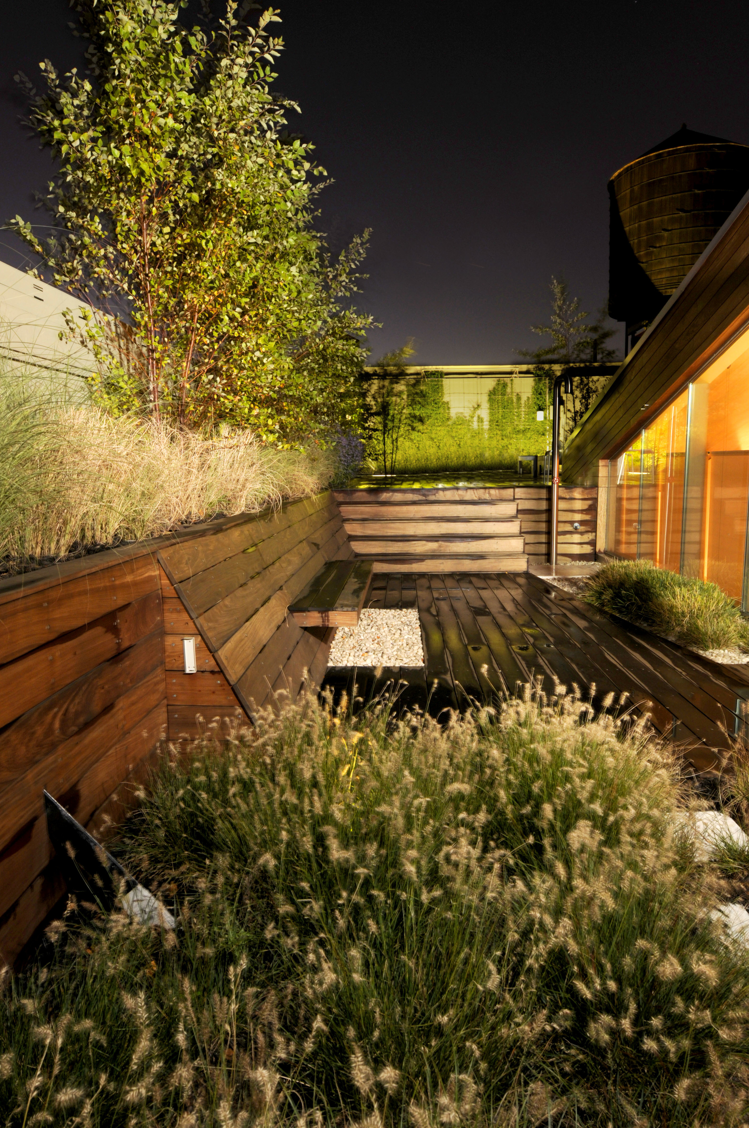
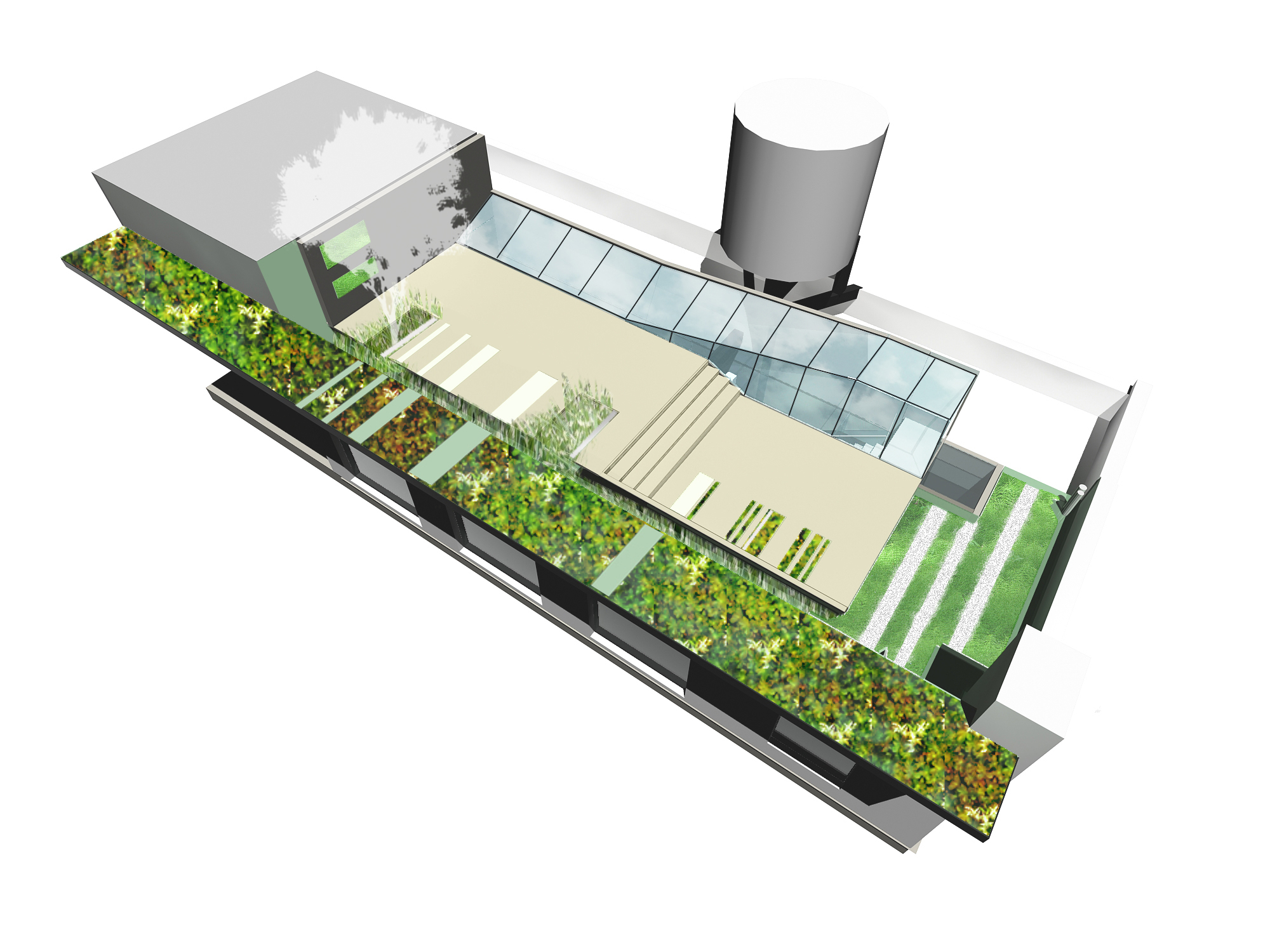
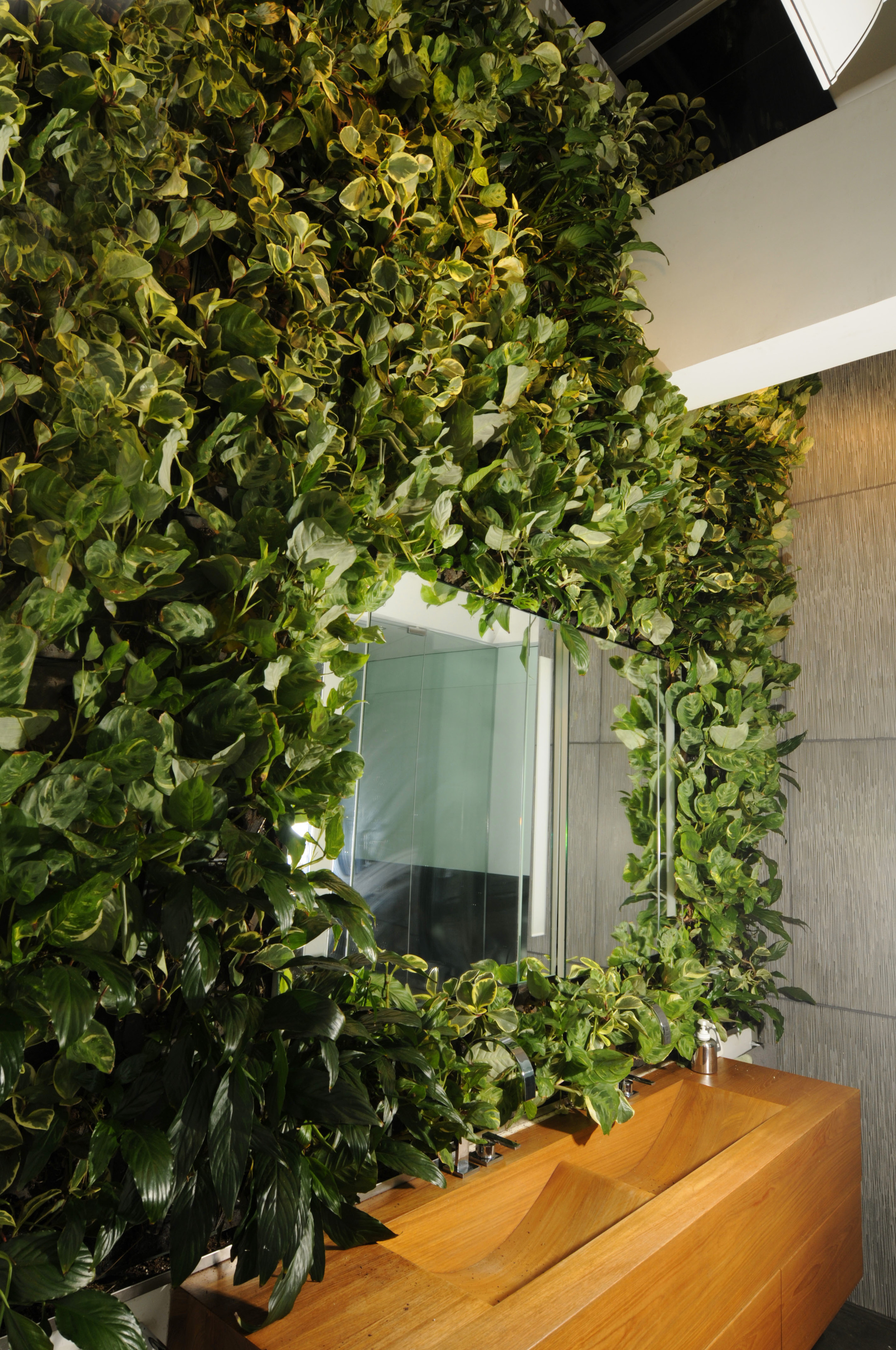
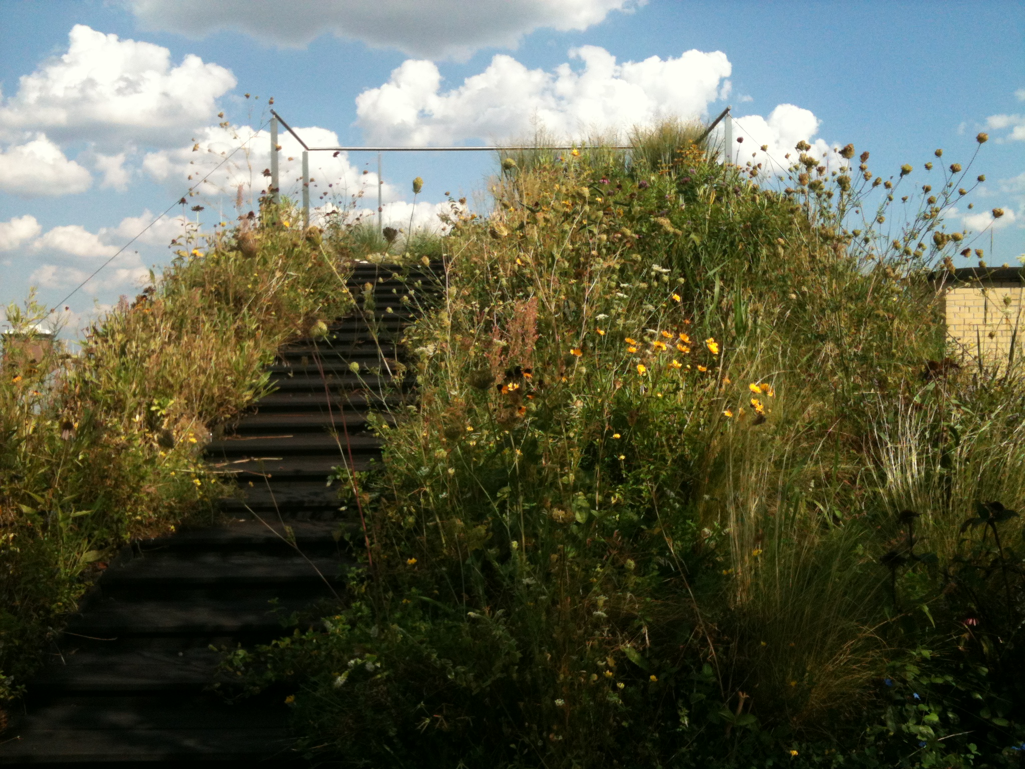
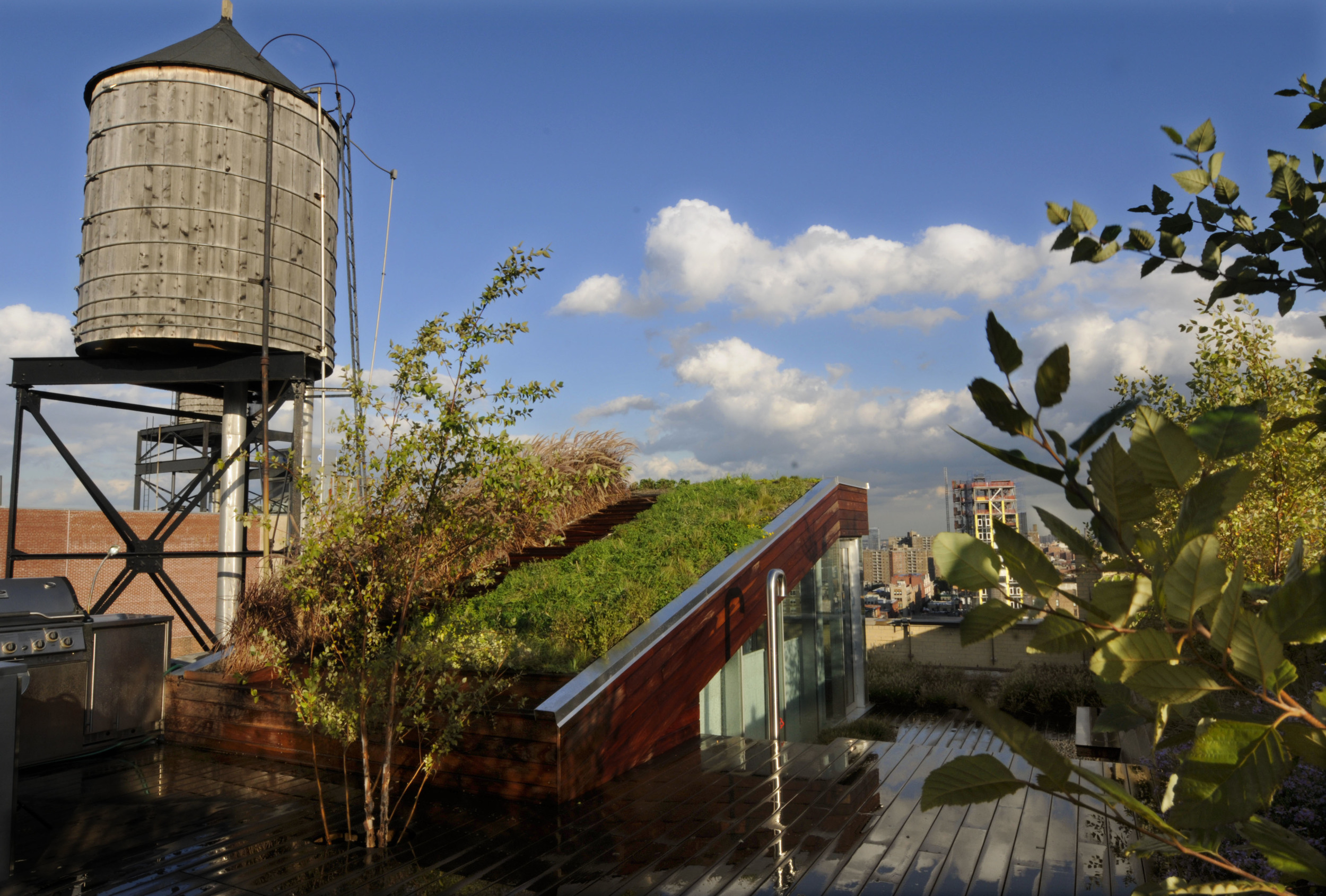
The project at 684 Broadway explores the interface of built and natural environment of architecture and landscape; not blurring the line between landscape and architecture, but widening it. This thick interface creates the opportunity for new types of spaces. Alternating sheaves of landscape and building on both horizontal and vertical planes create transitions within this widened line. It is a complex interface that is layered – the thicker the line the better – and results in a new spatial entity. Interface becomes a sustainable strategy that aims to maximize biodiversity and sustainable design in this urban site by extending green space both horizontally and vertically within the renovated apartment and exterior roof space. The result, hypernature, is an artificial spectacle of constructed nature. 

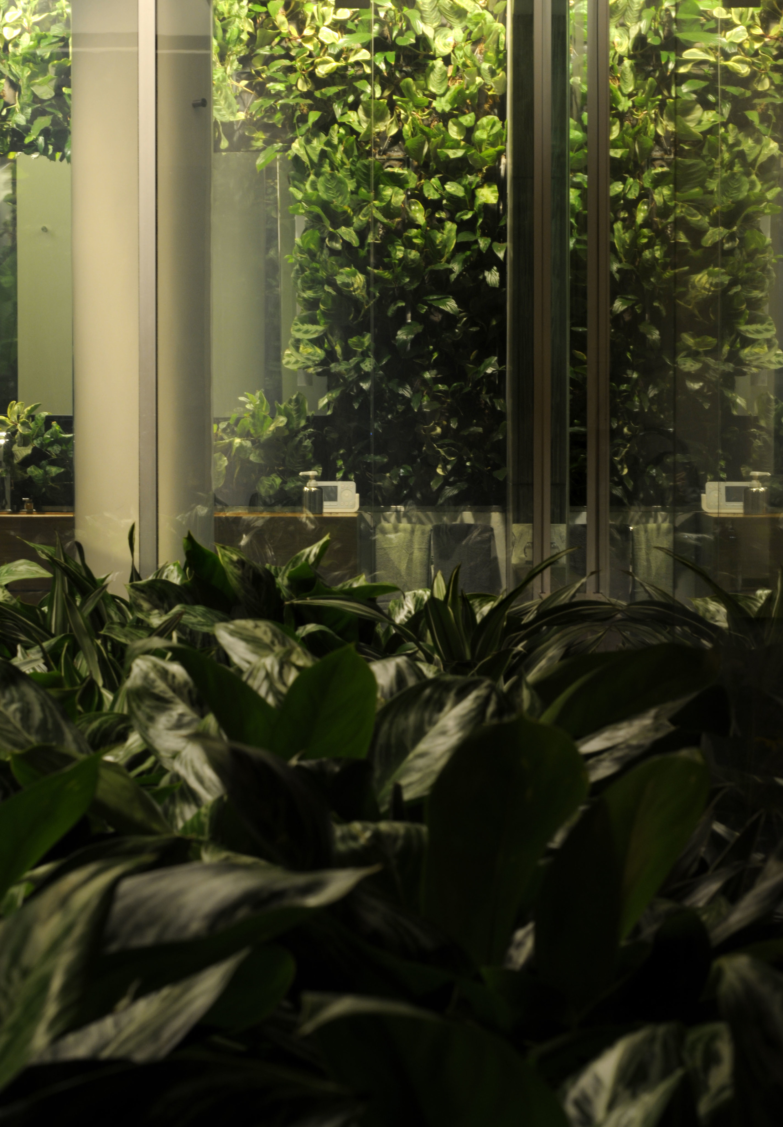
The interface begins with an interior garden beneath a twenty foot long skylight. Filled with large leaved Elephant Ears and black bamboo, the plants create an ascending green carpet beneath the floating stairs to the roof. Above the delicate bamboo fronds, through a glass partition separating the garden from master bathroom, is visible a green wall planted with euonymus. This improbable swath of vertical vegetation climbs the wall colliding with a second skylight through which is visible the rooftop planting.

Suspended above the sea of grasses is a bi-level ipe deck. On the lower level a small gravel path leads to a look out pod with views over the lower east side, an outdoor shower and on the opposite side of the stair bulkhead, a more private enclave with jacuzzi and sunning deck. Five steps lead to the upper level with an outdoor kitchen and grill lounging space. Opposite the parapet, the bulkhead rises into the sky. Densely planted with stepable plants one can lie on the slope and watch cloud rushing overhead. A staircase leads to the top from which there is a 360 degree view of the Lower East side.